June 6, 1936. © SEPS 2014
Click here to license this piece from Curtis Publishing.
Click here to purchase this and other pieces by Frances Tipton hunter at Art.com.
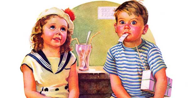
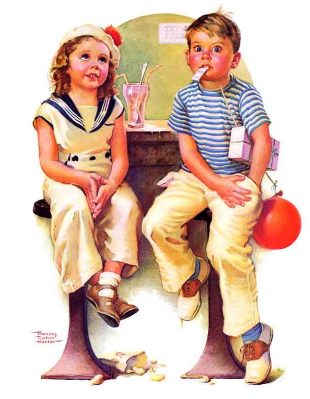
The June 6, 1936 cover of The Saturday Evening Post,“No Money For Her Soda,” shows two kids who’ve spent the day with each other, and a boy who doesn’t have two pennies left to rub together. Even in this embarrassing moment the artist’s use of small children in a setting for adults, while using a bright color palette, manages to keep the scene innocent and playful.
Frances Tipton Hunter’s first cover for The Saturday Evening Post does a wonderful job arranging tokens of the day’s activities around the counter. The remnants of the day rest under the boy’s arm, on the floor, and even held between his teeth, including a ticket stub, a gift-wrapped box, an empty soda glass, and a bag of ballpark peanuts. Just in case we need further evidence of the boy’s financial predicament (and we don’t really), the boy’s pockets are turned inside out.
Much like the works of Norman Rockwell, Frances Tipton Hunter painted innocent boys and girls living idealized American childhoods, complete with this idyllic failure of financial preparation. Your heart aches as what looks to be a fun-filled day comes to a stalled, awkward end—the partially deflated balloon representing the increasingly poor prospects of their future together.
Painted at the height of the Great Depression, the picture of a young spendthrift on a badly planned date automatically raises broader questions. Though the work depicts children, could this catastrophic date, complete with reckless money management, have hit a little too close to home for a struggling 1930s America?
The two children sit upon adult-sized, vertical barstools (feet dangling), staged symmetrically opposite one another to draw the viewer’s attention to the compositional “H” frame’s center. The horizontal line of the bar cuts across the image, drawing the eye in to navigate the story’s narrative, a pocket-searching hand and the counter’s empty glass.
Further dissecting the work’s structural composition, Hunter’s set design and palette interact with the overall story to tone down the seriousness of the subject matter. The lighter hues–pinks, peaches, blues, beige, and white all work to soften the severity of the situation. Hunter even changed the Post font color to a fun, light-hearted pink.
The white backdrop of the cover’s negative space pulls the scene forward dimensionally from the rest of the cover, creating depth layered from the barstools to the bar, to the back wall of the soda shop. The entire scene steps out from the cutoff nameplate of The Saturday Evening Post as an entrée into their moment.
This momentary glimpse into a child’s hardship brings both a smile and a reminder to keep track of one’s finances.

Become a Saturday Evening Post member and enjoy unlimited access. Subscribe now