American tastes changed dramatically after World War II. Reunited couples were eager to make up for lost time. A country freed from fears, stresses, and rationing turned its attention to homes, cars, fashionable clothing, hair styles, and above all, relationships. These stark changes are especially apparent when we look at the popular illustrations of the day.
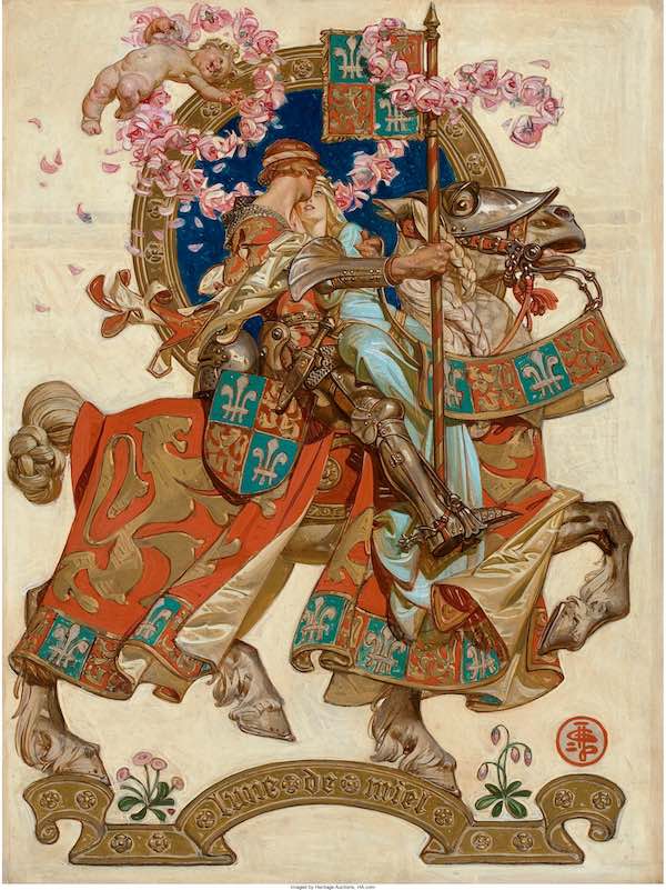
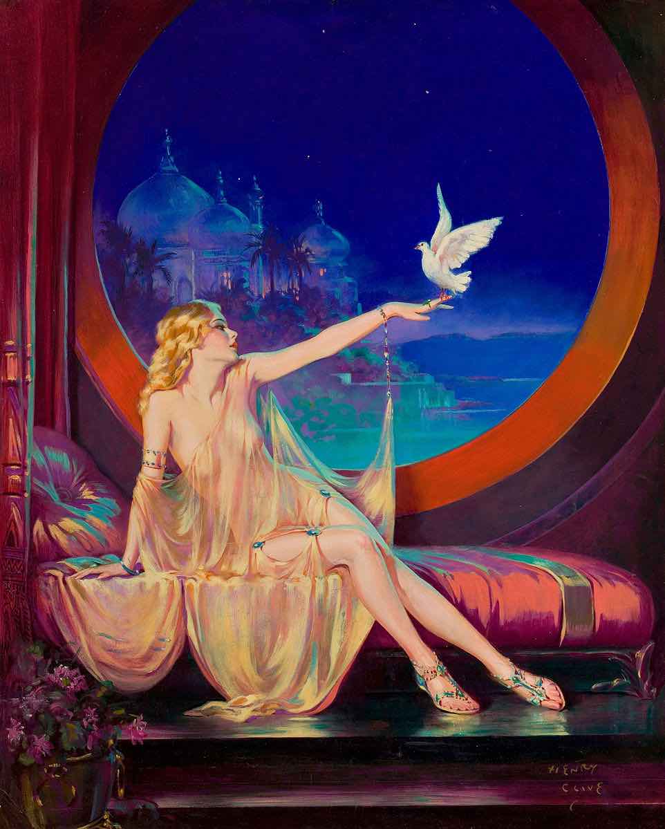
The escapist pictures and stories that the country craved during the Depression — romantic tales of South Seas adventures or knights in armor — disappeared from magazines.
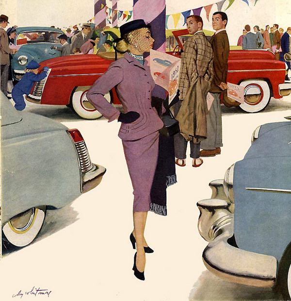
As illustrator Al Parker wrote in The Illustrator in America 1880-1980, “The need to escape was already waning and, with it, escapist art.” Young housewives and mothers (the primary readership of magazine fiction) now wanted to see girls finding true love with the boy next door. Young men, relieved that they had survived the war, enjoyed car ads illustrating peacetime lifestyles rather than reliable mechanical parts.
Parker recounted what it was like to be an illustrator in those days, “depicting an idealized world, peopled with handsome men and gorgeous women, bedecked in their best in the most fashionable of settings. … At the end of the war, the illustrator strutted amidst a pageant of plenty. Advertising budgets had skyrocketed and magazines bulged with fiction, providing work for all who painted in the style of the innovators.”
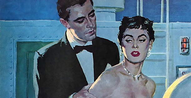
Magazines became larger and more colorful to show these pictures. In contrast to pre-war illustrations, which often included complex scenes and detailed backgrounds, the new illustrations often favored close-ups of the faces of heroes and heroines against a plain white or flat-colored background to eliminate unwanted clutter. Black cocktail dresses contrasted against bright white backgrounds showed off the shapes of young women enjoying themselves in the new prosperity. Sports cars and cocktail parties made bold background props, but the illustrations almost always centered on a stylishly dressed modern American woman.
This explosion of pent-up demand created steady employment for legions of talented young illustrators with a knack for stylish images of young love and domestic relationships. The leading illustrators of this style included Joe de Mers, Jon Whitcomb, Al Parker, Andy Virgil, Joe Bowler, and Mike Ludlow. Many other artists came and went and are little remembered today. But no one topped the great Coby Whitmore when it came to illustrating the relationships the public was so eager to see. As art historian Walt Reed noted in The Illustrator in America 1880-1980, “probably no other illustrator has been so inventive over so long a time in doing variations on the theme of boy meets girl.”
Whitmore was born in Dayton, Ohio, and moved to Chicago to work as an apprentice in an art studio by day while studying at the Art Institute of Chicago at night. His first real art job was working for the Chicago Herald Examiner. He later moved to Cincinnati, where he worked for a few years developing his style before finally moving to New York. There he began winning illustration assignments from national magazines such as The Saturday Evening Post, Redbook, Cosmopolitan, McCall’s, Ladies’ Home Journal, and Good Housekeeping.
Whitmore had the perfect disposition for painting in the new, snazzy style. He described his three primary interests in life as “racing cars, illustrating, and smart clothes on good looking women.”
What made Whitmore stand out from the crowd while so many of his peers were quickly forgotten?
Like the other illustrators, Whitmore mastered anatomy and color theory and learned to make the most of his tools — including gouache, casein, and designer paints. But Whitmore went far beyond the basics. Unlike many of his peers, Whitmore gave design and composition high priority in his illustrations. He used photographs of his models for reference the way other illustrators did, but while others slavishly copied the photographs, Whitmore always did his best to bring “fine art” elegance, class, and imagination to his subject matter. It didn’t matter that the stories he illustrated were sometimes corny or melodramatic; Whitmore was heavily influenced by French fine artists Bonnard and Vuillard, and he tried to elevate his illustrations to their level. When many of his peers began to lapse into formulaic solutions to their repeated assignments to draw another “pretty girl,” Whitmore always seemed to find a fresh and imaginative approach.
A picture is worth a thousand words, so let’s look at some samples of what made Whitmore great:
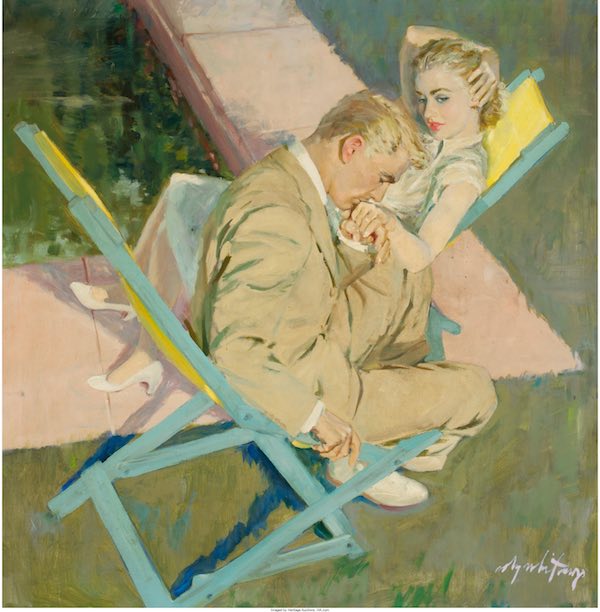
Note in this painting of “Nice Girl from Boston,” Whitmore has simplified the picture down to its essence. Instead of all the heavy detail and realism that would normally be required to fill two large pages, Whitmore charmed his audience by implying a fun, sexy relationship.
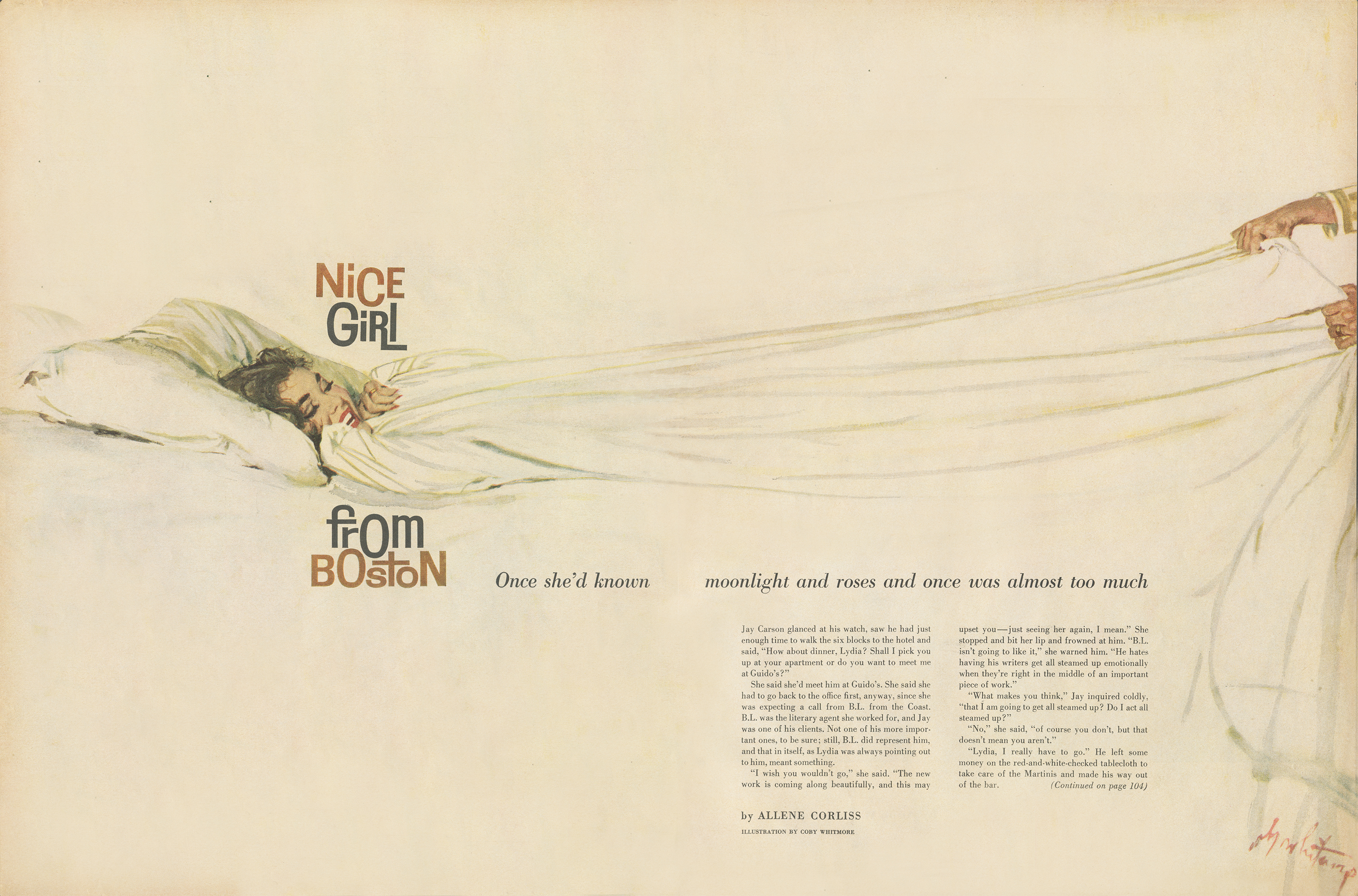
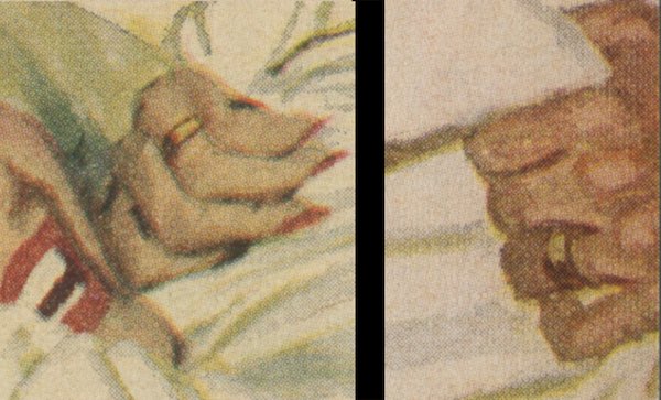
Note one crucial detail that could not be omitted: They are both wearing wedding rings. Without that detail, Whitmore’s painting would likely have been rejected.
In this next illustration of a young couple in a rowboat, Whitmore painted in a much looser style than the Norman Rockwell style that dominated the pre-war years.
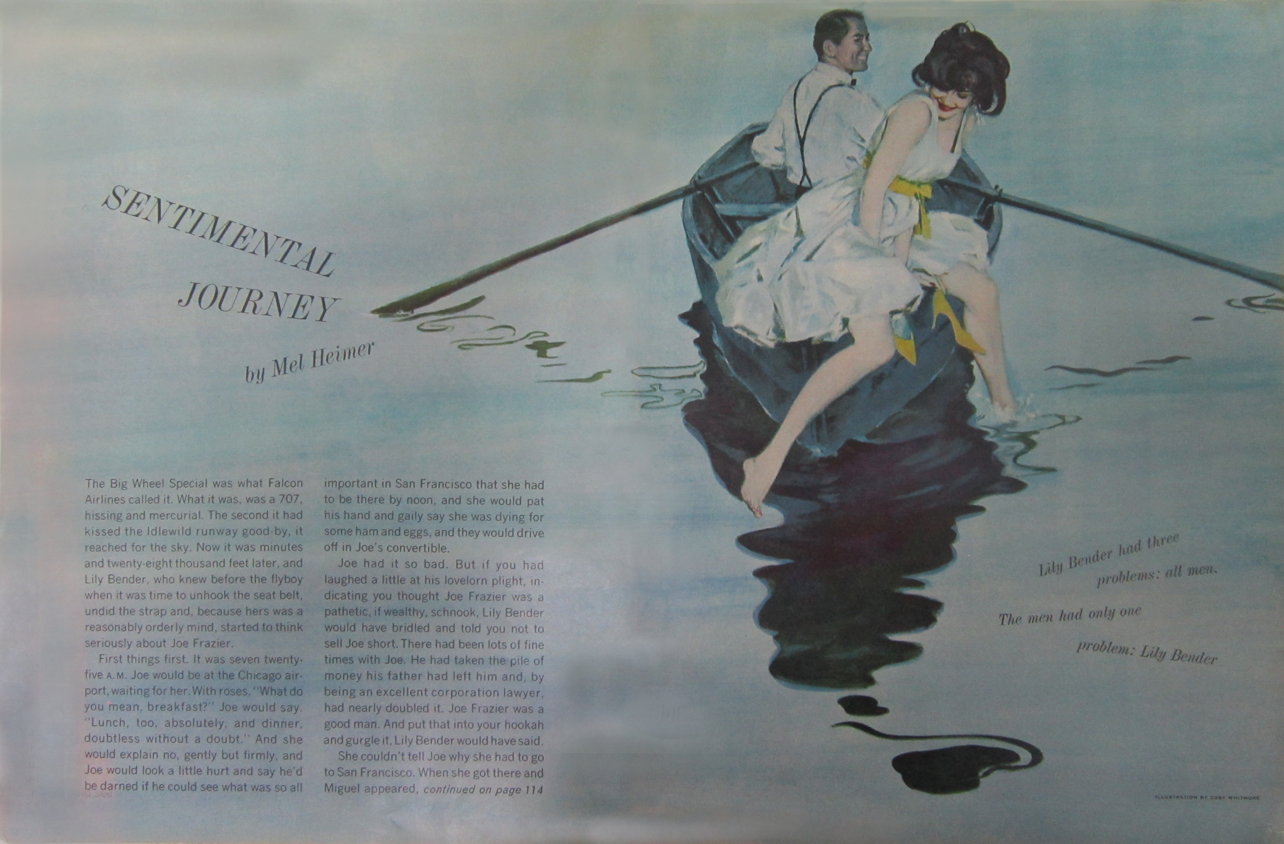
In particular, see how the ripples in the lake form abstract designs.

Whitmore was a contemporary of abstract painters such as Jackson Pollock and Adolph Gottlieb, and he paid attention to their innovations. Despite his own realism, those ripples in the lake showed that Whitmore was able to abstract with the best of them.
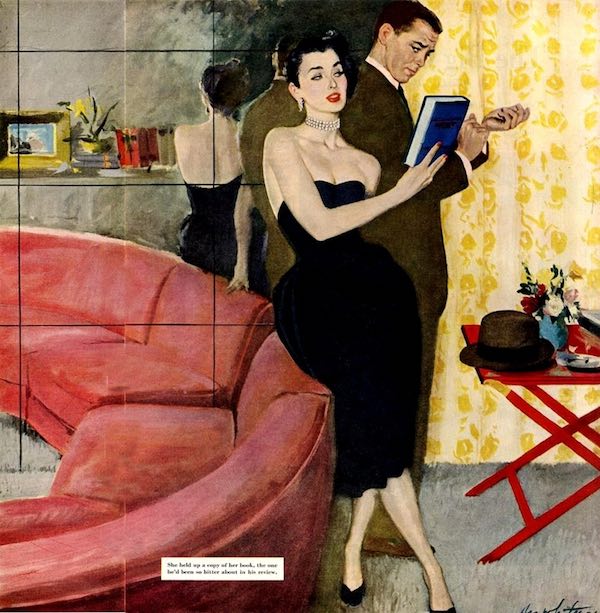
In this final example, Whitmore uses an unusual angle and the creative placement of couples to make an attention-grabbing design.
You can see more examples of Whitmore’s work on the Post’s web site: here is an analysis of his illustrations and the artist’s profile.
Become a Saturday Evening Post member and enjoy unlimited access. Subscribe now
Comments
I really love this week’s close-up look at Coby Whitmore, David. Your insights help me appreciate the images in a deeper way than I already do. The contrasts of style due to the Depression, World War II and after are important and fascinating to read about. Changing times and circumstances dictated a lot.
The Illustrator in America book is one I’d like to buy. Of all the images in this feature, I’d have to say Henry Clive’s is my favorite. I was not familiar with him before, but was/am with most of the others mentioned. I’m sure there are people that get Coby Whitmore and Jon Whitcomb confused. Their signatures are similar, but their styles aren’t.