Artists used to dream about painting a cover for The Saturday Evening Post. But there was a big difference between the printed covers America saw and the actual oil paintings created by Post cover artists.
The young Norman Rockwell said that his highest ambition was to paint a cover for the Post, which he called “the greatest show window in America for an illustrator.” The Post had the largest readership of any magazine and paid well, but most of all, its cover spot was culturally important. Readers studied and discussed the covers in homes all across America, and they were even used as teaching tools.
In the 1930s, a young art student in Minnesota wrote home about her classes:
[T]his is what they are teaching us to do here in Illustration. We are doing covers for the Saturday Evening Post, and everyone has a [Post] cover at their side which they consult and worship while working at their own sketch. ¹
Rockwell studied those early Post covers and daydreamed about his future:
I used to sit in my studio with a copy of the Post laid across my knees. “Must be two million people look at that cover,” I’d say to myself. “At least. Probably more. Two million subscribers and then their wives, sons, daughters, aunts, uncles, friends. Wow! All looking at my cover.” And then I’d conjure up a picture of myself as a famous illustrator and gloat over it, putting myself in various happy situations: surrounded by admiring females [and] deferred to by office flunkies at the magazines. ²
Rockwell and other artists could tell very little from the printed cover of the Post about the magic behind the scenes. What was required to create a successful Post cover illustration? Rockwell recalls that he spied on one of the Post’s most prolific and accomplished cover artists, J.C. Leyendecker: “I’d followed him around town just to see how he acted….I’d ask the models what Mr. Leyendecker did when he was painting. Did he stand up or sit down? Did he talk to the models? What kind of brushes did he use? Did he use Winsor & Newton paints?” ³
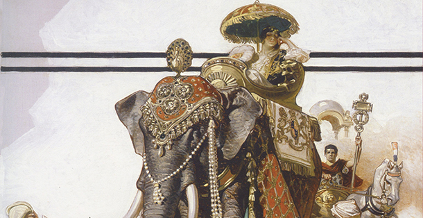
Today the internet gives us the ability to compare the original paintings with the printed Post covers, and enjoy the details that were lost in the printing process. First of all, we should note that the original paintings that were reproduced on the cover of the Post were far larger than the magazine — sometimes four or five times larger. Compare the size of these Leyendecker covers with the original paintings:


They were painted with oil paint on canvas, just like fine art in the greatest museums. Often, Post cover artists had been trained in a classical fine art tradition. Leyendecker, for example, trained in Paris at the Académie Julian.
Perhaps the biggest difference between the original paintings and the printed Post covers was that the original paintings were often done in bright, glowing colors while the printed covers were often muted and fuzzy. Compare this printed cover by Leyendecker with his original painting. We can see how the printed cover could impress the young Rockwell …

… yet it conveyed only a fraction of the talent in the original:

Leyendecker painted details with exquisite care, even though he realized that readers would never really be able to see or appreciate them.


Let’s compare another published version of a Leyendecker cover with the original painting.


Once again we can see a huge difference between the original painting and the printed version that showed up in mailboxes across America. Notice the care that Leyendecker invested in capturing the feel of the velvet in the man’s jacket, despite the fact that it barely reproduced with the printing technology of the day.

Note the flesh tones on Leyendecker’s cherubs and compare them to the published version.


Even the bone structure and flesh of the man’s hand is treated with great subtlety that few readers of the Post were likely to notice.


These extra touches required not only great talent and technical skill, but also extra time, which was precious for artists working under a deadline. Great cover artists like Rockwell and Leyendecker painted hundreds of covers under deadline. They must have been sorely tempted to cut corners; after all, the differences would not be apparent to the average Post reader. Leyendecker alone painted 322 Post covers, but he consistently maintained his high standards.
What motivated these great craftsmen to remain at their easel making the best art they could, despite the fact that it would not always be appreciated?
Illustrator Robert Fawcett once observed, “The argument that ‘it won’t be appreciated anyway’ may be true, but in the end this attitude does more harm to the artist than to his client.” These high personal standards are what made this elite group of artists so remarkable.
- Quote by author and illustrator Wanda Gag, from The Gag Family: German-Bohemian Artists in America by Julie L’Enfant. Top ↑
- Rockwell: My Adventures as an Illustrator Top ↑
- Rockwell: My Adventures as an Illustrator Top ↑
Become a Saturday Evening Post member and enjoy unlimited access. Subscribe now
Comments
As a kid. I admired Norman and the post covers being born in 1936 I have even copied one portray of huckleberry that’s was reported that it was never finished. As a portrait artist for charity only and hobby I am teaching some intercity kids some tricks of the trade. I’m a copiest so composition was not in ne
Hi my fiance and I aquired a picture /painting about 5 years ago I thought it was a Norman Rockwell,print I was sure and tucked it away in storage we clean out apartments and on occasion but abandoned storage units in our area it helps with our flea market sales hobby well we were moving some things around and I had sold an old trunk I had this work stored in I gave it a look and noticed some broader strokes on the outline,the when paying attention that is ,the clear change in materials used to create what I believe is a sketch to painting,well,I learned in my study of the work that it is titled “Trimming The Pie” created by J.C Lyendecker who quite often I have read I believe from your posts,sent his originals to,the art editor at “The Post”,at the time matted on board,framed,and directly resembling,what the cover would look like even with the header I believe,and in this exact dimension,I have looked print after print up online,and none seem to have this detail,color or outline flaws nor can I see clear use of charcoal,pencil,paint,sketch marks,color over but there,or the obvious shading and color change in the flesh that is clearly here on my example I want to send to you if you can help please do contact me on this email,or call me at 8285850847 my name is Melodie Christopher appriciate you time either way
Looking for story illustrator Robert W. Douglas. The story was first called Hog Rob,it is a picture very dark of a man wearing a hat with a boar by his side I was told the story title changed.I think it ran in the late 50’s I am looking for that illustration
Thank You
Jeffrey Wood
looking for story illustrator Robert W Douglas .The story was first called hog rob
it is a picture very dark of a man wearing a hat with a boar then I was told the story title changed I am looking for that post story with the picture I think it was in the 50’s or early 60’s
thanks
Jeffrey Wood