John F. Kennedy was elected president in 1960, at the dawn of a decade of great social change. The ‘60s became known for its civil rights, women’s rights and anti-war protests; it was the decade of the Beatles and of Woodstock, of bold new styles and artistic innovation. As Kennedy proclaimed in his inaugural speech, “The torch has been passed to a new generation of Americans.”
There are many different ways to view that great cultural transformation, but perhaps one of the best ways to visualize it is to compare two portraits of JFK himself—before and after his election—by Saturday Evening Post illustrators. What a difference a couple of years makes!
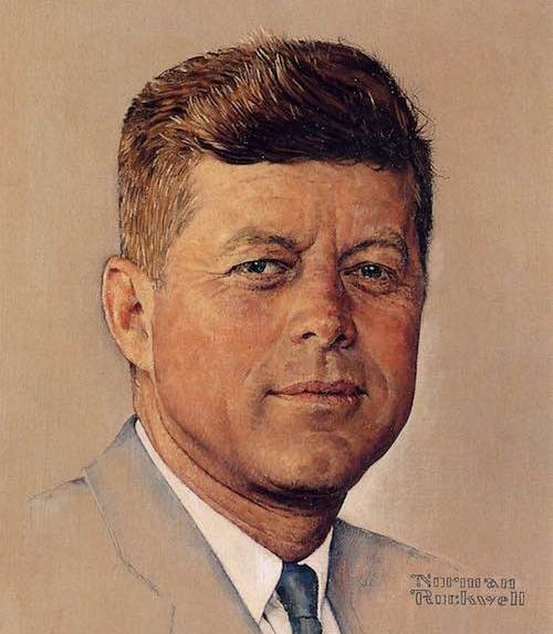
This first portrait was painted in the traditional style by Norman Rockwell for the cover of the Post in 1960, before JFK became president.

The Post had asked Rockwell to create portraits of both Nixon and Kennedy that year. Rockwell was nearing his retirement but went to the Kennedy family compound in Hyannis Port, Massachusetts, before the Democratic National Convention and began work on the cover portrait. Rockwell came to like Kennedy and ultimately voted for him, but kept his vote secret because the Post endorsed Nixon that year. Rockwell worked hard to make sure that his paintings of the two candidates were exactly equal, and no Post reader ever accused him of favoritism.
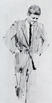
Even as Rockwell’s cover appeared on the newsstands, a bold new generation of illustrators was arriving on the scene. One of the most promising was the young Bernie Fuchs, whose fresh new style looked very different from Rockwell’s. Like Rockwell, Fuchs would go on to become an illustrator for the Post. In 1962 Fuchs was summoned to the White House to paint a new portrait of JFK.

I interviewed Fuchs about his experiences with JFK for my new art book, The Life and Art of Bernie Fuchs. Fuchs recalled that as the president began to pose, he looked the artist over and said doubtfully, “You seem awfully young to be such an important artist.” Fuchs, who had been sizing up the president from an artist’s perspective, was just thinking that Kennedy seemed awfully young to be president, but kept silent. What Fuchs did not find out until later was that the young president had just been informed that the Soviet Union had placed missiles in Cuba. In a few days, the world would be embroiled in the Cuban Missile Crisis. The torch had indeed been passed to a new generation.

When the portrait was completed, it had a vigorous, dynamic style that the president loved. He handed the portrait to his aides and said, “Go show this to Jackie.”
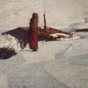
Fuchs went on to do several well-known portraits of JFK. When Jackie Kennedy died in 1994, it was discovered that she had kept two of Fuchs’ pictures in her personal collection. His art seemed to embody the youthful, robust mood of Camelot.


Note the dramatic contrast between Rockwell’s portrait of JFK in 1960 and Fuchs’ portraits just a few years later. These pictures trace the changes in American taste and culture during those years.
Rockwell looked over his shoulder and recognized that he wasn’t able to do what the new generation of illustrators did. Their materials and working methods were very different, and they worked much more spontaneously. Rockwell worked carefully and used many preliminary studies, while Fuchs seemed to have boundless energy and enthusiasm for experimentation. Not only that, but Fuchs worked in an era when clients encouraged experimentation, while Rockwell’s clients preferred a more classical look and had discouraged him from becoming too adventuresome.
When Fuchs first came to the big city as a young artist, his work attracted a lot of attention. Albert Dorne, the president of the Famous Artists School, identified Fuchs as the most promising illustrator of the new generation, so he arranged a lunch meeting in Manhattan to introduce him to Rockwell. In art as in politics, the torch was being passed to a new generation. Fuchs recalled that the two liked each other and respected each other’s work very much, but felt that they didn’t have much in common. The world was changing rapidly, and they were painting for two different audiences.
Fuchs went on to paint illustrations using wild angle shots and new materials.

We have unexpected photographic proof that Rockwell admired and appreciated the bold work of the next generation. A photographer snapped a picture of Rockwell in his studio standing by his wall of inspirational art by great classical artists. He has displayed the work of giants such as Michelangelo, Rembrandt, Dürer, and other great artists. But down in the corner we see that he has also displayed a picture by the new kid on the block, Bernie Fuchs.

Despite his age, Rockwell had the vision to appreciate timeless quality from any generation.
Become a Saturday Evening Post member and enjoy unlimited access. Subscribe now
Comments
Both great artists and portrayals of JFK. I just painted the monochrome JFK portrait by Fuchs. Turned out quite nice and I love his technique. He probably did it in an hour or two while Rockwell slaved months over his. Both are beautiful works.
I have an original, large, hand drawn portrait of President J.F. Kennedy. It is the one with him looking to the ground, with his hand in his pocket and signed by Bernie Fuchs. Could you please give me some information about it. Perhaps the Fuch’s family would be interested in it. ? Thank you. Lulu
Bob McGowan, Jr.– It’s fascinating to speculate about how a great talent such as Rockwell’s would respond if he were transplanted to a different era. You could well be right. The Post was so concerned about not offending its nationwide base, it really prevented Rockwell from addressing the changes of the 1960s, (especially civil rights). Fortunately, his move to LOOK gave us a glimpse of what was in Rockwell’s mind, and he did some very important work in his late years.
As you will see in the Bernie Fuchs book, while the Post was prohibiting Rockwell from addressing race relations, LOOK was commissioning Bernie Fuchs to go out and paint innovative portraits of Martin Luther King and other important African American leaders of the day. Rockwell must have chafed at that.
Thanks for your thoughtful comments, I can see you know this field well!
Skip Weiss– Thanks, there are dozens of these colorful stories involving the artists from that era. Some of the stories have been buried all these years and only seem to be surfacing now, as the artists pass away. Their personal scrap books and reminiscences are being reviewed for the first time by scholars and historians.
I know I’m going to really like it already. I can relax, learn, take my time, enjoy and just ‘lose myself’ for awhile with your book!
LOOK magazine was enriched during it’s final years by Norman Rockwell, and created a link with the POST the two magazines would not have had otherwise. One huge link they both had from about 1965-’67 was the upper cover portion (sometimes half!) just for the cover blurbs only. The covers were so similar, as to be almost interchangeable at that point.
I’m inclined to feel if Norman Rockwell was 22 in 1966 (instead of 1916) he would have started off doing what he was doing at 72, illustrative art on the social causes of the times I mentioned earlier.
He would have chronicled the tumultuous times over the past 5 decades that would have had more in common with many of the serious covers done during World War II than the mostly charming, warm, awkward situational everyday life covers he’s best known for.
That America was gone, including the means to even present such images. Rockwell would have been global/international in his art, but still primarily American. I believe a lot of it would have been consciousness raising for the environment, animal rights and exposing things that needed to be through his art. Some of his greatest work yet would have been after 9/11, in the 21st century.
Norman Rockwell’s quantity of work probably would have been less, but of equal quality. His art would still be admired and appreciated, but equally likely to bring tears to people’s faces as smiles. This is what the crystal ball tells me, David.
Nice story, David!
Thanks, Bob. I appreciate it. I’m quite proud of the book– 300 illustrations spanning a crucial period of American illustration, and a biography with a lot of colorful characters and events. I hope you like it.
A number of artists found more editorial freedom at Look, which was not as much a “general audience”magazine.
I can’t fault you for your preference; given a choice between Rockwell and Fuchs, you can’t go wrong. It’s interesting, Fuchs started out doing hyper-realistic car paintings in the 1950s, before going wild in the 1960s. I wonder how Rockwell would have reacted if he came of age in the 1960s?
Really great article David about Bernie Fuchs, Rockwell, JFK and how they all tied in with the ’60s. I really appreciate the book link too, thank you so much. I’m ordering it soon as possible. It will go nicely with my ‘Art of Bob Peak’ book from 2013. I love both portraits of JFK, but would still pick Rockwell’s if I HAD to choose.
It’s interesting too that both Rockwell and Fuchs did work for LOOK magazine during the mid-late ’60s. I love the illustration above Fuchs did of JFK for LOOK, and Norman Rockwell’s Peace Corp cover. Rockwell’s work depicting race relations is largely unknown today, like his beautiful Moon Landing work for LOOK in 1969 as well.