Norman Rockwell and the Post: A Fruitful Relationship
© SEPS
My grandfather once said, “The Post is my best and only opportunity to express myself fully.” He liked to come up with his own stories and tell them his way — and the Post covers were the best way for him to do that. With other illustration work, he was forced to rely on and stay true to someone else’s story. Without the unique opportunity that The Saturday Evening Post presented to him for so many years, it could be argued that Norman Rockwell would not have evolved into the incomparable and beloved storyteller we know today.
Pop, as we called him, always wanted to become a great illustrator — he was driven from the moment he started sketching while his father read Charles Dickens to the family, and later studying the work of other artists: “You start by following other artists — a spaniel. Then, if you’ve got it, you become yourself — a lion.”
His dream was to do a cover for The Saturday Evening Post, but he was haunted by doubts. Only the very best, like J.C. Leyendecker and Coles Phillips, did covers for the Post.
He began to sit alone in the studio he rented with his friend, the noted cartoonist Clyde Forsythe, a copy of the Post spread out before him, allowing himself to dream. He dared to visualize a picture he had painted on its cover. He imagined how many people would see it — one million, even two million? He pictured his name in the lower-right-hand corner. What would it be like if he were the man he wanted to be, a famous illustrator, adored by female fans, his covers displayed on newsstands and tucked in the mailboxes of families around the country? He pictured children fighting over who would get to see the cover first and explore all its details. He even saw himself dining with the Post’s larger-than-life editor, George Horace Lorimer.
One day Clyde found him on the sofa, suffering over the fact that none of this was even close to becoming a reality. Clyde had to convince Pop that he was indeed good enough to attempt a cover. Don’t be intimidated, he said: “Lorimer’s not the Dalai Lama.”
So my grandfather got to work. Two ideas came to him, conjured up from the kind of covers he had admired on the Post. The first was a Gibson Girl kind of painting with a dashing man bending over a sofa to kiss an irresistible, but removed, high-society woman; the second, a young ballerina bowing before an audience in a dramatic spotlight. Clyde took one look at the paintings and exclaimed dryly, “C-R-U-D.” The ballerina, he said, looked like a “tomboy who’s been scrubbed with a rough washcloth and pinned into a new dress by her mother. Forget about what you think the Post is looking for and paint what you do best — kids.”
Pop followed his friend’s advice, completing several paintings and rough sketches to take to the offices of The Saturday Evening Post. For his big meeting, my grandfather bought a brand-new black hat and new suit in a fashionable gray herringbone tweed. He had a custom-made “suitcase” created to take the paintings on the train to the Post in Philadelphia. The problem was, the case looked more like a small black casket. Despairing thoughts followed him all the way. But miracle of miracles, Lorimer accepted two finished paintings and okayed three sketches for future covers. His first cover, Salutation [also called Boy with Baby Carriage], would appear on the cover of The Saturday Evening Post on May 20, 1916 — Pop was only 22 years old.
My grandfather used one of his favorite models, Billy Payne, for all three boys in this first cover. The boy pushing the pram is fully realized and rendered, but the other two boys are poorly done. He should have used three distinct boys to model for the painting. And the dark hollow of the pram and barely visible baby were probably the result of nerves. Pop must have been anxious about painting his first Post cover and perhaps couldn’t quite deal with getting an actual baby as a model with its very real wriggling and crying to contend with.
April 16, 1927
© SEPS
In later years, he often recalled the fun and hard work of pitching his ideas to Lorimer. He would place the sketches in front of Lorimer on his desk and then act them out to bring the whole picture and story to life in an exciting way:
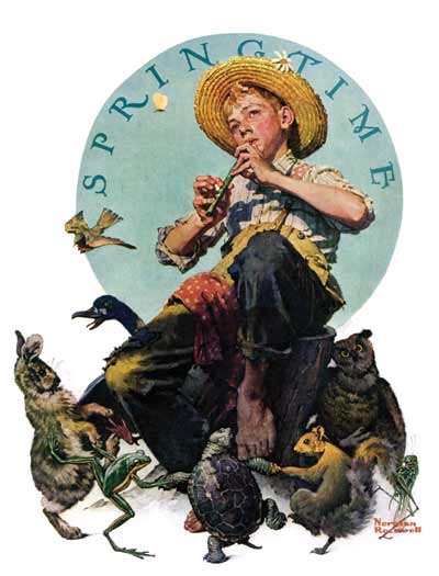
I’d get up from the chair, shake myself and point to one of the sketches on the desk. “Springtime,” I’d say, “a little boy perched on a stump playing a flute.” And I’d sit on the edge of a chair, pull up my legs from the floor in a graceful pose, and make believe I was blissfully blowing a flute. “The kid’s happy,” I’d say. “It’s spring. The sun is warm upon his neck; the bees are buzzing in the flowers. And the little animals are dancing in a ring about the stump. A rabbit, a duck, a frog” — I’d kick up my heels and dance around the chair — “a turtle, a squirrel, an owl, a grasshopper. It’s spring. Everybody’s joyful.”
“Good,” Mr. Lorimer would say, scribbling OKGHL on the side of the sketch.
That particular sketch ended up as Springtime, 1927, the April 16, 1927, cover [above].
My grandfather’s time at The Saturday Evening Post can be divided into three periods corresponding to the three editors, along with one significant art editor, who oversaw the magazine until my grandfather quietly resigned in 1964. The first period, of course, was dominated by the commanding presence of Lorimer. Pop remembered always being greeted by Lorimer standing behind his desk, silhouetted by the light from the two expansive windows behind him. “The Great Mr. George Horace Lorimer, the baron of publishing,” as my grandfather would affectionately refer to him, had a strength and unwavering decisiveness that Pop so admired. Lorimer’s square jaw and commanding eyes projected power softened with kindness. Over the years, Lorimer became a father figure and mentor to my grandfather, even as Pop remained somewhat in awe of the man. (He even sought Lorimer’s approval when marrying his second wife, my grandmother Mary.) When Lorimer resigned in 1936, it was the end of an era.
The second period was a short and difficult one for Pop. Always in fear of the Post dropping him at any moment despite his growing fame, he felt even more precarious when Wesley Stout came on board as editor, succeeding Lorimer. Stout lacked Lorimer’s decisiveness. He seemed to look for what was wrong in each of my grandfather’s paintings instead of what was right. This whittled Pop’s confidence down until he didn’t feel good about any of the work he was turning in.
But five years later, Ben Hibbs replaced Stout as editor. He was a Midwesterner, much more casual, and he genuinely liked my grandfather’s work. He resurrected The Saturday Evening Post at a time when the magazine desperately needed it. He had the cover redesigned so that full paintings were shown, not just vignettes of one or two people with almost no background. The logo was streamlined into a more modern font in the top-left corner. This freed Pop to take his stories to a whole new level of detail, atmosphere, and character. And Hibbs supported Rockwell. He was the one, after all, who enthusiastically accepted and championed the Four Freedoms, publishing them inside the Post after the government rejected them. (The government would later relent, touring the paintings around the country to raise money for war bonds. The exhibition would raise more than $132 million.)
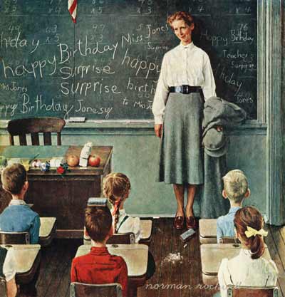
March 6, 1948
© SEPS
While Hibbs was editor, Ken Stuart came in as art editor in 1945, muddying the waters somewhat. He is credited with changing the direction of the content of the covers, moving them toward the celebration of America and loftier, more expansive ideas. But Stuart was a small man with a tremendous ego; he wanted to dictate ideas to his artists and control them. He had been an illustrator himself before becoming an art editor and perhaps felt entitled to have that much input. But my grandfather felt that Stuart over-directed at times. Their relationship was conflicted at best. The low point in their working relationship came when Stuart went so far as to paint a horse out of one of Pop’s covers, Before the Date, September 24, 1949, without telling him.
Pop threatened to leave the Post. And my grandmother, Mary, was absolutely furious; she had never liked Stuart. But things settled down after it was arranged that Bob Fuoss, the managing editor, and Hibbs would oversee all matters regarding my grandfather. Pop’s attitude then seemed to soften toward Stuart. He even did what he could to butter him up, inviting him to my parents’ New York City wedding in the ’50s.
© SEPS
Still, that long-ago bitterness between the two men lingers today. Stuart claimed that Pop “gifted” several paintings to him, Saying Grace, The Gossips, and Walking to Church. No communications were found from my grandfather to Stuart other than Pop asking for his paintings to be returned in the ’50s and Stuart refusing this request, citing company policy. My grandfather felt that Stuart simply took the paintings out of the Curtis building one day and held on to them. The Stuart sons recently sold Saying Grace, my grandfather’s most popular cover, and the two other paintings at Sotheby’s for $57.3 million, a figure that would have astonished and probably embarrassed my grandfather.
Most people today do not realize that during Pop’s tenure, The Saturday Evening Post prohibited its artists from painting people of ethnicity in any role other than a subservient one. This never sat well with my grandfather. He would sneak African Americans and people of other ethnic backgrounds into his paintings where he could — Statue of Liberty, July 6, 1946, for example. He cleverly turned this policy on its head in his December 7, 1946, cover, New York Central Diner. In it, a young boy in the train’s dining car is trying to figure out the check. But it is an African-American man, the waiter, who is the heart of this painting. The viewer’s eye goes to him because his presence is so immediately felt; he radiates such kindness and amusement at the boy’s dilemma.
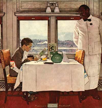
December 7, 1946
© SEPS
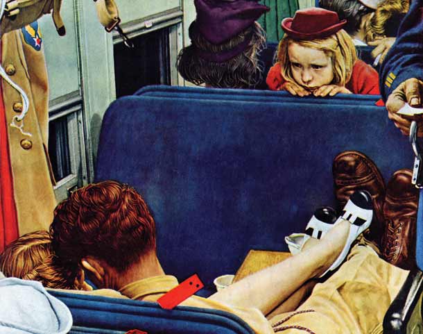
In my grandfather’s paintings, everything is said without words. The entwined legs of the two lovers in Voyeur, August 12, 1944 (page 39), reveal a quiet, unspoken, and immediate intimacy — and are the most prominent visual — though the little girl in red sneaking a look at them is sharing in their secret. It is one of my grandfather’s more intimate works, yet it takes place in a very public space, the brightly lit passenger car of a train. This contrast makes the cover touching and effective. The exposing overhead light doesn’t matter to the two lovers who are in their own private world, not even noticing the little girl leaning over the seat in front of them. We feel we are an amused, unseen observer on that train. Note the contrast between the young woman’s polished, stylish shoes and the soldier’s lived-in service boots.
Like Van Gogh, Norman Rockwell was a master of shoes. Shoes can sometimes reveal more about the real life of a character than the face — the wear and tear, even with a good polish, still remains. One could say that the sole reveals the soul. Faces can hide aspects of personality through façades, cosmetic artifice, glasses, expressions, etc. There are many instances of Rockwell’s quiet focus on shoes in the Post — Breaking Home Ties, Tattoo Artist, Rosie the Riveter, The Game (April Fool 1943), New Year’s Eve, Willie Gillis Home on Leave, Hat Check Girl, The Cover Girl (Double Take), Dreams of Long Ago, Star Struck (Boy Gazing at Cover Girls), First in His Class, Full Treatment, Bookworm — as well as in advertising such as Crackers in Bed from the Edison Mazda series, and the list goes on and on. Bookworm actually shows a man wearing two entirely different shoes — a perfect, subtle way to show that this man is in his own world and too distracted to worry about matching shoes!
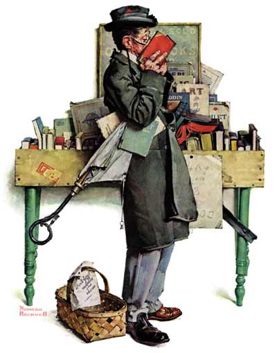
August 14, 1926
© SEPS
My grandfather loved to paint older people and children because of the clear contrast they represented: the old visited alongside the new, the unrelenting process of aging that we all have to move through. An older face reveals the trials and tragedies of a full life. There is either a softening or hardening of the features that occurs over time and forever etches itself onto the face — less artifice, even less of an attempt to hide the truth, the failures, the secrets and dreams. Children have an essential purity of reaction and an often unsuppressed sense of play, adventure, and possibility.
Pop always wanted to “get the feel of a place” that he was going to paint. He searched for the smallest details that would make his picture “ring true,” including the actual attire, props, and accessories of the period. That is what makes it so much fun to explore his paintings. Every detail is carefully chosen, a clue, a secret that is connected to the story. He was a “method” actor and director before anyone knew what “method acting” was. Many of his paintings and covers became a sort of sense memory exercise, capturing the atmosphere of the scene he had immersed himself in — whether the smells, sounds, and visuals of a prize fight in New York City or a blacksmith’s shop in a small town in Vermont.
© SEPS
All great art is a search for what is true. And Pop’s entire career was bound up in completing that search. In one example, he spent hours in Louisa May Alcott’s home for his series on Little Women, exploring the attic where she used to do her writing and contemplation. In another, he traveled to Mark Twain’s childhood town of Hannibal to prepare for illustrating Tom Sawyer and Huck Finn. He even went to the extreme of being left alone in Tom Sawyer’s famous cave, where he sketched alone by the light of a flickering lamp.
Rockwell’s vivid imagination was the engine that drove him all those years, an imagination that never tired. But it was often a constant struggle because of periods of self-doubt, and the fear that there was a lack of expansion and growth in his work. It is indeed a revelation to see the progression of his work — to see his vision, technique, and storytelling skill deepening and expanding over the 322 covers he did for the Post between 1916 and 1964. One marvels at his refusal, successful as he was, to stay in one place.
Yet, even as he grew as an artist, his core values never changed. Through almost half a century with The Saturday Evening Post, his work was always rooted in his central belief in the goodness in people. His message: We are struggling, celebrating, learning, and growing each day, and we are all in this together. That is what lives in the best of my grandfather’s work and in the best of all of us.
“It is no exaggeration to say simply that Norman Rockwell is the most popular, the most loved, of all contemporary artists,” Post editor Ben Hibbs said. “While the face of the world was changing unbelievably, Norman has amused, charmed, and inspired a great many millions of Americans. The fact that he has managed to capture the hearts of so many people is easy to understand when you know him, for somehow Rockwell himself is like a gallery of his paintings — friendly, human, deeply American, varied in mood, but full, always, of the zest of living.”
Click images to enlarge:
August 12, 1944
© SEPS
April 16, 1927
© SEPS
March 6, 1948
© SEPS
December 7, 1946
© SEPS
September 25, 1954, © SEPS
August 14, 1926
© SEPS
© SEPS
March 6, 1954.
© SEPS
March 17, 1956
© SEPS
March 15, 1958
© SEPS
August 22, 1953
© SEPS
Norman Rockwell and Faith
My grandfather has been called a “nonbeliever.” Nothing could be further from the truth. Norman Rockwell didn’t go to church as an adult because of his early church experiences as a boy, but he was always very respectful of and moved by religion. He had his own quiet faith.
His parents were Episcopalian and deeply religious. My grandfather was forced to go to church and participate as a choirboy at every church the family attended. He and his brother, Jarvis, were forbidden to play with their toys on Sunday — they weren’t even allowed to read the funny papers. If his mother — who was a hypochondriac and a bit of a hysteric — wasn’t feeling well enough to go to church, the family would sing hymns at home. But most of all, it was the “underside of church life” which revealed itself in those formative years and left Pop with lasting impressions that stayed with him and forever affected his relationship to church, faith, and his outlook on life.
As a choirboy, Norman Rockwell was required to sing at four services on Sunday and rehearse four times a week, including a dress rehearsal every Friday night. He remembered each of his choirmasters vividly. One was a tyrant who bullied and threatened the boys to make them sing like “little angels.” He would shoot the hymnbooks off the top of the piano at them with remarkable precision when they sang off pitch or an incorrect melodic phrase. Another choirmaster would come to rehearsals drunk.
Pop recalled the sexton swearing and grunting as he polished the altar cross with a dirty cloth. He remembered having to dress up in Spanish-American War uniforms to participate in holiday parades. As the smallest boy he would have to self-consciously march all by himself carrying a wooden gun at the very end, the little lone caboose — “the high private in the rear rank,” his father used to say. The man in the motorcar behind him would prod him with a “cowcatcher” to keep him in step. As humiliating as this was for Pop, can’t you just see it as one of his paintings?
Once he was trapped in the belfry with some of the other boys when they accidentally were locked in by the sexton. They had been teasing the girls from a nearby wayward home. It was hours before anyone understood that their screams and waves were not playful hellos but cries for help.
On top of everything else, he and his brother had to walk through a slum with rocks in their hands to get to church and were taunted by gangs of boys and the drunks that would sometimes lurch out at them. In Mamaroneck the church paid Pop $1.50 each week, but his mother made him return the money—something that really irked him, even many years later. That seemed very unfair to my grandfather — he felt he had earned it.
You can begin to get an idea of someone’s faith by reading their personal letters and observing what items they surround themselves with. My grandfather would sometimes sign his notes with “God bless us all.” It is interesting to note that Pop placed two Madonnas in their own special niches in his studio. One overlooked where he painted, the other was by the door over the sofa that he would sometimes take naps on. One of those Madonnas is a hand-carved statue from Peru. He also had a Buddha from Siam. He had a phonograph in his studio at one point and would sing along with a recording of hymns at the top of his lungs all by himself.
© SEPS
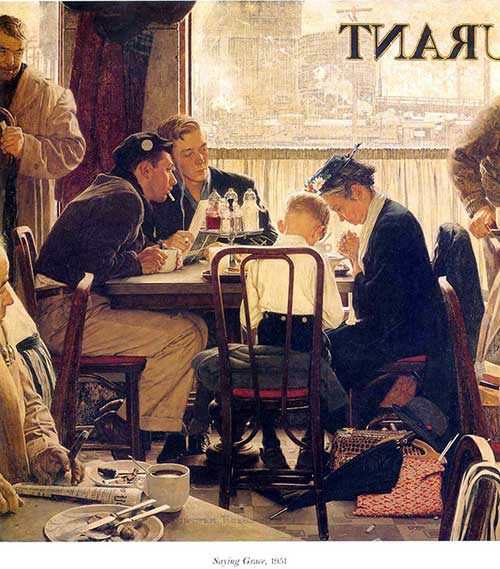
Saying Grace is perhaps my grandfather’s most beloved painting. He painted it in 1951 for the Thanksgiving cover of The Saturday Evening Post. A woman in Philadelphia wrote him about seeing a Mennonite family saying grace in an automat. The image really expresses my grandfather’s attitude — curious, respectful, and accepting but also suggesting that that kind of religion is something of the past. He placed the scene in a shabby railroad restaurant instead of an automat — my grandfather loved the romance of train stations, transition points of many hellos and goodbyes, arrivals and departures, a story in each.
The myriad and clarity of detail in the painting is a wonder and each one is carefully chosen. There is a quiet order in the midst of chaos: the variety of baggage, each person with a different coat and hat — a unique visual identity — the tableware, the cups of coffee. The newspaper in the lower left-hand corner grounds the painting with a sense of time marching forward, just as the background outside the window speaks of the industrial progress that keeps driving forward. Yet the carpetbag beside the old woman speaks of a very different time, the umbrella indicates impending rain explaining the slightly gloomy overcast light that Pop chose. He could have made it a sunny day with a tree and a nice neighborhood outside the window. Instead there is a deeper, silent meaning to this image, which I think can be missed.
The focus of the painting is the boy — a symbol of the innocence and purity of childhood — in the middle of the crushed cigarettes and the debris on the floor, and all the older men who have wised up to life or rather, by their world-weary faces, it seems life has schooled them the way life often does. The boy is the only one with his jacket off. The white shirt draws the viewer’s attention to him. My grandfather understood the beauty and vulnerability of the nape of a child’s neck as any parent certainly does. The old woman is the symbol of a bygone era. Her white scarf ties the two together visually just as their aligned body language does; the boy leans toward her and their faith. Their clothing is out-of-date. Pop bounces light off of the evenly placed fork and knife at the bottom of the picture and that reflection leads the eye once again to the boy and the old woman. The various stares also draw the focus towards them. His cut-off signature playfully mirrors and balances the cut-off “restaurant” sign in the window.
“The people around them were staring, some surprised, some puzzled, some remembering their own lost childhood, but all respectful. If you actually saw such a scene in a railroad station, some of the people staring at the old woman and the boy would have been respectful, some indifferent (probably a majority), some insulting and rude, and perhaps a few would have been angry. But I didn’t see it that way. I just naturally made the people respectful. The picture is not absolutely true to life; it’s not a photograph of an actual scene but the scene as I saw it.” —Norman Rockwell in My Life as an Illustrator
The man posing with the cigarette was Don Winslow, who studied with Pop at the art school my grandfather organized one summer in Vermont. Winslow remained in Vermont afterwards, living in the one-room schoolhouse on the green and acting sometimes as Pop’s assistant. He was talented but troubled. The man next to him is my Uncle Jarvis. Gene Pelham, one of Pop’s photographic assistants, is the man with the paper and cigar.
My grandfather’s favorite poem really says all you need to know about his faith:
Abou Ben Adhem by Leigh Hunt
Abou Ben Adhem (may his tribe increase!)
Awoke one night from a deep dream of peace,
And saw — within the moonlight in his room,
Making it rich, and like a lily in bloom—
An angel writing in a book of gold.
Exceeding peace had made Ben Adhem bold,
And to the presence in the room he said,
‘What writest thou?’ — The vision raised its head,
And with a look made of all sweet accord,
Answered, ‘The names of those who love the Lord.’
‘And is mine one?’ said Abou. ‘Nay, not so,’
Replied the angel. Abou spoke more low,
But cheerly still; and said, ‘I pray thee, then,
Write me as one that loves his fellow men.’
The angel wrote, and vanished. The next night
It came again with a great wakening light,
And showed the names whom love of God had blest,
And lo! Ben Adhem’s name led all the rest.
Perhaps we can all take a cue from my grandfather — it is far more important to respect someone else’s faith than to judge and condemn them for it. Goodwill toward one another is the compass he followed.
Blessings,
Abigail
P.S. It is interesting to note that when the painting was reproduced on the SEP cover, significant portions of the painting were cut off — the faces of the two men on the left and the “U” of the “restaurant” sign in the window in addition to more details on the right were left out. The color was also changed from a sepia-toned theme to a brighter tone with more blue in it. Pop used to complain about this — his work would sometimes be noticeably changed from the original. I believe the fact that his work was seen in reproductions and not in the original form for so many years is one of the main reasons my grandfather’s work was undervalued for so long. The reproductions simply don’t come close to capturing the clarity of detail, technique and color tone.