Read all of art critic David Apatoff’s columns here.
The artists of the Saturday Evening Post were sometimes called upon to paint brand-new subjects that had never been painted by traditional artists.
Most of the Post’s illustrators were formally trained in perspective, anatomy, and the other technical skills of art. They learned to paint portraits and landscapes and bowls of fruit. But painting for a weekly periodical is not the same as painting for a gallery or museum. During the long domain of the Post, new inventions such as the radio, airplanes, refrigerators, and televisions were introduced as important phenomena in the daily lives of Americans. When they debuted, they had to be illustrated for the pages of the Post.
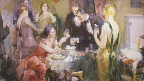
This 1929 painting by artist Walter Biggs suggested that the most elegant black-tie parties would benefit from having a Frigidaire-brand refrigerator in the living room so the guests could have ice cubes in their drinks:
There were no paintings by old masters to serve as models for these modern illustrations. Rembrandt never painted a skyscraper or an electric fan. The Post’s artists had to make it up as they went along. Painting the physical object was difficult enough, but the real challenge was to anticipate the cultural significance of the new inventions. What role would they serve? How should they be portrayed?
There’s no better example of this than the early illustrations of cars. It was clear from the very beginning that every family would want a car.
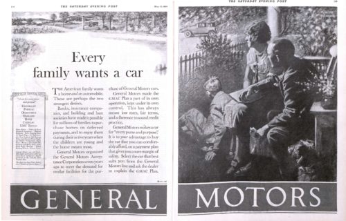
This 1925 illustration by artist M. Leone Bracker depicts a family on their front porch enviously watching their neighbors’ cars drive by. They are stranded, staring while their neighbors have been freed by their automobiles to go “everywhere.”

Before the public had figured out the best ways to use this strange new invention, or even how they preferred it to look, illustrators for the first car ads had to decide on the best way to portray cars.
Some artists tried to relate cars to classical mythology, depicting gods of speed or flight.
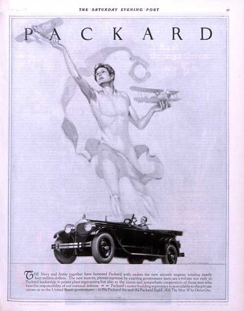
Other artists linked the automobile to modern art and design, which was born around the same time as cars.
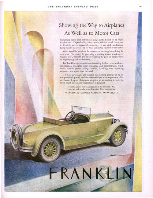
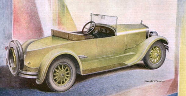
Illustrator E. Everett Henry (1893-1961) painted this early car in an idealized, art deco style for the May 29, 1926 issue of the Post. Thirty years later when people understood cars better, Henry would illustrate a car as a commonplace everyday nuisance, driving too fast through family neighborhoods.
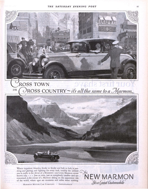
Some illustrators tried to have it both ways, portraying cars as an invention for both the city and the country markets.
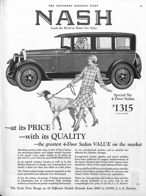
Of course, artists through the ages have always been able to promote products by placing an attractive woman in front of them, even if she has no connection to the product itself:
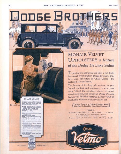
For a brief period, the Dodge Brothers Company apparently believed the best way to advertise cars was to show paintings of their “mohair velvet upholstery,” which was supposedly comfortable to sit on while watching parades. This campaign did not last long.
A wide variety of artistic talents tried their hand at creating the visual identity of cars. Some of the top illustrators in America who illustrated covers for the Post and other magazines would also paint ads for the auto manufacturers.
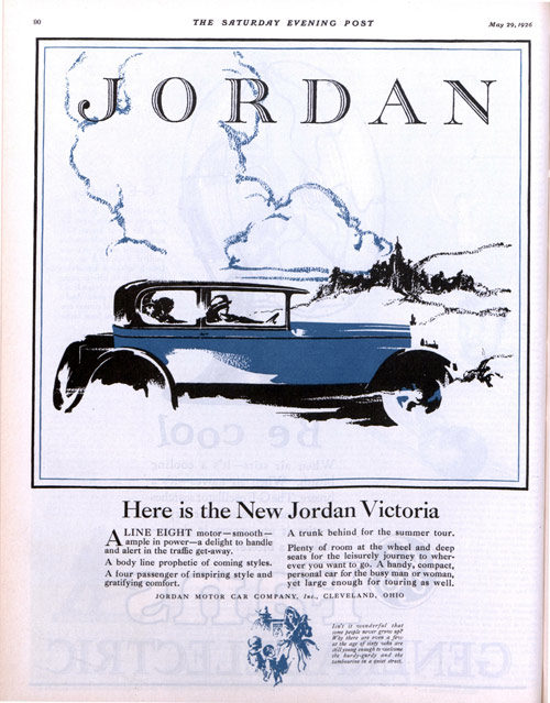
In the following picture, an unknown illustrator has left out all the details, giving us just a simplified suggestion of a car. By only implying what the car will do, he leaves it up to his audience to fill in all the details in their minds and imagine how great their new car will be:
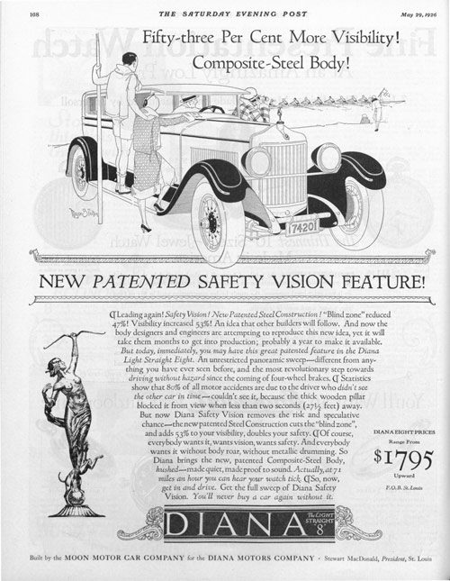
In the next example, the illustrator Major Felten (1904-1975) treads very carefully, drawing the car objectively with a light, realistic line. Felten became well known for his bold, exciting paintings of jungle cats and savage warriors, which he created with a heavily stylized look. By comparison this plain vanilla illustration looks timorous, as if he hasn’t quite figured out what to make of this new invention.
Note how many different car companies flourished in those early years as designers and manufacturers experimented with how the new invention should look and function. At the same time, creative artists were offering many different approaches to artistic interpretations of the automobile, giving us this diverse collection of creative pictures. While the artists’ impressions of a car have changed dramatically in the last hundred years, we can still see in these early efforts the same factors that motivate car buyers today— status, luxury, safety, comfort, value, beauty, and good old Fear of Missing Out.
Become a Saturday Evening Post member and enjoy unlimited access. Subscribe now


Comments
David, I sent you a Christmas card back on Dec. 10th to the Post, and hope you received it being forwarded not long after. In addition to the card was a photocopy of the enthusiastic July 18, 1988 reply letter to me from Pontiac Motor Division’s ad agency, DMB&B, regarding the famous ‘AF VK’ ad series of 1959-1971.
Your jaw will drop at how different times were then, and how this would/could never happen today. I was invited by Van Kauffman and his wife to their home off Beverly Glen to see his amazing studio and the original Pontiac ads that were then reproduced for Post, LIFE and Look magazines. In my 4/17/18 comments here I mentioned he painted the gorgeous locales and the people, and occasionally drew himself into the ads. Several hours flew by, and when I felt it was time to leave, I was invited to stay for dinner!
Mr. Kauffman passed away in the ’90s. I met Art Fitzpatrick at a GM car show in 2010 I knew he’d be attending and I told him about that meeting 22 years earlier. He shook my hand and said “So YOU’RE Bob McGowan!” with a smile. I was surprised at first, but told me I made quite an impression on Van and his wife years ago, and they never forgot me. I was touched and had no idea. I felt bad for not keeping in touch after that.
He explained to me how he’d intentionally “exaggerate” the proportions of the cars to give them a sense of fantasy photography didn’t allow. I actually knew that from my visit with Van and how they coordinated together for the perfection these ads delivered. I kept in touch with him over the phone occasionally until he passed away a few years ago in his late 90s. I’d also bought some artwork from him as well.
These ads were definitely art of the Post too, up until 1968. Anyhow, if you didn’t get this amazing letter, let me know, and I’ll try and send it to you more directly!
Thanks David! The Post just put up a feature from their awesome new ‘Automobile’ softcover book on Harley Earl in ‘The Ultimate Car of 1954: Big Fins and More’ that I JUST put some comments on. It had me look here again.
It’s interesting to me Cadillac was one of the first auto manufacturers to go over to photography almost exclusively for their ads, starting after World War II. Pontiac though, used artwork as late as 1971 when it had long been replaced by photography by everyone else. I met both artists, Art Fitzpatrick who painted the cars, and Van Kaufman who painted the background and the people, in 2010 and 1988 respectively.
GM was KING back then, and flew them to exotic locales all over the world (mainly Europe) to create those fantastic ads! If you have a story on that sometime, I’ll have comments—for sure.
Bob McGowan– Once again you have a lot of expertise to contribute. I’ve never heard of the Diana either, but if you flip through the pages of the Post from that era, you’ll see dozens of car manufacturers that we never hear about today. There were apparently a lot of casualties on the path to the brands we have today.
Your point about the Walter Biggs is at the heart of what interests me here. How do you combine a new product, like a metal, geometric ice box, with traditional classical art subjects like people or draped cloth? It sticks out like a sore thumb, and ruins the integrity of the composition unless the artist takes steps to humanize and integrate it. Illustrators were still feeling their way here, trying to figure out just how painterly they could get with mechanical objects, and how blatantly they could sell their subject matter when their art is not being commissioned by a church or a king, but rather by a manufacturer.
Well, these artists ventured into uncharted waters very successfully illustrating the myriad of newly invented products (mentioned) at the beginning of the 20th century, with the auto ads being the big ticket items.
The Walter Biggs illustrated Frigidaire ad at top, though beautiful, almost has the product too blended in to be effective as an ad. There must be an ad copy portion below with a picture of the fridge, right?!
There were certainly plenty of varied style ads for autos in 1926. The two-page GM ad at top (right side) almost looks like photography until you enlarge it. Very clever ‘desire creator’ not specifically advertising any car line. Being able to go “everywhere” is a very powerful message, and you can see from this family’s expressions and body language, they’re perfect candidates for a new Chevrolet (?) perhaps, to enter the GM family.
I love the Franklin ad most of all, with it’s use of art deco and perfect colors to complement the car, Interesting how the rear end is ‘V’ shaped. The Marmon ad is cleverly two ads in one.
The woman walking her dog in the Nash ad doesn’t have anything to do with the car, yet she does. She fills in the space perfectly with some ’20s sex appeal, and gives the people in the Nash something to smile about. It made me smile too.
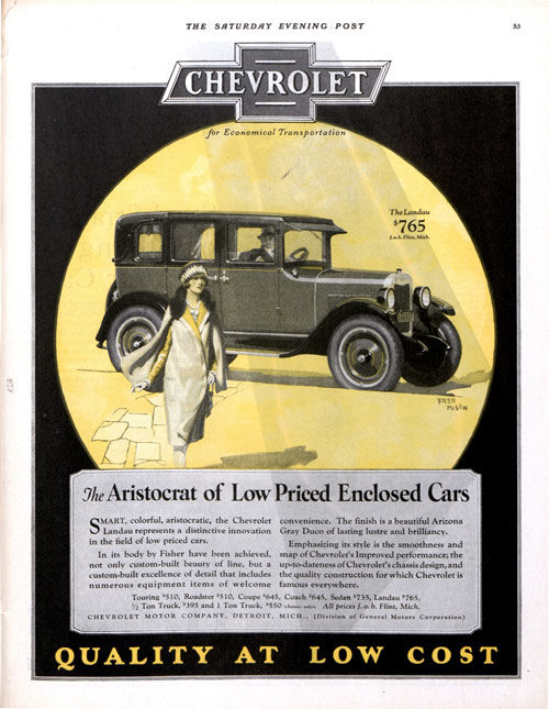
I like the ad copy in the Chevrolet ad more than the picture. The man’s looking at the woman, but neither look happy. Probably true to life, but this is an AD! As the head of the ad department, I would have had the picture portion revamped/redone or scrapped altogether.
The Dodge ad is emphasizing comfort almost exclusively, which is fine. Most ads incorporate that into their conventional ads. Here they REALLY wanted you to know about that mohair velvet upholstery!
The Jordan ad is fantastic! An outrageously beautiful car. Details of the running boards and rear tires and wheels are either left out for our imaginations, or are there—–covered up as it speeds through the snow.
Then we end with the Diana. I’ve never heard of this make before. It’s really gorgeous. Too much so not to have had a stronger illustration depicting it. The people and how they’re posed isn’t so hot either. All in all though, they’re a pretty superb set of ads, David.