Managing editor and logophile Andy Hollandbeck reveals the sometimes surprising roots of common English words and phrases. Remember: Etymology tells us where a word comes from, but not what it means today.
This column is normally about words, but this week I’m focusing on something word-adjacent: punctuation. Why punctuation? Because tomorrow, September 24, is National Punctuation Day, a celebration begun in 2004 to encourage the correct use of punctuation. (Ironically, the day is often “celebrated” by posting pictures of misused punctuation.)
While you have an array of symbols and punctuation at your fingertips on a standard computer keyboard, those aren’t historically or internationally the only punctuation marks available to you. Some of the following punctuation marks are basically obsolete, and some aren’t used in the United States, but most of them, if you have the patience to hunt them down, are still available to you in a standard, full-sized font set like Times New Roman.
« Guillemets »
Some European-minded readers might object to my calling guillemets an unusual punctuation mark, and they would have a point. Guillemets are what French writers use instead of quotation marks, but they’re used in exactly the same way.
«You mean like this?» asks Jean-François.
Yes. Like that.
Guillemet is a diminutive of the name Guillaume — “William” in English, making the punctuation marks “little Williams.” They’re said to have been named after the 16th-century French typecutter Guillaume Le Bé, who is supposed to have invented the marks.
❧ Hedera
Back in the days of ancient Greek and Latin, when the raw materials for creating written texts were rare and expensive, wasted space was wasted money. Where there was a change of subject, a new speaker, or a new stanza of poetry, they didn’t just start a new line of text like we do today. They dropped in a symbol to indicate the shift instead and then kept writing on the same line. The hedera was a common symbol to use.
Hedera is the Latin word for “ivy,” which is essentially what the symbol looked like. It’s also called the fleuron, from the Old French floron “flower.”
Not only was it useful for the reader to understand that something had changed, but it was a small opportunity for the more artistic scribes to show off their creativity. Though there’s no standard look of a hedera today, it usually appears as a heart-shaped leaf with a little vine attached to it.
☞ Manicule, or Fist

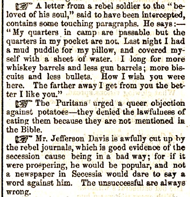
I like to think of this as the first emoji. This little pointing hand went by many names — fist, bishop’s fist, printer’s fist, mutton fist, pointing hand, and others. The most hoity-toity name was manicule, from the Latin manicula, which simply means “small hand.” But whatever it was called, it was a standard character in old printing presses.
This little hand was used to point out important information, and you might recognize it from the U.S. Postal Service’s “Return to Sender” stamp. In the mid-1800s, The Saturday Evening Post used it to separate short items in its weekly “Latest News” section.
¶ Pilcrow
The pilcrow is, in a sense, what the hedera evolved into. It too was a marker of a shift in subject, speaker, or stanza, but it has remained more useful and used in modern text.
In Medieval Latin, it was called a paragraphus, going back to the Greek paragraphos, from para- “beside” and graphein “to write.” This became the Old French paragraf, which made its way into English around 1500 and eventually became paragraph, indicating not the symbol itself but the block of text the symbol was meant to set off.
But it just so happened that a second, variant Old French spelling of paragrafe — pelagraphe — was fairly common. This made it into English as pelagreffe, which in Middle English was transformed onto pylcrafte, under the influence of the English word craft. This eventually morphed into pilcrow because of the symbol’s resemblance to a blackbird.
Today, the pilcrow is a proofreader’s mark used to indicate where a new paragraph should start. But if you’re on a computer word processor like MS Word, you can sort of see pilcrows in action. There’s a pilcrow in the Paragraph section of the Home tab; click it, and it will show the nonprinting characters in your document, and you’ll find that wherever you hit Enter in your document, there’s a nonprinting pilcrow to mark it.
The pilcrow, by the way, wasn’t always a backward, double-stemmed P. Originally it was a C, for capitulum “little head,” but the symbol became more and more stylized into the symbol we use today.
Featured image: Shutterstock
Become a Saturday Evening Post member and enjoy unlimited access. Subscribe now


Comments
Very interesting, as always. One of the symbols I miss is the ‘cents’ option; simply the the small c with the forward line through it. Not sure when that one went away, but suspect probably in the Eighties. I’m always working on improving my writing/comments, which include run-on sentences here and there.
Thanks for the info on the manicule, by the way. I agree that it was likely the first emoji too. I’m sure readers of The Saturday Evening Post in the mid-1800s were grateful for any visual separations or distinctions they could get back then, even though they were used to the paper as it was. Oh, sorry about that run-on sentence, or was it?