The Art of the Post: The One Thing Alice Provensen Couldn’t Share With Her Husband
Read all of art critic David Apatoff’s columns here.
The great illustrator Alice Provensen died last month at the age of 99. She was famous for the many popular books for children that she wrote and drew with her husband, Martin.
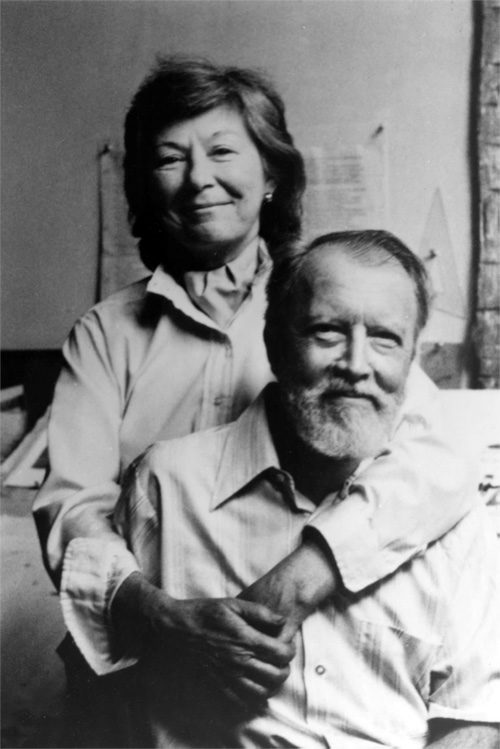
Alice and Martin met during World War II. They fell in love and formed an award-winning team that collaborated closely for the next 40 years. Generations of children have now grown up on their books.
They started by illustrating books written by other authors, such as The Color Kittens and The Fuzzy Duckling, classics from the Little Golden Book series.
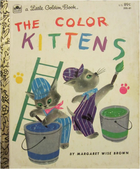
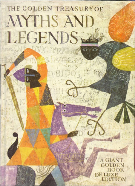
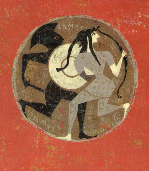
Soon the Provensens were writing and illustrating their own books. Some were based on classic stories such as Aesop’s Fables, Mother Goose, Bible tales, and the plays of Shakespeare. They won the Caldecott Medal in 1983 for their book, The Glorious Flight, about the first flight over the English Channel. Their beautifully designed books, The Iliad and The Odyssey and The Golden Treasury of Myths and Legends stand out as classics of children’s book illustration.
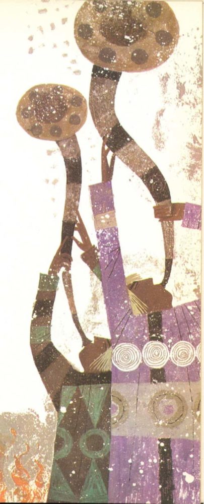
As children’s book historian Leonard S. Marcus told The Washington Post when Alice passed away, “Some of their books sold millions of copies. There was a kind of lightness and open space in their work. You could project your own imagination into their world.” They found a secret for success that few children’s book illustrators and authors could equal.
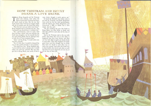
It’s hard to imagine how a creative team could have been any closer than the Provensens. The two came from almost identical backgrounds. They were both born in Chicago and both moved to California when they were twelve. They both attended the University of California, and both received scholarships to train at the Art Institute of Chicago. They both went to work for Hollywood studios (Martin at Disney and Alice at Walter Lantz). They were married in 1944, then moved to Washington where they both worked supporting the war effort.
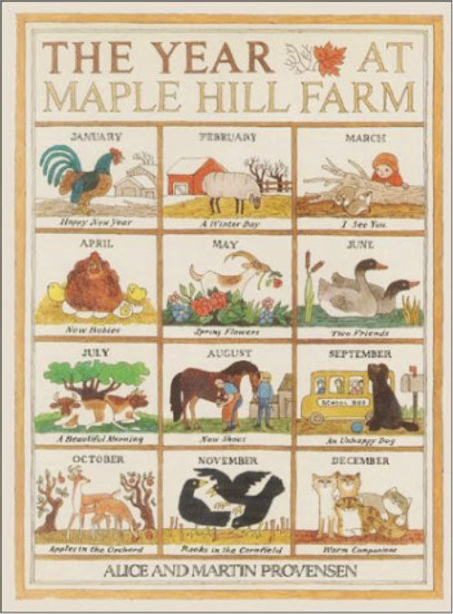
In 1950 the Provensens purchased an abandoned farm in upstate New York, far from city life. They moved two drawing tables into the barn and started working together, back to back. Their excellent book, A Year at Maple Hill Farm, describes their sweet life on the farm.
Their styles blended together so perfectly that for nearly 40 years no one could distinguish who did the words and who did the pictures. Ms. Provensen recalled for the Orange County Register in 2009, “Sometimes we’d work on the same page. I’d see something, or tell him how to fix something.” In response to questions from Publishers Weekly about the secret of their working methods, Alice simply said, “we were a true collaboration. Martin and I really were one artist.” No one ever saw their works in process.
Living and working together in one room there was very little space for privacy or egos. The two seemed to share everything, completing each other’s thoughts and brush strokes.
Yet, there was one small part of their work that the Provensens chose to keep private from each other. When they were just beginning to come up with an idea, they would sometimes tie a string across the room and hang a sheet or blanket between their two tables. As Alice recalled in her interview with Publishers Weekly, “Once in a while one of us may have had an idea we were just developing that we didn’t want the other person to see just yet…. We would string a curtain up between our desks.”
Even though this barrier was purely symbolic — a flimsy drape that could easily be breached at any time — it still had psychological importance.
In those first sparks of the creative process, when an artist tries to coax an idea into existence, the idea can be so fragile that other words or voices — or even a second set of eyes — might scare it off. Explaining it prematurely to your partner using an existing vocabulary could rob the idea of its creative potential.
Married people can share all kinds of things and never blush once. But the nakedness of a new idea — that can be a little too personal, and sometimes needs to be kept concealed.
Martin passed away in 1987. Now Alice and Martin are back together on the same side of the curtain.
The Art of the Post: From the Pages of the Post to Museum Walls
Read all of art critic David Apatoff’s columns here.
The illustrations that appeared in The Saturday Evening Post were intended to last until the next issue came out. The Post was a “periodical,” designed only to fill a period of time until it was updated by a newer issue containing more current information, fashion trends, and merchandise for sale.
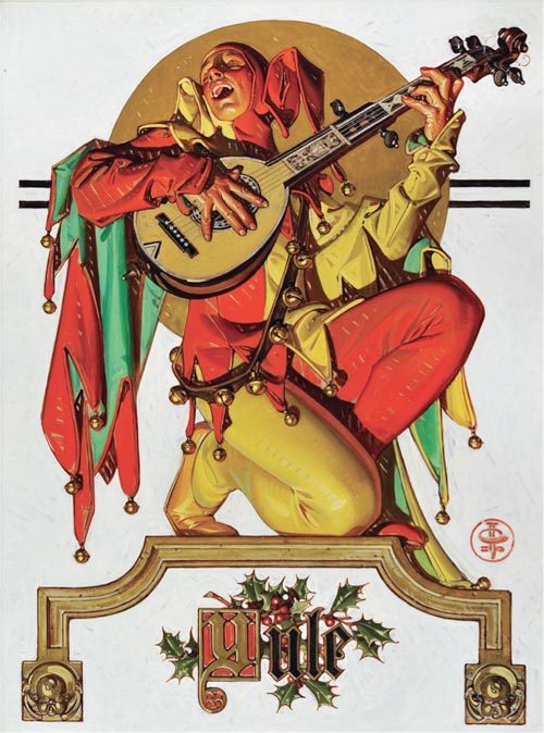
Generations of illustrators created beautiful pictures to fill the Post and other magazines, but it was always understood that they were creating temporary art; one day that thin magazine paper would turn brittle and yellow with age, and eventually crumble and return to mother nature.
It took a while for experts to recognize that illustrations had enduring value, but once Norman Rockwell’s 1951 cover for the Post, “Saying Grace,” sold for $46 million, even the most stubborn nay-sayers realized that this “temporary” art form was worth preserving.
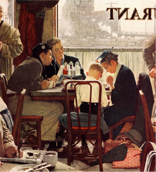
Today illustration art is being rescued and conserved by experts, to take its rightful place on museum walls.
During the decades when Rockwell and other illustrators were exiled from “fine” art, thousands of drawings and paintings were saved from the trash heap by a hardy band of collectors and artists who had the courage to ignore the condescension of highbrow art critics. These collectors weren’t intimidated by labels. Instead, they collected for the best possible reason: they loved the images. Their love of the pure art made them fearless, and they helped preserve the art form in private collections while the experts slowly had a change of heart.
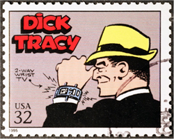
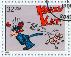
One such collector was Andrew Sordoni III, who started out as a young boy smitten by the art in Sunday comic strips. He liked Dick Tracy and Krazy Kat and a handful of other strips that were delivered to his house in the funny papers. Fortunately, Sordoni’s mother was a fashion illustrator, and she taught him to respect the craft of good drawing. For many years “craftsmanship” was a dirty word in the fine arts community, but it served as a polar star for Sordoni’s collecting. Soon Sordoni began collecting unfashionable illustrators such as Maxfield Parrish. Today Parrish paintings have sold for millions of dollars.
 |
 |
|
U.S. postage stamps featuring comics Dick Tracy and Krazy Kat. (Shutterstock) |
|
A lifetime of collecting has come to fruition in an opening this month of a large exhibition of American illustration art at the Sordoni Art Gallery in Wilkes-Barre, Pennsylvania.
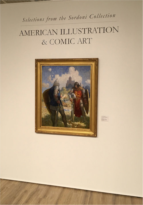
The show, which features one of the great private collections of American illustration, will run from April 7 to May 20, 2018. It was curated by Stanley I. Grand, Ph.D., a professor of art history and expert on the allegorical engravings from Giovanni Battista Ferrari’s De Florum Cultura.
The Sordoni show includes 135 works of art, including a number of illustrations that were originally seen in the pages of the Post, but which now can be seen as the artist created them.
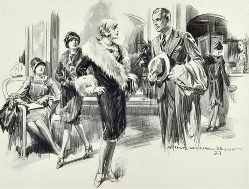
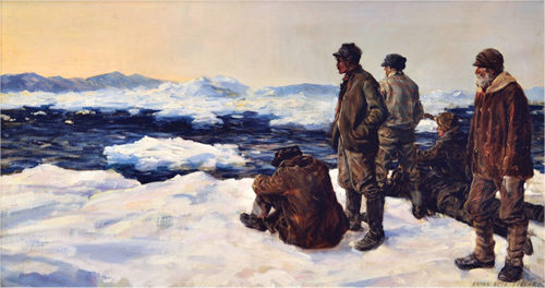
The collection reflects the personal taste of Sordoni, who collected what was once ignored as “lowbrow art.” As the catalog notes, “Andrew found his own way and collected works that were considered of lesser importance at the time, but are now highly regarded both in market and aesthetic terms.”
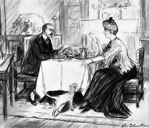
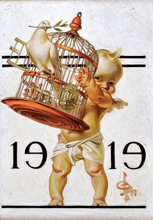
The art in the exhibit includes work by famed illustrators such as Rockwell, Parrish, and N.C. Wyeth. The substantial catalog accompanying the show is a prime example of how critical attention surrounding the field of illustration art has evolved from initial skepticism to serious study by respected academics and biographers who are devoting years and substantial critical analysis to multiple biographies.
While Rockwell was a groundbreaker in being accepted by the “fine” art community, other illustrators whose work appeared in the Post are hot on Rockwell’s heels. Artists such as J.C. Leyendecker, Dean Cornwell, Bernie Fuchs, Robert Fawcett, and others all have their own coffee table art books now, and the value of their original work at auction has increased dramatically. While illustration art was once auctioned in a separate category, much of it is now commingled and sold interchangeably with traditional American “fine” art.
The Art of the Post: The Challenge of Illustrating the Earliest Cars
Read all of art critic David Apatoff’s columns here.
The artists of the Saturday Evening Post were sometimes called upon to paint brand-new subjects that had never been painted by traditional artists.
Most of the Post’s illustrators were formally trained in perspective, anatomy, and the other technical skills of art. They learned to paint portraits and landscapes and bowls of fruit. But painting for a weekly periodical is not the same as painting for a gallery or museum. During the long domain of the Post, new inventions such as the radio, airplanes, refrigerators, and televisions were introduced as important phenomena in the daily lives of Americans. When they debuted, they had to be illustrated for the pages of the Post.
This 1929 painting by artist Walter Biggs suggested that the most elegant black-tie parties would benefit from having a Frigidaire-brand refrigerator in the living room so the guests could have ice cubes in their drinks:
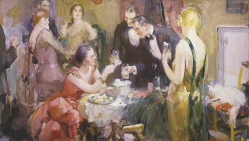
There were no paintings by old masters to serve as models for these modern illustrations. Rembrandt never painted a skyscraper or an electric fan. The Post’s artists had to make it up as they went along. Painting the physical object was difficult enough, but the real challenge was to anticipate the cultural significance of the new inventions. What role would they serve? How should they be portrayed?
There’s no better example of this than the early illustrations of cars. It was clear from the very beginning that every family would want a car.
This 1925 illustration by artist M. Leone Bracker depicts a family on their front porch enviously watching their neighbors’ cars drive by. They are stranded, staring while their neighbors have been freed by their automobiles to go “everywhere.”
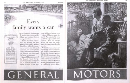

Before the public had figured out the best ways to use this strange new invention, or even how they preferred it to look, illustrators for the first car ads had to decide on the best way to portray cars.
Some artists tried to relate cars to classical mythology, depicting gods of speed or flight.
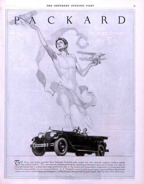
Other artists linked the automobile to modern art and design, which was born around the same time as cars.
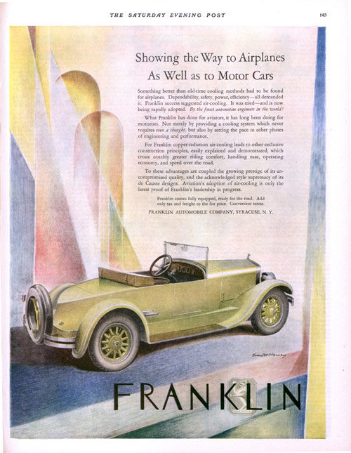
Illustrator E. Everett Henry (1893-1961) painted this early car in an idealized, art deco style for the May 29, 1926 issue of the Post. Thirty years later when people understood cars better, Henry would illustrate a car as a commonplace everyday nuisance, driving too fast through family neighborhoods.
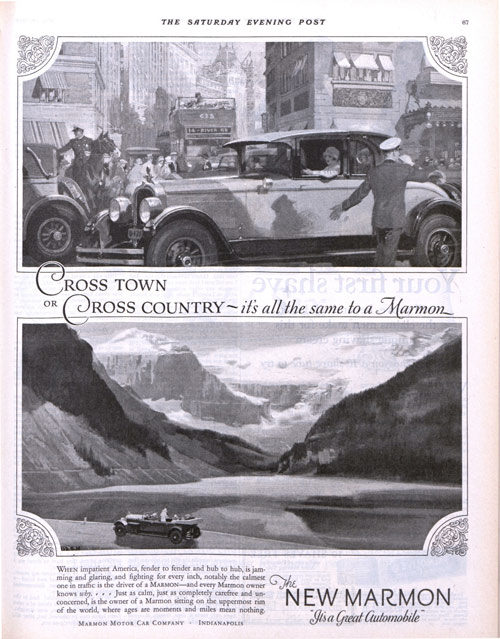
Some illustrators tried to have it both ways, portraying cars as an invention for both the city and the country markets.
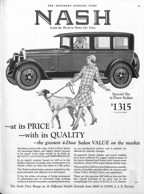
Of course, artists through the ages have always been able to promote products by placing an attractive woman in front of them, even if she has no connection to the product itself:
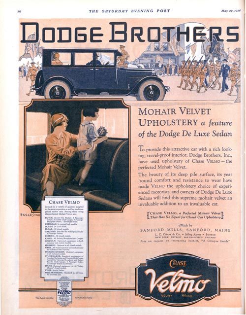
For a brief period, the Dodge Brothers Company apparently believed the best way to advertise cars was to show paintings of their “mohair velvet upholstery,” which was supposedly comfortable to sit on while watching parades. This campaign did not last long.
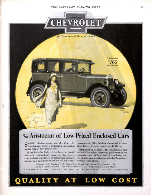
A wide variety of artistic talents tried their hand at creating the visual identity of cars. Some of the top illustrators in America who illustrated covers for the Post and other magazines would also paint ads for the auto manufacturers.
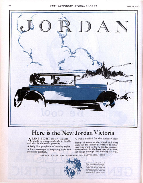
In the following picture, an unknown illustrator has left out all the details, giving us just a simplified suggestion of a car. By only implying what the car will do, he leaves it up to his audience to fill in all the details in their minds and imagine how great their new car will be:
In the next example, the illustrator Major Felten (1904-1975) treads very carefully, drawing the car objectively with a light, realistic line. Felten became well known for his bold, exciting paintings of jungle cats and savage warriors, which he created with a heavily stylized look. By comparison this plain vanilla illustration looks timorous, as if he hasn’t quite figured out what to make of this new invention.
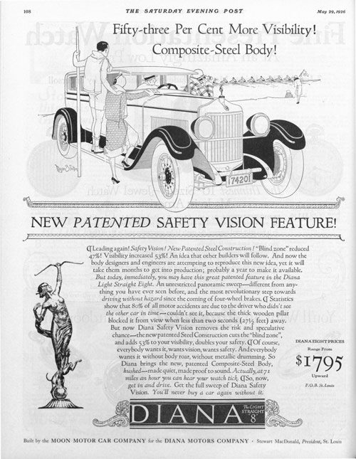
Note how many different car companies flourished in those early years as designers and manufacturers experimented with how the new invention should look and function. At the same time, creative artists were offering many different approaches to artistic interpretations of the automobile, giving us this diverse collection of creative pictures. While the artists’ impressions of a car have changed dramatically in the last hundred years, we can still see in these early efforts the same factors that motivate car buyers today— status, luxury, safety, comfort, value, beauty, and good old Fear of Missing Out.