The Art of the Post: Coby Whitmore Illustrates a New Era of “Boy Meets Girl”
American tastes changed dramatically after World War II. Reunited couples were eager to make up for lost time. A country freed from fears, stresses, and rationing turned its attention to homes, cars, fashionable clothing, hair styles, and above all, relationships. These stark changes are especially apparent when we look at the popular illustrations of the day.
The escapist pictures and stories that the country craved during the Depression — romantic tales of South Seas adventures or knights in armor — disappeared from magazines.
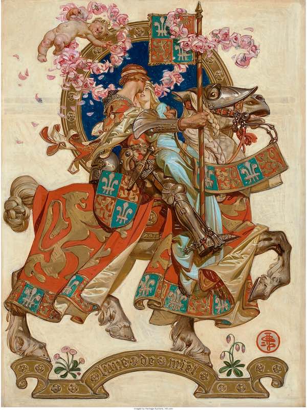
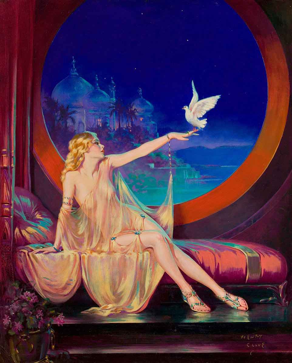
As illustrator Al Parker wrote in The Illustrator in America 1880-1980, “The need to escape was already waning and, with it, escapist art.” Young housewives and mothers (the primary readership of magazine fiction) now wanted to see girls finding true love with the boy next door. Young men, relieved that they had survived the war, enjoyed car ads illustrating peacetime lifestyles rather than reliable mechanical parts.
Parker recounted what it was like to be an illustrator in those days, “depicting an idealized world, peopled with handsome men and gorgeous women, bedecked in their best in the most fashionable of settings. … At the end of the war, the illustrator strutted amidst a pageant of plenty. Advertising budgets had skyrocketed and magazines bulged with fiction, providing work for all who painted in the style of the innovators.”
Magazines became larger and more colorful to show these pictures. In contrast to pre-war illustrations, which often included complex scenes and detailed backgrounds, the new illustrations often favored close-ups of the faces of heroes and heroines against a plain white or flat-colored background to eliminate unwanted clutter. Black cocktail dresses contrasted against bright white backgrounds showed off the shapes of young women enjoying themselves in the new prosperity. Sports cars and cocktail parties made bold background props, but the illustrations almost always centered on a stylishly dressed modern American woman.
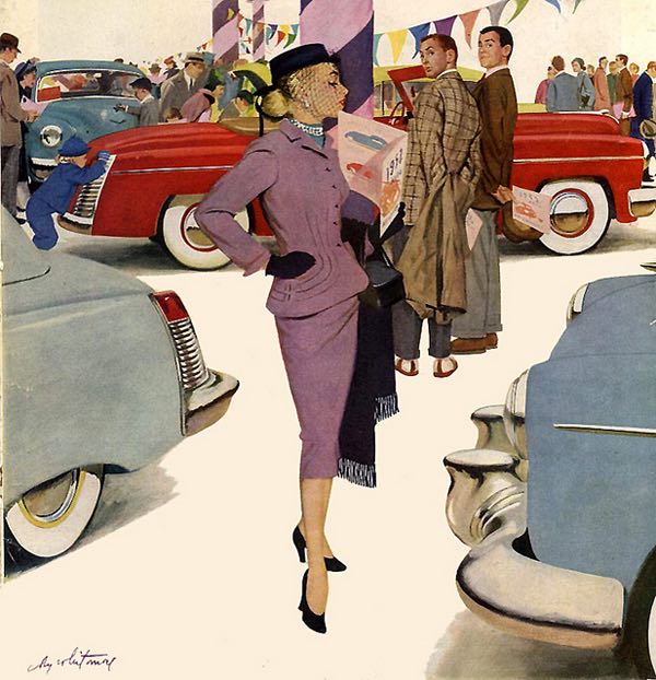
This explosion of pent-up demand created steady employment for legions of talented young illustrators with a knack for stylish images of young love and domestic relationships. The leading illustrators of this style included Joe de Mers, Jon Whitcomb, Al Parker, Andy Virgil, Joe Bowler, and Mike Ludlow. Many other artists came and went and are little remembered today. But no one topped the great Coby Whitmore when it came to illustrating the relationships the public was so eager to see. As art historian Walt Reed noted in The Illustrator in America 1880-1980, “probably no other illustrator has been so inventive over so long a time in doing variations on the theme of boy meets girl.”
Whitmore was born in Dayton, Ohio, and moved to Chicago to work as an apprentice in an art studio by day while studying at the Art Institute of Chicago at night. His first real art job was working for the Chicago Herald Examiner. He later moved to Cincinnati, where he worked for a few years developing his style before finally moving to New York. There he began winning illustration assignments from national magazines such as The Saturday Evening Post, Redbook, Cosmopolitan, McCall’s, Ladies’ Home Journal, and Good Housekeeping.
Whitmore had the perfect disposition for painting in the new, snazzy style. He described his three primary interests in life as “racing cars, illustrating, and smart clothes on good looking women.”
What made Whitmore stand out from the crowd while so many of his peers were quickly forgotten?
Like the other illustrators, Whitmore mastered anatomy and color theory and learned to make the most of his tools — including gouache, casein, and designer paints. But Whitmore went far beyond the basics. Unlike many of his peers, Whitmore gave design and composition high priority in his illustrations. He used photographs of his models for reference the way other illustrators did, but while others slavishly copied the photographs, Whitmore always did his best to bring “fine art” elegance, class, and imagination to his subject matter. It didn’t matter that the stories he illustrated were sometimes corny or melodramatic; Whitmore was heavily influenced by French fine artists Bonnard and Vuillard, and he tried to elevate his illustrations to their level. When many of his peers began to lapse into formulaic solutions to their repeated assignments to draw another “pretty girl,” Whitmore always seemed to find a fresh and imaginative approach.
A picture is worth a thousand words, so let’s look at some samples of what made Whitmore great:
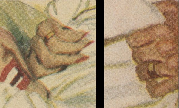
Note in this painting of “Nice Girl from Boston,” Whitmore has simplified the picture down to its essence. Instead of all the heavy detail and realism that would normally be required to fill two large pages, Whitmore charmed his audience by implying a fun, sexy relationship.
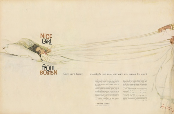
Note one crucial detail that could not be omitted: They are both wearing wedding rings. Without that detail, Whitmore’s painting would likely have been rejected.
In this next illustration of a young couple in a rowboat, Whitmore painted in a much looser style than the Norman Rockwell style that dominated the pre-war years.
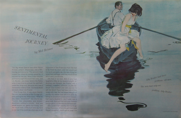
In particular, see how the ripples in the lake form abstract designs.
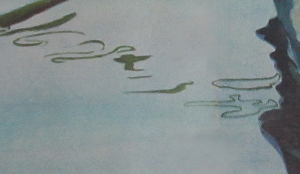
Whitmore was a contemporary of abstract painters such as Jackson Pollock and Adolph Gottlieb, and he paid attention to their innovations. Despite his own realism, those ripples in the lake showed that Whitmore was able to abstract with the best of them.
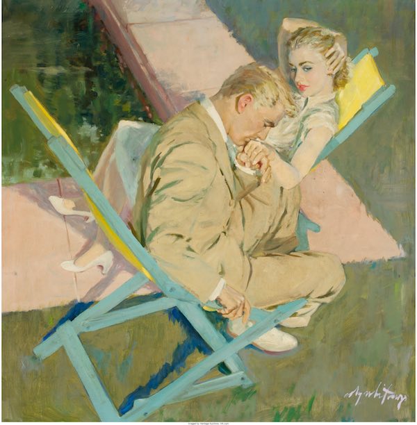
In this final example, Whitmore uses an unusual angle and the creative placement of couples to make an attention-grabbing design.
You can see more examples of Whitmore’s work on the Post’s web site: here is an analysis of his illustrations and the artist’s profile.
Cover Gallery: Rainy Days
The weather may be dreary, but these rainy day covers will make you feel cheery!
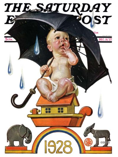
December 31, 1927
J. C. Leyendecker
Artist J. C. Leyendecker was well known for his Baby New Year illustrations that graced many Post covers from the 1910s through the 1940s. Our 1928 baby awaits the possible repeal of Prohibition, symbolized by “wet” weather.
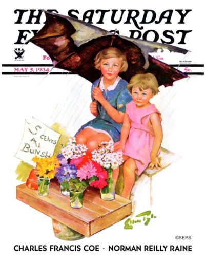
Ellen Pyle
May 4, 1934
The subjects in this illustration were likely artist Ellen Pyle’s own children; they served as the models in more than 20 of her Post covers.
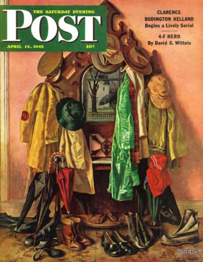
John Atherton
April 14th, 1945
[From the editors of the April 14, 1945 issue] Norman Rockwell suggested the idea to Atherton. The hatrack is in the hall of the Community House at Arlington, Vermont. Neighbors contributed the hats, coats and galoshes seen in the painting.
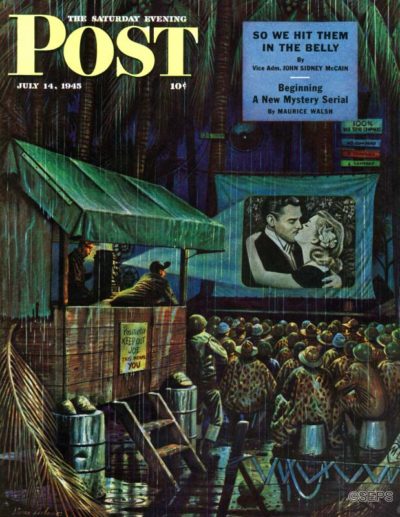
Stevan Dohanos
July 17, 1945
[From the editors of the July 17, 1945 issue] We imagine it is hard for anyone who has never sat on a Pacific spit kit of an island for months on end, contemplating the shapely curves of a can of tinned-pork products for emotional release, to understand Stevan Dohanos’ cover. After such soul-gnawing, a flickering, one-dimensional pin-up girl enlarged many times on an improvised screen must have the pulling power a naked electric-light bulb has for a moth. Most South Pacific movies are now first-run, sometimes world premieres; but when “Wilson” was shown on Okinawa before an audience just back from the front lines, there were eight air-raid interruptions, and the show assumed a three-and-a-half-hour Gone With the Wind proportion. Perhaps the reason why Dohanos’ G.I.’s are willing to sit in the rain is that their bucket seats are really magic carpets taking them home to Main Street for an hour or two.
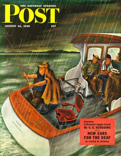
Constantin Alajalov
August 31, 1946
[From the editors of the August 31, 1946 issue] The man who has determined to go fishing, Constantin Alajalov observed when he was in Florida, will go fishing until he catches a fish, in spite of bad weather. Alajalov determined to paint this truth. There were a few things on which he needed to refresh his recollection, but to do this, he needed only to go out in a boat on a similar day. We don’t know how long the average determined fisherman has to wait for a sunny day. We do know how long Alajalov had to wait to catch a rainy one. One fair day followed another. He waited three weeks.
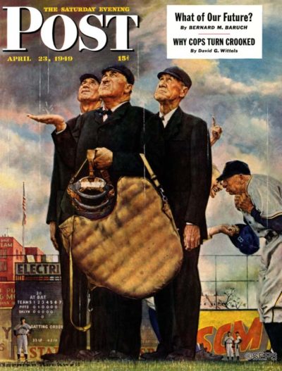
Norman Rockwell
April 23, 1949
[From the editors of the April 23, 1949 issue] This week’s Norman Rockwell cover depicts Ebbets Field, the home of the Brooklyn Dodgers. Here, the Dodgers are trailing the Pittsburgh Pirates 1-0 in the sixth inning. If the arbiters—left to right, Harry Goetz, Beans Reardon and Lou Jorda—call the game because of rain, the score will stand as is, and Pittsburgh will win. This irks the Brooklynites, who dislike having other teams win. In the picture, Clyde Sukeforth, a Brooklyn coach, could well be saying, “You may be all wet, but it ain’t raining a drop!” The huddled
Pittsburgher—Bill Meyer, Pirate manager—is doubtless retorting, “For the love of Abner Doubleday, how can we play ball in this cloudburst?”
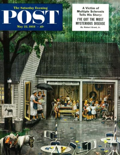
Stevan Dohanos
May 22, 1954
[From the editors of the May 22, 1954 issue] Rather than be depressed by Mr. Dohanos’ soggy scene, note how the deluge has improved the situation. Any birthday party is fun, even if nothing more happens than the duly expected games, grub and slight fights between incompatible little boys. But to arrange for the routine confusion to be stepped up into the joyous chaos of a garden party dispersed by a cloudburst, that’s a charming innovation indeed. And how delightful it is to throw a party in or into a garage, where tools and other weapons are available for favors as well as paper hats, where joy can he so much more unconfined than in an ordinary living-room hullabaloo. Even that pony thinks, Bless the rain—no more work. Fortunately, there isn’t space here for what mother thinks.
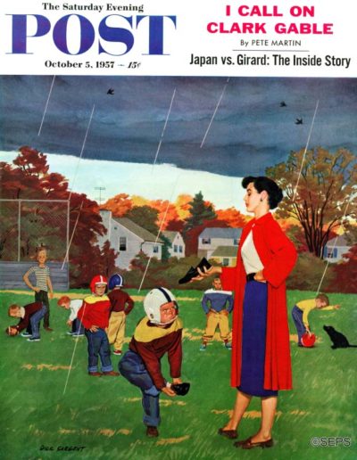
Richard Sargent
October 5, 1957
[From the editors of the October 5, 1957 issue] Women can be such a handicap sometimes—“Aw, ma, halfbacks don’t wear rubbers. Next thing, you’ll want me to make touchdowns with my poncho on. Next thing, you’ll want me to run the end with an umbrella.” To which mother replies, “James, football men obey the quarterback’s signals or get benched. The bench is home. Now then, four, eleven, forty-four, hip—on rubbers!” Well, the maxim says that mothers know best, and if James catches cold by getting wet everywhere except his feet, let’s switch to the maxim that only Monday-morning quarterbacks think of everything. This might have been some action picture if Dick Sargent hadn’t rung in mother; yet let’s settle for the maxim that when it comes to painting, painters know best.
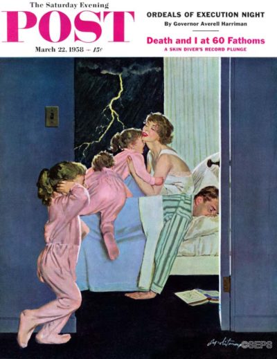
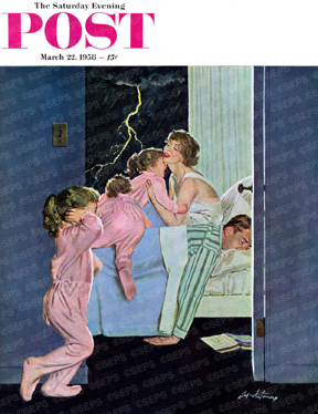
Coby Whitmore
March 22, 1958
[From the editors of the March 22, 1958 issue] Of course, the children haven’t been frightened by Papa’s snoring, but by the awful sounds of Nature on an electrical rampage. So mother will gather them in her arms and love away their fear—mustn’t it be wonderful to be a mother? If that lightning is bedeviling a far-north state, it should signify the breaking up of a winter which certainly needed breaking up; and yet not long ago some northern areas had thunderstorms followed by the blankety-blankest descent of snow for thirty-something years. Let’s leave forecasting to the weatherman, who is welcome to it. Coby Whitmore’s man of the house, buried there in the bed, must be the deepest sleeper this side of the proverbial log. How does mother get him up mornings—rap on his head with the book?
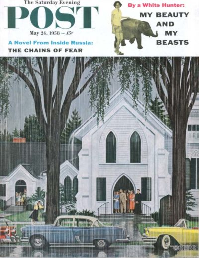
Melbourne E. Brindle
May 24, 1958
[From the editors of the May 25, 1958 issue] This wet cover had its origin in a drought. When crops withered in the Eastern states last summer, the Rev. Benjamin Axleroad, seen there at the door of St. Mark’s Episcopal Church in Bridgewater, Conn., included in his prayers a plea for precipitation. And one Sunday, just as his service ended, down came the rain, exit drought. Weeks later artist Melbourne Brindle, a St. Mark’s vestryman, puzzled some of the congregation by posing them at the church and refusing to tell them what it was all about—surprise, folks, you’re in the Post! Comments on the cover scene: (l) artistic license helped keep that grass green during the drought; (2) if any of the parishioners were out on a golf course during the deluge, how remorseful they must have been that they weren’t in church.
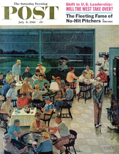
Ben Kimberly Prins
July 8, 1961
[From the editors of the July 8, 1961 issue] How do you like that? On Saturday afternoon—prime time at any golf club—comes the deluge. Well, that’s par for the course, we suppose, and the course in this Ben Prins cover belongs to The Dunes Club of Myrtle Beach, South Carolina. That wave in the background is a fringe of the Atlantic Ocean, not the crest of an oncoming flood. The three-wheeled vehicle under the umbrella is what is known as a caddy car, and its occupants are either fair-weather athletes scurrying toward the indoor recreation of the nineteenth hole, or spirited souls bent on challenging their fellow duffers to a game of motorized water polo. At any rate they’re not slowing down at the putting green. The weather being what it is, they’re probably less concerned about sinking putts than about sinking, period.
Art Gallery: Holiday Glamour
This holiday season, we bring you 33 portraits of women from the pages of the Post, from 1920s beauties to 1950s fashion plates, all wishing you season’s greetings and winter cheer!
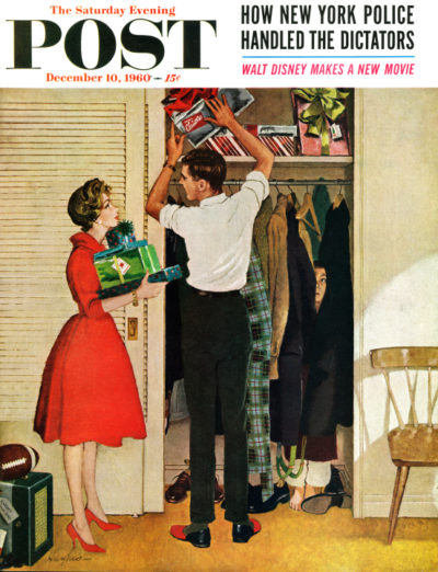
George Hughes
December 10, 1960
Sneaking away while the house is asleep, this couple stashes away their Christmas gifts.
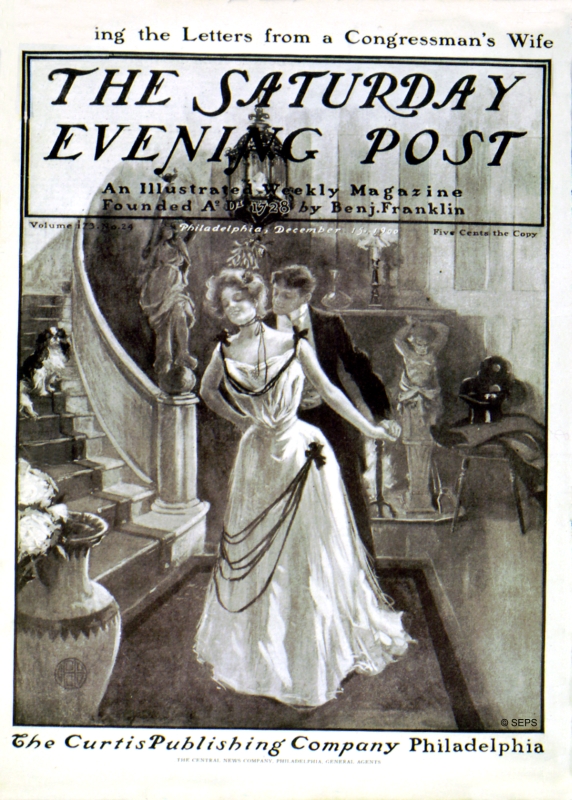
December 15, 1900
Lavish parties and formal garb say sophistication, but this couple whisks each other away to steal a kiss under the mistletoe.
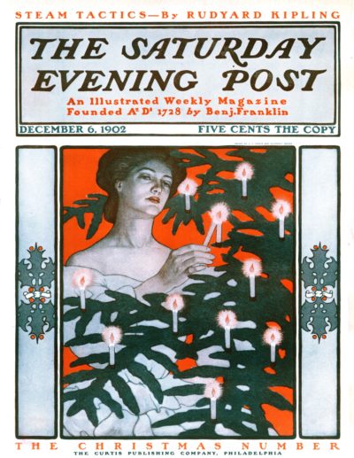
J.J. Gould & Guernsey Moore
December 6, 1902
The warm candlelight from the tree makes this Christmas beauty radiant.
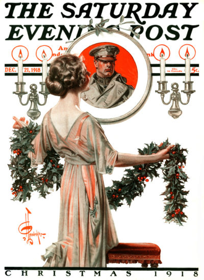
J.C. Leyendecker
December 21, 1918
They may be celebrating the holidays miles apart, he’s still the focal point of her celebration.
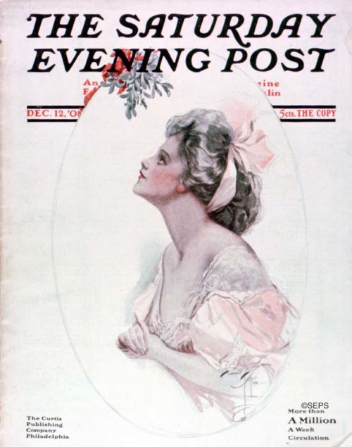
Harrison Fisher
December 12, 1908
This woman hopes for kisses from Christmases future.
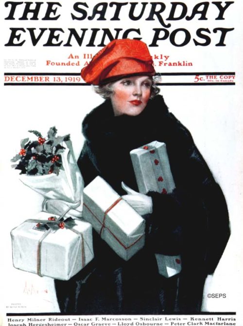
Neysa McMein
December 13,1919
Arms overflowing with parcels and holly, she can’t remember if she bought the pipes for Grandpa Joe.
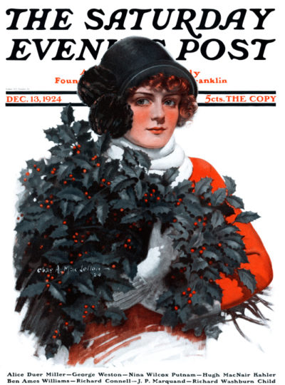
Charles A. MacLellan
December 13, 1924
This merry maid has boughs of holly to spare.
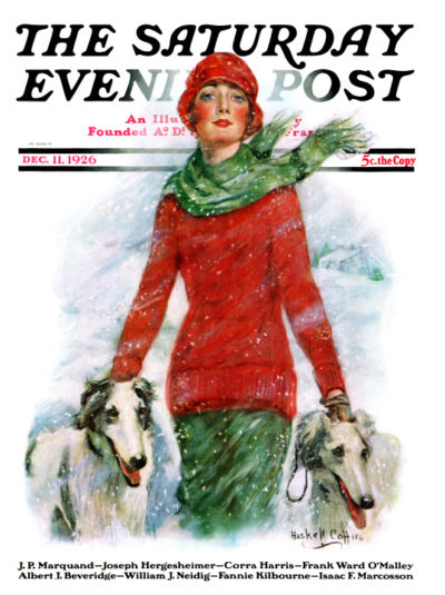
William Haskell Coffin
December 11, 1926
Cheeks chilled to rosy red, there is no better way to enjoy the snow than a stroll with your two best friends.
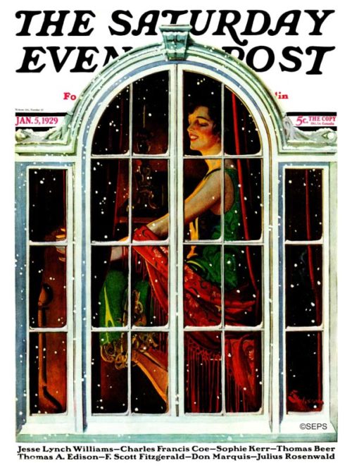
E.M. Jackson
January 5, 1929
This festive flapper is cozy indoors while the snow piles up outside.
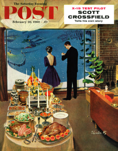
Thornton Utz
February 20, 1960
This hostess awaits her guests on a wintry evening.
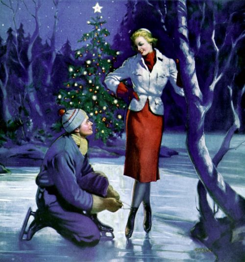
Manning de Villeneuve Lee
December 1, 1937
Late nights in the winter are perfect for ice-skating…and maybe something more.
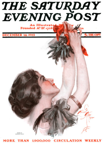
Harrison Fisher
December 14, 1912
This elegant lady puts the finishing touches on the mistletoe.
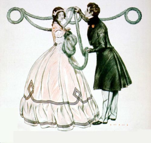
Henry Hutt
December 20, 1902
There’s no better way to get into the holiday spirit than hanging garland with the one you love.
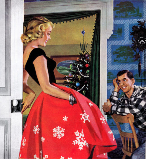
Paul Nonnast
December 01, 1954 (Country Gentleman)
There is no time like the holidays for romance.
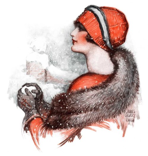
James Calvert Smith
January 17, 1925
This holiday lady is eyeing the next victim of a playful pelting.
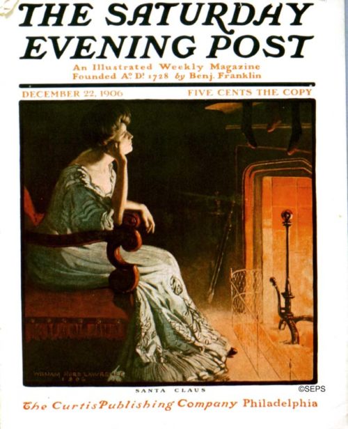
William Hurd Lawrence
December 22, 1906
For some, snuggling up next to hearth and enjoying the solitude is a far better way to spend the holidays.
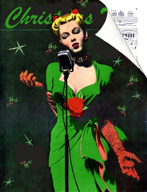
Al Parker
February 03, 1945
With a microphone and her sultry voice, she performs a stunning rendition of “Christmas Time.”
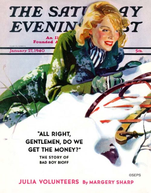
Dominice Cammerota
January 27, 1940
Who said kids get to have all the fun?
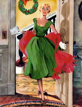
Ernest Chiriaka
February 06, 1954
She’s almost late to her own party!
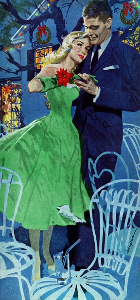
Robert Meyers
April 20, 1957
Holiday romance takes the chill out of the coldest nights.
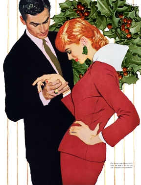
Joe deMers
March 31, 1956
A quiet moment before the whirlwind.
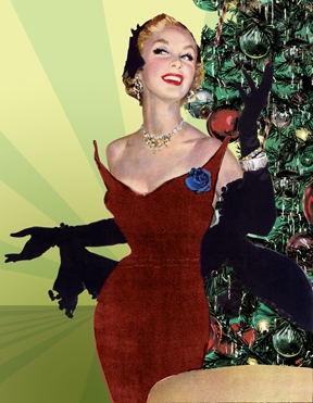
Joe deMers
August 05, 1950
She recounts her encounter with her admirer at the park.

R.G. Harris
May 12, 1951
When he asked his best friend to join him for dinner he never expected to be the third wheel on his own date.
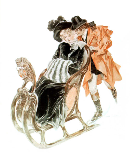
Henry Hutt
December 30, 1905
With fresh snow covering the ground, sleigh rides make the perfect escape from the festivities.
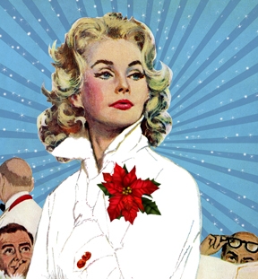
Coby Whitmore
May 07, 1960
Poinsettia pinned and hair curled, this winter wonder catches the eye of all the guys.
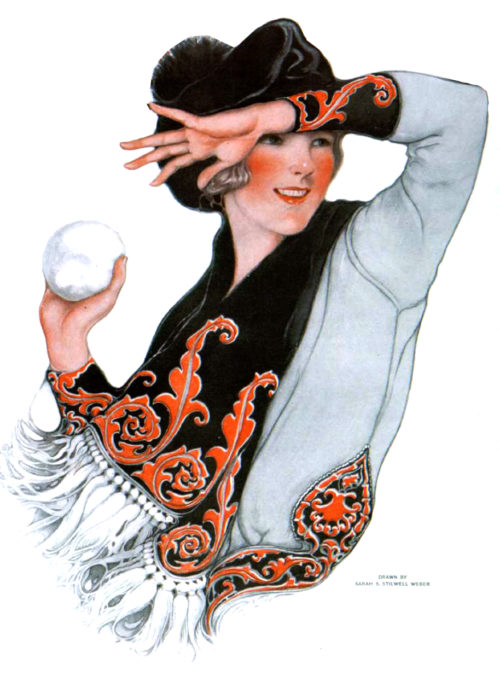
Sarah Stilwell-Weber
March 03, 1917
This winter-clad socialite prepares to thrash any who threaten her fashion.
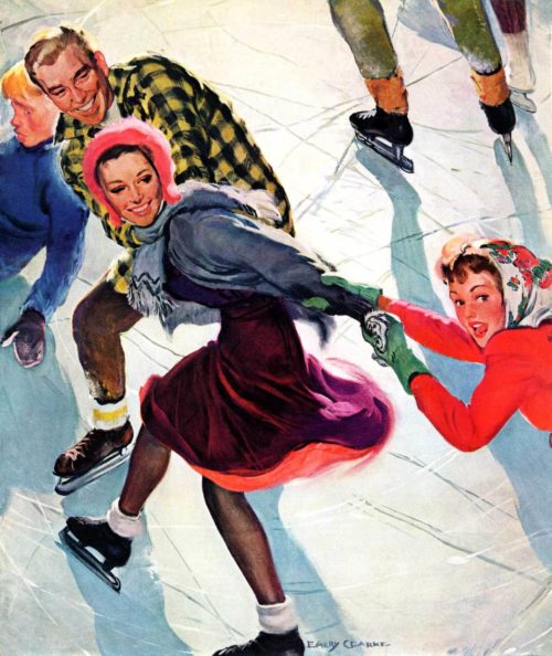
Emery Clarke
March 02, 1940
She sails with grace across the ice.
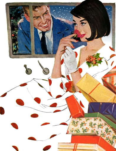
Coby Whitmore
October 24, 1959
Out of all of the gifts she received, her favorite was the rose.
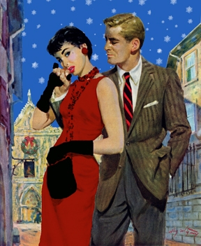
Coby Whitmore
August 20, 1955
The best way to enjoy a fresh snowfall is with someone who can hold you close.
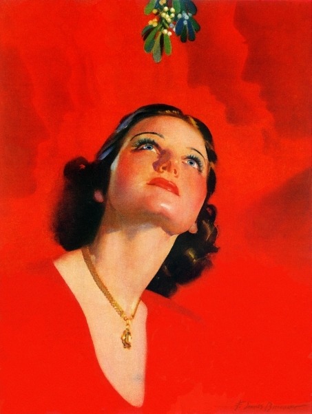
F. Sands Brunner
December 01, 1938 (Country Gentleman)
Waiting for someone under the mistletoe.

Joe deMers
April 15, 1950
She coaxes him over for a midnight dance.
Bob Hilbert
February 21, 1953
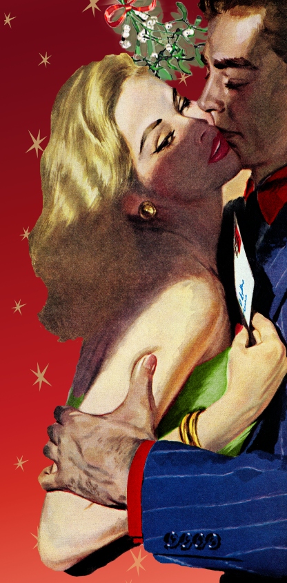
The letter in her hand doesn’t stave off this mistletoe kiss.
Alex Ross
January 29, 1944
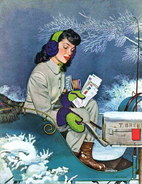
This postwoman is delivering season’s greetings in spite of the snowfall.
Coby Whitmore
Even before graduating from Steele High School in his Midwestern hometown, Dayton, Ohio, Coby Whitmore grew up knowing he wanted to be an artist. Over the course of a professional career spanning more than three decades, his reformations in the illustrative medium changed design concepts forever, earning him an induction into the Society of Illustrators’ Hall of Fame in 1978.
Whitmore began his art education at the Dayton Art Institute, later migrating to an apprenticeship in Chicago. Coby’s experiences in the Midwestern metropolis shaped his redefining style as well as the future of his career. He apprenticed in the studio of Haddon Sandblom[link], worked for the Chicago Herald Examiner, and enrolled in night classes at the Chicago Art Institute. Whitmore’s move to Chicago introduced him to a circle of young artists, most notably his future compatriots, Ben Stahl and Thornton Utz. Together the artistic trio became known as the Chicago Gang.
Covers by Coby Whitmore
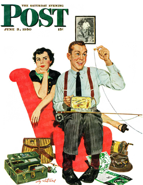
Fishing Season
Coby Whitmore
June 3, 1950
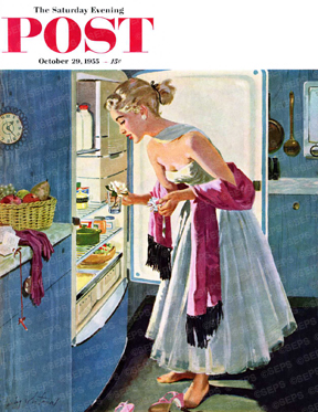
Prom Momento
Coby Whitmore
October 29, 1955
Lighting Storm
Coby Whitmore
March 22, 1958
Purchase prints of Coby Whitmore’s work at Art.com.
They did away with excess clutter and lighting, minimizing a model’s surroundings. Whitmore described the evolution of his artistic process as recognition of excess controlling, subjugating, and defining his characters. During a photo shoot in an old heirloom-filled house, he explained, “Then, as I worked along, I discovered that the furniture subordinated the characters. A process of elimination began, and in the finished drawing, all that remains of the beautiful old house is the lamp, the sofa, and a piece of silverware.” The Chicago Gang was partial to illuminating the subtle complexities of human relationships exposed in familiar, if not everyday, circumstances. Whitmore stripped away the overabundance surrounding his models and focused the work on intimate moments between people. Additions were selected with intent. Any objects present either conveyed the illustrator’s message or constructed a comprehensible scene incorporating as few props as possible.
The illustrator eventually headed back east to apprentice again in Ohio, at the studio of Carl Jensen in Cincinnati. He married his high school sweetheart, Virginia Comer, from Dayton and set out for New York City. In 1942, Whitmore joined the prestigious art studio of Charles E. Cooper on West 57th Street.
Much of Whitmore’s work depicts post-war American families, centered around a maternal figure who exudes happiness in the normalcy of everyday life. Coby Whitmore’s popular illustrations were featured on both the covers and in stories of The Saturday Evening Post, McCall’s, Ladies Home Journal, Cosmopolitan, Good Housekeeping, and several corporate advertising campaigns. Accusations of tawdry material (a woman stretching in bed, for example) forced some of his illustrations off magazine covers and into the magazine’s pages. In an interesting twist of fate, Whitmore further advanced his artistic career by combining his sleek lines and minimalist design with his fascination for racing cars. In the early 1950s, he designed the Fitch-Whitmore Le Mans Special with racecar driver John Fitch.
Toward the end of Whitmore’s career, illustration was used less and less. And many artists had to find work illustrating novel covers or headed back to the classroom as teachers. Whitmore eventually retired to Hilton Head, South Carolina. Today, his illustrations are held in both private and permanent collections at institutions such as the Pentagon, the United States Air Force Academy, the New Britain Museum of American Art, and Syracuse University.
Beyond the Canvas: “The Critical Young Man” by Coby Whitmore
Click here to purchase artwork from Coby Whitmore at Art.com.
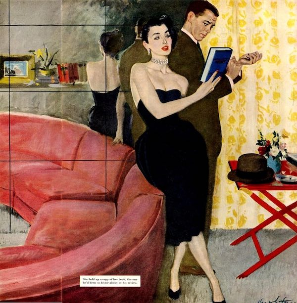
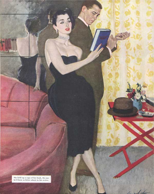
To understand Whitmore’s illustration from “The Critical Young Man,” you must first understand the theme of story. The tale revolves around a judgmental literary critic, Harvard Smith, who lambasts an author’s book for using an image of a scandalous dress on the cover.
The author, Edna Cloud, believes the critic must be a tiring old man, so under the guise of an alias, she flirts with the critic to understand him. She is shocked to find an intelligent man her own age, and she later reveals her identity by wearing the infamous dress on her first date with Smith.
Whitmore’s illustration cuts to the moral of the story by focusing on this moment: Edna Cloud shows Harvard Smith that he was wrong to judge her book–and Edna herself–by the cover.
Whitmore’s work is filled with visual symbolism that shows the viewers how the two characters are feeling internally. Edna Cloud and Harvard Smith stand back to back in the center of the frame, and each side of the apartment mirrors the respective characters’ emotions. Edna stands in front of a mirror that reflects her bare back and uncovered shoulders to the viewer, which tells the viewer that she’s open-minded. Harvard Smith, on the other hand, is a professional critic; he’s rigid, closed off. He believes in boundaries and strict moral values. Whitmore uses the character’s dress and mannerisms to convey to the reader that these people are total opposites.
If you look at Harvard Smith’s face, you’ll notice that it’s contorted; his eyes scan the back of the dress, Edna, and the book. The illustration captures the moment where we aren’t quite sure if he’s figured out that the woman he’s come to know is the same woman who wrote the book he judged so heavily.
Whitmore’s illustration takes the viewer to the climax of the story: Edna Cloud’s plan has taught Harvard Smith a timeless lesson: appearances can be deceiving.
