Read all of art critic David Apatoff’s columns here.
Americans were so dazzled by the invention of color movies that they almost forgot what made black and white movies great.
Technicolor arrived in the 1930s, and its rich, saturated colors opened a whole new world to moviegoers who were accustomed to seeing movies only in black and white. As years went by, black and white movies began to seem boring and old-fashioned. Children refused to watch them. In 1986, when mogul Ted Turner bought the rights to MGM’s movie archive, he announced that he was going to colorize the classic black and white movies to make them popular again. “I’m colorizing Casablanca,” he told the Los Angeles Times. “Once people start watching the colored version, they won’t bother with the original.” Directors and actors were outraged; they argued it would be sacrilege to colorize movies such as Citizen Kane, but Turner responded, “The last time I checked, I owned the films that we’re in the process of colorizing. I can do whatever I want with them, and if they’re going to be shown on television, they’re going to be in color.”
After a heated public debate, the public began to appreciate that color movies lacked some of the special qualities of black and white movies. For example, the art deco films of Fred Astaire and Ginger Rogers had a glamour that color movies could not match. The deep shadows and gritty tone of film noir movies simply couldn’t be achieved with color. Today, some directors prefer black and white for making serious artistic statements, with movies such as Manhattan (1979), Raging Bull (1980), Schindler’s List (1993), or the currently acclaimed Roma.
Just as the arrival of color transformed the film world, the arrival of color transformed the illustration world. Today, no one would consider buying a magazine with black and white pictures. But throughout the 19th century and well into the 20th, The Saturday Evening Post and other magazines thrilled readers with black and white illustrations. Some of the most gifted artists of their era were virtuosos with black pencil, charcoal, or ink. They appreciated the special qualities of black and white that have been drowned out today in the clatter of bright colors and special effects.
Here are some examples of those great early black and white illustrators, mostly forgotten today, whose work shows the special qualities of black and white art:
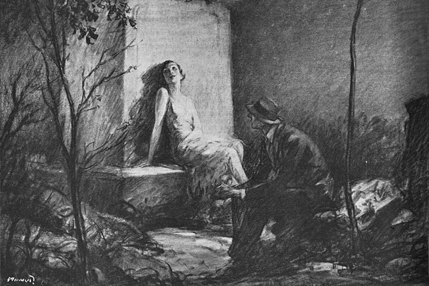
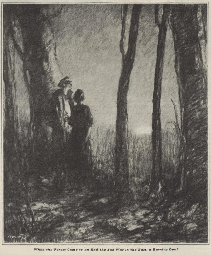
H.J. Mowat (1879-1949) was an illustrator popular in the 1920s and 30s. He created a wonderful mood with his black and white drawings. For example, his romantic pictures often involved a black sky with a white moon, or couples in black and white formal wear.
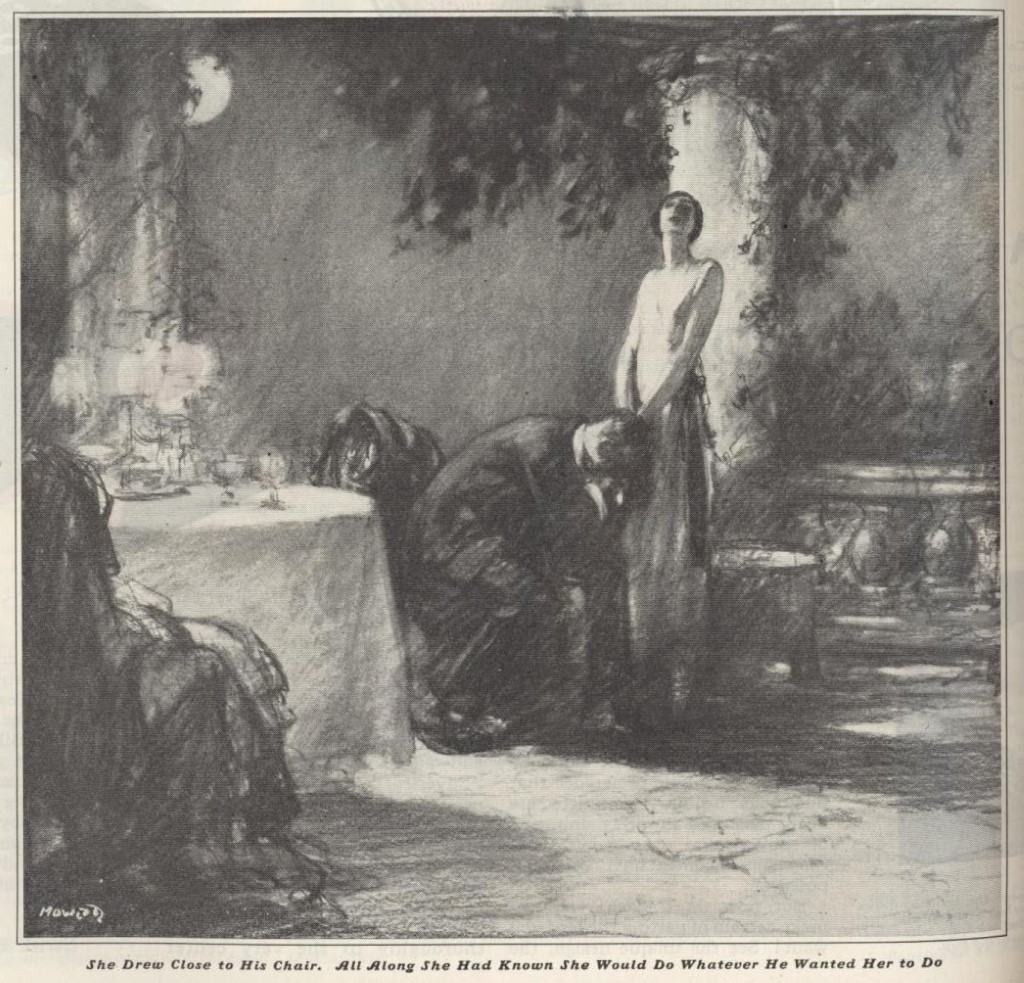
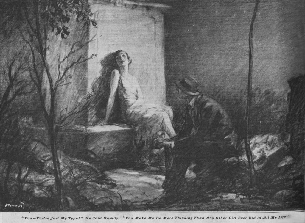
Even when the story described vivid colors, such as a sun like a “burning opal” Mowat’s pencil drawings could inspire our imaginations:
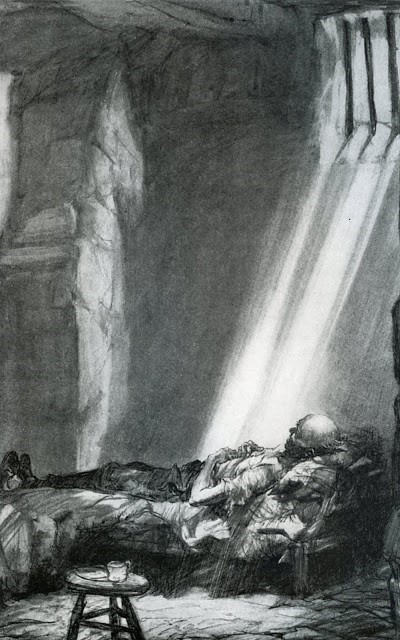
Another popular illustrator for the Post, Henry Raleigh (1880-1944) drew this dramatic illustration of a political prisoner. If he had painted this picture in colors, it would have softened the harshness and the despair of the situation.
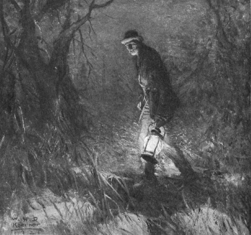
Another great talent, now largely forgotten, was William Henry Koerner (1878-1938). Notice how Koerner makes the maximum use of black and white in the dramatic lighting of this night scene:
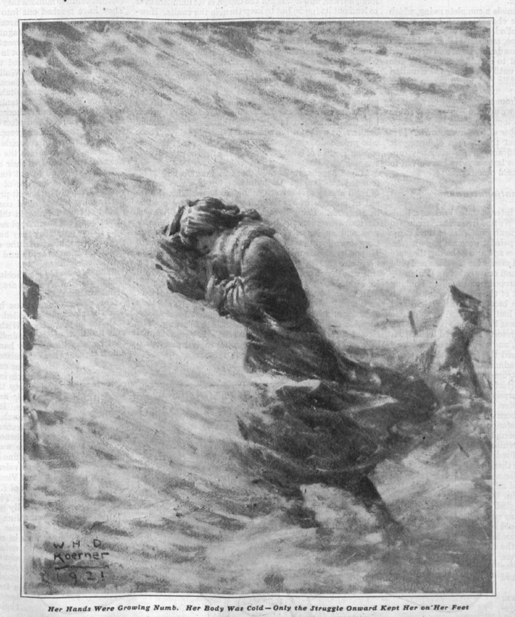
Another prime example of the use of black and white is in this picture of a blinding snow storm:
Can you imagine how these pictures would be weakened if they were in full color?
Audiences may have temporarily abandoned these kinds of pictures for the same reason that moviegoers temporarily stopped going to black and white movies. A black and white palette does have its limitations, but those limitations can inspire the imaginations of viewers in remarkable ways. A full color painting does much of the work for us and presents us with a fait accompli, but a pencil line is an incomplete suggestion; it requires viewers to fill in the blanks.
The limited palette of black and white sometimes requires more from the artist, too. The artists described above, and several of their peers working at the Post often had to be more inventive in order to get their message across in mere black and white. This affected how they selected a focus, how they staged their picture, and how they found artistic solutions for their assignments.
Rather than assume that black and white illustrations are boring or second class, give them a second look. Stark, high contrast line drawings have their own power, and even the gray of pencil shading can contribute a silvery sheen to a picture. These artists bygone artists did superb work using a limited medium and continue to deserve attention today.
Become a Saturday Evening Post member and enjoy unlimited access. Subscribe now


Comments
This is yet another fascinating look at something forgotten and overlooked. With the advent of Technicolor in the ’30s, it is understandable at the time why black & white increasingly fell out of favor with the public as time went on.
‘The Wizard of Oz” remains a permanently perfect film that nothing can ever touch at all, including the eye-popping Technicolor. Before Dorothy steps into her bedazzling adventure in Technicolor, she’s in the sepia-toned realities of that farm and its frightening realities. After the twister ends, her new (yet unknown) even scarier occurrences that lie ahead are about to start. But not at first. At first we see literally and subliminally that black & white is “bad” and color is “good”.
80 years later we know most of the worst films ever made are in color, and the quality of color today is not what it used to be either. I love how ‘Hollywood’ has the nerve to call constant gunfire, fires, fireballs and the rest of the long monotonous list, “special effects” instead of the standard crutches they are.
All the films you mentioned in paragraph 3 would have been diminished had they been in color. I must mention Peter Bogdanovich’s ‘Paper Moon’ from 46 years ago. It gave you the feeling you were there along with them in the depths of the Depression, and the film had been made then. He had to really fight to get the film made in black & white. Fortunately he won out! Personally, I love black & white and color. The former draws me in, in a way color doesn’t. It’s been said that everything looks worse in black and white. Sometimes that’s true, often it’s not.
I love the illustrations you show here to illustrate your point. The use of pencil, charcoal and ink emphasis let you use your imagination with these images in a way color simply cannot. Color would also take away from the serious starkness and bleakness trying to be conveyed.
I hope to see a lot more of these illustrations as I work my through the Post’s archives. I’m in the 1820’s still, but have already seen some neat stuff. It’s a temptation to skip ahead 100 years, but that would be wrong. Seeing the issues in chronological order is the only way to understand what happened when, and how it would affect what happened next.
David,
I enjoyed your article “The Art of the Post: Looking Back at Those Glorious Black and White Illustrations.” My grandfather was Emmett Watson. He did 2 Saturday Evening Post covers:
https://www.emmettwatson.com/1941-2/january-25-1941-saturday-evening-post/
https://www.emmettwatson.com/1941-2/april-19-1941-saturday-evening-post/
He also did many interior illustrations in black and white. Two of may favorites are from Life and Leslies:
https://www.emmettwatson.com/1919-22/february-12-1920-life/
https://www.emmettwatson.com/1919-22/august-7-1920-leslie-s-weekly/
Do you know if Emmett Watson did any black and white interior illustrations for the Saturday Evening Post?
I am putting together a web site of Emmett Watson work and would like it to be as complete as possible. Thank you in advance for taking the time to respond.
Jim