Read all of art critic David Apatoff’s columns here.

Mead Schaeffer drove Norman Rockwell crazy.
Schaeffer and Rockwell were two of the most famous illustrators for the Post during the Golden Age of illustration. They were close friends and lived next to each other near Arlington, Vermont. Rockwell wrote in his autobiography:
Schaeffer and I became fast friends. We helped each other take photographs, we criticized each other’s pictures, talked about art, inspired each other…. This friendship with Schaeffer — a working illustrator, someone who shared my ideals, understood my problems — stimulated me. I guess it helped my work almost as much as moving to Arlington.
Despite their friendship, the two artists painted in different styles. Rockwell painted with meticulous detail, but Schaeffer preferred to focus on the “mood of the picture.” He saw no point in painting details such as shoelaces or fingernails. He wanted to achieve a more spontaneous, expressive feeling.
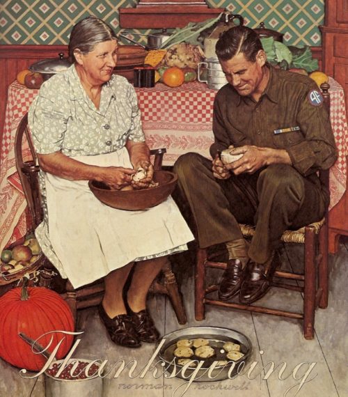
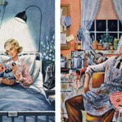
For example, compare the tight realism of this Norman Rockwell painting:
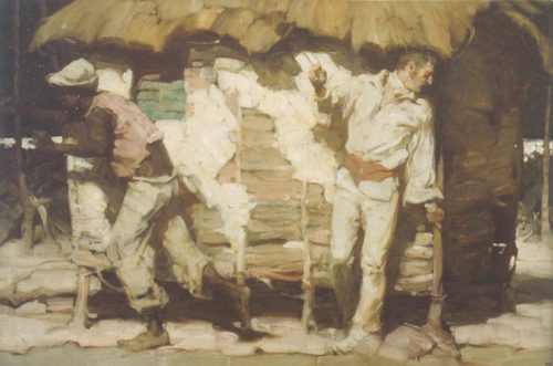
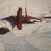
…with the broader, more vigorous brush strokes in this painting by Schaeffer:
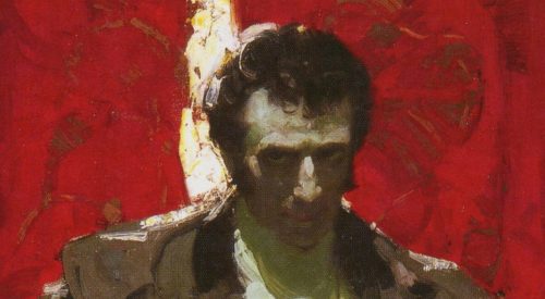
The following close-up shows Schaeffer’s lush, thick use of paint. Rather than polish and blend colors the way Rockwell did to achieve that photographic look, Schaeffer deliberately left the visible trail of his brush in order to show off the tactile qualities of paint:
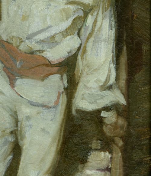
Illustration historian Fred Taraba wrote about Schaeffer’s work, “It is the mood that carries the message rather than the overabundance of detail typical of his contemporaries, including his friend and neighbor Norman Rockwell…. If the mood was right, details could remain implied.”
Rockwell wrote in his autobiography that he was confounded by how quickly Schaeffer was able to paint using this style:
I’d always ask the model, “what did Mr. Schaeffer work on yesterday?” “Oh,” the model would say, “he did a picture of a lumber camp.” “How many figures?” I’d ask. “Five or six,” the model would say, “and a horse.” This would drive me crazy. I was spending days painting a single figure.
Schaeffer’s expressive style meant that he did not always measure everything to see if proportions and anatomy and perspective were exactly correct. To the contrary, he sometimes reshaped and exaggerated his subject to achieve the mood he wanted.
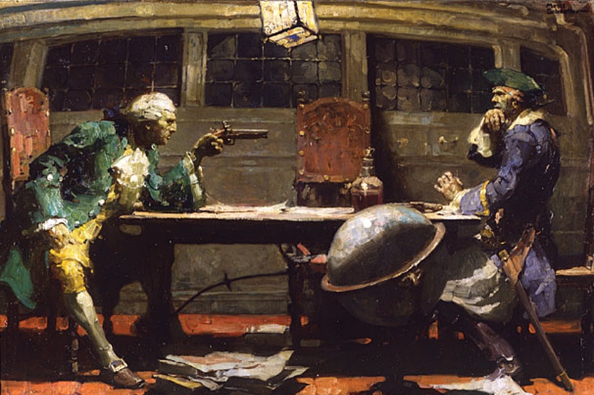
For example, his painting of the Count of Monte Cristo achieves a heightened dramatic effect by presenting the Count as unnaturally tall:
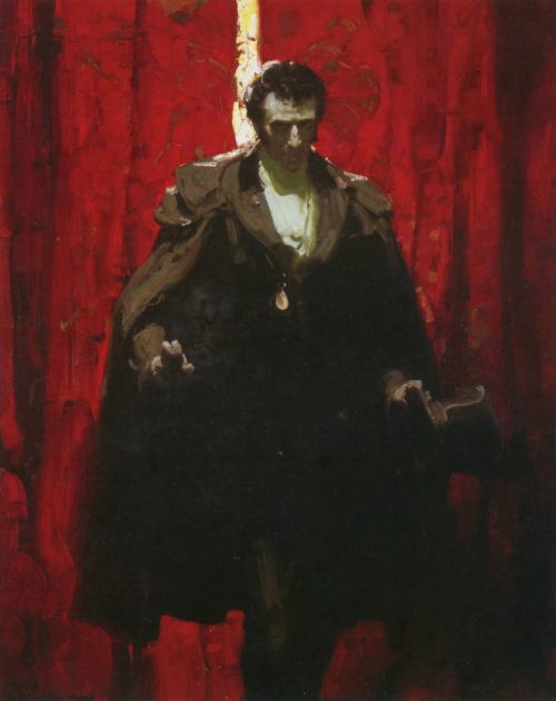
If measured objectively, Schaeffer’s version of the Count might stand eight or nine feet tall. Those long legs are way out of proportion. Notice how that knee projects out of the darkness in the anatomically wrong place:
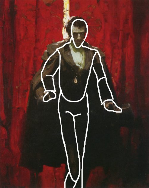
This was not a mistake. Schaeffer did this intentionally. He was not creating a chart for anatomy students; he was an artist using exaggeration and distortion to create a spell. The Count’s dreadful height and proportions created an ominous mood that could not be conveyed with Rockwell’s more realistic approach. Schaeffer took liberties that Rockwell could never allow himself.
Another part of the “mood” of the painting comes from the way the Count is dramatically lit: his body disappears into the dark shape of his cloak, but his face and chest are illuminated, with a stripe of light that points us right to the face like a lightning bolt. If we look at a close-up we can again see Schaeffer’s use of expressive, visible brushstrokes.
Schaeffer sometimes finished a painting in a single afternoon. Like Rockwell, Schaeffer used models and photographs for reference but did not paint in a photorealistic style. Unlike his friend Rockwell, who was a dedicated workaholic, Schaeffer also believed that there was a time to paint and a time to step back from painting to refresh his mind (usually by going fishing). It’s no wonder Rockwell wrote that watching Schaeffer would drive him crazy.
Schaeffer’s pictures showed a freedom and spontaneity which many of his peers admired and sometimes envied. Schaeffer’s work is in the process of being rediscovered by critics, and a new biography is being published by The Illustrated Press.
Featured image: Illustration for The Black Buccaneer by author Stephen Meader (Wikimedia Commons)
Become a Saturday Evening Post member and enjoy unlimited access. Subscribe now

Comments
The white line drawing you made doesn’t manage to trace the characters torso so you had to draw the crotch higher up to make the line drawing look correct. That’s why you think the legs look anatomically incorrect.
Thank you for this bit of history on these two phenomenal illustrators Norman Rockwell and Mead Schaeffer and their styles. I like many have been a fan of their work for many years.
I would be curious to know, now that you have exposed to the thinking behind each of these men’s particular illustrative styles, why it was that Mead Schaeffer adapted more of Norman Rockwell’s style, ie being more detailed, at some point when he began doing covers for THE SATURDAY EVENING POST.
This new feature on Mead Shaeffer’s painting and art techniques compared with Rockwell’s is a great companion piece to your October 2017 feature on his Post covers. They often were more dramatic/graphic depictions of World War II through art (in color) vs. LIFE’s black and white photo covers. He got down to the nitty-gritty for the Post to be taken as seriously as LIFE as a ‘war magazine’ on this truly all consuming topic.
I like the inside story on here on Schaeffer’s techniques and what he felt was important (or not) compared to Rockwell’s. I never would have realized his ‘Count of Monte Cristo’ was actually exaggerated and distorted to the extent you describe to cast his spell of dramatic effect. I would have to say it was very effective, and knew exactly what he was doing! That includes his intentionally leaving in the brush strokes as you described.
In your March 2018 feature on illustrating the earliest cars, I put additional comments in last January on how Art Fitzpatrick would intentionally exaggerate and distort the Pontiac’s he drew in the famous 1959-’71 ad series for the dramatic appeal (fantasy) photography would never allow otherwise. He worked closely with Van Kauffman who drew the background and people to bring it all together. My previous comments there go into all that.