How to Look at a Norman Rockwell Picture: Part 6 — Rockwell’s Gift for Design
Read all of art critic David Apatoff’s columns here.
This is the sixth in a series of columns on how to appreciate the artistic side of Norman Rockwell’s paintings. See Part 1 on Rockwell’s use of hands, Part 2 on his use of black and white, Part 3 on how he leads your eye, Part 4 on his interaction with the great artists in history, and Part 5 on his mastery of light and color.
How is a painting different from other art forms, such as music or literature?
All three art forms convey a message or a feeling, but music uses sounds to appeal to our ears, literature uses words to appeal to our minds and a painting uses visual images to appeal to our eyes. Painters express themselves in colors and shapes and lines, and the quality of their image is judged by their ability to combine these visual elements into a good design.
If you look closely at Norman Rockwell’s work you’ll see he was a master of design.
What makes a design “good”?
A painter can’t simply put shapes and colors in a straight line, like words on a page. Words on a page are efficiently organized; they’re uniform in size, consistent, and organized in straight lines, but visually they’re monotonous. Painters must arrange a variety of shapes, colors, and lines in unusual ways that are creative, interesting, and pleasing to the eye. Art students are taught that uniformity, symmetry, and repetition are often the enemy of good design. These are examples of lessons for students at the Famous Artists School, where Norman Rockwell taught for many years:
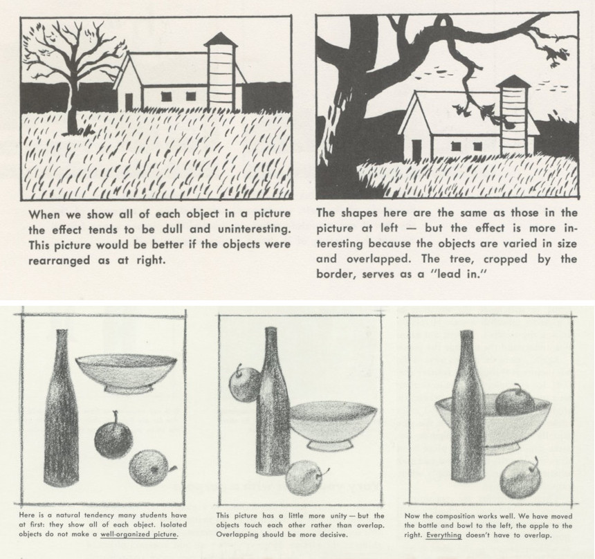
These lessons tell students that pictures are more appealing to our eye when the elements of the picture are a variety of sizes rather than uniform; when they continue off the edge of the picture to intimate a larger world beyond the borders; when they are clustered together in little groupings, rather than isolated; when the objects in a painting overlap with each other to establish a harmonious relationship; when the objects in the painting have complex or interesting outlines. These and dozens of other factors are what artists take into consideration when they design a picture.
A mere story-teller would not be too concerned about the design or composition of the picture.
becomes responsible for the forms used to convey the content. But Rockwell the artist felt that it wasn’t enough to tell a good yarn with a picture. A picture had to be well designed with a good composition. Let’s look at some examples of how Rockwell designed his picture to make it especially interesting for the viewer.

In the picture above, notice that the boy takes up the central position in the heart of the picture, over the centered blue circle, but the composition is still not symmetrical. Rockwell has given us a strong diagonal line, formed by the duck’s wing, which leads us to that beautifully designed trail of books that takes us aloft and makes the composition more interesting.
In this next painting of Louisa May Alcott, note how Rockwell designed the painting with another strong diagonal, which extends from the hat in the bottom right corner up to the face in the upper left corner, dominating the picture like a shining sun in a landscape painting.
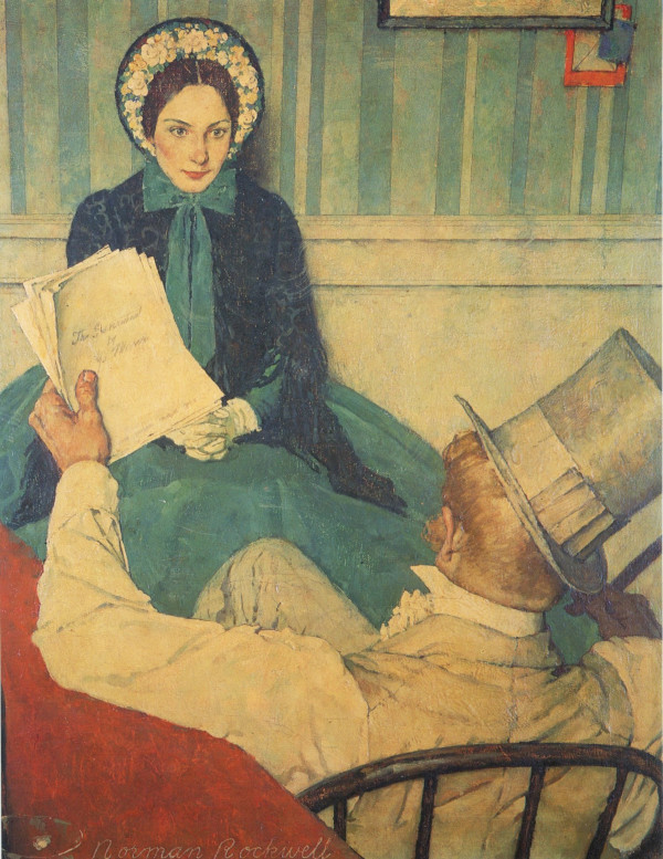
Notice too how Rockwell uses the principle of overlapping elements to give us a feeling of great solidity and strength. In a less well-designed painting all these elements could have become fragmented or worked against each other. But in Rockwell’s carefully designed painting these figures are the visual equivalent of mountains in a landscape painting, and give us the same psychological feeling of rest and composure that a mountain range would.
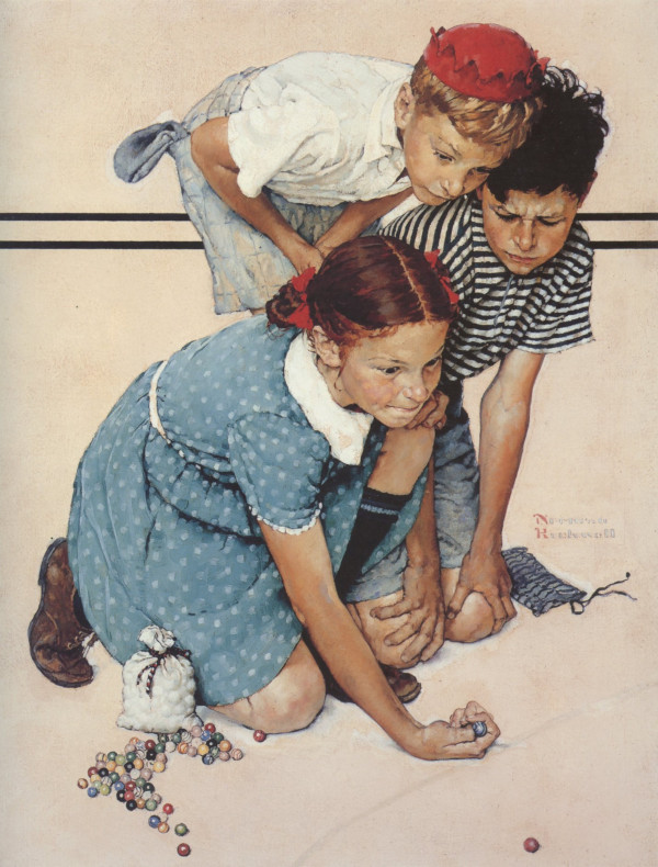
This next example shows us a beautiful grouping of figures. Notice the interesting outline around the three children and the shapes of the gaps caused by their arms. (It may help to envision them like a silhouette.) Inside this abstract shape we see a joyful array of patterns and textures: a bold black and white striped shirt contrasted against a bright red hat or the girl’s polka-dotted dress with that powerful white collar. Each child has a very distinctive pose and facial expression, yet visually the three fit together like pieces of a single jigsaw puzzle.
Finally, in this last example look at how Rockwell designs this image so that the girls are interlocked. A lesser artist might assume all three figures standing straight up, perpendicular to the ground, in which case they would never intersect. But Rockwell shows us one girl leaning forward, one girl leaning backward, and one girl with a petticoat protruding outward. In this way Rockwell sews together all the figures in this dynamic composition.
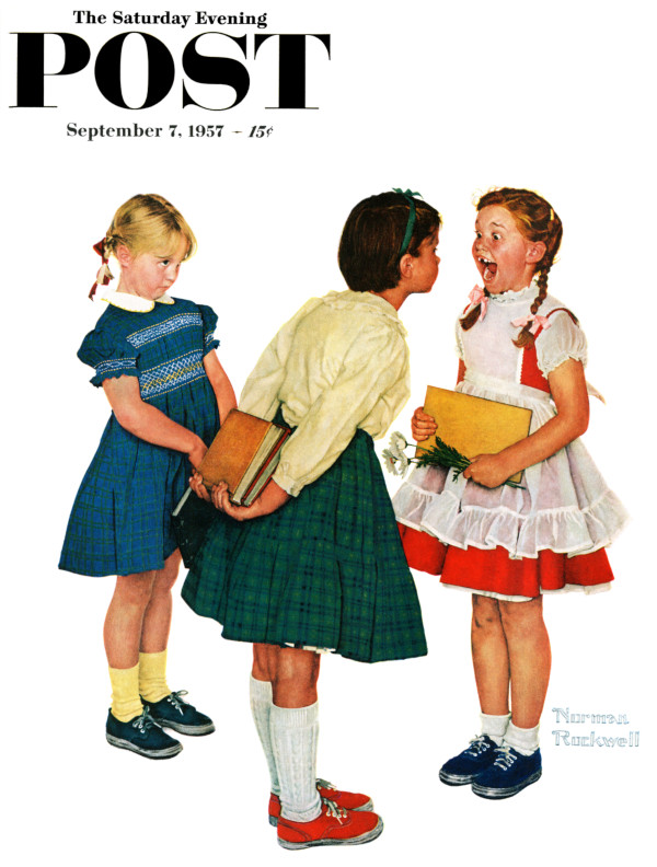
This illustration tells a great, funny story about kids. A good story teller might be content with painting standard looking children sufficient to convey the joke. But Rockwell went way beyond the joke and spent a great deal of time and talent carefully working out a strong visual design.
In that sense, Rockwell was like every other fine artist who believed that form and content must be balanced in a work of art, and that a painting that does not achieve excellence in both categories is a diminished painting.
Featured image: SEPS