Rockwell Video Minute: Arguing Politics Over Breakfast
See all of the videos in our Rockwell Video Minute series.
Featured image: Norman Rockwell / SEPS
The Art of the Post: The Artist Who Drew on Toilet Paper
Read all of art critic David Apatoff’s columns here.
There’s no stopping a born artist.
Artist Sarah Goodridge grew up in a small colonial village where she had no pencil or paper but learned to draw by scratching pictures with a pin on birch bark. Polish artist Edward Galinski, held prisoner in a Nazi concentration camp, continued to draw by scratching images on the plaster walls of his cell. The young artist Austin Briggs lacked art supplies but improvised by drawing on window shades he removed from condemned buildings.
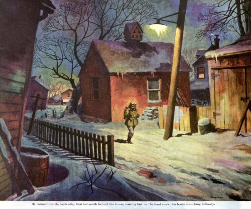
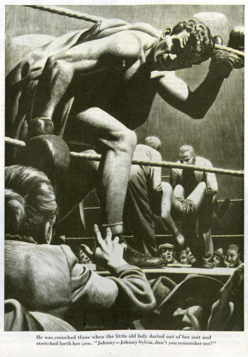
But few artists could match the story of illustrator James Bingham (1917-1971) who, as a young boy, drew on his family’s toilet paper. Bingham’s son recalled the family legend: “When Dad’s family got together they all used to complain about having black bottoms… Dad used to go to the bathroom and draw on the toilet paper then roll it back up!”
It’s true that Bingham lived to make pictures.
He grew up in Pennsylvania, the son of an architect. Starting at the age of three, he spent all his spare time drawing and painting. He did the artwork for his school yearbook all four years of high school.
When he graduated, he was already and experienced artist. Bingham spent two short semesters at art school before the school offered him a job as an instructor. Instead, Bingham moved to New York to start a career as an illustrator.
He had just begun when World War II interrupted. Not one to let a little thing like a world war get in the way of his drawing, Bingham joined the Navy where he worked on propaganda pictures for the war effort, including caricatures of Hitler and Hirohito.
After the war, Bingham made up for lost time, reportedly taking only 11 days of vacation in nine years. When friends suggested that he take some time off to develop a hobby, he said that if he had a hobby it would be to “paint.”
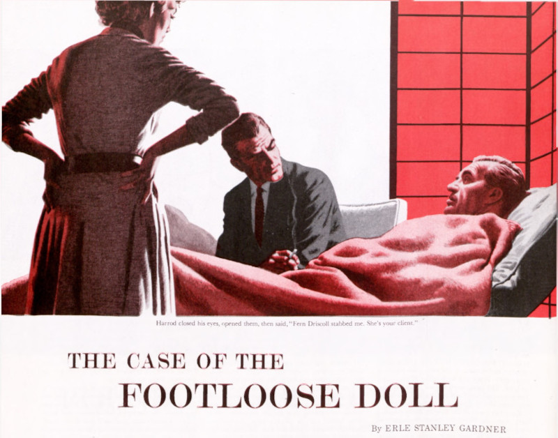
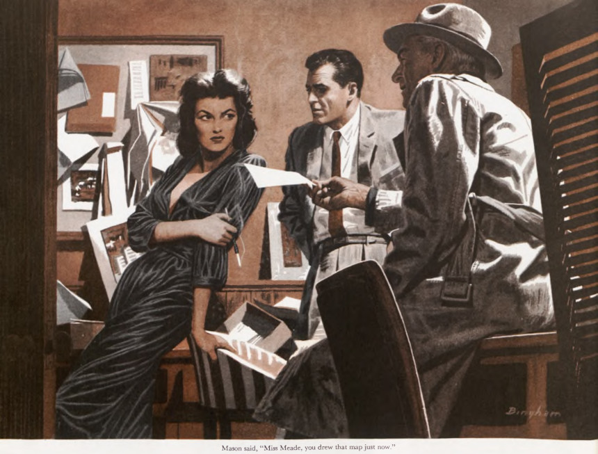
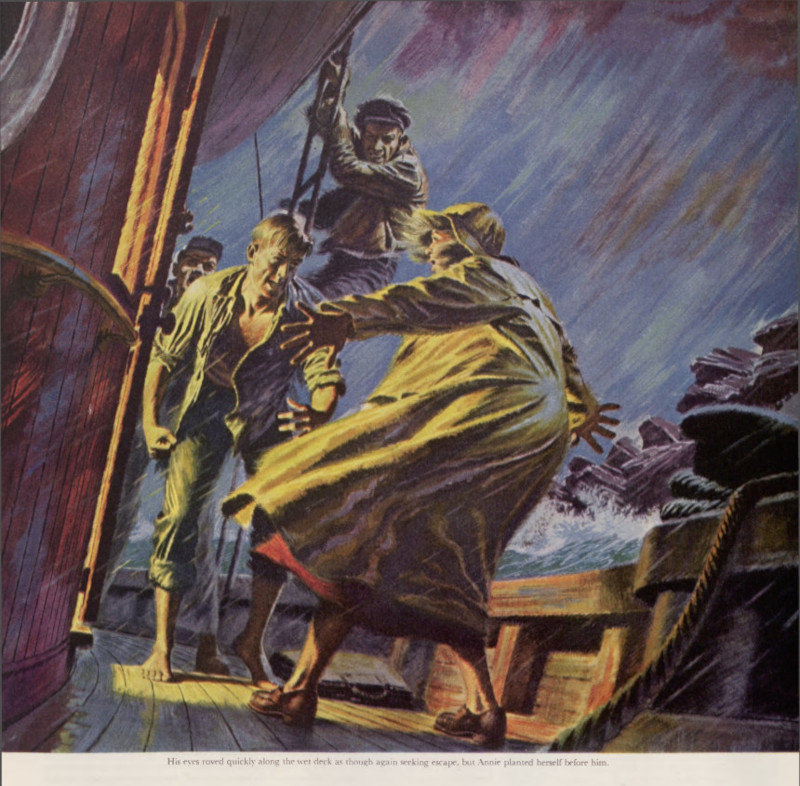
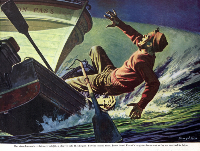
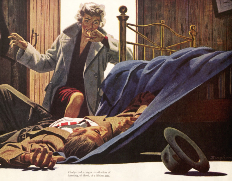
With this work ethic, Bingham became one of the most prolific illustrators of the 1940s and ’50s. For The Saturday Evening Post he illustrated the highly popular Perry Mason and Tugboat Annie series as well as many other story illustrations.
He also worked for other magazines such as Argosy, Good Housekeeping, and Esquire. He illustrated Pearl Buck’s novel, Pavilion of Women.
At the same time he was illustrating fiction, he was a hugely popular commercial illustrator for many of America’s largest commercial accounts. U.S. Steel, Nieman Marcus, Maxwell House Coffee, Gulf Oil, Cannon Towels, Caterpillar Tractor, Philadelphia Whiskey, Alcoa Steamship Company, and Champion Spark Plugs were among the many corporations that called upon his talents.
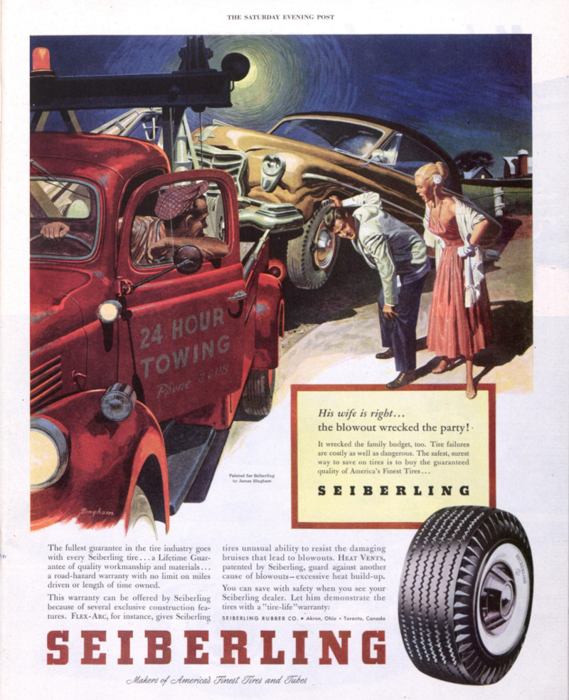
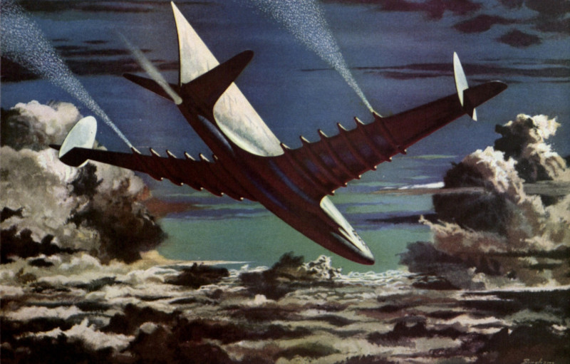
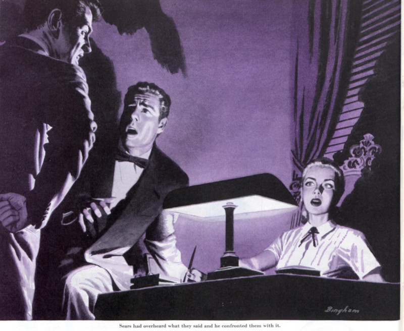
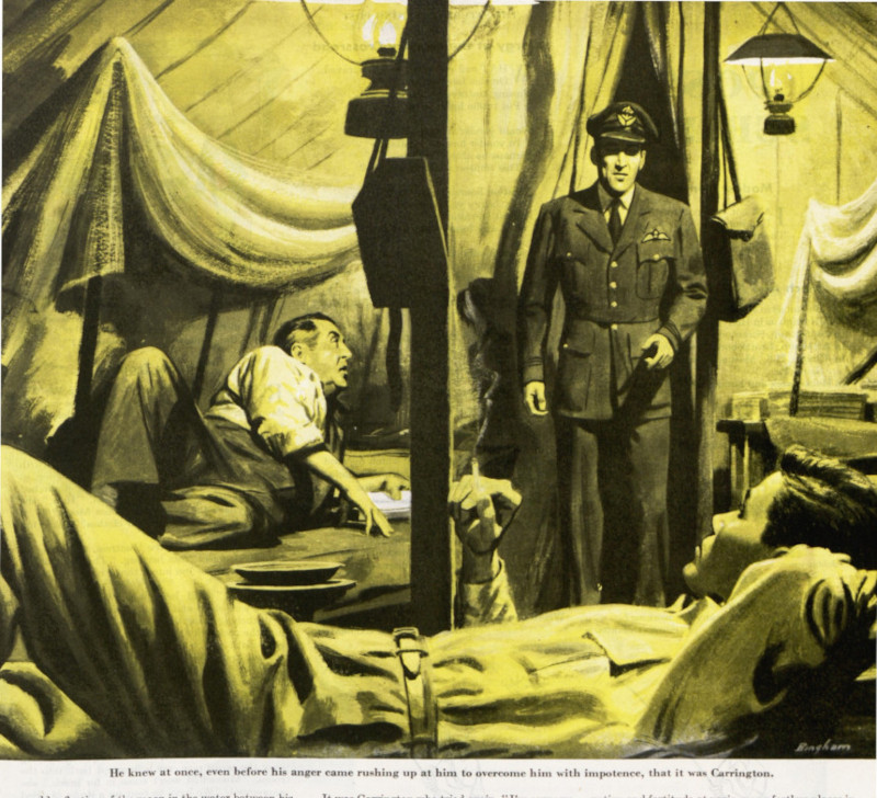
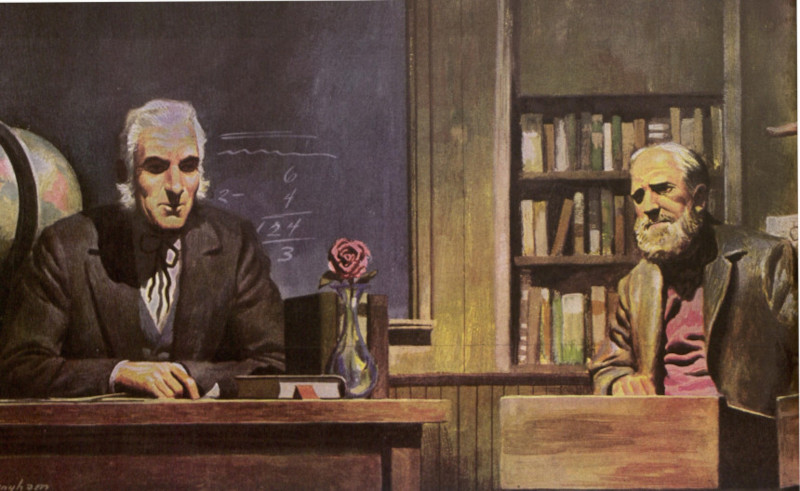
One of the advantages of working nonstop was that Bingham developed the skills necessary to portray any subject from any angle, in any lighting, using any perspective. He became a “utility infielder” of illustration. Art directors knew he could be relied upon to do a good job on a tight deadline, whether the subject was a shadowy noir detective scene or aerospace machinery.
Bingham could be trusted to make the picture work, whether the budget allowed for only two colors or permitted full color.
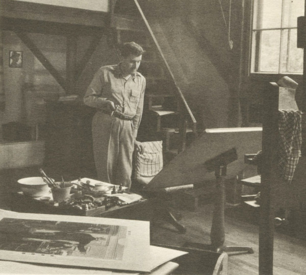
In the 1950s, Bingham moved to Florida where he continued to draw and paint nonstop. He worked on illustration assignments he obtained through his agent in New York, but he also branched out into a second career doing architectural drawings. His son recalled, “For a while I think Dad did just about every high rise ever envisioned for south Florida.”
When we study Bingham’s pictures, it’s easy to see what made him so attractive to such a diverse group of clients. He was not a flashy stylist who inserted his opinions into each picture or showed off his technique. Readers never had to struggle with his interpretations. Instead, he had a very clean approach, depicting his subjects with a simplified realism that proved very appealing to readers. There were no warts or moles in the world that Bingham painted.
I’ve written in this column about other illustrators for the Post whose style was readily recognizable, such as J.C. Leyendecker or Norman Rockwell. But there is also a role in art for an objective visual reporter like Bingham who could simplify a picture to its essence.
Like a dedicated artist, Bingham died in the middle of a painting. He was working in his studio on an illustration for Chris Craft when he had a stroke, and passed away shortly thereafter. In hindsight, we’d have to say he succeeded in doing what he cared about most: using his time to make as many pictures as he possibly could.
Featured image: James Bingham / ©SEPS
The Art of the Post: The Ornery Illustrator
Read all of art critic David Apatoff’s columns here.
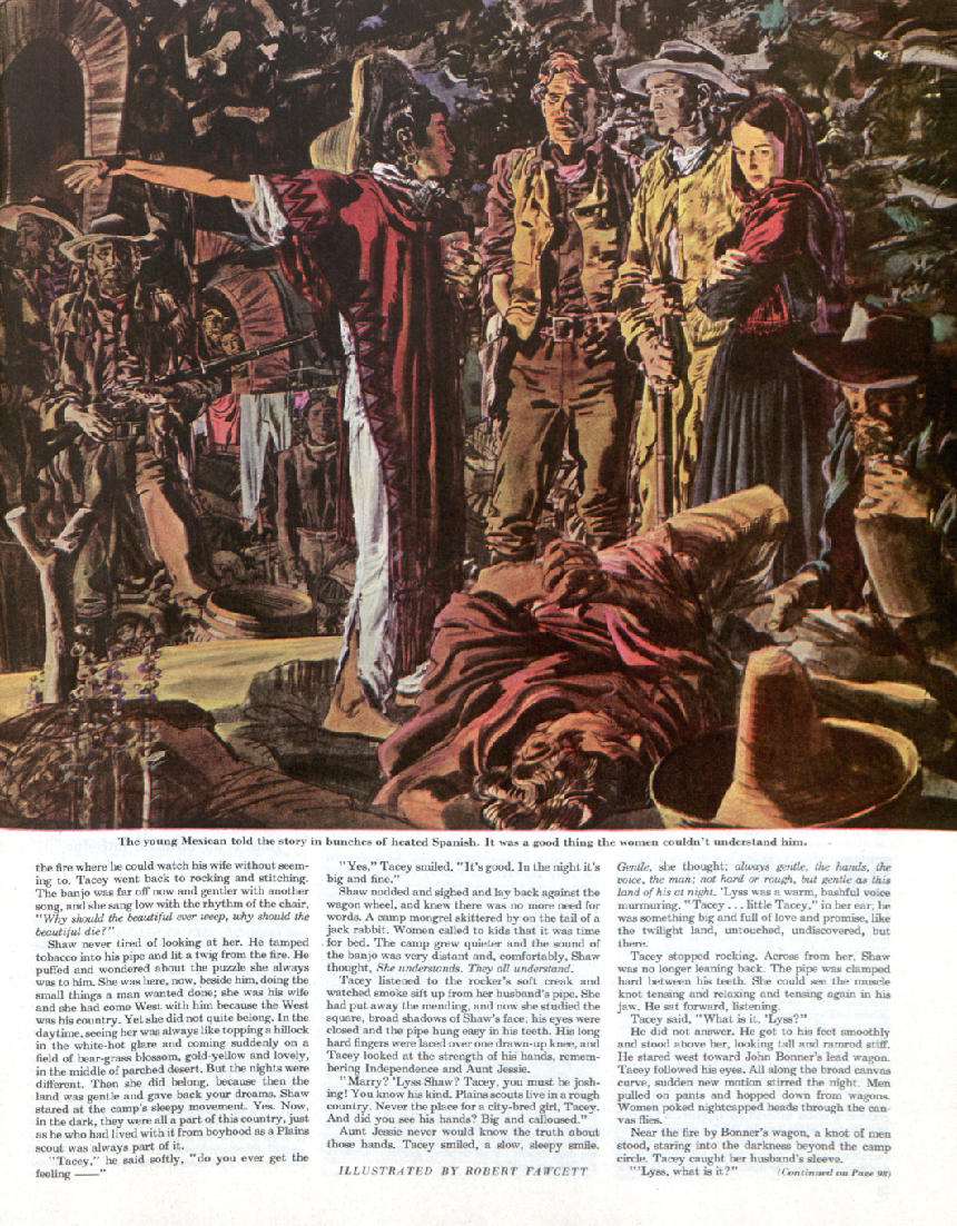
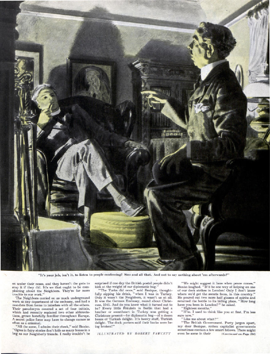
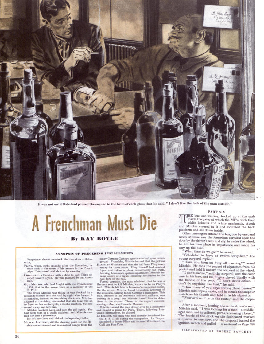
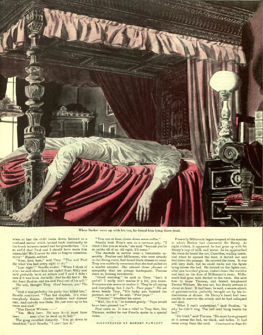
Robert Fawcett illustrated for The Saturday Evening Post in the 1940s and ’50s. He was known as one of the best draftsmen in American illustration…also one of the most prickly.
Fawcett had no patience for diplomacy. Brilliant, opinionated, and candid, he had strong views about everything from art to politics, and was fearless about expressing them, whether people wanted to hear them or not. Friends recalled that he could be quite intimidating.
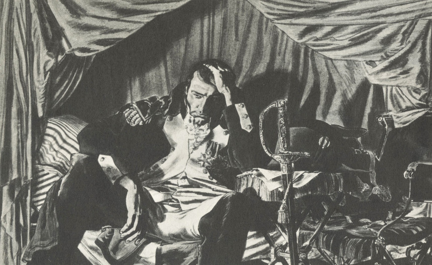
On one occasion, a client instructed Fawcett to revise the face on an illustration of Napoleon. Fawcett refused. He felt the client’s bad idea would diminish his picture, so he kept the picture for himself.
On another occasion, Fawcett turned down a plum assignment to illustrate the hit musical Oklahoma! Fawcett made preliminary sketches, but an art director suggested that Fawcett could improve the image by making the illustration more “theatrical,” putting bright colored shirts on the cowboys and making them more flamboyant. Fawcett replied that he was not interested in working in that style, and suggested that another illustrator would be better suited for the job. He returned the project to the client.
Fawcett would scold politicians, advertisers, publishers, and artists for their low standards or ignorant views. A less talented artist never could have gotten away with such behavior, but everyone had such respect for Fawcett that he never lacked for friends or assignments.
Fawcett was born in 1903. As a boy, he loved to draw and trained in lithography shops, advertising agencies, and commercial art studios — wherever he could find work. His dream was to attend London’s Slade School of Art, which was famous for training several generations of the best draftsmen in England. The school prided itself on stripping away all gimmicks and artifice and focusing on pure drawing skills — exactly what Fawcett wanted.
By the time he was 19, Fawcett had saved enough to pay for two years at Slade. He studied there from 1922 to 1924 and got a tough, old fashioned art education. Fawcett recalled that under the watchful eye of stern teachers, “I did nothing but draw from the model eight hours a day for two years.”
Fawcett returned to the U.S. and began his career as an illustrator. In an era when the popular illustration style was to paint in bright colors, Fawcett — who was color blind — developed his own distinctive methods. He would draw a picture in black ink, and then paint over it with washes of color, which he often had to select by reading the label on the paint tube.
He soon became famous for his eccentric working habits.
Art Director Howard Munce described Fawcett’s technique for creating his own drawing tools: “Bob had a habit of poking around the studios of his friends and finding beat-up brushes that had known better days. The owner was always amused and pleased to give them to him when he showed an interest. Back in his own studio, he’d give the tired discards a shave and a haircut with a sharp blade and refashion them to suit his needs. Mostly he made wedged tips of various angles to serve special functions in his illustrations. In his hand, an old brush would begin a new life. He might use it to stroke in lines, to indicate a complicated bit of rococo molding, or to scumble in a particular texture. But however he used it, it would always leave his unmistakable imprint.”
Similarly, when magic markers were invented Fawcett was among the first professional artists to use them. Most illustrators stayed far away from the strange new medium because they were unpredictable and frustrating. Fawcett seized upon them and converted them into his own customized tools. He would whittle and reshape the felt nibs, or deliberately let them dry out to create a rougher line. He showed how to use the new tools to maximum advantage. The manufacturer of the new pens, Flo-Master, was so delighted when it saw how Fawcett was able to make use of their product that they sent him a lifetime supply. Knowing Fawcett’s reputation for high standards, they made an ad bragging that Fawcett used their markers.
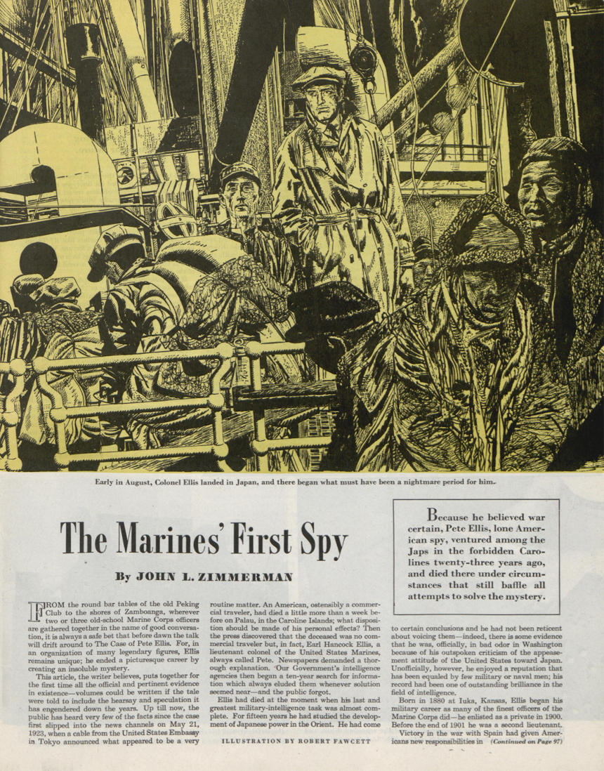
In 1945, Fawcett’s career took a big leap forward when he received his first assignment for the Post, a serial entitled, “Cadmus Henry and the Hand of God.” This initial project was so well received that Fawcett was asked to be a regular contributor and soon graduated to the top of the Post’s pay scale.
A few weeks after his illustrations appeared in the Post, Fawcett was invited to lecture to students at the Society of Illustrators in New York. Fawcett was skeptical. “I’m willing, he responded, “but who wants to hear me?” When word spread that Fawcett was going to speak, the leading illustrators of the day flocked to the hall and crowded out the students. The event became standing room only, with established artists overflowing into the corridor and out the door, straining to hear what Fawcett had to say. He had arrived.
Fawcett’s success didn’t cause him to soften his views one bit. In interviews and in published essays he openly criticized the bad taste of the advertisers who paid for his work and the magazines who published it. In The Annual of American Illustration from the Society of Illustrators (1961), he wrote, “[T]he advertising and publishing fraternities pander to the lowest common denominator or make obeisance to expediency for temporary profit. [These people] will stand revealed in their mediocrity if it continues.” Fawcett said that illustrators needed to play a role in educating the artistic taste of the public, “showing [advertisers and publishers] who now stand as arbiters of the public taste just what that taste can be developed to accept.”
In an interview in American Artist magazine Fawcett acknowledged that illustrators faced powerful pressures to lower their standards. This was primarily because of “the intrusion of the man who pays the bills — the client. His position gives him the right to prefer and to buy mediocre illustration…and he exercises this right with almost unfailing regularity….The artist must know and accept this situation…where a large income is the prime motive.”
But he exhorted his fellow illustrators not to let income be their prime motive: “It should be the aim of every illustrator to withstand the tendency of publications to force his work into a mold, to make him conform to an accepted pattern. This is a difficult thing to do — the financial rewards of conforming are great…. We must be ready to refuse work unless it allows us to conform in some degree to standards that we ourselves set, and the result should add life and character to the printed page….”
When it came to politics, Fawcett was a flaming liberal. He would sometimes start his day writing angry letters to politicians or newspapers, fuming about some social injustice or other. He made his opinions known about schools, zoning, and community affairs. He rejected both the Republican and the Democratic parties because “prejudice, bigotry and fear in the U.S. are not the characteristics of only one party.” He was a lively conversationalist and loved to debate current events, but the wealthiest man in town stopped inviting him over for dinner when Fawcett predicted that his host’s mansion was going to be converted into a retirement home for workers.
Fawcett was not an easy man to live with, but for those who were strong enough to cope he proved a scintillating companion. He lacked much formal education, but his house was a center of cultural activity. He had a strong interest in music and became friends with world famous musicians including Arturo Toscanini and Jascha Heifetz, who visited him at his home. He related music to the abstract designs that were the foundation of his “realistic” pictures. He studied Beethoven’s notebooks and believed that Beethoven’s thematic notations were very similar to an artist’s conceptual sketches: they are both “notations of plastic linear ideas.” Fawcett said that abstract drawing “is probably as close to music as drawing can come.” He claimed that the greatest influence on his illustrations came not from the visual arts but from opera.
Fawcett also kept company with a wide variety of modern artists, such as the English sculptor Jacob Epstein. Original drawings by the abstract sculptor Henry Moore and another friend, the modernist painter Graham Sutherland, hung on his walls. He was also highly regarded by his fellow illustrators even when they didn’t socialize with him. When Fawcett wrote a book about his theories of drawing, Norman Rockwell called it a “great contribution to art as well as illustration.”
Fawcett never became as famous as Rockwell or other well-known illustrators of his day, but that was Fawcett’s peculiar trade off. He believed that an illustrator who wanted to protect his or her abilities had to be prepared to give up some profitable assignments if necessary, and to sacrifice part of his or her popular audience. And if you had to insult a few clients along the way? Well, apparently that was just a bonus.
Featured image: Robert Fawcett / © SEPS
The Art of the Post: Rockwell and Payne — Great Storytellers, Then and Now
Read all of art critic David Apatoff’s columns here.
In the Golden Age of American illustration (approximately 1890 – 1940) the most popular artists were the great storytellers.
It wasn’t enough to be a talented painter. Illustrators had to use their skills to tell stories that touched the public imagination. This required them to stage convincing pictures incorporating facial expressions and body language, costumes and lighting, props and backgrounds. These ingredients had to be combined in a narrative that seemed “true” to a human nature that the public recognized.
“Fine” artists cared less about storytelling. During this same period, “fine” art became more abstract and chilly; it stopped telling stories and began visualizing concepts and ideas… or nothing at all.
Illustration reached its Golden Age before movies and television existed. This left illustrators unchallenged as the country’s visual imagination for love stories, folktales, parables and legends. Norman Rockwell, Maxfield Parrish, Charles Dana Gibson, and James Montgomery Flagg were celebrity storytellers — the George Lucas and Stephen Spielberg of their day. The public loved their work and followed it religiously.
Today, illustration has changed. Rockwell could spend months on a painting, while today’s illustrators are often given only a few days. Rockwell worked with slow drying oil paint on large canvases, but by the 1950s most illustrators had migrated to quick drying water colors or acrylic paint. They painted on smaller, lighter cardboard. Today, most work on a computer. But perhaps the most crucial difference is that few illustrators today have the patience or talent to tell persuasive stories the way Golden Age illustrators did. They leave that job to filmmakers. Rather than compete with cameras to create realistic scenes, many illustrators have turned to flat, stylized pictures focusing on concepts.
However, for contemporary illustrators with the talent and the heart to be modern storytellers, illustration shows us that human nature has not changed. The styles have changed, the clothing and certainly the technology have changed, but the same heartwarming truths that resonated during the Golden Age resonate today.
For example, everyone recognizes this type of person, the smug young graduate setting out to conquer the world.
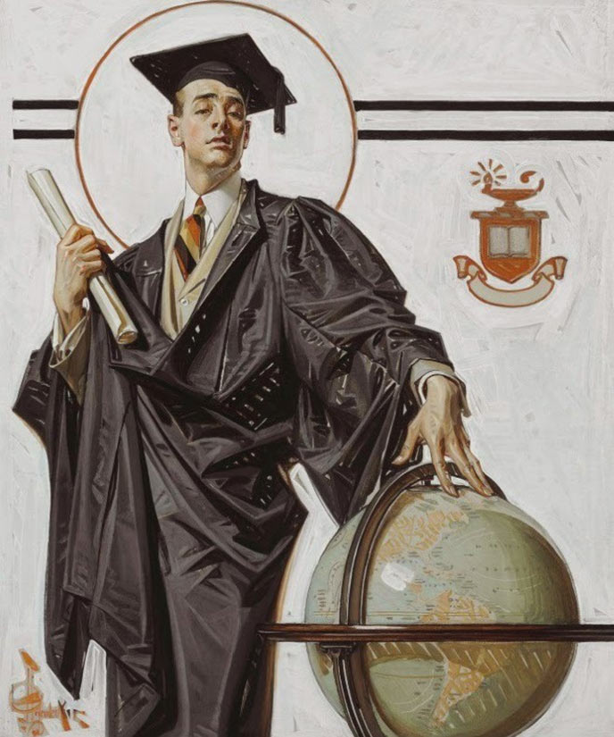
This early Post cover was painted by Norman Rockwell’s hero, J. C. Leyendecker, in 1920. Note the imperious sneer and raised eyebrow, the arrogance of youth who does not yet know what he does not know.
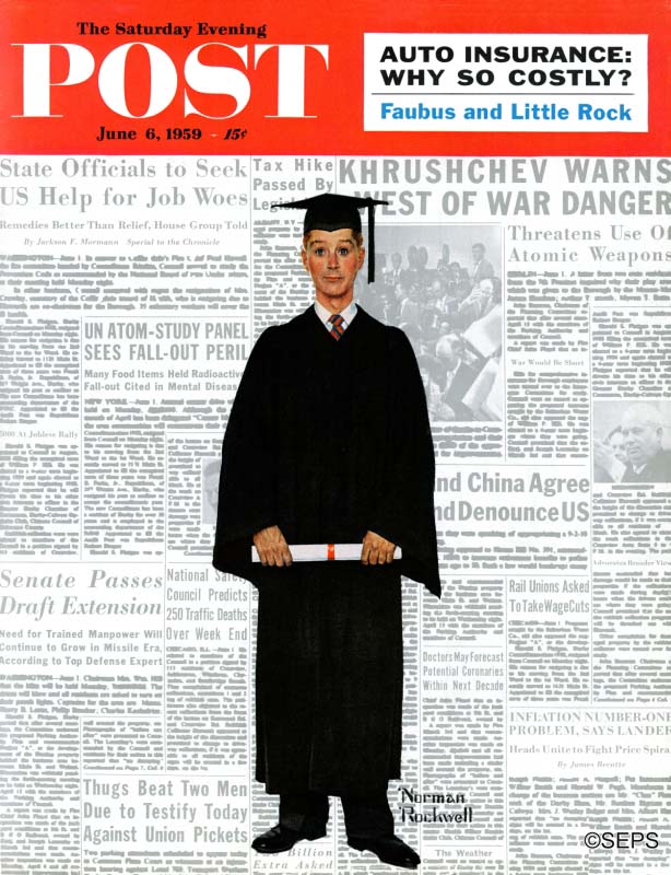
Nearly 40 years later, it would be Norman Rockwell’s turn to try his hand with the stereotype of the graduate, but the world looked very different in 1959. Instead of the smug confidence on the face of Leyendecker’s graduate, Rockwell offered us a fresh scrubbed graduate facing a world of daunting headlines.
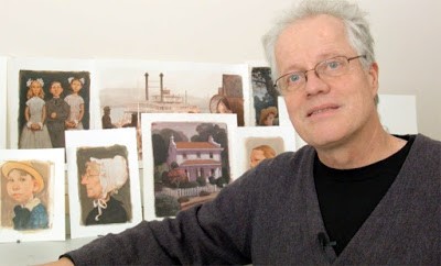
Despite the differences, we still recognize both of those very human stories. Fast forward several more decades and we find another version of the graduate, this one by the talented C.F. Payne:
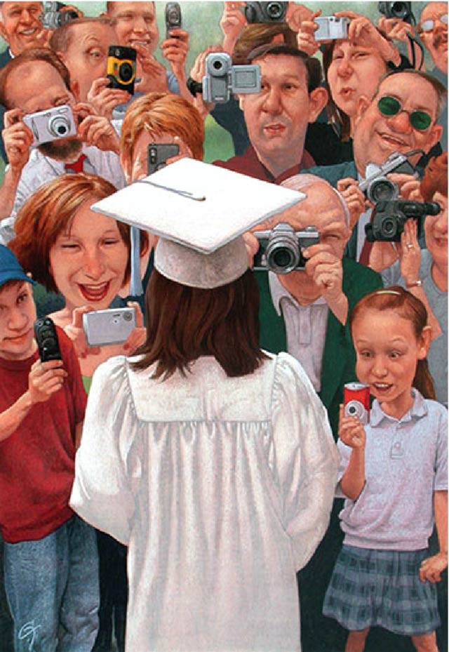
Today’s digital cameras and recorders have transformed the graduation experience again. The loving family has become paparazzi in a media feeding frenzy. The graduate has become the centerpiece once again but seems a little overwhelmed by it all. (Did you note that this time the graduate is a girl?)
There have been many changes over the years in the world awaiting these graduates, and yet these three illustrators have focused on timeless elements of human nature so these three stories still “ring true.”
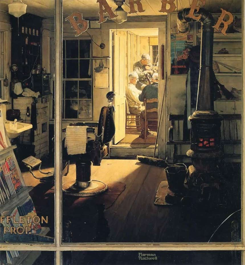
As another example, compare Rockwell’s famous painting of old timers practicing their music in the back of Shuffleton’s barber shop after hours…
…with Payne’s painting of today’s old timers practicing their beloved rock ‘n’ roll after hours in the basement:
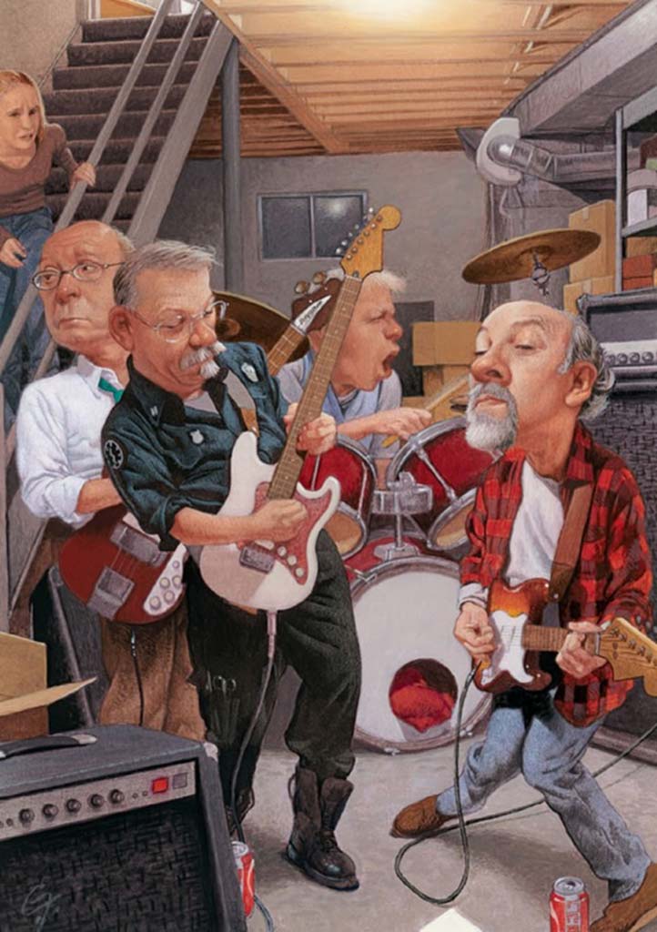
Payne’s modern version would not work nearly so well if he was not a master of facial expressions. Compare the dads thinking they’re so cool, and the horrified expression of the young daughter coming down the stairs. We all understand what’s going on here.
Of course, every great illustrator is eventually called upon to paint young love. Norman Rockwell’s cover of a boy serenading a girl is something we all can relate to, on one side or the other:
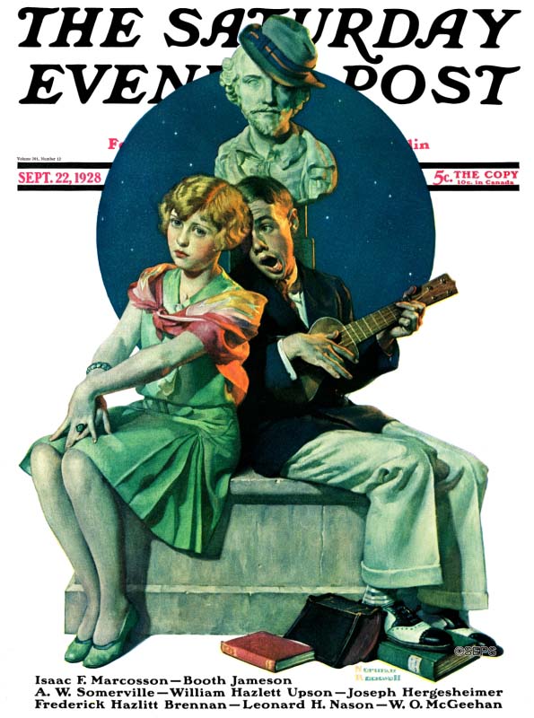
It was painted 90 years ago, but the awkward story is still fresh enough to make us wince.
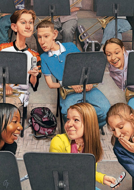
90 years later, Payne is showing us that music is still “the food of love” for gawky teenagers. You know these children, just as you know the couple on Rockwell’s cover.
Here’s another Payne illustration of modern trysting. Again, look at the waiter’s expression as he waits for the young, self-absorbed couple:
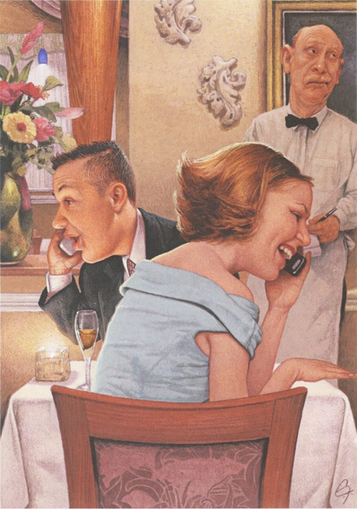
The technology has changed since Rockwell’s day, but whether you live in the city or the country, in the North or the South, you know this couple and you laugh.
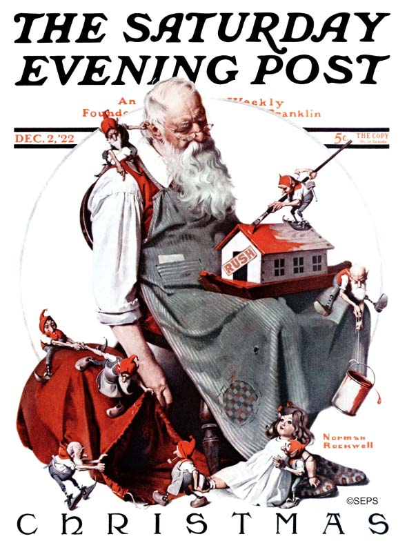
As a final example, look how Norman Rockwell’s exhausted Santa Claus receives help from his elves to get the job done:
But Payne’s more modern Santa was able to benefit from modern efficiencies:
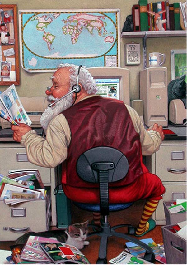
Newer technologies are a recurring theme in Payne’s “slice of life” illustrations, yet at their core is always the same warm heart that made Rockwell’s paintings resonate with viewers. Where Rockwell’s pictures of young love rely on handwritten notes, Payne’s schoolchildren send their hearts via cell phone. But we all recognize that the emotions are the same.
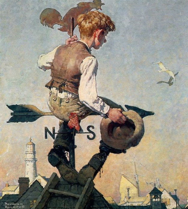
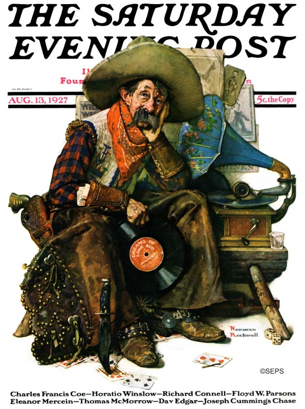
Payne is quick to acknowledge the influence of Rockwell in his work. When he was a boy, Payne was inspired by Rockwell, along with other “great artists.” He recalled, “You just can’t run away from the impact of Rockwell…. Rockwell set such a standard, not only with his storytelling but also with his craftsmanship.” Rockwell’s example compelled Payne to do his best: “If I don’t do my very best people will just not accept it. It cannot be mediocre because they’ve already got this torchbearer who set a standard.” Payne’s favorite Rockwell paintings included the classic boy on the weather vane [above] and the old cowboy listening to the Victrola:
When Payne arrived at college, some of his art teachers pressed him to abandon Rockwell’s “out of date” realism. In an interview with Brian Kane, Payne remembered, “They’d say… ‘Rockwell is not to be admired,’ so I’d get into arguments with my instructors…. I was one of those who refused to buy it.”
Payne went on to master traditional drawing skills and develop the full range of artistic talents that would make him a first class storyteller in pictures, as well as one of the top illustrators in America. He was recently elected to the Society of Illustrators Hall of Fame.
For decades he has painted covers for magazines such as Time, Reader’s Digest, Sports Illustrated, the New York Times Book Review, The Atlantic, and U.S. News & World Report. He has illustrated numerous children’s books and his work has been exhibited in art galleries and museums around the country. He learned how to paint any scenario he imagined; he learned perspective and anatomy and realism, but perhaps most importantly, he developed an uncanny ability to capture a wide range of subtle facial expressions and apply them with humor and humanity.
Apart from technical skill and talent, the humanity of the paintings from the Golden Age of illustration is a lot of what makes those old paintings continue to resonate today. It’s also a lot of what makes Payne stand out in this generation.