
On August 4, 1821, the first publication bearing the name The Saturday Evening Post hit the streets of Philadelphia, but it was a far cry from the glossy magazine of today. Back then, Samuel Atkinson and Charles Alexander’s new publication was a single 25 1/2-x-19 1/2-inch broadsheet folded in half, yielding four pages of densely packed text in five columns. Over the next two centuries, the Post would undergo many changes, the most visible being the magazine’s logo.
Use this interactive timeline to take a quick visual journey through some of the Post‘s graphical changes, and keep reading below to learn even more.
As the owners of a fledgling newspaper, Atkinson and Alexander likely kept a tight hold on the purse strings, avoiding unnecessary expenditures as much as possible, and that included fancy typefaces. The masthead at the top of those first issues was straightforward and unadorned.
![]()
But that didn’t last long. Throughout the 1820s, the Post masthead went through a number of iterations, from Medieval to downright muddled. It also picked up the motto “A Family Newspaper — Devoted to Literature, Morality, Science, News, Agriculture and Amusement.”
By the early 1830s, Atkinson had become the paper’s sole proprietor, so he decided to put his name on it:
The paper changed hands a number of times during the 1830s and ’40s, until, in 1848, the Post was bought by then-editor Henry Peterson and his publishing partner Edmund Deacon. Printing technologies advanced, and by March 8, 1856, the Post masthead included a patriotic image of an eagle, shield, and the U.S. motto.
Deacon and Peterson had dropped the old “Family Newspaper” motto and, by 1860, picked up a new one — “Devoted to Pure Literature, News, Agriculture, Humor, &c.” — along with a cleaner look.
During the Civil War, the Post’s masthead accumulated decorative flourishes in the corners and background, with an elaborate typeface reminiscent more of a circus poster than a serious newspaper. Perhaps, amid the horrors of war, the Post’s owners hoped to offer some glimmer of cheer to its weekly subscribers.
After the war, the ornamentation remained, though it was tweaked and twisted quite often. In June 1868, the masthead’s typeface changed to something less like a circus poster and more like the kind of print one would find on dollar bills — and that typeface remained for more than a decade.
Meanwhile, Peterson retired in 1873 and the paper was sold to Andrew E. Smythe.
The masthead above from June 1878 shows another Saturday Evening Post claim to fame: In 1874, when the paper was only 53 years old, it began billing itself as “The Oldest Literary and Family Paper in the United States.” Like most self-aggrandizement, there was a bit of hyperbole to this claim. The qualifiers “literary and family” are important: Other U.S. papers were older than The Saturday Evening Post — for example, the Elizabeth Daily Journal in Elizabeth, New Jersey, began publication in 1779 and would continue for 212 straight years — but they weren’t “literary and family papers.”
But the hype must have worked, because at the beginning of 1879, the Post grew from 8 pages to 16. By 1885, the masthead had been reworked and a new motto appeared: “The Great Pioneer Family Paper of America.”
Despite outward appearances, The Saturday Evening Post had gone into decline after the Civil War. By the mid-1890s, circulation had fallen drastically, and it was nearly bankrupt.
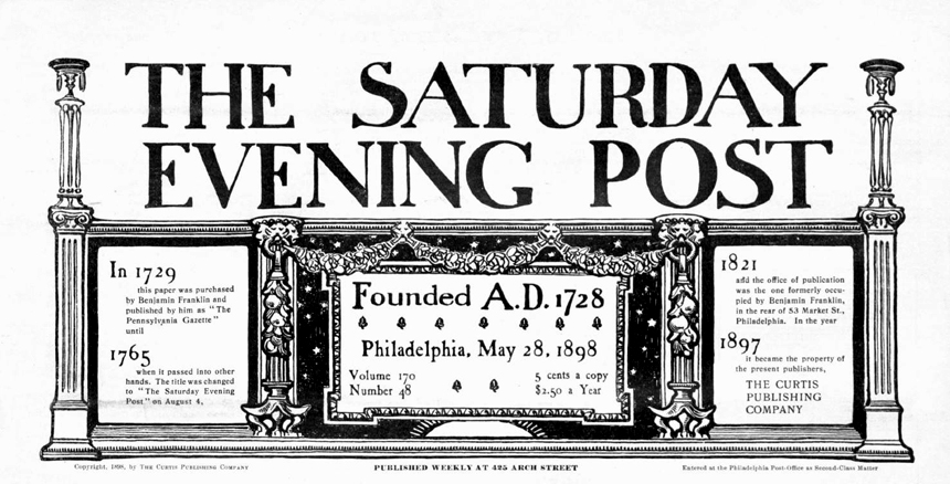
The year 1897 is an important one in Saturday Evening Post history. That’s the year Cyrus Curtis, who had created a spectacular success with the Ladies Journal (which, in 1899, became The Ladies Home Journal), bought The Saturday Evening Post for a mere $1,000. Curtis had a vision of taking what was then a more-or-less local paper and turning it into a Ladies Home Journal for men, focusing on the topics that ambitious young men were most interested in at the time — business, public affairs, and romance.
One of the first changes was to the masthead, and it involved more than just a new typeface and a 50-cent rise in the subscription price:
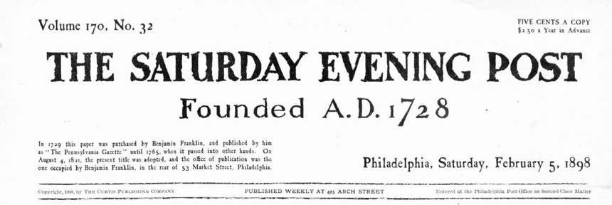
Suddenly, the Post’s history had grown by 93 years! Curtis had decided to capitalize on the Post’s tenuous link to a much earlier popular publication. The Pennsylvania Gazette began publishing in 1728, but not until Benjamin Franklin took its helm in 1729 did it begin to grow. By the time Franklin retired in 1748, he had turned it into one of the Colonies’ most popular papers. The Pennsylvania Gazette continued publishing after his retirement and death, but eventually folded at the beginning of the 19th century.
When Atkinson and Alexander decided to start their own paper in 1821, they created it in the same offices from which Benjamin Franklin had built The Pennsylvania Gazette, possibly even using some of the same printing equipment.
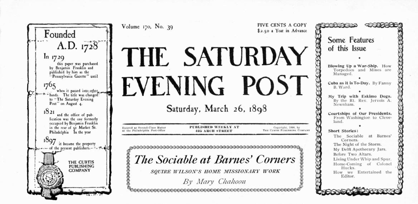
Cyrus Curtis didn’t create the link between the Post and the Gazette — others had told the story before him — but he did capitalize on it in his search for a wider audience. He kept the story front and center on the masthead, tweaking its design numerous times during his first few years.
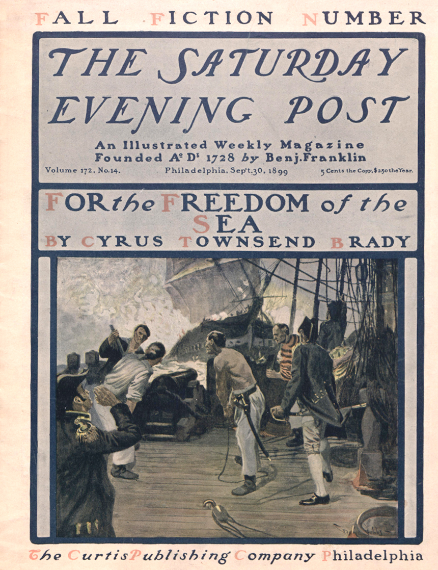
In the late spring of 1899, Curtis passed the editorial reins of his magazine to a young man named George Horace Lorimer — the editor who would see the magazine through 37 years of incredible growth. Changes to the magazine came quickly and quite visibly. First, the publication shifted from newsprint to the more modern magazine format. Also, throughout 1899, Lorimer experimented with giving the cover page over to a single, dominant image, a new idea at the time. On September 30, readers saw the Post’s first use of color on the cover:
The Post’s designers fiddled with the cover over the next two years, until November 9, 1901, when Lorimer landed on a typeface and title treatment he liked. It remained in place for 41 years.
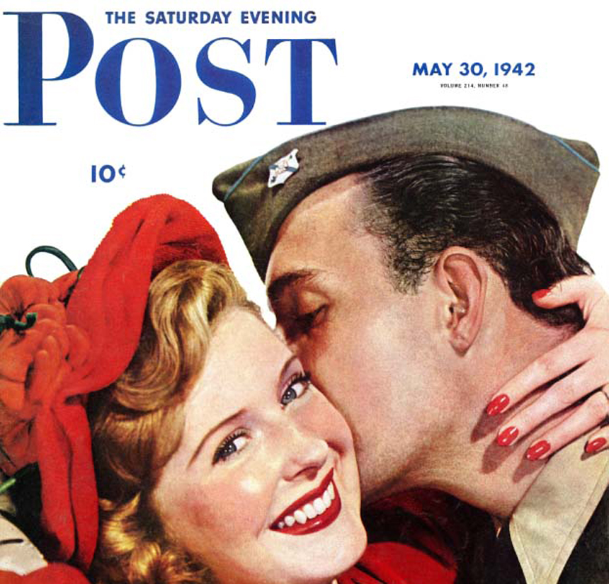
Lorimer retired in 1936, passing the editorship on to Wesley Stout and thence, in 1942, to Ben Hibbs. Not long after Hibbs took the reins, the Post got a makeover, with a new logo that emphasized the word Post over The Saturday Evening.
In 1961, with Ben Hibbs still at the editorial wheel, the Post logo underwent another change that de-emphasized The Saturday Evening even further. This time around, though, the first cover to sport the new logo drew attention to the change. Norman Rockwell was commissioned to create a cover image depicting Post graphic designer Herbert Lubalin working hard on the new design, with a dozen examples of previous Post logos on hand for inspiration.
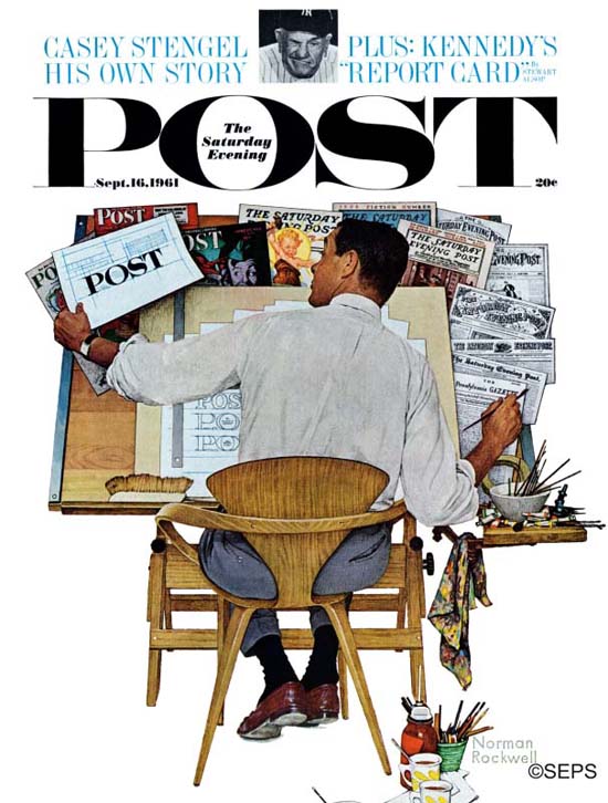
Rockwell did a little updating himself for this cover: He changed his signature to employ more modern lettering.
Sadly, that logo didn’t stay around long. During the 1960s, tweaks to the logo showed that the editors preferred the focus on the word Post but couldn’t decide where to put The Saturday Evening. In mid-1962, the logo reverted to one resembling the 1942 version, but with a new typeface.
And six months later, at the beginning of 1963, the logo was reduced to just the word POST, with the full name of the magazine appearing much smaller below it.
Toward the end of the ’60s, the Post — by this time publishing every two weeks — did some market testing are rebranded itself with a new logo that brought back the complete name.
The 1960s were a tough time for the Post. By the end of the decade, a number of missteps, a veritable revolving door to the editor’s office, and a libel suit that went all the way to the Supreme Court had left the magazine $67 million in debt and wanting for high-paying advertisers. The Post suspended printing in 1969.
Industrialist Beurt SerVaas heard of the magazine’s problems and bought the Post along with a number of Curtis Publishing’s other assets, primarily to get ahold of the popular children’s magazine Jack and Jill, which had been printing continuously since 1938.
But in 1971, SerVaas and his wife Cory revived the Post, first as a quarterly magazine and then, by 1974, publishing nine times a year. For the revived cover, the SerVaases returned to the title treatment of the 1920s and ’30s.
In 1982, the Post was purchased by the Benjamin Franklin Literary Society, a nonprofit organization founded by Cory SerVaas. Though the logo didn’t change, the magazine shifted its focus to the issues that were Cory’s passions: health, medicine, and volunteering.
In 2013, the magazine saw another shift both inside and out. With Cory’s daughter Joan SerVaas as CEO and Steven Slon as editorial director, the new Post, the one you see today, was a reaffirmation of the magazine’s vital link to America’s past. The new logo reflected that link — as it still does today — with the addition of a new motto: “Celebrating America, Past, Present, and Future.”
![]()
Get this logo delivered to your home — along with all The Saturday Evening Post has to offer — six times a year by subscribing to the magazine today!
Become a Saturday Evening Post member and enjoy unlimited access. Subscribe now

Comments
Absolutely LOVE this well-researched fascinating feature on the history of all of the past POST logos, including the circumstances that led to updates, for better and worse. The interactive timeline is beautifully done as well!
My favorite pre-1901 logos include: the clean 1821 style, 1860, 1878, 1885, and May 28, 1898. Some of the others were hard to read and had carnival overtones. Due to the Civil War, it was probably intentional as to be uplifting during those sad times.
I’m almost certain the 1942 logo was influenced by juggernaut LIFE magazine. Collier’s and Liberty had also gone over to the smaller upper left corner logos around the same time. I also think that World War II suddenly made a lot of styles of a lot of things appear old fashioned overnight, even though there was nothing wrong with the previous designs.
The LIFE-ish 1942-’62 logo was interrupted by the larger than LIFE logo across the entire cover with ‘The Saturday Evening’ snuck inside the ‘O’ in late 1961 to mid-’62, then returning to the corner. It’s a favorite logo that commanded and demanded attention.
The ’63-’64 logo looked ever more LOOK-like, which was probably intentional. The only thing different is the ‘O’ and ‘T’ didn’t have the gray background. The ’65-’68 logo deleted the black background and ‘The Saturday Evening’ more also. The Post also adopted LOOK’s top third cover space for cover blurbs. Not every issue, but many.
The mid-’68 to early ’69 logo is another real favorite. The font lettering looked like it was definitely based on the pre-’42 logo only up in the corner, and used capital and small letters (upright) to spell out the whole name once again. As things turned out, this logo turned out to be the logical prelude to the 1971-2012 logo.
We learn from this feature how many hands the POST has gone through between 1821-1971. The magazine has really been in a new ‘Golden Age’ since 2013 with Joan SerVaas, Steve Slon and their incredible team, not to mention this newly remodeled website which beautifully complements the magazine on a daily basis. The updated logo is a beautiful 21st century version of the 1942 original.
Everyone has worked too hard for too long for the POST to remain obscure. If 1969 was the year there was great awareness of its going away, let 2019 be the year of its triumphant return by any and all means necessary. 500,000 to one million and beyond? Absolutely! So let it be written. So let it be done.