See all of the videos in our Rockwell Video Minute series.
Become a Saturday Evening Post member and enjoy unlimited access. Subscribe now
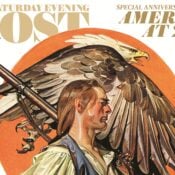
In 1961, Norman Rockwell perfectly captured the creative process that went into developing the Post’s new logo. (His painting lasted much longer than the new design!)
See all of the videos in our Rockwell Video Minute series.
Become a Saturday Evening Post member and enjoy unlimited access. Subscribe now

Comments
The details are indeed exquisite – I especially love the Norman Cherner Plycraft Armchair.
As those chairs were commissioned in 1958 by the Massachusetts-based furniture manufacturer, I often wonder if Rockwell chose the chair for its aesthetics, because it was locally made, or because Lubalin actually sat in one?
My one critique: Lubalin was a lefty, not a righty. When he studied calligraphy at Cooper Union, this was a disadvantage that he brilliantly and tenaciously overcame.
I agree with John’s comment, and should have added last week that this September 1961 cover is one of Rockwell’s greatest covers. It’s easy to overlook with all of the past logos from right to left to concentrate on. Reproducing those in miniature had to have been difficult. We have to view it in its wonderful, splendid, white background totality.
He also drew Mr. Lubalin in the perfect (state-of-the-art) mid-century style, right down to his wrist watch. The cover also has some ties to Rockwell’s ‘triple-self-portrait’ from the year before. We tend to think of Rockwell’s covers as ‘nostalgic’ intentionally, but they were always up-to-the-minute at the time, for the time he painted them. The only exceptions (obviously) were covers depicting something already historical when those issues were new.
KEEP UP THE GREAT WORK. MR ROCKWELL WAS THE BEST !!!!!!!
Great video on a wonderful logo that only lasted 9 months. I’m sure the desire for a more modern look in the early ’40s in general, combined with greater pressures to compete with LIFE magazine in particular, almost forced the change at that time. There were even more factors at play in 1961 and it accompanied a whole revampment of the Post otherwise, and more throughout the decade.
I know a lot of magazines would change their logos periodically decades ago like Collier’s and Liberty, especially during World War II. Look magazine’s logo evolved during those years too, finally settling on the most familiar in 1955. From that year until 1960 it was large, across the entire top section also. That could have been an influence on the Post in 1961 to try it out, since those waters had already been tested by a competitor.
For several years in the ’60s, the name Post was almost there by itself with The Saturday Evening being very tiny. I also really loved the even briefer lasting 1968 logo in which the full name was written out. Still up in the corner, it was reminiscent of the pre-’42 logo in the lettering style, just upright and using capital & small letters. It kind of set the stage for the return of the original logo that would last through 2012.
The Post has beautifully utilized the extra space the ‘modern’ 2013-present logo has given it with some of the best covers yet! The background trees in the upper right section of the Nov./Dec. cover is a perfect recent example.