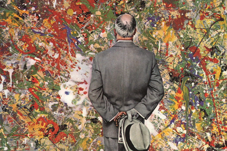
As with many of his covers, Rockwell’s Connoisseur (January 13, 1962) draws its humor from a portrait of the old confronting the new. In this case, a gentleman of old-fashioned tastes — evidenced by the gray homburg and suit, matching gloves, and umbrella — contemplates the dizzying splatters of a painting in the style of Jackson Pollock. The painting seems to nearly overwhelm him.
Many assumed Rockwell was mocking the seeming absurdity of modern art, proving what many Americans were saying at the time: “Why, I could paint better than that.”
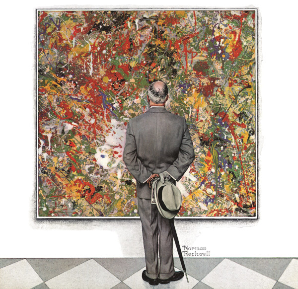
But in fact, Rockwell’s painting was intended as a tribute to modern art, not a criticism of it. Referring to this painting, he said, “If I were young now I might paint that way myself.”
And, in fact, others judged the abstract portion of Rockwell’s cover highly. Entered under a pseudonym in a New York art exhibition, it won first prize. And noted avant-garde artist Willem De Kooning said of his faux Pollock, “Square inch by square inch, it’s better than Jackson.”
This article is featured in the January/February 2022 issue of The Saturday Evening Post. Subscribe to the magazine for more art, inspiring stories, fiction, humor, and features from our archives.
Featured image: Norman Rockwell / © SEPS
Become a Saturday Evening Post member and enjoy unlimited access. Subscribe now


Comments
Rockwell was a lot more cutting-edge than people gave him credit for, then or now. I was very glad to read that his faux Pollock won first prize, and that the noted avant-garde artist declared it better than Jackson’s, square inch by square inch.
It’s too bad Rockwell wasn’t given the same respect in the late 60’s by the phony New York art crowd (as Norman Rockwell) per prior features where they were giving accolades to emptied vacuum cleaner contents and single dots on a canvas as ‘works of art’, while dismissing Rockwell.
On a note to Gene Newman, I applaud you for your attempt at trying to copy Rockwell’s modern art picture above to the extent you did. I’ve studied this picture many times and the irony of it is that while this may “look easy” or “anybody could do THAT”, just try it, and you’ll quickly find out it’s very difficult. It may appear to be chaos, but is actually anything but. Appearances (so often in life) can be very deceiving.
This is an extremely intricate work of art. I have a wide range of artists I love from Renior to Rockwell, but that also includes Picasso, Dali, Bob Peak, Pollock and all the artists for The Saturday Evening Post. I’d be curious to know how difficult doing the faux Pollock back then was in terms of time and effort vs. his ‘normal’ covers. I bet it was right up there, maybe even longer.
When I was a young amateur artist, I attempted to copy Rockwell’s modern art picture. I got the business man okay, but didn’t even try to match the painting within the painting which would have taken days. I used the Pollock method and spent a carefree 20 minutes filling in the canvas. I’m surprised Norman praised modern art, but that was his way. I’m sure I would have been more interested in it, if Norman Rockwell was involved.