The Art of the Post: Norman Rockwell’s Most Important Art Lesson
Read all of art critic David Apatoff’s columns here.
When Norman Rockwell was a young art student, he idolized Joseph Leyendecker, who he called “the most famous illustrator in America.” Leyendecker was a cover artist for The Saturday Evening Post, and painted more than 300 covers between 1903 and 1943. Rockwell dreamed of becoming a cover artist too, but didn’t know how he could ever paint as well as the great Leyendecker.
In his autobiography, Rockwell recounted how he spied on Leyendecker, trying to learn his artistic secrets:
I’d followed him around town just to see how he acted…I’d ask the models what Mr. Leyendecker did when he was painting. Did he stand up or sit down? Did he talk to the models? What kind of brushes did he use? Did he use Winsor & Newton paints?
Unfortunately, none of this information seemed to make Rockwell a better painter.
A few years later, Rockwell finally got to visit Leyendecker in his studio and watched first-hand the master working on a painting. It turned out that Leyendecker’s secret had nothing to do with his brand of brushes or paint. Rockwell recalled:
New Rochelle published a brochure illustrated with reproductions of paintings by all the famous artists who lived in the town. Joe worked on his painting for months and months, starting it over five or six times. I thought he’d never finish it.
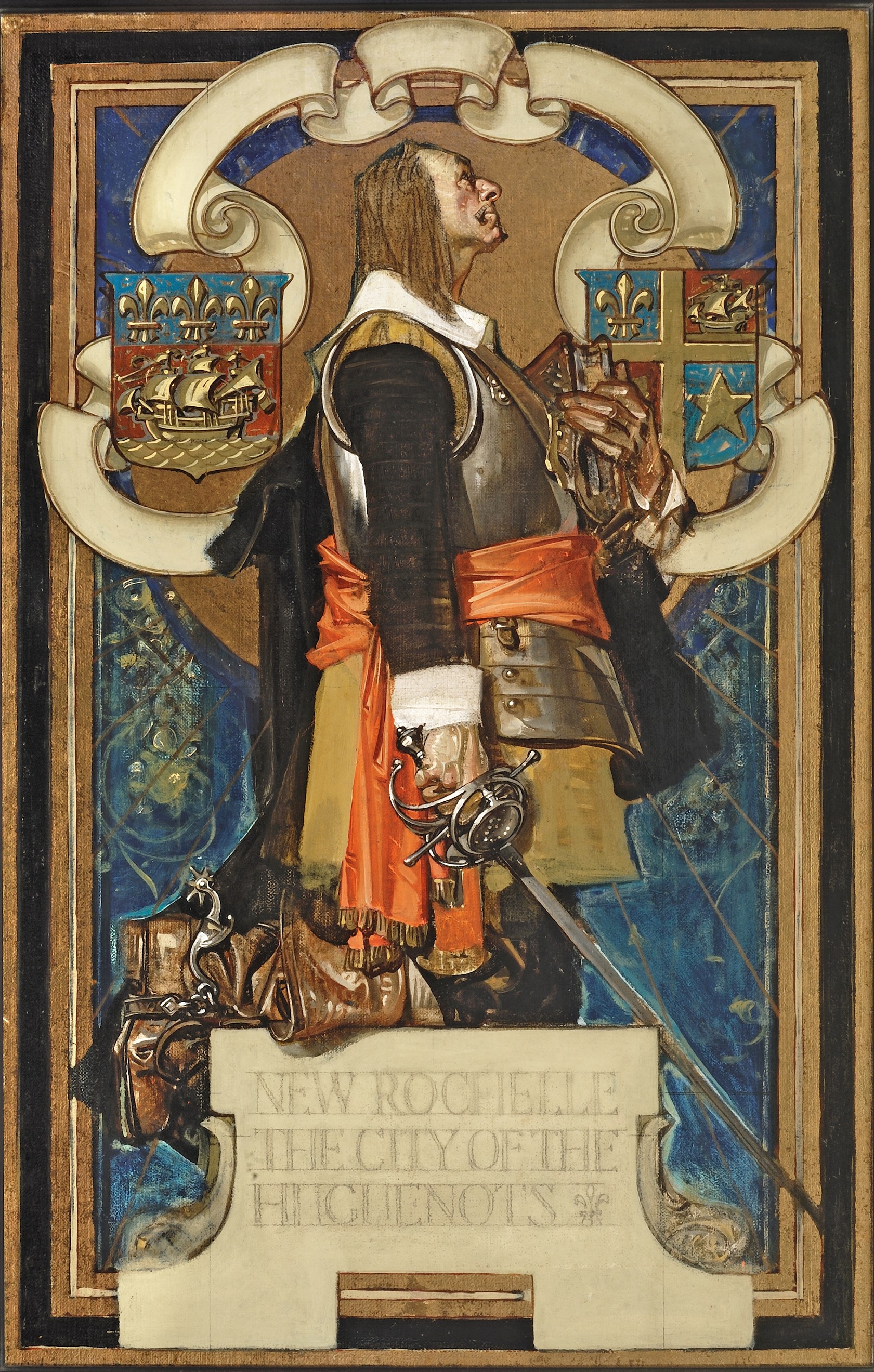
The painting that Rockwell saw on Leyendecker’s easel was beautiful, with many fine touches.
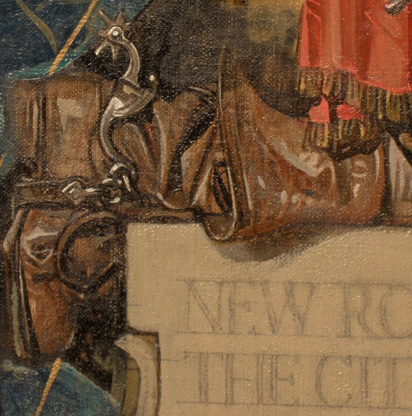
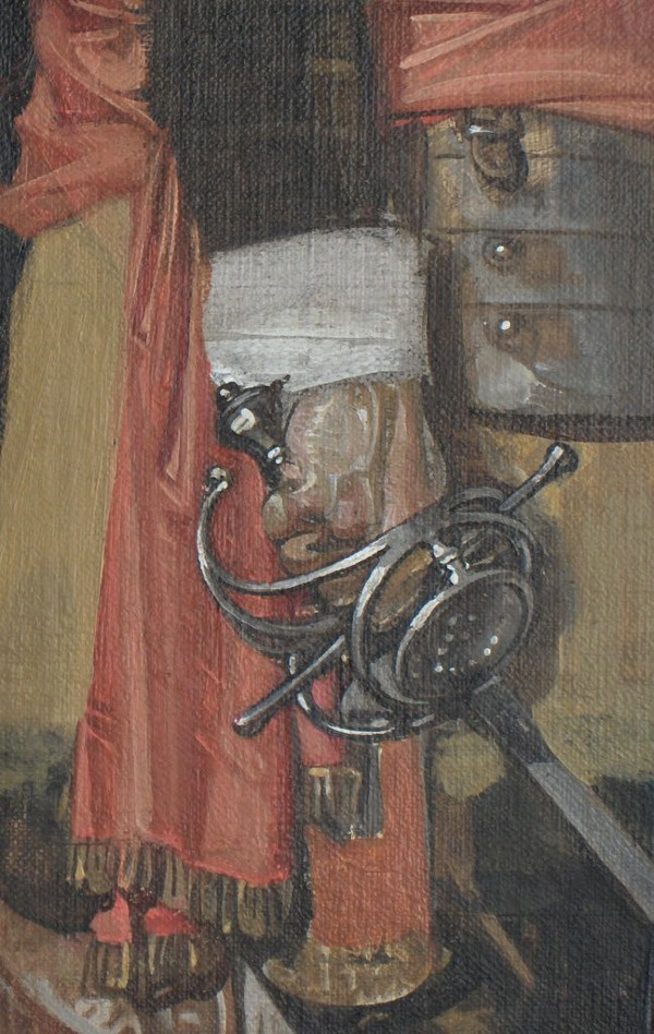
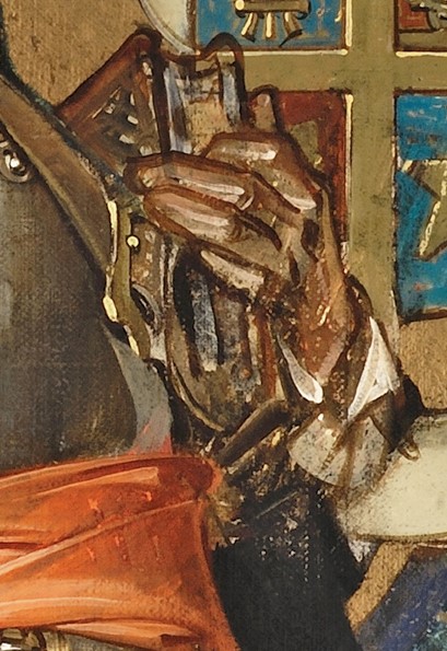
The painting was 95 percent finished and the client would have been happy to pay for it. All Leyendecker needed to do was finish this hand and a few other touches.
Yet, Leyendecker remained unsatisfied. The painting didn’t meet his high personal standards.
Rather than correct the parts he wanted to improve, Leyendecker set the entire painting aside and started all over again, searching for the exact image he envisioned.
Later, when Rockwell saw the final version published by New Rochelle, it looked like this:
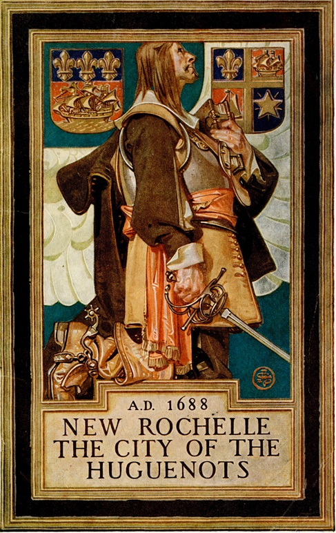
This gave young Rockwell a lot to think about: Leyendecker’s first version was perfectly acceptable; it just wasn’t 100 percent what it could have been. Leyendecker seemed to spend a lot of time starting over in search of that elusive missing five percent.
Leyendecker’s high standards made Rockwell nervous about showing his own work to the master. Rockwell wrote, “You never asked Joe…what he thought of your painting unless you wanted a real critique; he thought nothing of starting a picture over again.”
But when it was Rockwell’s turn to become a professional illustrator, it seems he had learned the lesson. He painted “100%” in gold at the top of his easel to remind himself never to give anything less. That philosophy kept Rockwell at his easel seven days a week painting countless studies in order to get the details right. If he’d been willing to accept 95 percent, Rockwell could’ve worked faster, made more money and spent more time with his family. But he learned the lesson of Leyendecker, and that’s why people still remember him and admire his work today.
Featured image: Painting by J.C. Leyendecker. Photo courtesy of David Apatoff
How to Look at a Norman Rockwell Picture: Part 6 — Rockwell’s Gift for Design
Read all of art critic David Apatoff’s columns here.
This is the sixth in a series of columns on how to appreciate the artistic side of Norman Rockwell’s paintings. See Part 1 on Rockwell’s use of hands, Part 2 on his use of black and white, Part 3 on how he leads your eye, Part 4 on his interaction with the great artists in history, and Part 5 on his mastery of light and color.
How is a painting different from other art forms, such as music or literature?
All three art forms convey a message or a feeling, but music uses sounds to appeal to our ears, literature uses words to appeal to our minds and a painting uses visual images to appeal to our eyes. Painters express themselves in colors and shapes and lines, and the quality of their image is judged by their ability to combine these visual elements into a good design.
If you look closely at Norman Rockwell’s work you’ll see he was a master of design.
What makes a design “good”?
A painter can’t simply put shapes and colors in a straight line, like words on a page. Words on a page are efficiently organized; they’re uniform in size, consistent, and organized in straight lines, but visually they’re monotonous. Painters must arrange a variety of shapes, colors, and lines in unusual ways that are creative, interesting, and pleasing to the eye. Art students are taught that uniformity, symmetry, and repetition are often the enemy of good design. These are examples of lessons for students at the Famous Artists School, where Norman Rockwell taught for many years:
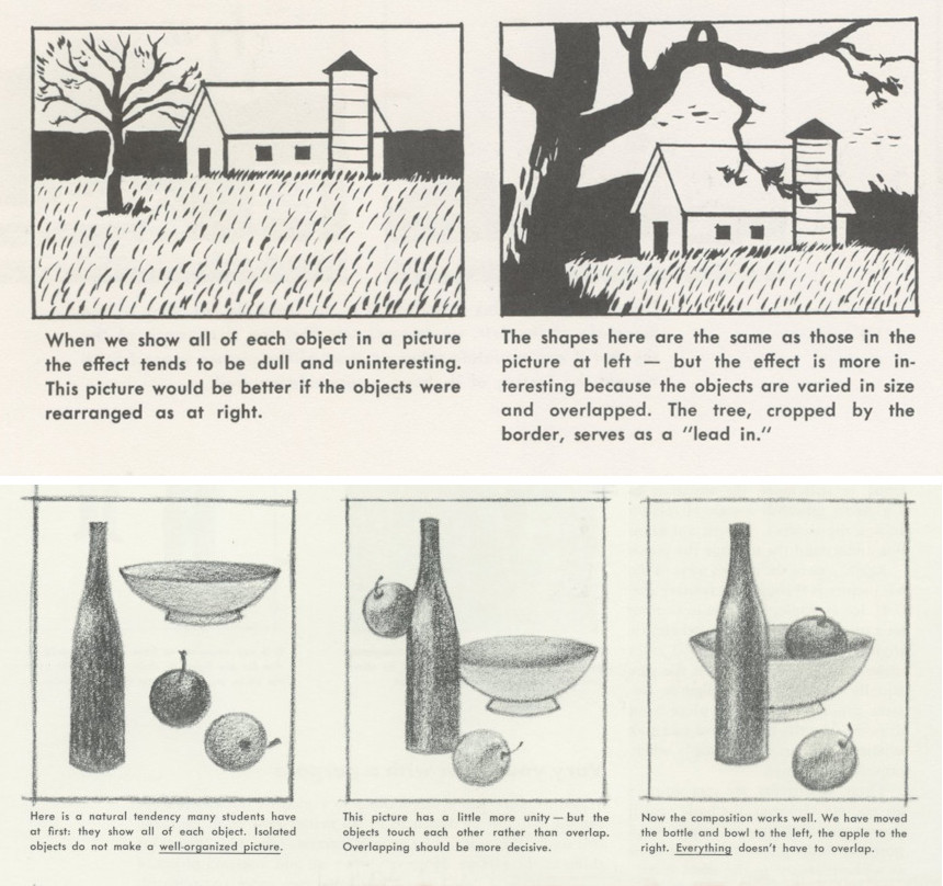
These lessons tell students that pictures are more appealing to our eye when the elements of the picture are a variety of sizes rather than uniform; when they continue off the edge of the picture to intimate a larger world beyond the borders; when they are clustered together in little groupings, rather than isolated; when the objects in a painting overlap with each other to establish a harmonious relationship; when the objects in the painting have complex or interesting outlines. These and dozens of other factors are what artists take into consideration when they design a picture.
A mere story-teller would not be too concerned about the design or composition of the picture.
becomes responsible for the forms used to convey the content. But Rockwell the artist felt that it wasn’t enough to tell a good yarn with a picture. A picture had to be well designed with a good composition. Let’s look at some examples of how Rockwell designed his picture to make it especially interesting for the viewer.
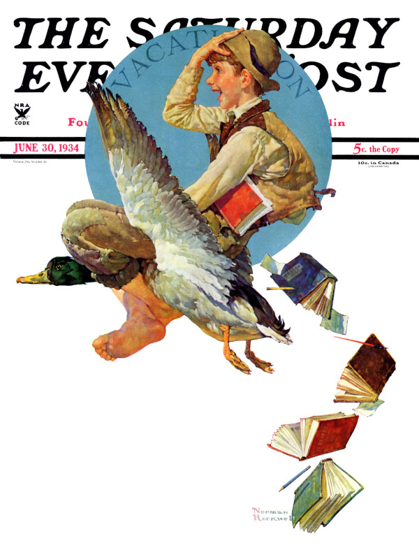
In the picture above, notice that the boy takes up the central position in the heart of the picture, over the centered blue circle, but the composition is still not symmetrical. Rockwell has given us a strong diagonal line, formed by the duck’s wing, which leads us to that beautifully designed trail of books that takes us aloft and makes the composition more interesting.
In this next painting of Louisa May Alcott, note how Rockwell designed the painting with another strong diagonal, which extends from the hat in the bottom right corner up to the face in the upper left corner, dominating the picture like a shining sun in a landscape painting.
Notice too how Rockwell uses the principle of overlapping elements to give us a feeling of great solidity and strength. In a less well-designed painting all these elements could have become fragmented or worked against each other. But in Rockwell’s carefully designed painting these figures are the visual equivalent of mountains in a landscape painting, and give us the same psychological feeling of rest and composure that a mountain range would.
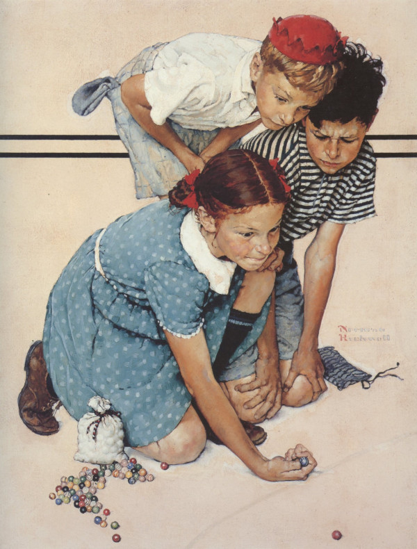
This next example shows us a beautiful grouping of figures. Notice the interesting outline around the three children and the shapes of the gaps caused by their arms. (It may help to envision them like a silhouette.) Inside this abstract shape we see a joyful array of patterns and textures: a bold black and white striped shirt contrasted against a bright red hat or the girl’s polka-dotted dress with that powerful white collar. Each child has a very distinctive pose and facial expression, yet visually the three fit together like pieces of a single jigsaw puzzle.
Finally, in this last example look at how Rockwell designs this image so that the girls are interlocked. A lesser artist might assume all three figures standing straight up, perpendicular to the ground, in which case they would never intersect. But Rockwell shows us one girl leaning forward, one girl leaning backward, and one girl with a petticoat protruding outward. In this way Rockwell sews together all the figures in this dynamic composition.
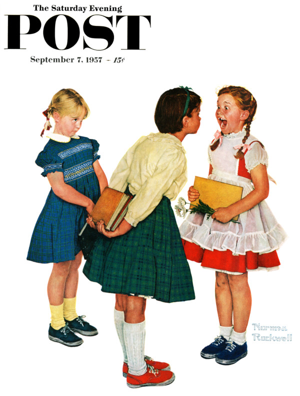
This illustration tells a great, funny story about kids. A good story teller might be content with painting standard looking children sufficient to convey the joke. But Rockwell went way beyond the joke and spent a great deal of time and talent carefully working out a strong visual design.
In that sense, Rockwell was like every other fine artist who believed that form and content must be balanced in a work of art, and that a painting that does not achieve excellence in both categories is a diminished painting.
Featured image: SEPS
Post Artists: The Majestic Art of N.C. Wyeth
For a generation of readers, N.C. Wyeth’s pictures were as well known as the books they illustrated: Treasure Island, Last of the Mohicans, and Robinson Crusoe. Learn how this illustrator of swashbuckling pirates, the Wild West, and Maine fishing life got his big break and went on to found America’s greatest art dynasty.
See all Post Artists Videos.
Featured Image: Smokey Face by N.C. Wyeth (Brigham Young University Museum of Art)
How to Look at a Norman Rockwell Picture: Part 4 — Building on the Work of Other Greats
Read all of art critic David Apatoff’s columns here.
This is the fourth in a series of columns on how to appreciate the artistic side of Norman Rockwell. See Part 1 on Rockwell’s use of hands, Part 2 on his use of black and white, and Part 3 on how he leads your eye.
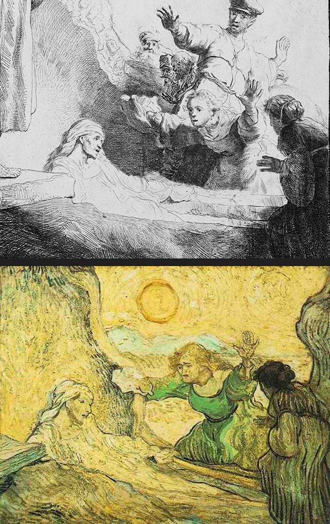
The greatest artists sometimes painted their own version of another artist’s work. For example, Vincent Van Gogh admired Rembrandt’s 1632 picture of Lazarus Rising From the Dead, so in 1890 he recreated Rembrandt’s picture as an homage:
Similarly, surrealist painter Salvador Dali took Vermeer’s painting “The Lace Maker” as his inspiration.
Norman Rockwell was no different. He was inspired by the greatest artistic geniuses and felt challenged by their accomplishments. Even though he was a “mere illustrator” he felt he could learn important lessons from their work. If we recognize these influences in Rockwell’s work, we can better appreciate the scope of his ambition.
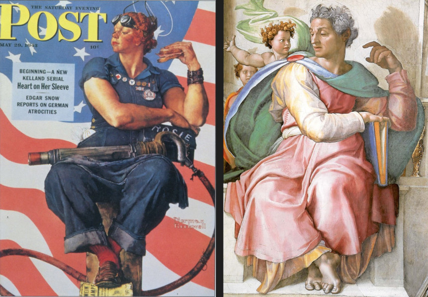
For example, Rockwell’s 1943 cover illustration of Rosie the Riveter was a direct tribute to Michelangelo’s famous painting of the prophet Isaiah on the ceiling of the Sistine Chapel:
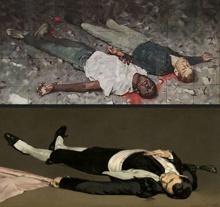
Similarly, when Rockwell wanted to paint a picture of murdered civil rights workers he used as his model Manet’s famous composition of a fallen matador:
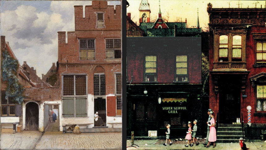
And Rockwell said that his model for this urban street scene for the cover of The Saturday Evening Post was Vermeer’s famous painting, “The Little Street in Delft.”
Why do artists use the work of other artists? Is that cheating? Have they run out of ideas?
If we take a closer look at Rockwell’s painting of the street scene, it will give us a better idea of what Rockwell is doing.
First we should note that this painting exemplifies everything that fans love about Rockwell. The story it tells is rich, interesting and multi-layered.
A family walking to church on Sunday morning, all dressed up with stiff — perhaps overly stiff — postures, averts their eyes from the seedy neighborhood through which they must walk. Notice that the milk bottles and Sunday morning newspapers are still on the front porches, so the local residents are still in bed. A pair of dancing shoes from the night before is airing out on a window ledge. For an especially nice touch, notice the flock of birds in the sky leaving the steeple, roused by the ringing of the morning church bells.
Go down an additional layer into this painting and you’ll realize that it describes how critics thought of Rockwell. They accused him of being myopic, his eyes fixed straight ahead, disregarding the seamy side of life all around him. True artists are supposed to notice details such as litter and broken sidewalks, but Rockwell was accused of living in a corny, idealized world.
But consider this: Rockwell’s tribute to Vermeer was painted at the exact same size as Vermeer’s masterpiece, using the exact same medium, and it comes off well by comparison. Rockwell may have been working on a deadline for a corporate employer, but he aimed high. He painted those bricks, captured the glow and the feel of old Dutch painting, studied Vermeer’s palette and composition. He appreciated Vermeer’s artistry and was able to work in that style the way very few, if any, fine artists of his day could. He may not have viewed himself as an artistic genius, but we can tell from his choices that he viewed the work of artistic geniuses as relevant to what he was doing.
Featured image: ©SEPS
How to Look at a Norman Rockwell Picture: Part 3 — How Rockwell Leads Your Eye
Read all of art critic David Apatoff’s columns here.
This is the third in a series of columns about how to recognize the “art” in a Norman Rockwell painting. See Part 1 on Rockwell’s use of hands and Part 2 on his use of black and white.
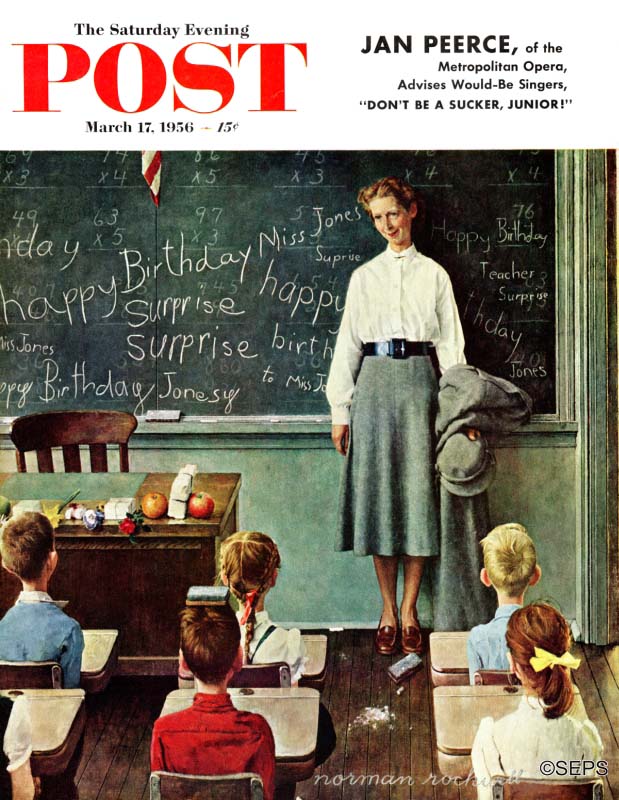
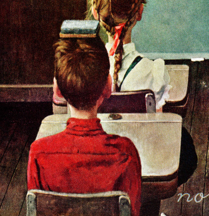
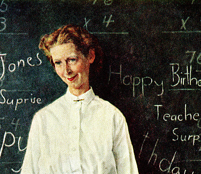
When you look at this charming painting of a teacher being surprised by her students, the first thing you notice is the teacher standing against the blackboard. You start with the expression on her face and then pull back, looking for clues about what’s happening. Next you read the words on the blackboard and learn that this is a birthday surprise. Then you gradually notice the rest of the details. The gifts on her desk, the personalities of the individual children, the chalk dust on the floor from the children scampering back to their seats before the teacher walks in.
If you started looking at the picture from a different spot — for example, the class clown balancing the eraser on his head…
…or the chalk dust on the floor…
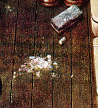
…this painting would make little sense at all. You’d wander around the page at random before eventually stumbling across its meaning.
How did you know to view everything in the proper sequence? The answer is because Norman Rockwell used a painter’s tools to lead you around the painting in exactly the order he wanted. He established all the priorities for you.
When we read a book, we follow a clear set of rules: for readers of English, we start at the top of the page and read from left to right, working our way to the bottom. Along the way, we follow the traffic signals provided by punctuation. But artists work with a very different set of rules to guide us in “reading” a painting. Certain visual elements demand priority attention. Our eyes are naturally attracted first to bright colors, or to high contrasts between extreme colors (for example, when an artist places black next to white). Certain shapes cause our eyes to move in a particular direction, or at a particular speed. Certain subjects, such as human faces, seem to grab our attention. On the other hand, some devices signal us to leave less important parts for later: subdued colors, soft boundaries, earth-colored tones and other devices don’t compete for our attention, so artists use them for backgrounds.
Returning to our painting of the teacher standing in front of the class, Rockwell starts us with the teacher by contrasting her stark white shirt against the blackboard.
Notice that a few of the girls in the classroom are also wearing white, but they don’t compete for our attention because their white dresses aren’t as noticeable. Why? Because they are contrasted against light brown and pale green colors, not black. Rockwell also gives the teacher visual priority by making her the largest object in the painting. It helps, too, that hers is the only face in the painting — we only see the backs of the heads of the students. We aren’t conscious that Rockwell is doing it, but he walks us through every step of that painting, telling us how long to linger and where to turn next.
In this next painting of a soldier returning home from the war, Rockwell takes control in a very different way.
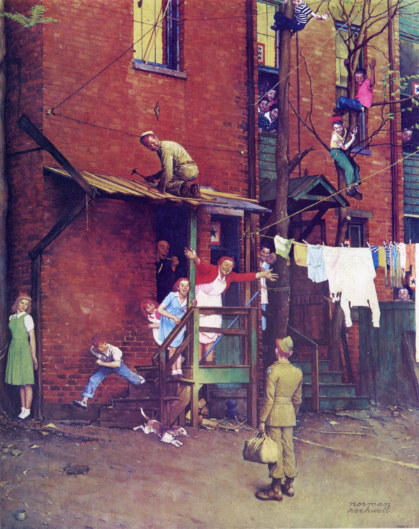
Unlike the school teacher, here the center of attention is a tiny part of the picture, with his face turned away from us:
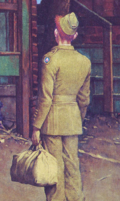
So how does Rockwell do it this time? How does he orchestrate a picture with eighteen figures in it? He achieves it by employing the eyes and faces of others. Seventeen characters in the painting are all focused on just one thing: the eighteenth character. We don’t see the soldier’s face, but he is surrounded almost 360 degrees by excited people looking directly at him:
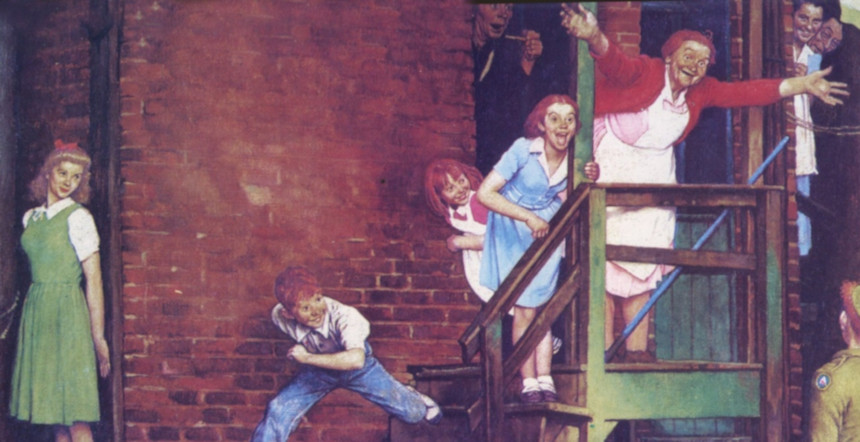
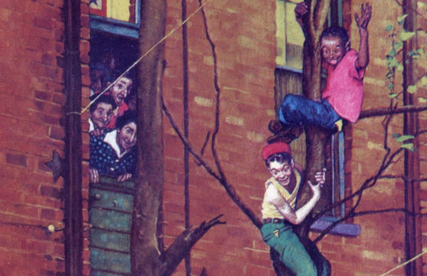
No matter where you look in this painting, the faces of those characters lasso you and drag you back to where Rockwell wants you to look: at the homecoming soldier who makes everything else in the painting make sense. Small and inconspicuous, he is the glue that binds the whole painting together.
And there is a lot to bind. There may be as many as a dozen different stories going on here. If Rockwell were a writer, he would have to explain to us which of these characters are the soldier’s family, and which is his shy sweetheart waiting to see how her returning soldier feels. The deft Rockwell establishes that by giving the soldier’s family members distinctive red hair, a wonderful storytelling tool. A writer might spend a paragraph describing the soldier’s emotions, but by making the soldier so small, Rockwell the psychologist shows us how overwhelming the sights and sounds of home are. This is an excellent example of how visual story telling can be more profound and subtle than words. The picture would not be nearly as powerful if Rockwell hadn’t staged it to give us the view over the soldier’s shoulder.
Staging a painting is important because our eyes can’t absorb everything in a picture at once. Our eyes see things, and perceive meaning, in stages. Writers tell stories in orderly sentences and paragraphs that are designed to present a narrative in linear form. But great artists such as Rockwell can unfold a narrative just as well — sometimes better — using visual elements.
All images by Norman Rockwell, © SEPS
How to Look at a Norman Rockwell Picture: Part 2 — Black and White
Read all of art critic David Apatoff’s columns here.
This is the second in a series of columns about how to recognize the “art” in a Norman Rockwell painting. See Part 1 on Rockwell’s use of hands.
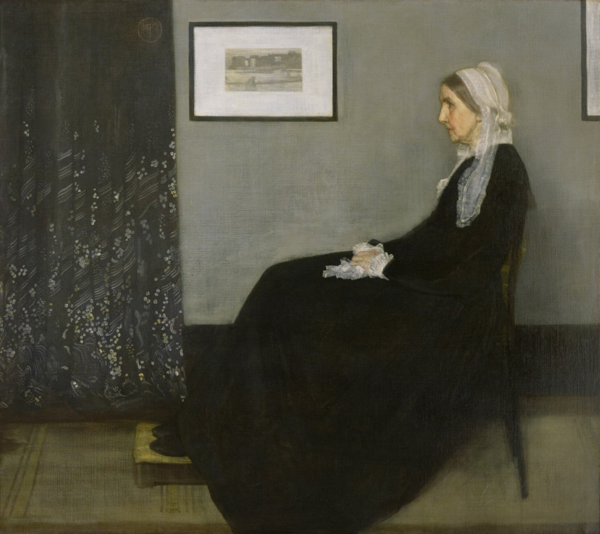
Whistler’s famous painting, Whistler’s Mother, is not really about Whistler’s mother.
The actual name of the painting is Arrangement in Grey and Black No. 1. As the title suggests, the purpose of the painting was to focus on the strategically placed dark and light elements in the picture. Art critic Kathryn Hughes wrote,
The subject is not Anna Whistler at all, nor is it Old Age, Wisdom or Regret or any of those other sententious one-worders that the High Victorians liked to affix to their drawing-room art. Rather, it is a commentary on… picture-making. Using a severely restricted palette, Whistler draws attention to the arrangement of large, simplified forms, so that the curves of the model’s face, dress and chair are grounded by the rectangles of the curtain, footstool and the floor.
Whistler believed in the modern art doctrine of “Art for art’s sake,” and was focused on the quality that artists call “value” — that is, the lightness or darkness of a color.
All great painters must learn to master the value of colors: the gradation of color from white to black, from light to dark. From the dawn of art, value has been one of the key organizing elements of painting. To control a painting and make the parts work well together, every artist must first decide which spot will be the lightest and which will be the darkest. Having established this, the painter can then relate all the middle values to these opposites.
As modern art became more abstract in the 19th and 20th centuries, “value” came out from behind the scenes and took center stage. Radical artists such as Whistler even made value the subject of a painting. His painting cares more about the dark and light shapes in his composition than the sweet old lady you think you’re seeing.
Norman Rockwell was never concerned with such abstract themes, right? He was really more interested in painting funny anecdotes for the cover of the Post, wasn’t he?
Well, it turns out that Rockwell was a master of value. Look at how he has stripped away almost all color in these paintings and focused on the subtle gradations of black and white:

These are virtuoso paintings in black and white, reinforcing that Rockwell was acutely sensitive to the range of “value” in his paintings, as much as the greatest fine art masters.
Why haven’t you seen Rockwell’s elegant black and white masterpieces before? Because they were hidden in plain sight, right smack dab in the middle of Rockwell’s famous painting of Thanksgiving that you’ve seen a dozen times:
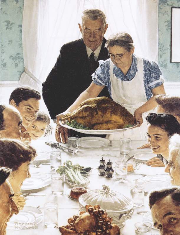
It is true that Rockwell was also interested in “painting funny anecdotes for the cover of the Post,” and that misleads some people to think he was less of a fine artist. But if you look at the raw ingredients of art in his painting, Rockwell understood value just as well as Whistler. It’s just that Rockwell was able to focus on more than one goal at a time.
How to Look at a Norman Rockwell Picture: Part 1 — Hands
Read all of art critic David Apatoff’s columns here.
A painting by Norman Rockwell can be viewed on many different levels. Some enjoy Rockwell as a story teller. Others like to go on a treasure hunt for details. Some like to look for a quick joke. But to fully appreciate the effort Rockwell put into his pictures, we should also look at his pictures as works of art. Rockwell put his heart and soul into the design, composition, color, and other characteristics of making “art” in the tradition of the greatest painters in history.
This is the first in a series about how to recognize and enjoy the “art” in Rockwell’s paintings.
Part 1: Hands
Human hands are expressive and beautiful, but they can also be very difficult to draw. They are anatomically complex, with a huge variety of possible positions. And even after an artist has mastered the technical skill of drawing hands, capturing their poetry — their expressiveness and their symbolism — adds a whole additional challenge.
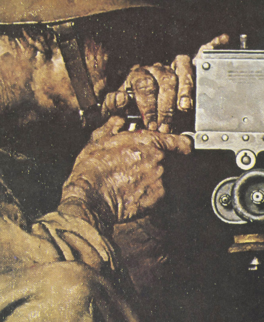
The great Renaissance artist Caravaggio’s paintings of hands were famous for showing authentic callouses and dirt under their fingernails, rather than the idealized hands that previously dominated art. His “natural” look scandalized viewers and church patrons of his day. Here is Caravaggio’s famous painting of Bacchus, with a close up of his dirty fingernails.
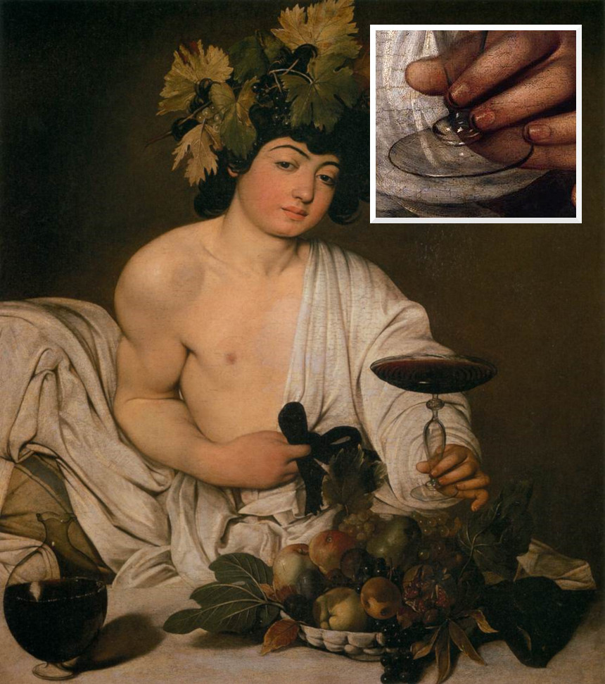
How shocking! But by painting the “real” hands of workmen and peasants, Caravaggio transformed the meaning of his paintings.
Because hands are so difficult to paint, many artists try to avoid painting them. They hide them in pockets or behind backs, as Elbert McGran Jackson did in this cover for the Post:
Many artists feel they can get by with hiding hands or giving them perfunctory treatment because hands are rarely central to a picture. They aren’t worth the trouble. Artists who want to realize the full potential for hands must exert a lot of additional effort.
If you look at almost any Rockwell painting, you’ll notice he went out of his way not only to draw hands, but to feature them prominently, and in the most interesting and expressive ways.
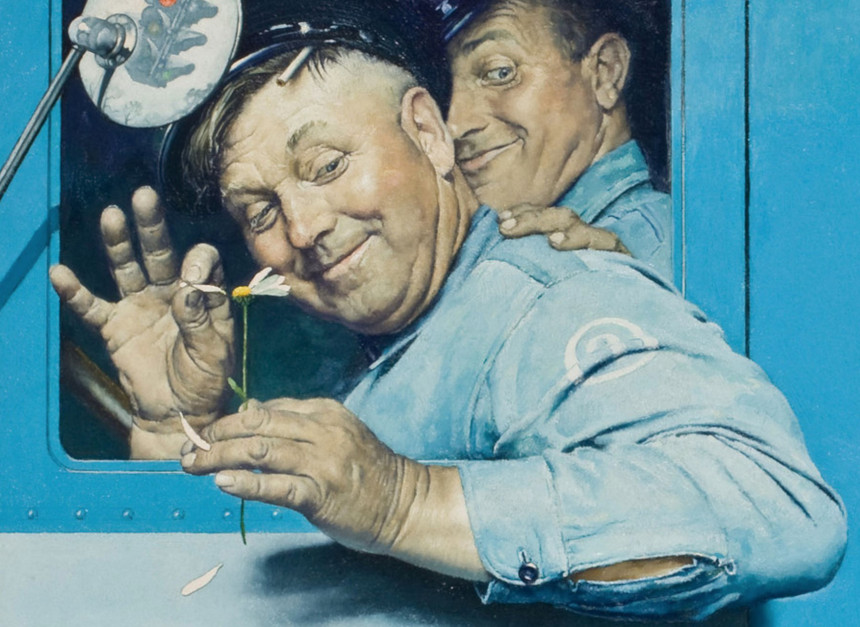
This required a great deal of additional effort, but the artist in Rockwell believed they were important to the overall painting.
Remember Caravaggio’s authentic hands of the workers and peasants? When Rockwell wanted to paint a common laborer standing up and expressing his opinion under the First Amendment, he was careful to show a workingman’s hands:
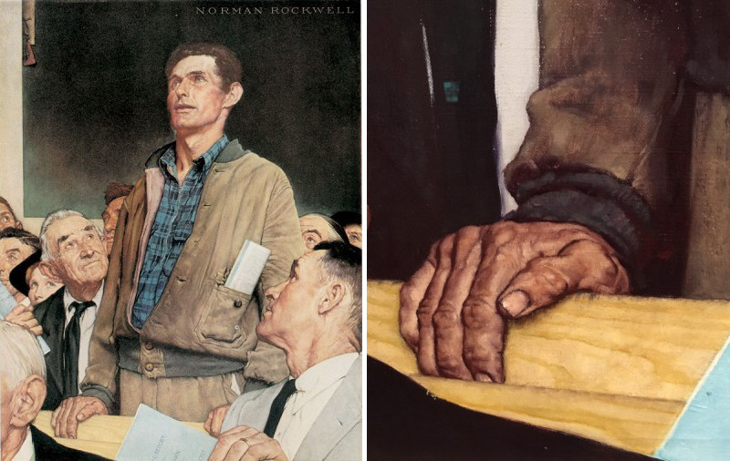
It would’ve been easy for Rockwell to avoid the extra work of painting another hand, but he clearly felt it was an important ingredient in his message about this man.
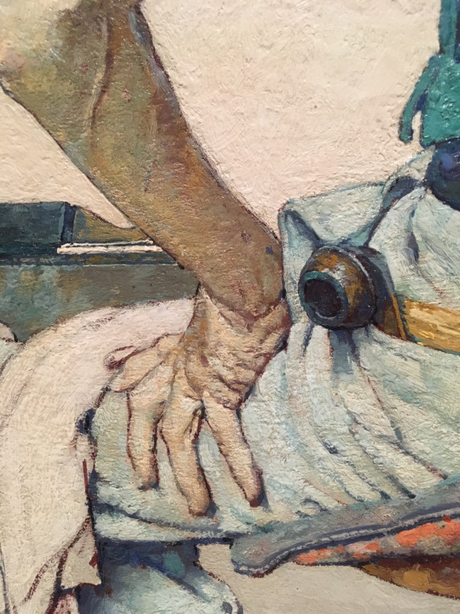
Rockwell’s hands are skillful, lovely and worthy of our attention, but what else do they tell us about Rockwell as an artist?
They reveal that Rockwell was a “materialist” in the best, old fashioned sense of the word. He had a rare appreciation for our material surroundings, their colors and patterns and textures, the nuances of skin as well as the structure of bone and muscle beneath the skin.
The way Rockwell painted hands gives us insight into an artistic virtue at the core of his work: his extraordinary ability to see the richness of our surroundings and draw our attention to the potential for poetry in even the humblest of details. Unlike some other fine artists, Rockwell did it for a broad audience and he did it under deadline. Still, as artistic virtues go, it’s hard to beat that one.
Featured image: Norman Rockwell, SEPS
Considering History: Remembering the Founding Fathers, Flaws and All, on the Fourth of July
This series by American studies professor Ben Railton explores the connections between America’s past and present.
On July 4, 1826, John Adams and Thomas Jefferson, America’s second and third presidents and two of the most famous and influential founding fathers, passed away within a few hours of each other. More than just a striking historical fact and one final interconnection between two friends and rivals whose lives and careers had often intertwined, Adams and Jefferson’s July 4 deaths offer a succinct illustration of how much the founders had already become, half a century after the Declaration of Independence, mythic figures with larger-than-life identities and stories.
Those myths are not without merit: the Declaration, Revolution, and Constitution were bold and impressive achievements, and a core group of figures played significant roles in all of them. As I argued in last year’s July 4 article, however, the Declaration also contains a hidden history that reflects darker and more divisive Revolutionary realities of slavery and hypocrisy. Similarly, founders like Adams and Jefferson were complex men, multi-layered historical figures whose flaws as well as their successes have a great deal to teach us about their period and America.
Jefferson’s worst failings are well known, and indeed have come to be defining aspects of our collective memories of him. Yet those flaws go deeper than the alleged (and historically likely, per both uncovered DNA evidence and the vital work of scholar Annette Gordon-Reed) repeated sexual assaults on one of his slaves, Sally Hemings. They also entail racist views of African Americans that become even more hypocritical when seen in light of those personal actions — views illustrated by the cut Declaration paragraph on slavery and the “foreign people” it had “obtruded upon” the colonists, but developed at much greater length in his Notes on the State of Virginia (1785).
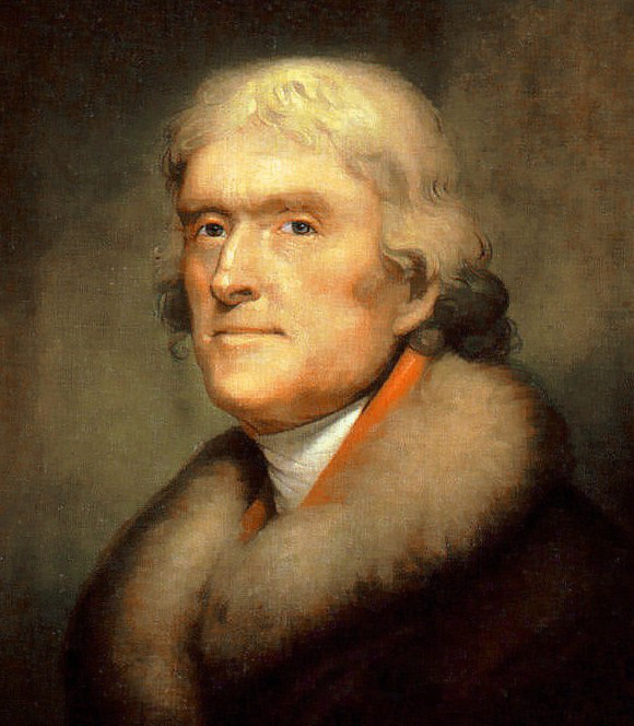
In one especially striking extended passage from Notes, Jefferson expounds at length on all the factors that make “the blacks … inferior to the whites in the endowments both of body and mind.” He remarks upon their “very strong and disagreeable odor,” their “want of forethought” and “transient griefs,” and their imaginations that are “dull, tasteless, and anomalous.” And he concludes, with particular hypocrisy for a lifelong slaveowner, that “This unfortunate difference of color, and perhaps of faculty, is a powerful obstacle to the emancipation of these people.” While that “perhaps of faculty” indicates an attempt at scientific nuance, the passage as a whole reflects a man unable or unwilling to learn the human truths of the enslaved African Americans all around him.
When it comes to John Adams’s flaws, there’s a general sense that he was one of the most elitist of the founders, a die-hard Federalist who at times feared the general public and its potential for disorder and sedition more than he sought to protect them in our framing documents. That’s a simplified but not inaccurate description of Adams’s overall political philosophies, yet I would argue that it hides a deeper flaw: as his impassioned legal defense of the British soldiers accused of murder at the 1770 Boston Massacre reveals, Adams’s elitism was also racially and culturally charged.
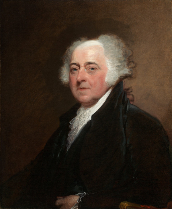
Defending the soldiers was Adams’s job as a young Boston lawyer, and one that he performed with fervor, particularly in an eloquent court monologue that helped win an acquittal for many of the accused. In the course of that statement, Adams deployed a series of stereotypical and bigoted images of the massacre’s first victim, Crispus Attucks. Attucks, Adams argued, had “undertaken to be the hero of the night” through his “mad behavior,” but exemplified instead the event’s “motley rabble of saucy boys, negroes and mulattos, Irish teagues and outlandish jack tars.” Given that Attucks was not only a mixed-race individual but also a fugitive slave, Adams’s language reveals the links between Revolutionary elitism and the same kinds of racist hypocrisy embodied by Jefferson.
So these famous founders weren’t just flawed — they were flawed in ways that reveal some of the exclusionary, white supremacist elements of the nation’s origins. Their vision of who was American — or at least who was most fully and definingly American—was certainly part of the Revolutionary era, and has continued to echo ever since. But it’s not the only side of the era, nor of these men and their lives and legacies. There are also genuinely inspiring sides to both Adams and Jefferson that embody our nation at its best.
Some of Adams’s most inspiring moments are directly tied to his marriage, and through them to his wife, the deeply impressive historical figure Abigail Smith Adams. Thanks to the work of historian Sara Georgini and the entire Adams Family Papers staff at the Massachusetts Historical Society, we have unparalleled access to materials like John Adams’s letters, many of which were exchanged with Abigail as the two were separated for more than a decade before, during, and after the events of the Revolution.
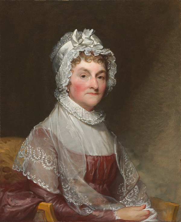
Those letters are justifiably famous for striking individual moments: John’s eerily accurate July 1776 predictions about future Independence Day celebrations; Abigail’s March 1776 letter imploring her husband and his fellow framers to “Remember the ladies” in their deliberations. But what the letters as a whole reveal more deeply are the sacrifices made by the founders during their decades of service to the nation for which they were fighting. That’s especially clear in an emotional July 1776 letter when John, having learned that his family had been suffering from smallpox without his knowledge, writes,
Do my Friends think that I have been a Politician so long as to have lost all feeling? Do they suppose I have forgotten my Wife and Children? … Or have they forgotten that you have a Husband and your Children a Father? What have I done, or omitted to do, that I should be thus forgotten and neglected in the most tender and affecting scene of my Life! Don’t mistake me, I don’t blame you. Your Time and Thoughts must have been wholly taken up, with your own and your Family’s situation and Necessities. But twenty other Persons might have informed me.
Thomas Jefferson had many important and influential moments throughout the Revolution as well as during its aftermath; he drafted the Declaration of Independence and served two terms as president. But to my mind it’s his philosophical, legal, and intellectual work over those same decades that offers his most inspiring contributions to that new America.

Exemplifying that vital work was Jefferson’s drafting of the 1786 Virginia Statute for Religious Freedom. This law, a key predecessor to the First Amendment’s protections of religious freedom, guaranteed that all Virginians “shall be free to profess, and by argument to maintain, their opinions in matters of religion, and that the same shall in no wise diminish, enlarge, or affect their civil capacities.” Jefferson put that philosophy in action through his professed support for Islam and Muslim Americans as part of these new civic communities. And a few decades later he created a community where such religious and intellectual freedom could flourish, founding the nation’s first non-sectarian public university, the University of Virginia, in 1819.
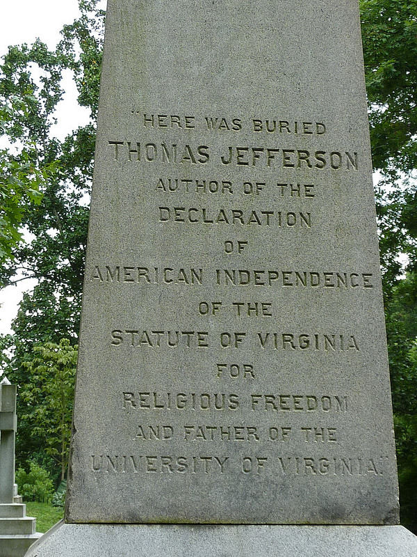
Jefferson wanted both the statute and the university memorialized on his tombstone (along with the Declaration), a moving illustration that as of July 4, 1826, such civic contributions remained critically important. The two towering figures who died that day left legacies that include some of America’s more divisive and bigoted histories to be sure. But they also contributed, through their lives and their ideas, to the founding of American ideals as well as the nation. Critical patriotism requires us to remember all these sides to Adams, Jefferson, and America on the Fourth of July.
Featured image: John Adams and Thomas Jefferson (Detail from postcard published by The Foundation Press, Inc., 1932. Reproduction of oil painting from the artist’s series: The Pageant of a Nation. Collection of the Virginia Historical Society, Library of Congress)