Vintage Advertising: Kodak Cameras from 1901-1965
On September 4, 1888, George Eastman received a patent for a camera that used his dry-plate technology on celluloid film. Until Eastman came along, photography was a cumbersome and expensive business. Images could only be captured on wet photographic plates, which had to be made up on the spot and immediately used.
Eastman needed a trademark name for his film and cameras that was short, unique and memorable, and used his favorite letter: “k.” “Kodak” was the result.
These advertisements that appeared in the Post show not only the evolution of Eastman’s cameras, but also changes in advertising from 1901-1965.

Kodak was a frequent advertiser in the Post. Here is one of its first full-page ads. Note that the Kodak ads showed women using the camera more often than men. Eastman wanted to emphasize that his cameras were extremely portable. Unlike the heavy, awkward bellows cameras of professionals, they didn’t require a lot of muscle to move around. Also, women represented a promising new market.

Kodak’s convenience would profoundly affect American society by making photography accessible to average Americans. They could photograph ordinary objects and commonplace activities that might never have been recorded by professional photographers.
Originally, users were required to mail their camera, with its exposed film, back to the company, which would remove and develop the film, then return the camera loaded with fresh film.

Owners of Eastman’s cameras and film could take pictures on a whim, which enabled them to photograph their friends looking relaxed and natural — a far better reflection of personal character than a formal portrait.

This ad might have implied color photography, but Kodak wouldn’t introduce its Kodachrome color film for another nine years.

In previous wars, soldiers had carried formal photographic portraits of their wives, sweethearts, or families. By World War II, they would get recent snapshots that showed how the folks back home looked and what they were doing.

The dry film concept had also led to motion-picture film. Throughout the century, the cost of movie cameras kept dropping into more affordable price ranges.

By 1961, Kodak cameras could automatically set the correct exposure. They also allowed convenient indoor photography with flash bulbs. And all for $22, the equivalent of $179 today.

Cameras kept getting smaller, and flash photography now used flash cubes. They let you take four indoor pictures without changing flash bulbs. A motor would automatically advance your film for the next exposure.
Cover Collection: Back to School
Classrooms may have changed from pencils to PowerPoint, but the Saturday Evening Post has always been there to witness sending our kids back to school.
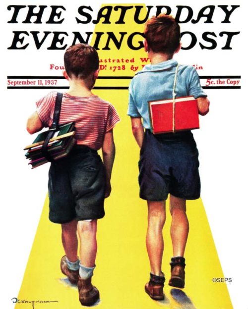
Robert C. Kauffmann
September 11, 1937
Robert C. Kauffmann painted five covers for the Post, on a variety of subjects from pets to water skiers. With their backs to the viewer, we can only guess what these two are feeling about the first day of school.
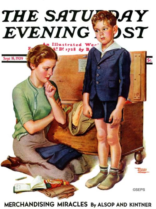
Frances Tipton Hunter
September 16, 1939
Frances Tipton Hunter was one of the most nationally recognized artists in Post history, depicting childhood in a style similar to Norman Rockwell. Most kids grow about 2 inches each year, so this mother likely has a lot of work ahead of her.
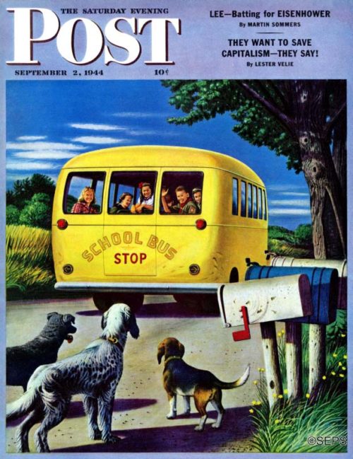
Stevan Dohanos
September 2, 1944
This is one time when the kids look happier than the dogs do about going to school.
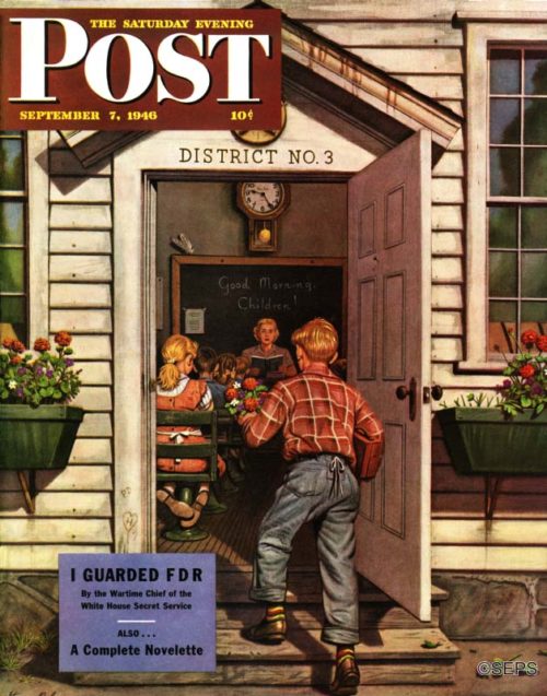
Stevan Dohanos
September 7, 1946
When Stevan Dohanos painted his picture of the first day of school, the children were brimming with excitement—not because they were posing for a cover, but because the day in question was a great day indeed. It was actually the last day of school, in June.
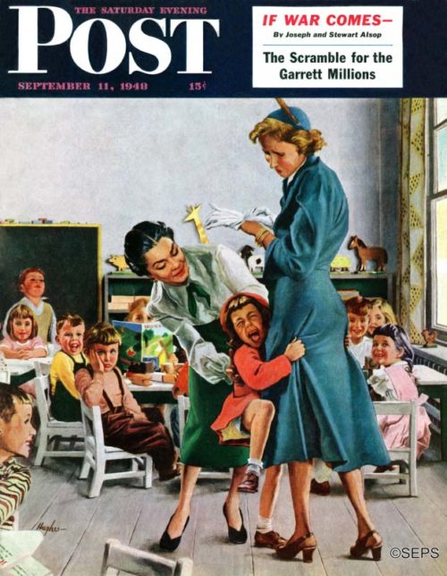
George Hughes
September 11, 1948
Artist George Hughes painted this scene at Bennington College, in Vermont, which operates a nursery school. “Do you ask me if I have any children of my own?” Hughes mutters. “Only five girls. The one who is crying on the cover is, of course, mine.”
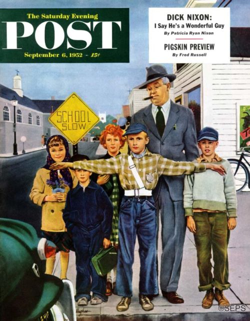
George Hughes
September 6, 1952
If artist George Hughes hadn’t stationed the young lifesaver on that corner, would that man have stepped dreamily into the street, just missed being nicked by the car, and then blamed it in loud words on the driver?
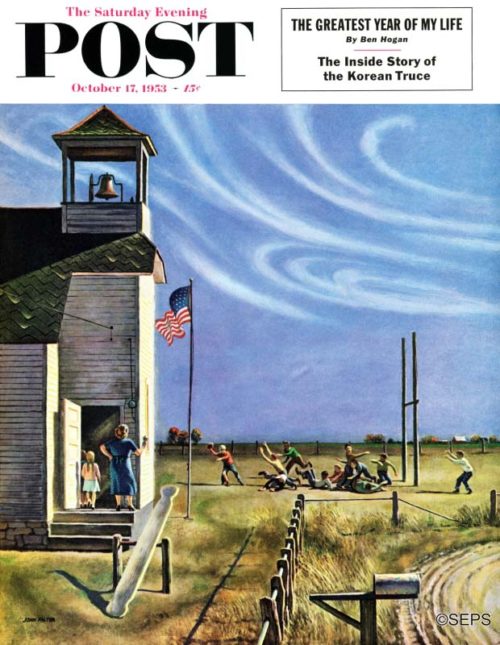
John Falter
October 17, 1953
Regarding that impending touchdown, we bet the teacher knows enough football to rule it illegal—ball was snapped after the school bell rang.
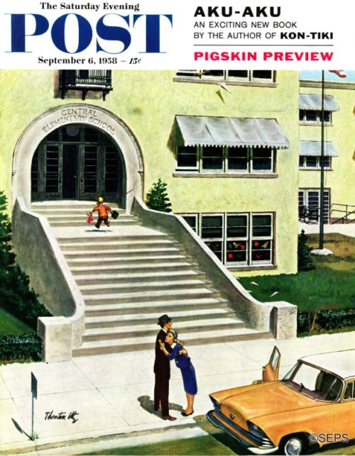
Thornton Utz
September 6, 1958
Artist Thornton Utz vows that when he was very little he liked school so much that he asked his folks if he couldn’t also go to night school. In time he got over that aberration.
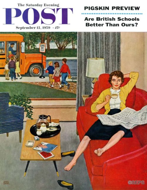
Amos Sewell
September 12, 1959
In mother’s ears is a faint, faraway ringing—would it be an echo of the youthful din that has dinned in her ears all summer, or does she think she hears what she is merely imagining, a school bell ringing? Anyway, peace.
Can You Identify the 31 Jobs in Rockwell’s “Rosie to the Rescue”?
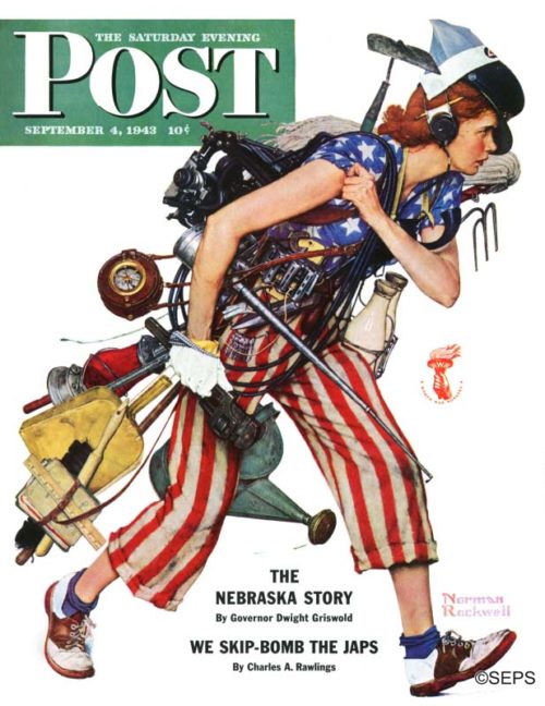
Norman Rockwell
September 4, 1943
In 1943, several major magazines agreed to salute the women war workers of America on their September covers. The Post gave the assignment to Rockwell, who’d already created an iconic tribute to women defense workers with Rosie the Riveter.
For this new cover, he wanted to acknowledge the wide range of jobs that 15 million women had taken up as men went off to war. The result was Rosie to the Rescue, which showed a woman bearing the symbols and tools of several trades hurrying off to her next job. The Post editors claimed 31 different occupations were represented on this cover. Some were jobs traditionally associated with women: cleaning, farming, nursing, and clerical work. Others, indicated by tools such as an electric cable and a monkey wrench, referred to industrial occupations that women were starting to enter in great number.
The cover not only acknowledges women war workers, it also recalls occupations of the 1940s that once employed thousands. Post readers of the day would have instantly recognized the bus-driver’s ticket punch, a taxi-driver’s change dispenser, a milkman’s bottle rack, a switchboard operator’s headset, and the blue cap of a train conductor. The railroad industry was also represented by the railroad section hand’s lantern, the locomotive engineer’s oil can, and that round object swinging on a shoulder strap — a clock used by night watchwomen in railway yards.
Here is what the Post editors had to say about this image in the “Keeping Posted” section of our September 4, 1943 issue:
At least thirty-one wartime occupations for women are suggested by Norman Rockwell’s remarkable Labor Day Post cover. Perhaps you can think of more. The thirty-one we counted, suggested by articles the young lady is carrying or wearing, are: boardinghouse manager and housekeeper (keys on ring); chambermaid, cleaner and household worker (dust pan and brush, mop); service superintendent (time clock); switchboard operator and telephone operator (earphone and mouthpiece); grocery-store woman and milk-truck driver (milk bottles); electrician for repair and maintenance of household appliances and furnishings (electric wire); plumber and garage mechanic (monkey wrench, small wrenches); seamstress (big scissors); typewriter-repair woman, stenographer, typist, editor and reporter (typewriter); baggage clerk (baggage checks); bus driver (puncher); conductor on railroad, trolley, bus (conductor’s cap); filling-station attendant and taxi driver (change holder); oiler on railroad (oil can); section hand (red lantern); bookkeeper (pencil over ear); farm worker (hoe and potato fork); truck farmer (watering can); teacher (schoolbooks and ruler); public health, hospital or industrial nurse (Nurses’ Aide cap). —“Keeping Posted: The Rockwell Cover,” September 4, 1943.
This article is featured in the July/August 2017 issue of The Saturday Evening Post. Subscribe to the magazine for more art, inspiring stories, fiction, humor, and features from our archives.
The Rockwell Files: Willie Gillis Comes Home
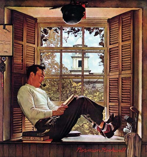
© SEPS
When Norman Rockwell chose to portray a typical American draftee in 1941, he created the character Willie Gillis, using the features of a local boy, Robert Buck. The beloved anti-hero — Willie was never portrayed in battle and seemed more a passive victim of circumstance than a warrior — disappeared from the Post’s cover during the last year of the war. It was no mystery: Buck was off serving in the South Pacific, and Rockwell refused to portray Willie in action without his model.
Willie’s reappearance, shown here, was as a civilian. Post readers would have recognized that Willie, like 7 million other veterans, was off to college, taking advantage of the G.I. Bill. Along with the stacked textbooks and nearby golf clubs, Rockwell acknowledged the experience that helped shape veterans like Willie. Trophies from the German foe appear on the wall above the window. Behind him, Willie proudly hung his framed discharge papers. He also tacked up his Army service patch, master sergeant’s insignia, and campaign ribbons. Some day they would share a place of honor in Willie’s home alongside his college diploma.
This article is featured in the May/June 2017 issue of The Saturday Evening Post. Subscribe to the magazine for more art, inspiring stories, fiction, humor, and features from our archives.
Vintage Advertising: 1940s Father’s Day Gifts
While you ponder what to get Dad for Father’s Day, we offer this look at the traditional gifts of the past.


In former times, many men wore “office attire” at work. An integral part of this attire was the semi-formal shirt. Custom demanded that the shirt be not only spotless, but starched and pressed so that the shirt had the consistency of cardboard. Men wore these shirts all day long, which is perhaps why the end of the work day and its “happy hour” was so popular.

The fountain pen was the next step in evolution after the quill pen and ink bottle. It could be quite ornate, expensive, and capable of producing a line of ink on a page so fine and even, it was like poetry. But when dropped, fountain pens invariably landed on their writing point and never again worked properly. Or, for mysterious reasons, they released their ink, usually while in a shirt pocket, which would never come clean again, hence the need for shirts on every Father’s Day.


A tie was an accessory of male attire that was worn around the neck and fastened in a knot, often too tight to allow comfort. The tie required the wearer’s shirt collar to remain closed, adding to the wearer’s discomfort. And spilled food invariably landed on a tie instead of a shirt. Naturally, good ties were made of silk, which couldn’t be washed.
The bow tie was the mark of the well-behaved rebel, a man unafraid of being thought independent or eccentric. The art of tying a bow tie was gradually lost over time until most men relied on a clip-on bow tie, which they wore on the rare occasions they were part of a wedding party.

Before the baseball cap became the de rigeur headgear, men’s hats were more elaborate. Made from straw or felt, they could be very expensive and were treated with great care. They were never worn indoors, but always worn in public where the style, and not the designer’s named on the crown, reflected the wearer’s personality.

You may have seen some of these items in old movies. They were more convenient than matches for lighting tobacco. A man who could confidently manipulate a cigarette lighter, deftly bringing a flame to a woman’s face as she placed a cigarette between her lips, was considered sophisticated, which was a good thing back then.

In the distant past, pipes were principally used for smoking wholly legal tobacco. They were considered “manly,” because, like cigars, they were only used by men. Other than Joseph Stalin, pipe smokers rarely caused anyone trouble.
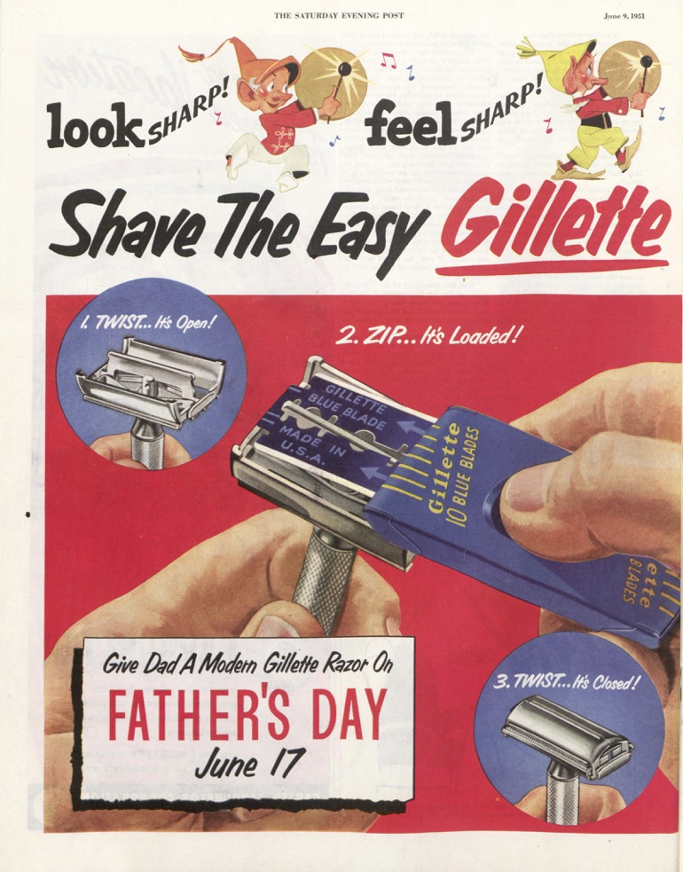
Shaving was once far more hazardous process than it is today. Until electric razors appeared, men used single blades. Although they had a shaving edge on both sides, they were less efficient than today’s multi-blade varieties. And occasionally they would nick a shaver’s face — quickly, easily, and cruelly.

A wrist watch was exactly what its name implied: a watch worn on the wrist. Popular with women in the 1910s, they were considered too effeminate for men to wear until soldiers adopted them in World War I. Thereafter, no man was considered properly prepared for the day without attaching a timepiece to his wrist band instead of his belt clip. (Watches only told time; they did not take pictures or sent text messages.)
Vintage Advertising: RCA’s 1920s Radios

By the late 1920s, everyone in America had to have a radio. The crystal receivers in the attic attached to a headset had only recently evolved into an elegant receiver in a wooden cabinet in the living room. The industry leader was Radio Corporation of America, which had patented its “super-heterodyne circuitry” in its Radiola models, solving the earlier problem of fading stations and fluctuating volume.
But these systems didn’t come cheap. The Radiola 33 sold for $77 — over $1,000 in today’s currency. To justify the investment, RCA’s advertising reflected the quality of its radios. In a series of full-page color ads, they portrayed Radiola owners wearing tuxedos and evening gowns, in stylish settings, listening to airy orchestras. The inference was only a slight exaggeration. Americans still considered radio a marvel of modern technology that brought a more elegant, more entertaining world into their homes.
An abridged version of this article is featured in the May/June 2017 issue of The Saturday Evening Post. Subscribe to the magazine for more art, inspiring stories, fiction, humor, and features from our archives.
Here are some great RCA radio ads that we didn’t have room to include in the magazine. Enjoy!

Click to Enlarge

Click to Enlarge

Click to Enlarge

Click to Enlarge

Click to Enlarge

Click to Enlarge
Click to Enlarge

Click to Enlarge

Click to Enlarge

Click to Enlarge

Click to Enlarge

Click to Enlarge

Click to Enlarge

Click to Enlarge

Click to Enlarge

Click to Enlarge
The Art of the Post: Two Kennedy Portraits Reveal the Changing Times
John F. Kennedy was elected president in 1960, at the dawn of a decade of great social change. The ‘60s became known for its civil rights, women’s rights and anti-war protests; it was the decade of the Beatles and of Woodstock, of bold new styles and artistic innovation. As Kennedy proclaimed in his inaugural speech, “The torch has been passed to a new generation of Americans.”
There are many different ways to view that great cultural transformation, but perhaps one of the best ways to visualize it is to compare two portraits of JFK himself—before and after his election—by Saturday Evening Post illustrators. What a difference a couple of years makes!
This first portrait was painted in the traditional style by Norman Rockwell for the cover of the Post in 1960, before JFK became president.

The Post had asked Rockwell to create portraits of both Nixon and Kennedy that year. Rockwell was nearing his retirement but went to the Kennedy family compound in Hyannis Port, Massachusetts, before the Democratic National Convention and began work on the cover portrait. Rockwell came to like Kennedy and ultimately voted for him, but kept his vote secret because the Post endorsed Nixon that year. Rockwell worked hard to make sure that his paintings of the two candidates were exactly equal, and no Post reader ever accused him of favoritism.
Even as Rockwell’s cover appeared on the newsstands, a bold new generation of illustrators was arriving on the scene. One of the most promising was the young Bernie Fuchs, whose fresh new style looked very different from Rockwell’s. Like Rockwell, Fuchs would go on to become an illustrator for the Post. In 1962 Fuchs was summoned to the White House to paint a new portrait of JFK.

I interviewed Fuchs about his experiences with JFK for my new art book, The Life and Art of Bernie Fuchs. Fuchs recalled that as the president began to pose, he looked the artist over and said doubtfully, “You seem awfully young to be such an important artist.” Fuchs, who had been sizing up the president from an artist’s perspective, was just thinking that Kennedy seemed awfully young to be president, but kept silent. What Fuchs did not find out until later was that the young president had just been informed that the Soviet Union had placed missiles in Cuba. In a few days, the world would be embroiled in the Cuban Missile Crisis. The torch had indeed been passed to a new generation.

When the portrait was completed, it had a vigorous, dynamic style that the president loved. He handed the portrait to his aides and said, “Go show this to Jackie.”
Fuchs went on to do several well-known portraits of JFK. When Jackie Kennedy died in 1994, it was discovered that she had kept two of Fuchs’ pictures in her personal collection. His art seemed to embody the youthful, robust mood of Camelot.

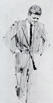

Note the dramatic contrast between Rockwell’s portrait of JFK in 1960 and Fuchs’ portraits just a few years later. These pictures trace the changes in American taste and culture during those years.
Rockwell looked over his shoulder and recognized that he wasn’t able to do what the new generation of illustrators did. Their materials and working methods were very different, and they worked much more spontaneously. Rockwell worked carefully and used many preliminary studies, while Fuchs seemed to have boundless energy and enthusiasm for experimentation. Not only that, but Fuchs worked in an era when clients encouraged experimentation, while Rockwell’s clients preferred a more classical look and had discouraged him from becoming too adventuresome.
When Fuchs first came to the big city as a young artist, his work attracted a lot of attention. Albert Dorne, the president of the Famous Artists School, identified Fuchs as the most promising illustrator of the new generation, so he arranged a lunch meeting in Manhattan to introduce him to Rockwell. In art as in politics, the torch was being passed to a new generation. Fuchs recalled that the two liked each other and respected each other’s work very much, but felt that they didn’t have much in common. The world was changing rapidly, and they were painting for two different audiences.
Fuchs went on to paint illustrations using wild angle shots and new materials.

We have unexpected photographic proof that Rockwell admired and appreciated the bold work of the next generation. A photographer snapped a picture of Rockwell in his studio standing by his wall of inspirational art by great classical artists. He has displayed the work of giants such as Michelangelo, Rembrandt, Dürer, and other great artists. But down in the corner we see that he has also displayed a picture by the new kid on the block, Bernie Fuchs.

Despite his age, Rockwell had the vision to appreciate timeless quality from any generation.
Vintage Advertising: The Lincoln Memorial
After decades of planning, budgeting, and construction, the Lincoln Memorial was finally dedicated on May 30, 1922. Americans were proud of this beautiful monument and eager to visit it. Companies wasted no time using the memorial to advertise a connection to their products. These advertisements appeared in the Post between 1921 and 1948 and hawked everything from tires to tombstones.
The Lincoln Memorial has taken on additional layers of meaning since the 1920s. As Jay Sacher noted, “the memorial is cultural shorthand for both American ideals and 1960s radicalism.” It is rarely seen in ads anymore. The memorial still makes regular film appearances, an easy stand-in for Heavy Symbolism. However it is used, the Lincoln Memorial will continue to transcend the banal appropriations of its image.

February 19, 1921
Click to Enlarge
Armco iron was used in the construction of the Lincoln Memorial, a fact that warranted several full-page ads in the Post.

October 28, 1922
Click to Enlarge
We’re not sure what the Lincoln Memorial had to do with a company that made ledger sheets and looseleaf binders, but they seemed to hope that the monument would lend them an air of dignity. The Lincoln Memorial certainly didn’t represent “cutting office costs,” as its construction costs in today’s dollars were north of $40 million.

December 1, 1923
Click to Enlarge
Marmon made cars in Indianapolis from 1902-1933. The Lincoln Memorial serves as the majestic backdrop to emphasize “the ultimate in luxurious transportation.”

March 14, 1925
Click to Enlarge
Many Americans wanted to visit this new monument, but how were they to get there? The Baltimore & Ohio Line, of course – the “only route New York, Chicago and St. Louis, passing directly through Washington, where liberal stop-over privilege is accorded.” (No such privileges for the conservatives?)

February 25, 1928
Click to Enlarge
Of course, if you’d rather drive than take the train, you’ll need a good set of tires to get you there.

June 4, 1938
Click to Enlarge
The Lincoln Memorial takes a backseat to this green-suited come-hither swimmer in an age where sex was starting to trump integrity as a selling point.

May 4, 1940
Click to Enlarge
The Lincoln Memorial once again gets low billing. In case you can’t read the caption, it says, “Newlyweds Betty and Bob Graves from Connecticut gaze at themselves and the Lincoln Memorial in Washington’s famous Reflecting Pool. What Betty really sees is a picture of herself getting delicious, economical breakfasts for Bob in her own little house with her new glass coffee pot and the heavenly new Chase & Sanborn Dated Drip Grind Coffee in the money saving package!” Our research was unable to confirm if that’s what Betty was actually seeing.

January 11, 1941
Click to Enlarge
Pharmaceutical manufacturer Squibb offers inspiring words – “The stones supporting that message may ultimately crumble. The words may disappear. But the ideas which they symbolize will live as long as men walk the earth.” (Buy our drugs.)

May 1, 1948
Click to Enlarge
The argument is that the Lincoln Memorial is made out of marble, so your tombstone should be, too. “Wise is the person who follows this example when selecting material for memorial or building purposes.”

August 31, 1940
Click to Enlarge
We threw in this ad just to show that the Lincoln Memorial wasn’t the only monument used in the service of advertisers. The sculptor of Mt. Rushmore ostensibly took Bromo-Seltzer for his headaches. Early versions of this medicine contained sodium bromide, a tranquilizer. That may not have been such a good idea when he was dangling off the side of Lincoln’s nose.
Ask the Man Who Owns One: Packard Ads from 1908-1953
Packards were the dominant luxury vehicle in the first half of the twentieth century. Here are some of our favorite Packard ads from the magazine.

October 31, 1908
Click to enlarge
This Packard Model Eighteen was one of the first Packard ads carried in the Post.

June 10, 1916
Click to enlarge
The Packard Twin-Six claimed to make “the twelve-cylinder car the world’s standard of automobile sufficiency and value,” and could be yours for less than $3,000.

Click to enlarge
“Like the beautiful proportions of Eastern architecture which centuries have been unable to improve upon, Packard lines have set a standard which the whole motor industry has been unable to more than copy.”

October 8, 1932
Click to enlarge
“Packard takes each individual Twin-Six to its Proving Grounds and there, on the world’s fastest concrete speedway, scientifically breaks it in.”

Click to enlarge
In 1934, Packard tried an early version of “social media,” creating a booklet with the names of people in the local community who had bought Packards. “Ask them the questions given, and any others you may think of. Then follow their verdict.”

March 30, 1940
Click to enlarge
This Packard Convertible Victoria “boasts no less than 160 horsepower. The most powerful 8-cylinder motor in any American passenger car whispers beneath its bonnet.”

March 22, 1941
Click to enlarge
“The Electromatic Drive, for example, is a revelation in simplified automatic driving. The clutch operates itself with uncanny skill…And available in all closed Packards, at extra cost, is a sensational new Packard “first” — real, refrigerated Air Conditioning!”

June 1, 1946
Click to enlarge
Packard had an early hand in co-branding. This ad features “Two star performers: the globe-girdling Pan American Clipper and the beautiful new Packard Clipper.”

April 11, 1953
Click to enlarge
This Packard ad features Alicia Markova, “Universally Acclaimed World’s Greatest Ballerina,” although she is neither interacting with nor endorsing Packards. Packard stopped making cars five years later, in 1958. The last Packard ad ran in the post in February of 1957, after the company had purchased Studebaker and changed its name to Studebaker-Packard.
Vintage Advertising: Bicycle Cards Are Named For a Craze
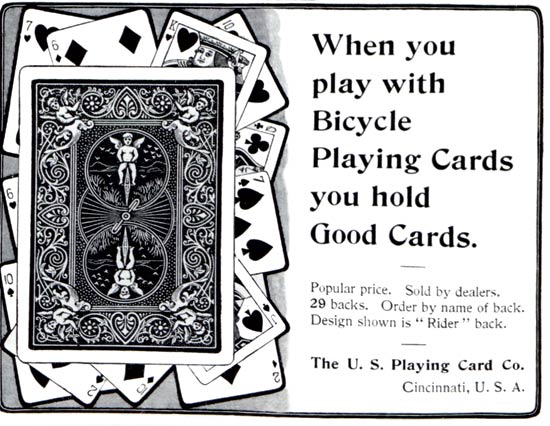
Back in 1885, when the Russell and Morgan Printing Company was preparing to launch a new line of playing cards, the company asked its employees to suggest a catchy, memorable brand name. The winning suggestion was the name of the popular item that was then sweeping the nation: the bicycle. Today, Bicycle is the top-selling playing card in the country, and its rider back design, shown in the ad above, is so well known that magicians choose it because it is so recognizable as a playing card.
Russell and Morgan, which started out producing circus posters in 1867, is now the United States Playing Card Company. Over the decades, it has produced several unique styles of cards, including a deck made for POWs during World War II: When the faces of these cards were peeled away, the cards could be assembled to reveal an escape map of Germany.
Parlor games come and go, yet playing cards are still in high demand. This year, the U.S. Playing Card Company will manufacture over 80 million decks.
This article is featured in the March/April 2017 issue of The Saturday Evening Post. Subscribe to the magazine for more art, inspiring stories, fiction, humor, and features from our archives.
Cover Gallery: Take Flight
America has always been in love with the concept of flight. From the first bi-planes to futuristic bombers, these Post covers fly you through a short history of aviation.
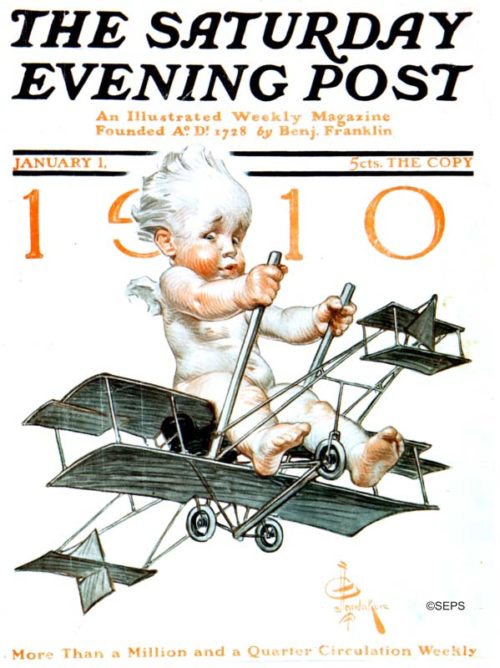
By J.C. Leyendecker
January 1, 1910
J. C. Leyendecker painted numerous “Baby New Year” covers, which often narrated the issue of the day: The 1910 baby flew a new-fangled bi-plane. The 1912 baby carried a “Votes for Women” sign. And 1914’s tot cruised the soon-to-be-opened Panama Canal. The worried face of our bi-plane baby reflects the trepidation many had about this brand-new mode of travel.
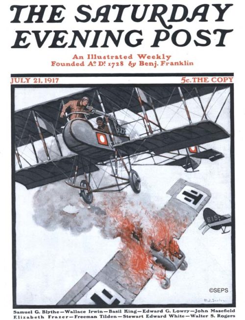
Henry J. Soulen
July 21, 1917
This dramatic aerial scene from a World War I dogfight depicts the moment of victory. Air combat was extremely rare at the beginning of the first world war. Although there was some tactical use of planes during the war, they were mostly used for reconnaissance. Over the course of the war, air battles evolved from grenades to handheld firearms, and eventually machine guns. The victorious plane has a pusher configuration, where the propeller is located behind the pilots. This solved the problem of the propeller interfering with the gunner’s line of sight.
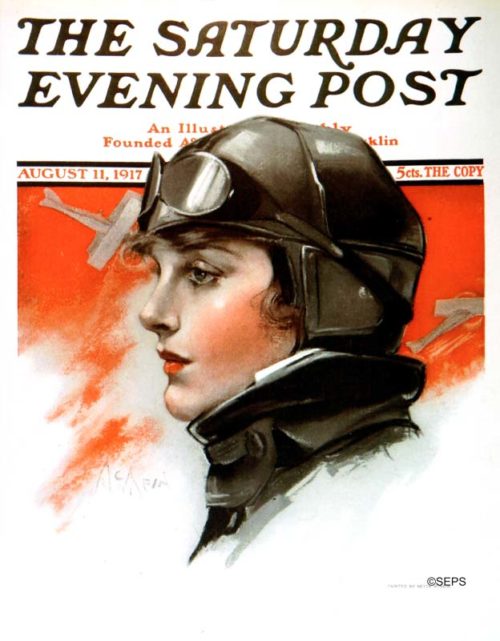
Neysa McMein
August 11, 1917
Neysa McMein got her start as an illustrator during World War I, travelling across France with Dorothy Parker to entertain the troops. She is known for creating the “Betty Crocker” image for General Mills, but this cover, as well as her inclusion in the Algonquin Roundtable, suggests a life that was perhaps more progressive than the fictional Mrs. Crocker’s.
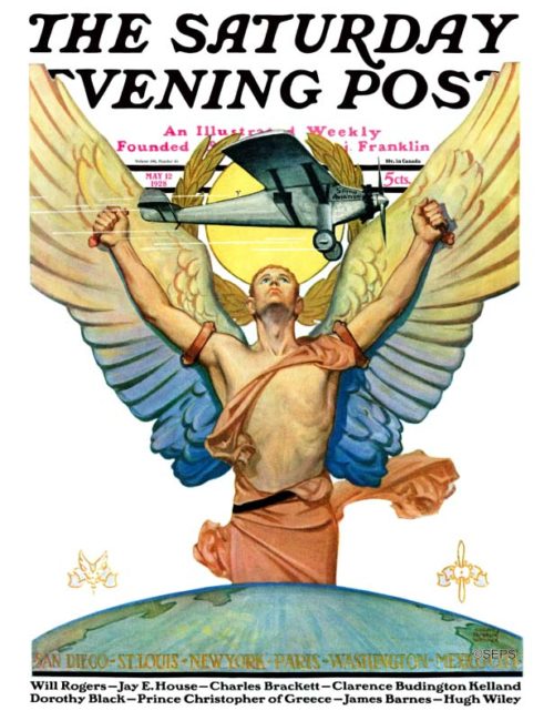
Edgar Franklin Wittmack
May 12, 1928
Edgar Franklin Wittmack was one of the top magazine cover illustrators from the 1920s to the 1940s, whose resume would include 22 Post covers. Wittmack’s covers often featured manly men — cowboys, mariners, Mounties, and movie stars —striking a jaunty pose for the portraitist. This ethereal, deco-style illustration was somewhat of a departure from his other Post covers.
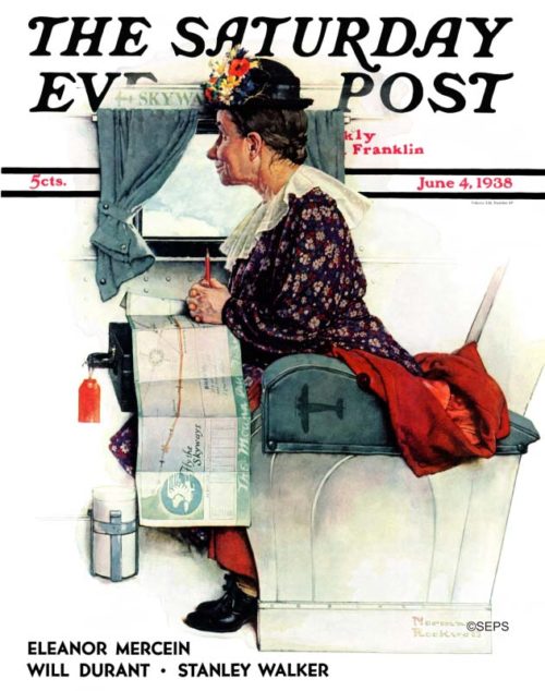
Norman Rockwell
June 4, 1938
Although this Rockwell illustration doesn’t feature a plane’s exterior, we couldn’t help but include this charmer. This eager first-time traveler gazes out the window, the route painstakingly traced out on her “Fly the Skyways” map. The rich narrative quality of the scene is the hallmark of Rockwell’s most compelling images.
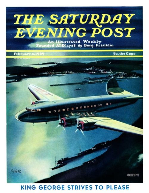
By Josef Kotula
February 4, 1939
This dramatic night scene is the only cover Josef Kotula painted for the Post. Kotula was known for his futuristic aviation and spaceship illustrations.
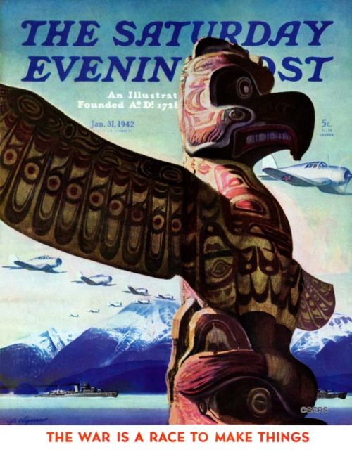
John Clymer
January 31, 1942
The U.S. had just entered World War II, and Clymer dramatically illustrated America’s commitment to protecting its Pacific shores. Both warships and planes glide across the dramatic backdrop of the Alaskan frontier, as the totem pole stands guard in the foreground, ever vigilant for invaders.
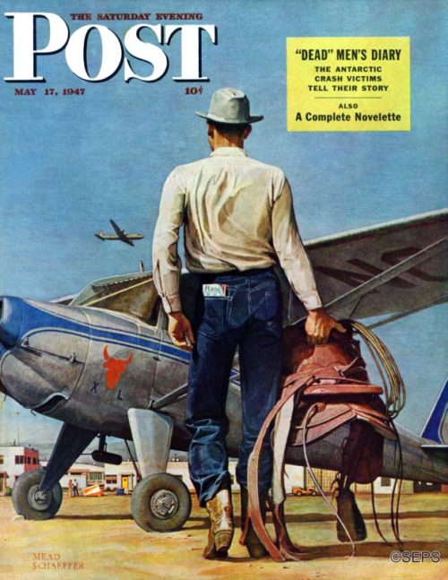
Mead Shaeffer
May 17, 1947
“The cowboy carrying his pet saddle to his plane is an everyday sight in the West,” artist Mead Schaeffer wrote when he delivered this painting. “Many a rancher lives in town and commutes to his ranch or ranches by air. The tableland makes landing fields all through the West, and because of the long distances involved, the West takes to planes the way the East take to cars. Many a business engagement, even luncheon engagements, are kept this way.” One of the flying ranchers, Lee Bivins, was Schaeffer’s model. The background is the airport at Amarillo, Texas.
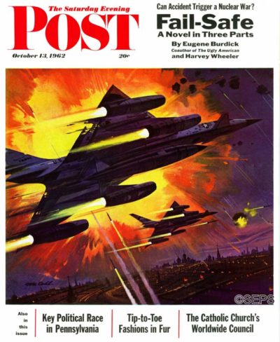
Robert McCall
October 13, 1962
This cover by Robert McCall accompanied a serialization of the book Fail-Safe, which described what might happen if a communications breakdown should cause nuclear-armed bombers to fly past their point of recall. The illustration depicts American bombers approaching Moscow, which is more obvious when one sees the two-page fold-out cover in its entirety. The Post editors wrote, “Accidental warfare is a valid subject for consideration in these cold-war days, and we would do well to keep in mind the grave problems facing the President—and all of us—in keeping the peace.”

Advertisement Gallery: War Sells
World War II was the most widespread and deadlist war in history, but it was also handy for selling soup! These 1942 ads used the conflict to sell everything from magnesium to motor oil.
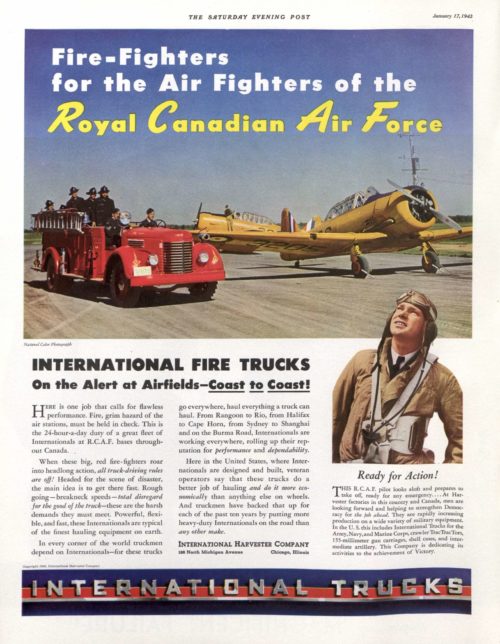
“At Harvester factories in this country and Canada, men are looking forward and helping to strengthen Democracy for the job ahead.”
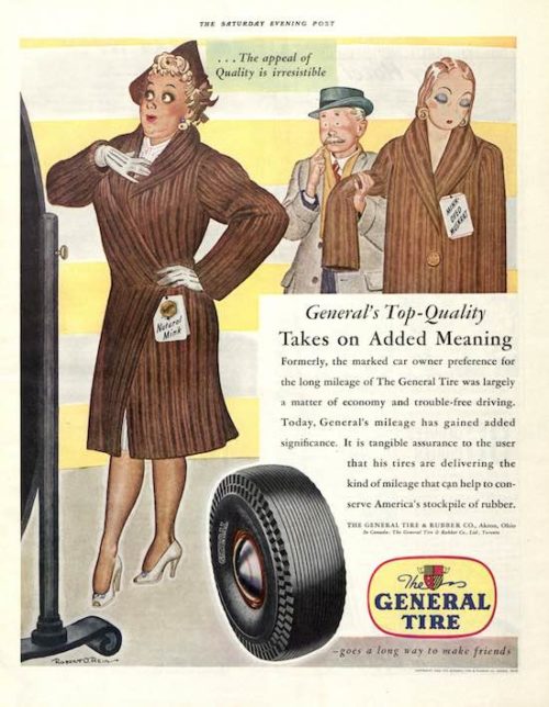
“It is tangible assurance to the user that his tires are delivering the kind of mileage that can help to conserve America’s stockpile of rubber.”
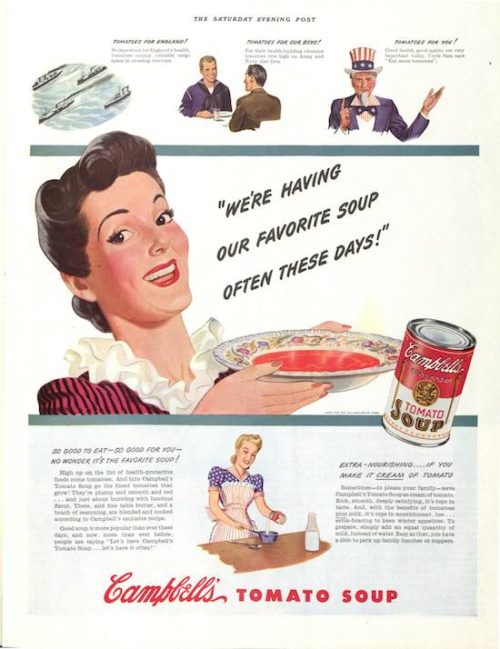
“Tomatoes for England! Tomatoes for our boys! Tomatoes for you!”
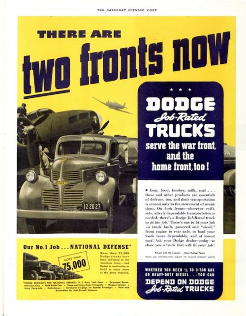
“More than 75,000 Dodge trucks have been delivered to the American Army — and Dodge is continuing to build as many more as the Army requires.”
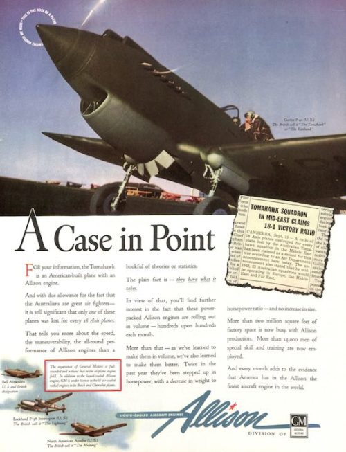
“America has in the Allison the finest aircraft engine in the world.”
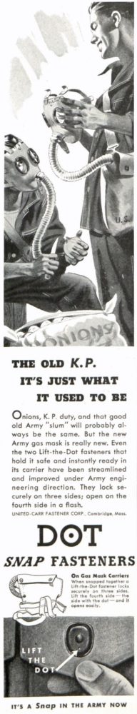
“Onions, K. P duty, and that good old Army “slum” will probably always be the same. But the new Army gas mask is really new. Even The two Lift-the-Dot fasteners that hold it safe and instantly ready in its carrier have been streamlined and improved under Army engineering direction.”
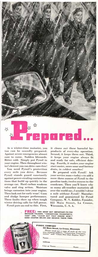
“Be prepared with Pyroil! Ask your service man—today—to add a mere three ounces of Pyroil to the gasoline tank; twelve ounces to the crankcase. Then you’ll know why so many all-weather motorists all over the world say, I wouldn’t drive a mile without Pyroil!”
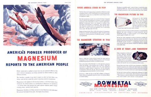
“Magnesium, therefore, is of deep interest to every American who holds dear the national heritages of our past—the hopes of our future.”
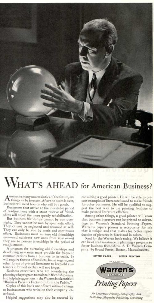
“Among the many uncertainties of the future, one thing can be foreseen. After the boom is over, business will need friends who will buy goods.”
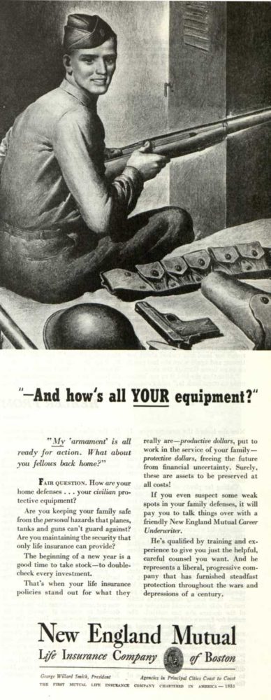
“My ‘armament’ is all ready for action. What about you fellows back home?”
Wouldn’t You Really Rather Have a Buick? Buick Ads from 1913-1965

“In the 1914 Buick you will find, in addition to those essentials of service which account for the Buick envied record of nine years, the choice of six models, fours and sixes, touring and roadster bodies, prices from $950 to $1985.”

“In the models for 1918 there is wide range of style — a still more pleasing dignity with grace and beauty of line.”

“Make this Christmas last for thousands of miles….”

1941 Buick Phaeton: “It isn’t just that the new Fireball engines, micropoise-balanced to vibrationless ease, carry Buick’s exclusive Dynaflash principle to new heights of agile brilliance while actually getting 10% to 15% more miles per gallon.”

“We aim to make those Buicks all that returning warriors have dreamed about — cars that from go-treadle to stop light will fit the stirring pattern of the lively, exciting, forward-moving new world so many millions have fought for.”

1953 Skylark: “Upon the Skylark, we have lavished practically every modern automotive advance — including the world’s newest V8 Engine, Twin-Turbine Dynaflow, Power Steering, Power Brakes, hydraulic control of the radio antenna, windows, top, and front-seat adjustment.”

Buick Electra: “The ‘Time Proof’ body by Fisher cradles and protects you with unequaled staunchness and quiet comfort. Vibration and noise are hushed in a body that keeps its new-car tautness longer than ever.”

The Riviera with Muscles on its Muscles. New Riviera Gran Sport
Vintage Advertising: How Much Do You Know About Cracker Jack?
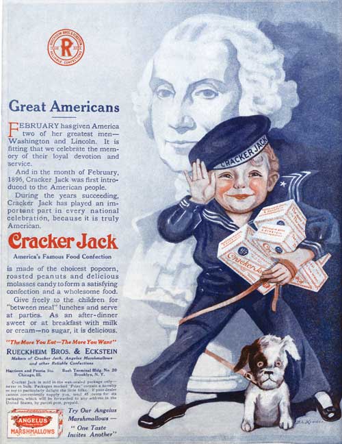
According to legend, a salesman accidentally coined the name for the Rueckheim brothers’ delectable snack food. After sampling the peanut-popcorn-and-molasses combination, he declared, “That’s a crackerjack,” using an old term for “first rate.”
The name stuck. And the packaging was also first rate — a cardboard box lined with wax paper so the contents stayed fresh. In 1908, Cracker Jack was immortalized in the song, “Take Me Out to the Ball Game,” which is estimated to be the third most frequently sung tune in America. In 1919, the company added a mascot, Sailor Jack, modeled after Frederick Rueckheim’s grandson Robert. When the boy died of pneumonia, his image was kept on the box as a lasting tribute.
Children appreciated that Cracker Jack cost only a nickel for over five decades. But they were especially drawn to the prizes in the box. In the course of 100 years, Cracker Jack delivered over 23 billion tiny prizes — puzzles, dolls, books, whistles, compasses, and hundreds more. Today, sadly, that tradition has ended, but you can scan a digital code inside the box — well, it’s a bag now — to play a “baseball-inspired mobile digital experience.” Oh, well. At least Sailor Jack’s image remains on the front of the package.
Gallery: Early Bicycle Advertisements
Bicycling had been popular for well over a decade when the first bike ad appeared in the Post.
However, as Margaret Guroff points out in “How Bikes Built Our Highways,” the bicycling fad had begun to fade by the turn of the century. Bicycle outings and cross-country tours were no longer appealing to the trendsetters who were probably captivated by the new horseless carriages.
But there was still a healthy market for the bicycle makers, as these ads show.

June 25, 1898
(Click to enlarge)
Columbia was one of the first major bicycle brands. Pope Manufacturing had been founded by Albert A. Pope, the man who gathered 150,000 signatures asking for a federal agency to promote building bike-able roads.

April 13, 1901
(Click to enlarge)
Thomas B. Jeffery founded Rambler Bicycles and eventually went on to start the long-lived Rambler automobile line.

June 8, 1901
(Click to enlarge)
Working without a retail store, the Cash Buyer’s Union offered bicycles-by-mail. Customers could pick up their bike at the train station and take it for a 10-day trial. The top-of-the-line model cost $15.95 — that’s $458 in today’s money, which is about in the middle of the current price range.

February 22, 1902
(Click to enlarge)
The Miami Cycle & Manufacturing Company, which produced the Racycle, followed the same route that others in the industry took, moving from bikes to motorized vehicles. By 1910, the company employed 1,000 workers and built 100,000 bicycles a year. It was also producing 10,000 motorcycles.

May 10, 1913
(Click to enlarge)
Iver Johnson immigrated to America from Norway in 1863. His arrival was well timed; there was plenty of work for a gunsmith in the middle of the Civil War. In 1900, his company moved into the bicycle business.
Iver Johnson bikes were known for graceful styling and the truss-bridge frame. This curved tube under the top of the frame provided added strength to handle the rough roads.

April 20, 1929
(Click to enlarge)
Hoping there would be a resurgence of interest in bicycling after World War I, bicycle makers formed The Cycle Trades of America to promote their products. They also conducted market research, which revealed that 75% of Americans now regarded bikes more as cheap, efficient transportation than as a form of recreation.

April 19, 1930
(Click to enlarge)
Montgomery Ward, like Sears & Roebuck, had evolved from catalog sales to a chain of retail stores across the country. In 1930, the year it turned down an offer to merge with Sears, it introduced this model of its Hawthorne bicycle.

April 12, 1947
(Click to enlarge)
Rollfast Bicycles were first manufactured in the 1890s by the D. P. Harris Hardware and Manufacturing Co. In 1900, they joined the H. P. Snyder Manufacturing Co., which took over the job of making the bicycles while Harris made parts. Snyder also manufactured Hawthorne bikes for Montgomery Ward through the 1930s.

December 6, 1947
(Click to enlarge)
The Roadmaster line of bicycles was created in 1935 by the Cleveland Welding Company. The brand was sold to AMF in 1950. In 1979, the company enjoyed on a wave of publicity when its track bikes were featured in the movie “Breaking Away.” Roadmaster is still a popular bicycle brand.

May 14, 1949
(Click to enlarge)
The American automobile industry of the 1950s celebrated a vigorous economy with models that were bigger, fatter, and more luxurious. Bicycles of that era followed the same trend. This Super Deluxe Monark featured wide, white-walled tires, a heavy frame, chrome details, and “Monark’s new, ‘Rubber Cushioned’ double spring shock absorbing front fork” — which the ad hinted was inspired by aircraft landing gear.
100 Years Ago This Week: Automobile Ads from 1917
The automobile industry was booming at the beginning of 1917. Recent innovations made cars more appealing to buyers; the 1916 Federal Aid Road Act had just been passed, promising to improve the country’s highways; mass production and ingenuity were driving down prices; and the U.S. had not yet joined World War I.
By 1922, there were more than 175 passenger car builders. Within a few years, that number would decrease sharply as smaller manufacturers founds themselves unable to compete with larger companies. But in January 1917, small manufacturers such as Cole (Indianapolis), Liberty (Detroit), Willys-Knight (Toledo), and Peerless (Cleveland) were gearing up for the big auto shows and advertising heavily to consumers in America’s most-read magazine. Below is a selection of car ads that appeared in the January 6, 1917 issue of The Saturday Evening Post.
If you like these ads, you might be interested in purchasing Automobiles in America: The Early Years, a Saturday Evening Post special collector’s edition.


