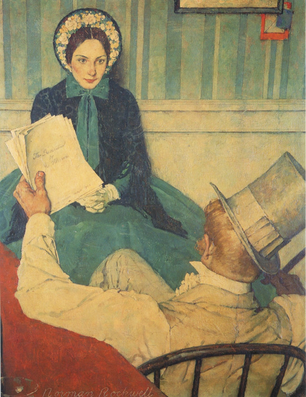
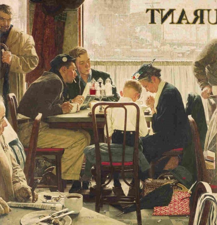
Rockwell Video Minute: Saying Grace
See all of the videos in our Rockwell Video Minute series.
Featured image: Norman Rockwell / SEPS
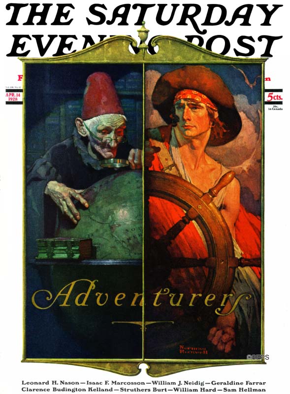
The Art of the Post: Norman Rockwell’s Most Important Art Lesson
Read all of art critic David Apatoff’s columns here.
When Norman Rockwell was a young art student, he idolized Joseph Leyendecker, who he called “the most famous illustrator in America.” Leyendecker was a cover artist for The Saturday Evening Post, and painted more than 300 covers between 1903 and 1943. Rockwell dreamed of becoming a cover artist too, but didn’t know how he could ever paint as well as the great Leyendecker.
In his autobiography, Rockwell recounted how he spied on Leyendecker, trying to learn his artistic secrets:
I’d followed him around town just to see how he acted…I’d ask the models what Mr. Leyendecker did when he was painting. Did he stand up or sit down? Did he talk to the models? What kind of brushes did he use? Did he use Winsor & Newton paints?
Unfortunately, none of this information seemed to make Rockwell a better painter.
A few years later, Rockwell finally got to visit Leyendecker in his studio and watched first-hand the master working on a painting. It turned out that Leyendecker’s secret had nothing to do with his brand of brushes or paint. Rockwell recalled:
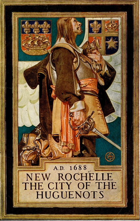
New Rochelle published a brochure illustrated with reproductions of paintings by all the famous artists who lived in the town. Joe worked on his painting for months and months, starting it over five or six times. I thought he’d never finish it.
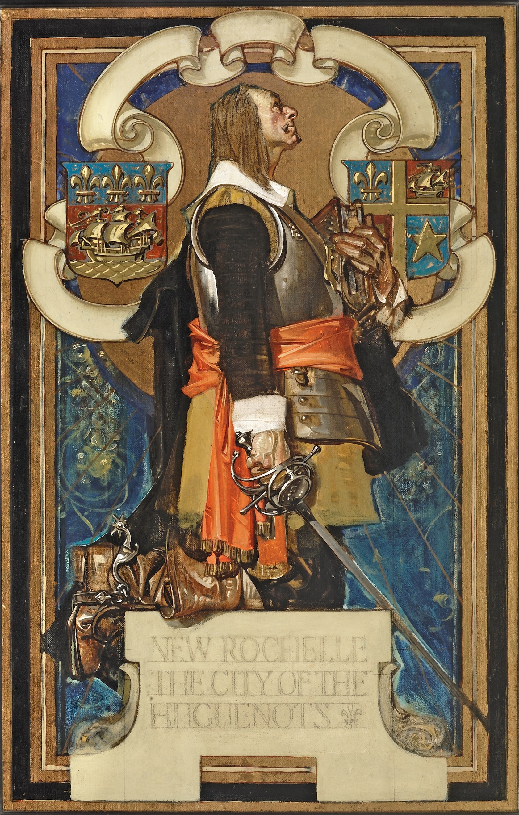
The painting that Rockwell saw on Leyendecker’s easel was beautiful, with many fine touches.
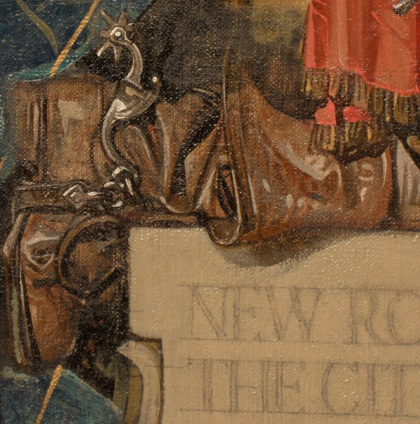
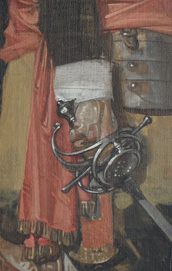
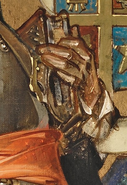
The painting was 95 percent finished and the client would have been happy to pay for it. All Leyendecker needed to do was finish this hand and a few other touches.
Yet, Leyendecker remained unsatisfied. The painting didn’t meet his high personal standards.
Rather than correct the parts he wanted to improve, Leyendecker set the entire painting aside and started all over again, searching for the exact image he envisioned.
Later, when Rockwell saw the final version published by New Rochelle, it looked like this:
This gave young Rockwell a lot to think about: Leyendecker’s first version was perfectly acceptable; it just wasn’t 100 percent what it could have been. Leyendecker seemed to spend a lot of time starting over in search of that elusive missing five percent.
Leyendecker’s high standards made Rockwell nervous about showing his own work to the master. Rockwell wrote, “You never asked Joe…what he thought of your painting unless you wanted a real critique; he thought nothing of starting a picture over again.”
But when it was Rockwell’s turn to become a professional illustrator, it seems he had learned the lesson. He painted “100%” in gold at the top of his easel to remind himself never to give anything less. That philosophy kept Rockwell at his easel seven days a week painting countless studies in order to get the details right. If he’d been willing to accept 95 percent, Rockwell could’ve worked faster, made more money and spent more time with his family. But he learned the lesson of Leyendecker, and that’s why people still remember him and admire his work today.
Featured image: Painting by J.C. Leyendecker. Photo courtesy of David Apatoff
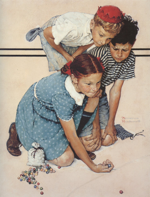
Rockwell Video Minute: The Holdout
See all of the videos in our Rockwell Video Minute series.
Featured image: Norman Rockwell / SEPS
Rockwell Files: Bridge Night
Nearly half of all households in the 1940s contained at least one bridge player. So when Rockwell featured this game on the Post’s cover in 1948, lots of readers would have understood what was going on.
Rockwell had been kicking around ideas for a bridge-themed cover before he took this unique angle on the game, which enabled him to show all the players’ cards.
The woman scratching her head is “South,” and since she’s won the bid for this hand, her partner “North” has laid down his cards to become the dummy player. South played her jack of spades, West has followed suit with the four. Now comes South’s dilemma. If East has the king, she can force it out with her ace. But if it’s in West’s hand, she’ll probably lose a trick.
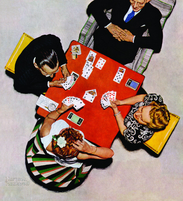
Meanwhile, her partner simply sits back and enjoys her quandary.
This article is featured in the September/October 2019 issue of The Saturday Evening Post. Subscribe to the magazine for more art, inspiring stories, fiction, humor, and features. Subscribers get access to digital archives of the magazine dating back to 1821.
Featured image: Norman Rockwell / SEPS.
Rockwell Video Minute: Missing Tooth
While painting a picture for a Crest toothpaste advertisement, Norman Rockwell’s young model gave him a great idea for a classic Saturday Evening Post cover.
See all of the videos in our Rockwell Video Minute series.
How to Look at a Norman Rockwell Picture: Part 6 — Rockwell’s Gift for Design
Read all of art critic David Apatoff’s columns here.
This is the sixth in a series of columns on how to appreciate the artistic side of Norman Rockwell’s paintings. See Part 1 on Rockwell’s use of hands, Part 2 on his use of black and white, Part 3 on how he leads your eye, Part 4 on his interaction with the great artists in history, and Part 5 on his mastery of light and color.
How is a painting different from other art forms, such as music or literature?
All three art forms convey a message or a feeling, but music uses sounds to appeal to our ears, literature uses words to appeal to our minds and a painting uses visual images to appeal to our eyes. Painters express themselves in colors and shapes and lines, and the quality of their image is judged by their ability to combine these visual elements into a good design.
If you look closely at Norman Rockwell’s work you’ll see he was a master of design.
What makes a design “good”?
A painter can’t simply put shapes and colors in a straight line, like words on a page. Words on a page are efficiently organized; they’re uniform in size, consistent, and organized in straight lines, but visually they’re monotonous. Painters must arrange a variety of shapes, colors, and lines in unusual ways that are creative, interesting, and pleasing to the eye. Art students are taught that uniformity, symmetry, and repetition are often the enemy of good design. These are examples of lessons for students at the Famous Artists School, where Norman Rockwell taught for many years:
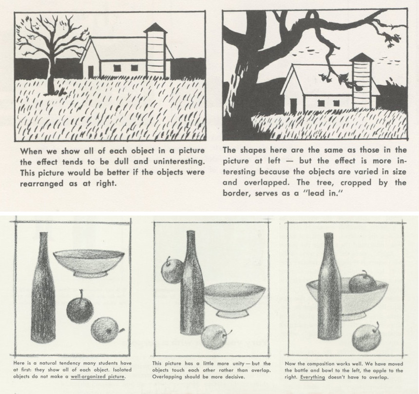
These lessons tell students that pictures are more appealing to our eye when the elements of the picture are a variety of sizes rather than uniform; when they continue off the edge of the picture to intimate a larger world beyond the borders; when they are clustered together in little groupings, rather than isolated; when the objects in a painting overlap with each other to establish a harmonious relationship; when the objects in the painting have complex or interesting outlines. These and dozens of other factors are what artists take into consideration when they design a picture.
A mere story-teller would not be too concerned about the design or composition of the picture.
becomes responsible for the forms used to convey the content. But Rockwell the artist felt that it wasn’t enough to tell a good yarn with a picture. A picture had to be well designed with a good composition. Let’s look at some examples of how Rockwell designed his picture to make it especially interesting for the viewer.
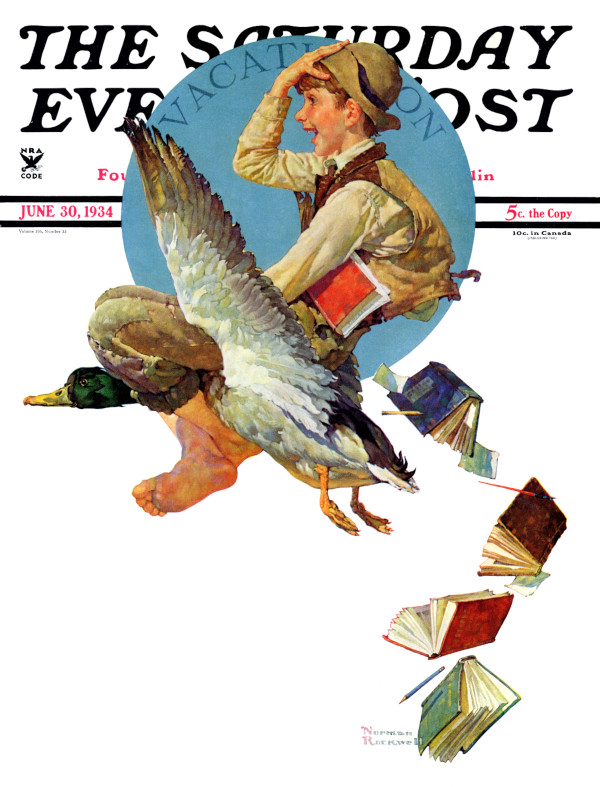
In the picture above, notice that the boy takes up the central position in the heart of the picture, over the centered blue circle, but the composition is still not symmetrical. Rockwell has given us a strong diagonal line, formed by the duck’s wing, which leads us to that beautifully designed trail of books that takes us aloft and makes the composition more interesting.
In this next painting of Louisa May Alcott, note how Rockwell designed the painting with another strong diagonal, which extends from the hat in the bottom right corner up to the face in the upper left corner, dominating the picture like a shining sun in a landscape painting.
Notice too how Rockwell uses the principle of overlapping elements to give us a feeling of great solidity and strength. In a less well-designed painting all these elements could have become fragmented or worked against each other. But in Rockwell’s carefully designed painting these figures are the visual equivalent of mountains in a landscape painting, and give us the same psychological feeling of rest and composure that a mountain range would.
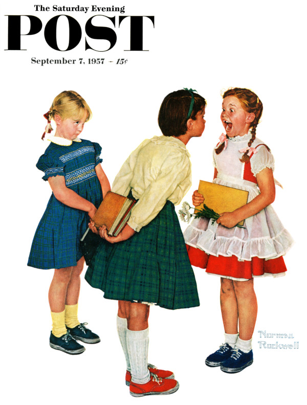
This next example shows us a beautiful grouping of figures. Notice the interesting outline around the three children and the shapes of the gaps caused by their arms. (It may help to envision them like a silhouette.) Inside this abstract shape we see a joyful array of patterns and textures: a bold black and white striped shirt contrasted against a bright red hat or the girl’s polka-dotted dress with that powerful white collar. Each child has a very distinctive pose and facial expression, yet visually the three fit together like pieces of a single jigsaw puzzle.
Finally, in this last example look at how Rockwell designs this image so that the girls are interlocked. A lesser artist might assume all three figures standing straight up, perpendicular to the ground, in which case they would never intersect. But Rockwell shows us one girl leaning forward, one girl leaning backward, and one girl with a petticoat protruding outward. In this way Rockwell sews together all the figures in this dynamic composition.
This illustration tells a great, funny story about kids. A good story teller might be content with painting standard looking children sufficient to convey the joke. But Rockwell went way beyond the joke and spent a great deal of time and talent carefully working out a strong visual design.
In that sense, Rockwell was like every other fine artist who believed that form and content must be balanced in a work of art, and that a painting that does not achieve excellence in both categories is a diminished painting.
Featured image: SEPS
How to Look at a Norman Rockwell Picture: Part 5 — Light and Color
Read all of art critic David Apatoff’s columns here.
This is the fifth in a series of columns on how to appreciate the artistic side of Norman Rockwell’s paintings. See Part 1 on Rockwell’s use of hands, Part 2 on his use of black and white, Part 3 on how he leads your eye, and Part 4 on his interaction with the great artists in history.
You couldn’t be blamed for thinking that this painting, entitled “A Day in the Life of a Girl” is about a day in the life of a girl.

But if you look closely there’s a second subject staring you right in the face: that subject is “light.”
Rockwell could easily have painted each event in the same consistent light. Instead, he spent a great deal of effort capturing light’s subtle changes throughout the day. Light is a separate character in this painting, as important as the girl.
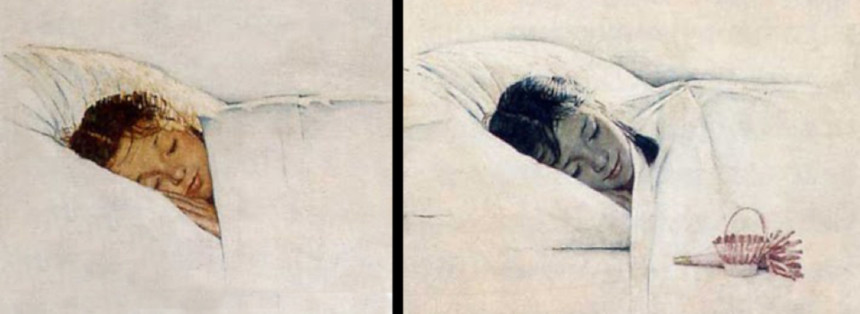
For example, compare the girl at the beginning and end of the day. Rockwell saw that the morning sun illuminates the full range of color in her skin and hair, with emphasis on warm colors such as red, orange and yellow. Moonlight, on the other hand, diminishes the color spectrum and creates cool colors such as blue and gray.
Next, notice how Rockwell captures the way artificial light from a bedside lamp looks different from natural light:
And electric light from the bedside lamp looks very different from the electric light of a movie theater marquee (below):
The sharp-eyed Rockwell can even distinguish between two different kinds of theater lighting: he paints the light from the marquee (above) differently from the way he paints the light from the silver screen (below). Then, after the movie ends and the children step out into the golden glow of the late afternoon sun, the light transforms their color completely:
Painting the effects of light required as much artistic skill and observation as painting the girl. This brilliant painting could just as well be called, “A day in the life of light.”
Artists have always been inspired by light; it is the magic ingredient, the source of what we perceive as color. Rockwell may have been a commercial illustrator who painted entertaining magazine covers for a corporate employer, but he was simultaneously a gifted artist, solidly within the artistic tradition that regards light as a source of wonder. (In a previous column I compared Rockwell to the famous impressionist Monet, who painted the same haystack several times to show that color looks different at different hours of the day.)
If you want to appreciate the artistic side of Rockwell’s work, look for the ways in which his paintings celebrate the qualities of light.
For example, why does the lighting of this fellow in the doorway look so warm and welcoming?
The source of light is from the ground up, rather than from the normal top down. Also, the light has an unusual warm glow. This is because the light is coming from a crackling fire in a fireplace. Rockwell doesn’t need to paint the fireplace for us, he can imply a fireplace using light.
In the next example, Rockwell uses color to contrast an ancient scholar at night in his study with a bold young explorer sailing into the dawn.
Rockwell didn’t have to clutter up his painting by showing additional objects, such as a black sky with stars and a moon, in order to set the scene. He was able to explain to viewers that it is night because he understood the palette of moonlight.
Finally, it’s important to emphasize that the artistic role of light goes beyond having the keen eye and technical skill to reproduce shades of light accurately. Light can also play a major emotional and psychological role in art. For example, look at Rockwell’s Post cover of a group of amateur musicians playing together after hours in the back of a barbershop:
Why didn’t Rockwell paint the entire scene in a well-lit room so he would have more space to show all those warm, folksy details and facial expressions for which he was famous?
The answer is that it was psychologically more effective to use a narrow sliver of light to reveal a partial glimpse of the beating heart of the picture. The joy of this picture is that these musicians are playing for their own private pleasure, not performing publicly. Their shining time together is surrounded on all sides by the darkened place of business, which makes this a more powerful, emotionally moving painting.
All this was achieved with color — one more example of how the mastery of light made Rockwell an excellent artist.
Featured image: Norman Rockwell/SEPS.
How to Look at a Norman Rockwell Picture: Part 4 — Building on the Work of Other Greats
Read all of art critic David Apatoff’s columns here.
This is the fourth in a series of columns on how to appreciate the artistic side of Norman Rockwell. See Part 1 on Rockwell’s use of hands, Part 2 on his use of black and white, and Part 3 on how he leads your eye.
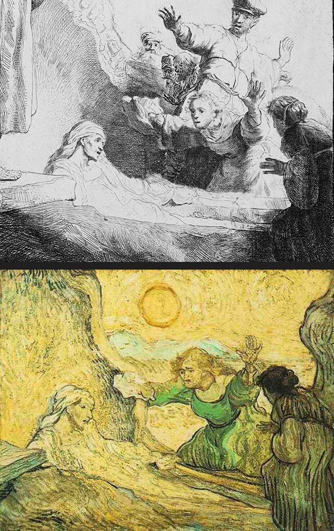
The greatest artists sometimes painted their own version of another artist’s work. For example, Vincent Van Gogh admired Rembrandt’s 1632 picture of Lazarus Rising From the Dead, so in 1890 he recreated Rembrandt’s picture as an homage:
Similarly, surrealist painter Salvador Dali took Vermeer’s painting “The Lace Maker” as his inspiration.
Norman Rockwell was no different. He was inspired by the greatest artistic geniuses and felt challenged by their accomplishments. Even though he was a “mere illustrator” he felt he could learn important lessons from their work. If we recognize these influences in Rockwell’s work, we can better appreciate the scope of his ambition.
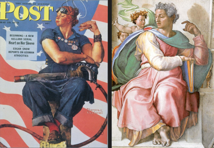
For example, Rockwell’s 1943 cover illustration of Rosie the Riveter was a direct tribute to Michelangelo’s famous painting of the prophet Isaiah on the ceiling of the Sistine Chapel:
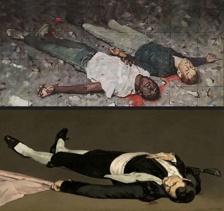
Similarly, when Rockwell wanted to paint a picture of murdered civil rights workers he used as his model Manet’s famous composition of a fallen matador:
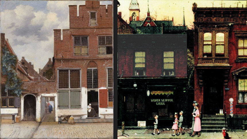
And Rockwell said that his model for this urban street scene for the cover of The Saturday Evening Post was Vermeer’s famous painting, “The Little Street in Delft.”
Why do artists use the work of other artists? Is that cheating? Have they run out of ideas?
If we take a closer look at Rockwell’s painting of the street scene, it will give us a better idea of what Rockwell is doing.
First we should note that this painting exemplifies everything that fans love about Rockwell. The story it tells is rich, interesting and multi-layered.
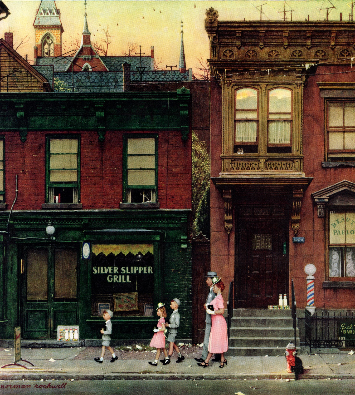
A family walking to church on Sunday morning, all dressed up with stiff — perhaps overly stiff — postures, averts their eyes from the seedy neighborhood through which they must walk. Notice that the milk bottles and Sunday morning newspapers are still on the front porches, so the local residents are still in bed. A pair of dancing shoes from the night before is airing out on a window ledge. For an especially nice touch, notice the flock of birds in the sky leaving the steeple, roused by the ringing of the morning church bells.
Go down an additional layer into this painting and you’ll realize that it describes how critics thought of Rockwell. They accused him of being myopic, his eyes fixed straight ahead, disregarding the seamy side of life all around him. True artists are supposed to notice details such as litter and broken sidewalks, but Rockwell was accused of living in a corny, idealized world.
But consider this: Rockwell’s tribute to Vermeer was painted at the exact same size as Vermeer’s masterpiece, using the exact same medium, and it comes off well by comparison. Rockwell may have been working on a deadline for a corporate employer, but he aimed high. He painted those bricks, captured the glow and the feel of old Dutch painting, studied Vermeer’s palette and composition. He appreciated Vermeer’s artistry and was able to work in that style the way very few, if any, fine artists of his day could. He may not have viewed himself as an artistic genius, but we can tell from his choices that he viewed the work of artistic geniuses as relevant to what he was doing.
Featured image: ©SEPS
How to Look at a Norman Rockwell Picture: Part 3 — How Rockwell Leads Your Eye
Read all of art critic David Apatoff’s columns here.
This is the third in a series of columns about how to recognize the “art” in a Norman Rockwell painting. See Part 1 on Rockwell’s use of hands and Part 2 on his use of black and white.
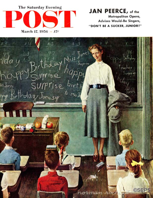
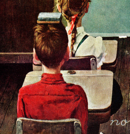
When you look at this charming painting of a teacher being surprised by her students, the first thing you notice is the teacher standing against the blackboard. You start with the expression on her face and then pull back, looking for clues about what’s happening. Next you read the words on the blackboard and learn that this is a birthday surprise. Then you gradually notice the rest of the details. The gifts on her desk, the personalities of the individual children, the chalk dust on the floor from the children scampering back to their seats before the teacher walks in.
If you started looking at the picture from a different spot — for example, the class clown balancing the eraser on his head…
…or the chalk dust on the floor…
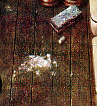
…this painting would make little sense at all. You’d wander around the page at random before eventually stumbling across its meaning.
How did you know to view everything in the proper sequence? The answer is because Norman Rockwell used a painter’s tools to lead you around the painting in exactly the order he wanted. He established all the priorities for you.
When we read a book, we follow a clear set of rules: for readers of English, we start at the top of the page and read from left to right, working our way to the bottom. Along the way, we follow the traffic signals provided by punctuation. But artists work with a very different set of rules to guide us in “reading” a painting. Certain visual elements demand priority attention. Our eyes are naturally attracted first to bright colors, or to high contrasts between extreme colors (for example, when an artist places black next to white). Certain shapes cause our eyes to move in a particular direction, or at a particular speed. Certain subjects, such as human faces, seem to grab our attention. On the other hand, some devices signal us to leave less important parts for later: subdued colors, soft boundaries, earth-colored tones and other devices don’t compete for our attention, so artists use them for backgrounds.
Returning to our painting of the teacher standing in front of the class, Rockwell starts us with the teacher by contrasting her stark white shirt against the blackboard.
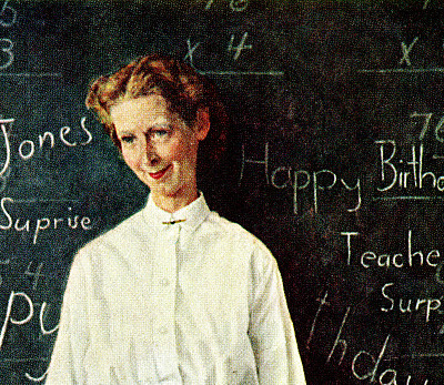
Notice that a few of the girls in the classroom are also wearing white, but they don’t compete for our attention because their white dresses aren’t as noticeable. Why? Because they are contrasted against light brown and pale green colors, not black. Rockwell also gives the teacher visual priority by making her the largest object in the painting. It helps, too, that hers is the only face in the painting — we only see the backs of the heads of the students. We aren’t conscious that Rockwell is doing it, but he walks us through every step of that painting, telling us how long to linger and where to turn next.
In this next painting of a soldier returning home from the war, Rockwell takes control in a very different way.
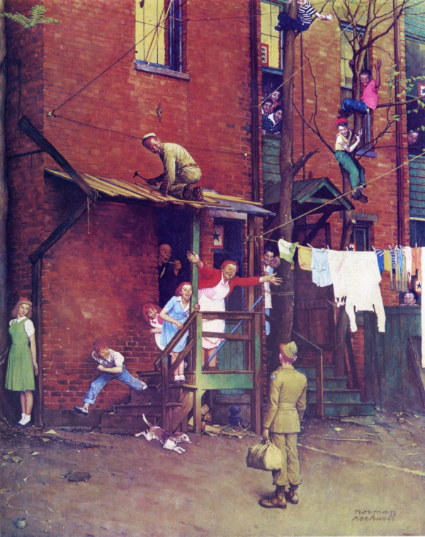
Unlike the school teacher, here the center of attention is a tiny part of the picture, with his face turned away from us:
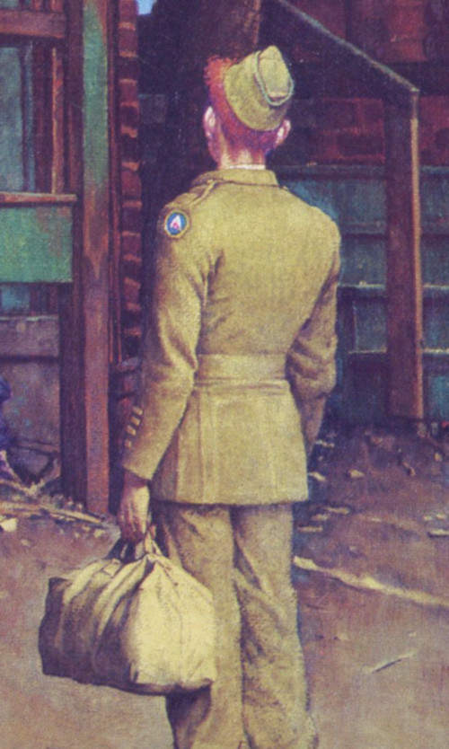
So how does Rockwell do it this time? How does he orchestrate a picture with eighteen figures in it? He achieves it by employing the eyes and faces of others. Seventeen characters in the painting are all focused on just one thing: the eighteenth character. We don’t see the soldier’s face, but he is surrounded almost 360 degrees by excited people looking directly at him:
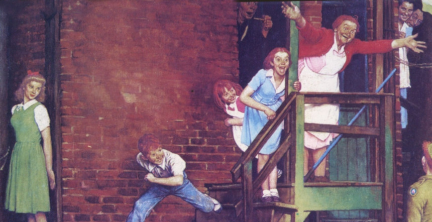
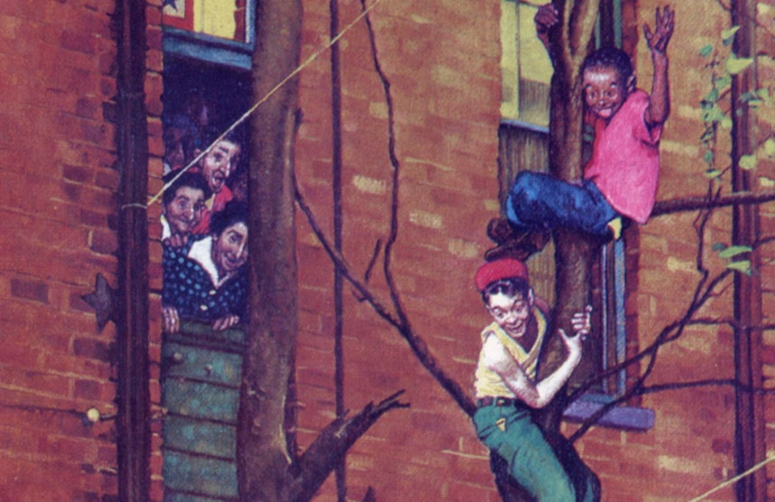
No matter where you look in this painting, the faces of those characters lasso you and drag you back to where Rockwell wants you to look: at the homecoming soldier who makes everything else in the painting make sense. Small and inconspicuous, he is the glue that binds the whole painting together.
And there is a lot to bind. There may be as many as a dozen different stories going on here. If Rockwell were a writer, he would have to explain to us which of these characters are the soldier’s family, and which is his shy sweetheart waiting to see how her returning soldier feels. The deft Rockwell establishes that by giving the soldier’s family members distinctive red hair, a wonderful storytelling tool. A writer might spend a paragraph describing the soldier’s emotions, but by making the soldier so small, Rockwell the psychologist shows us how overwhelming the sights and sounds of home are. This is an excellent example of how visual story telling can be more profound and subtle than words. The picture would not be nearly as powerful if Rockwell hadn’t staged it to give us the view over the soldier’s shoulder.
Staging a painting is important because our eyes can’t absorb everything in a picture at once. Our eyes see things, and perceive meaning, in stages. Writers tell stories in orderly sentences and paragraphs that are designed to present a narrative in linear form. But great artists such as Rockwell can unfold a narrative just as well — sometimes better — using visual elements.
All images by Norman Rockwell, © SEPS
How to Look at a Norman Rockwell Picture: Part 2 — Black and White
Read all of art critic David Apatoff’s columns here.
This is the second in a series of columns about how to recognize the “art” in a Norman Rockwell painting. See Part 1 on Rockwell’s use of hands.
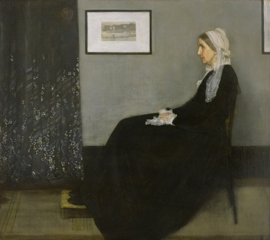
Whistler’s famous painting, Whistler’s Mother, is not really about Whistler’s mother.
The actual name of the painting is Arrangement in Grey and Black No. 1. As the title suggests, the purpose of the painting was to focus on the strategically placed dark and light elements in the picture. Art critic Kathryn Hughes wrote,
The subject is not Anna Whistler at all, nor is it Old Age, Wisdom or Regret or any of those other sententious one-worders that the High Victorians liked to affix to their drawing-room art. Rather, it is a commentary on… picture-making. Using a severely restricted palette, Whistler draws attention to the arrangement of large, simplified forms, so that the curves of the model’s face, dress and chair are grounded by the rectangles of the curtain, footstool and the floor.
Whistler believed in the modern art doctrine of “Art for art’s sake,” and was focused on the quality that artists call “value” — that is, the lightness or darkness of a color.
All great painters must learn to master the value of colors: the gradation of color from white to black, from light to dark. From the dawn of art, value has been one of the key organizing elements of painting. To control a painting and make the parts work well together, every artist must first decide which spot will be the lightest and which will be the darkest. Having established this, the painter can then relate all the middle values to these opposites.
As modern art became more abstract in the 19th and 20th centuries, “value” came out from behind the scenes and took center stage. Radical artists such as Whistler even made value the subject of a painting. His painting cares more about the dark and light shapes in his composition than the sweet old lady you think you’re seeing.
Norman Rockwell was never concerned with such abstract themes, right? He was really more interested in painting funny anecdotes for the cover of the Post, wasn’t he?
Well, it turns out that Rockwell was a master of value. Look at how he has stripped away almost all color in these paintings and focused on the subtle gradations of black and white:
These are virtuoso paintings in black and white, reinforcing that Rockwell was acutely sensitive to the range of “value” in his paintings, as much as the greatest fine art masters.
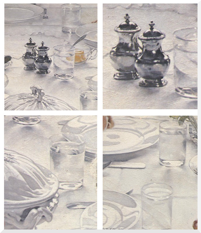
Why haven’t you seen Rockwell’s elegant black and white masterpieces before? Because they were hidden in plain sight, right smack dab in the middle of Rockwell’s famous painting of Thanksgiving that you’ve seen a dozen times:
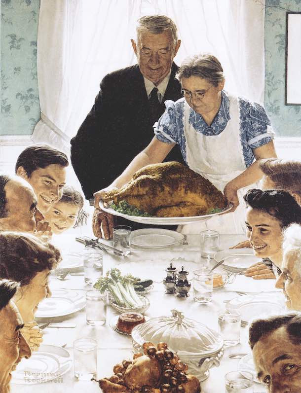
It is true that Rockwell was also interested in “painting funny anecdotes for the cover of the Post,” and that misleads some people to think he was less of a fine artist. But if you look at the raw ingredients of art in his painting, Rockwell understood value just as well as Whistler. It’s just that Rockwell was able to focus on more than one goal at a time.
How to Look at a Norman Rockwell Picture: Part 1 — Hands
Read all of art critic David Apatoff’s columns here.
A painting by Norman Rockwell can be viewed on many different levels. Some enjoy Rockwell as a story teller. Others like to go on a treasure hunt for details. Some like to look for a quick joke. But to fully appreciate the effort Rockwell put into his pictures, we should also look at his pictures as works of art. Rockwell put his heart and soul into the design, composition, color, and other characteristics of making “art” in the tradition of the greatest painters in history.
This is the first in a series about how to recognize and enjoy the “art” in Rockwell’s paintings.
Part 1: Hands
Human hands are expressive and beautiful, but they can also be very difficult to draw. They are anatomically complex, with a huge variety of possible positions. And even after an artist has mastered the technical skill of drawing hands, capturing their poetry — their expressiveness and their symbolism — adds a whole additional challenge.
The great Renaissance artist Caravaggio’s paintings of hands were famous for showing authentic callouses and dirt under their fingernails, rather than the idealized hands that previously dominated art. His “natural” look scandalized viewers and church patrons of his day. Here is Caravaggio’s famous painting of Bacchus, with a close up of his dirty fingernails.
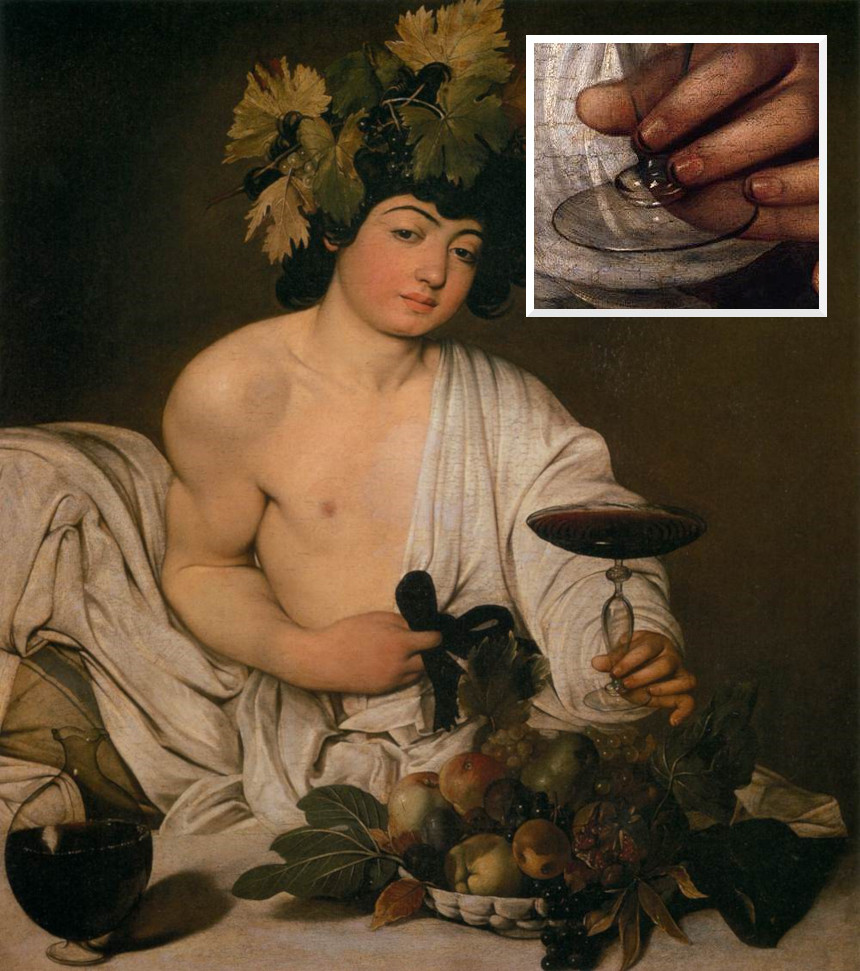
How shocking! But by painting the “real” hands of workmen and peasants, Caravaggio transformed the meaning of his paintings.
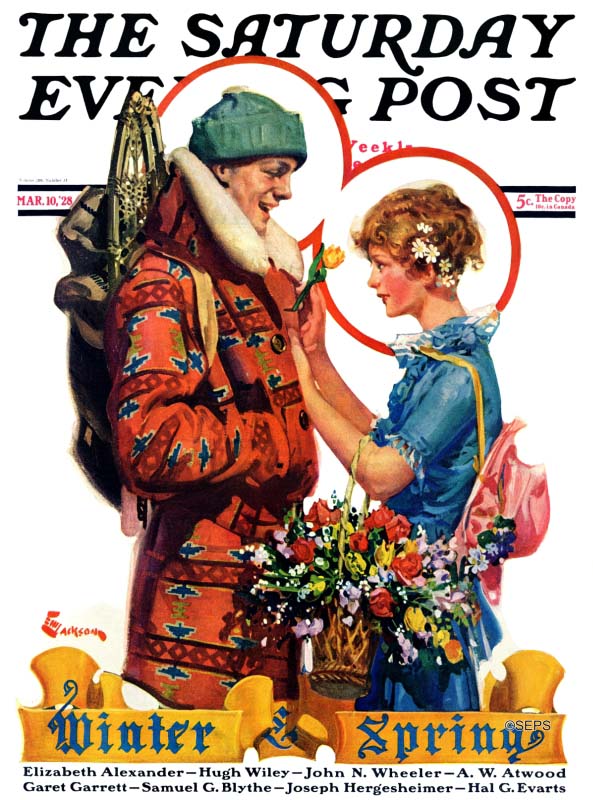
Because hands are so difficult to paint, many artists try to avoid painting them. They hide them in pockets or behind backs, as Elbert McGran Jackson did in this cover for the Post:
Many artists feel they can get by with hiding hands or giving them perfunctory treatment because hands are rarely central to a picture. They aren’t worth the trouble. Artists who want to realize the full potential for hands must exert a lot of additional effort.
If you look at almost any Rockwell painting, you’ll notice he went out of his way not only to draw hands, but to feature them prominently, and in the most interesting and expressive ways.
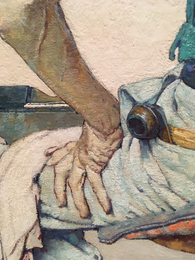
This required a great deal of additional effort, but the artist in Rockwell believed they were important to the overall painting.
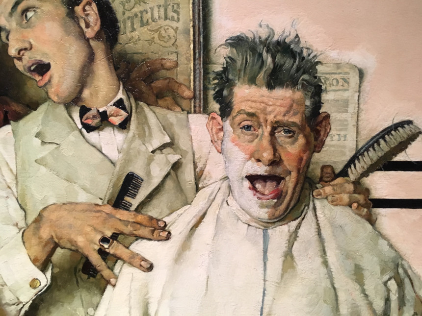
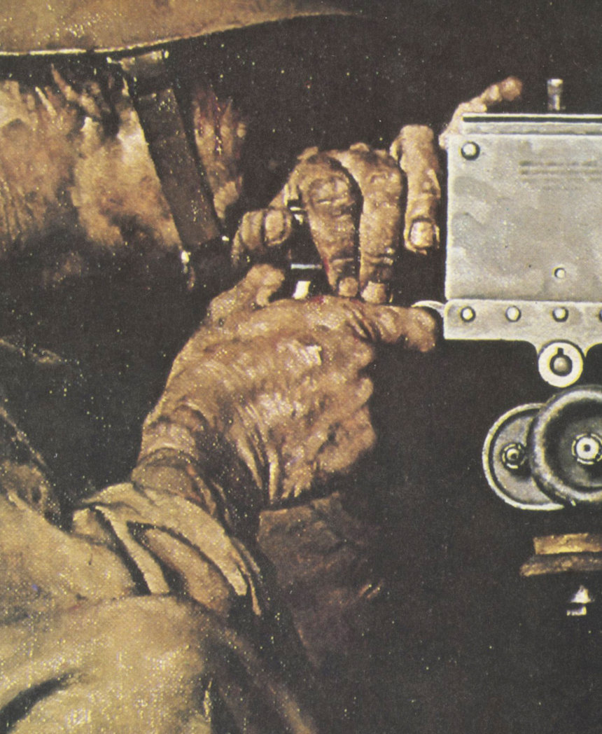
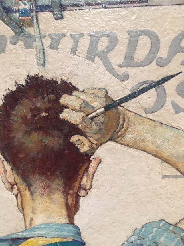
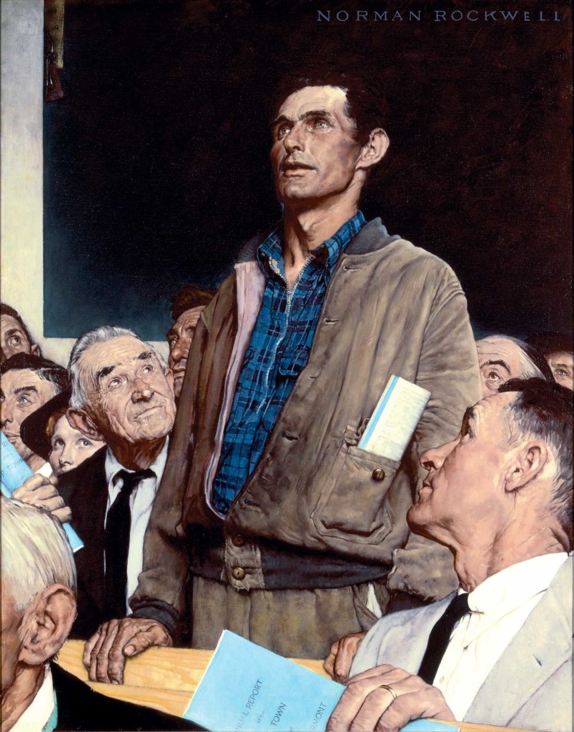
Remember Caravaggio’s authentic hands of the workers and peasants? When Rockwell wanted to paint a common laborer standing up and expressing his opinion under the First Amendment, he was careful to show a workingman’s hands:
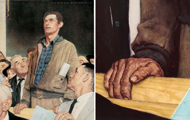
It would’ve been easy for Rockwell to avoid the extra work of painting another hand, but he clearly felt it was an important ingredient in his message about this man.
Rockwell’s hands are skillful, lovely and worthy of our attention, but what else do they tell us about Rockwell as an artist?
They reveal that Rockwell was a “materialist” in the best, old fashioned sense of the word. He had a rare appreciation for our material surroundings, their colors and patterns and textures, the nuances of skin as well as the structure of bone and muscle beneath the skin.
The way Rockwell painted hands gives us insight into an artistic virtue at the core of his work: his extraordinary ability to see the richness of our surroundings and draw our attention to the potential for poetry in even the humblest of details. Unlike some other fine artists, Rockwell did it for a broad audience and he did it under deadline. Still, as artistic virtues go, it’s hard to beat that one.
Featured image: Norman Rockwell, SEPS
Rockwell Video Minute: Coming and Going
It’s summer, and time for that family road trip! Norman Rockwell captures the before and after of a day at the lake.
See all of the videos in our Rockwell Video Minute series.
Featured image: Norman Rockwell; SEPS.
Rockwell Video Minute: Happy Birthday Miss Jones
Norman Rockwell’s painting, “Happy Birthday Miss Jones” showed not only his fondness for childhood scenes, but also his admirations for teachers, including one in particular who supported his dreams of becoming an artist.
See all of the videos in our Rockwell Video Minute series.
Rockwell Video Minute: The Chicago Cubs in “The Dugout”
Norman Rockwell’s “The Dugout” memorializes the 1948 Chicago Cubs, but maybe not quite the way they would have liked.
See all of the videos in our Rockwell Video Minute series at www.saturdayeveningpost/rockwell-video.
The Art of the Post: How Norman Rockwell Got the Last Laugh
Read all of art critic David Apatoff’s columns.
When did it happen?
And how?
Last year, the Wall Street Journal reported that Norman Rockwell’s paintings “have seen a sweeping reassessment by the art market….Rockwell now leads the charge in American art.” The fine art auction gallery Christie’s agreed, reporting that Rockwell’s top price at auction now exceeds the top prices for works by great American masters such as Edward Hopper, Georgia O’Keefe, and Andrew Wyeth.
The New York Times also confirmed: “Rockwell is now undergoing a major critical and financial reappraisal.”
Not long ago, Rockwell’s work was scorned as kitsch by art critics and collectors. Respectable museums would not display his art. Today museums worry that they can no longer afford his art. An important exhibition of Rockwell’s paintings, organized by the Norman Rockwell Museum in Stockbridge, Massachusetts, is midway through an international tour. The exhibition is based on Rockwell’s famous “Four Freedom” paintings. Even as these masterpieces travel to Washington, France, Houston, and Denver, their continued artistic relevance is demonstrated by another exhibition in a New York museum of modern conceptual art. These modern artists have simulated Rockwell’s Four Freedoms paintings, by inserting more diverse characters such as African Americans, LGBTQ people, Muslims, and other historically neglected groups. Relying on photography and Photoshop to mimic effects that Rockwell was able to achieve with his hands, they have tried to piggyback on the artistic power of Rockwell’s originals.
I would not discourage anyone from seeing the modern versions, but I strongly urge readers to go see Rockwell’s originals if they come to your city. The show offers a rare opportunity to view some brilliant and socially significant painting that will only continue to grow in stature.
In the years before Rockwell re-emerged as an important artist, famed art critic Clement Greenberg, America’s primary champion for modern abstract art, argued that Rockwell’s paintings should not be taken seriously: “you have to put Rockwell down, down below the rank of minor artist. He chose not to be serious.” Greenberg was the dean of modern art critics and a cheerleader for the avant garde. His opinion held great sway with other critics and collectors. He derided Rockwell’s paintings for being popular with the common, lowbrow crowd. Of course, such arrogance was nothing new; the great Roman poet Horace said it long ago: Odi Profanum Vulgus Et Arceo — “I detest the common crowd, and I rebuff them.” The fact that Rockwell remained popular with the public counted against him in an era when modern art was rebelling against traditional painting.
While Rockwell was earning a good living as the cover artist for The Saturday Evening Post, he was hurt by the critical reaction to his work. For a while he considered giving up illustration altogether and going to Paris to become a different kind of painter. He made a separate trip to Amsterdam, where he visited Rembrandt’s house. He stood alone in Rembrandt’s studio, looked up at the ceiling and called out, “Rembrandt? It’s me, Norman.…[long pause] What do you think?”
Despite his insecurities, Rockwell decided to stick with illustration. He had, through a combination of luck and hard work, found his calling. He spent the majority of waking hours in front of his easel doing what he loved.
Some major artists recognized the quality of Rockwell’s work and were not put off by the critics. Andy Warhol, for example, began collecting Rockwell paintings as soon as he could afford them in 1968. Famed directors Steven Spielberg and George Lucas also became major collectors of Rockwell’s paintings, saying they learned from his “cinematic devices” and the way he staged a story. Even some of the hippest writers and artists lauded Rockwell’s work. Frank Miller, popular media icon and creator of the “Batman: The Dark Knight” and “Sin City” series scoffed at the notion that Rockwell’s paintings were clichés: “They weren’t clichés until Rockwell invented them and they were embraced by the public.”
The critics resisted as long as they could, and some still resist today, but with the passage of time, the permanent qualities in Rockwell’s painting softened the opposition and gradually commanded more and more critical approval.
By the way, remember that art critic, Clement Greenberg? It turned out there was another side to his story. In 1980, after Rockwell had passed away, Greenberg confessed to a reporter that when Greenberg was a student he “wanted to paint like Rockwell” but lacked the talent. He and another art student made a trip to “visit the master” at his home in Massachusetts. Greenberg recalled, “Rockwell met us at the gate and I said, ‘I’m so glad to meet you Mr. Rockwell; you’re my idol.’” Rockwell’s humble response was, “Mr. Greenberg, I would’ve hoped that you’d outgrown me by now.”
Greenberg never could succeed in painting like Rockwell, but he became very good at writing long and brainy essays attacking traditional art.
Still, looking back to his meeting with Rockwell, Greenberg seemed almost wistful: “We spent the day with him [and] …he struck me then as rather happy.”
Perhaps Rockwell sensed that someday he might have the last laugh.
Featured image: ©SEPS
The Rockwell Files: Love at First Fight
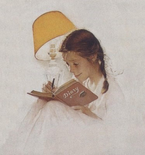
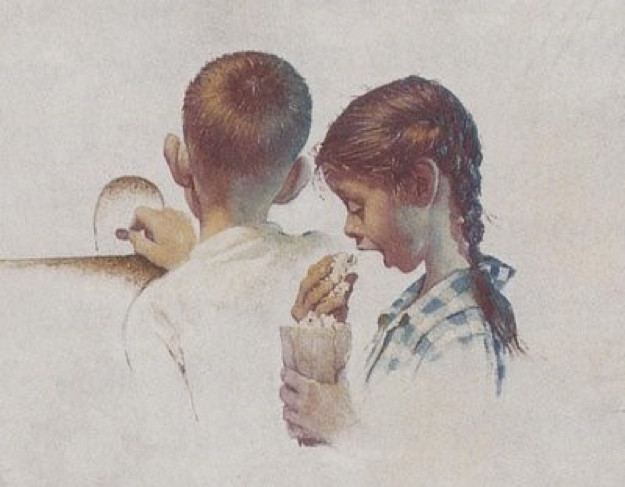
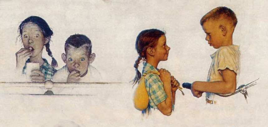
Three months after Rockwell’s Day in the Life of a Boy appeared on the cover of the Post, he decided to document a day in a little girl’s life, too. He chose his favorite child model, Mary Whalen, to pose for the 22 images of Day in the Life of a Girl for the August 30, 1952, cover.
Rockwell had to be imaginative in posing Mary for the photographs he would use to inform the painting. To give the impression of her racing off to the pool, her mother helped by holding her pigtails back while someone else pulled on her swim cap. To simulate the mutual dunkings of Mary and co-model Chuck Marsh, Rockwell used a bronze bust. The kids posed as if to dunk the bust’s head under water so Rockwell could get their elbow angles correct.
Making Mary’s hair look soaking wet was easier: “They poured a bowl of water on me,” she said.
Now came the toughest challenge. Though the models got along when posing, Chuck absolutely refused to kiss a girl — no way, no how. He finally agreed to a compromise: Rockwell brought out the bronze bust again and photographed Chuck kissing it.
The finished cover resembled Day in the Life of a Boy except for one image. Rockwell had been criticized for not showing the boy saying his prayers before going to bed. So he removed one of the images in the sequence — Mary and Chuck thanking the birthday girl for inviting them to her party — to make room for Mary kneeling at her bedside.