Cover Collection: Rockwell or Not?
Many of the covers of The Saturday Evening Post were painted by Norman Rockwell—322 in all—but not all of our covers were Rockwells! Can you tell which of these covers are Norman Rockwell originals and which aren’t? We’ve removed the artists’ signatures to make it more challenging. You can see the answers here.

December 27, 1919
Click to Enlarge

March 3, 1928
Click to Enlarge

November 3, 1928
Click to Enlarge

October 3, 1936
Click to Enlarge

April 29, 1939
Click to Enlarge

July 26, 1941
Click to Enlarge

December 20, 1941
Click to Enlarge

July 6, 1946
Click to Enlarge
Answers to “Rockwell or Not?”
Here are the answers to the “Rockwell or Not” cover gallery.
- Santa Behind Window, December 27, 1919: J. C. Leyendecker
- Wipeout on Skis, March 3, 1928: Eugene Iverd
- Hunter and Spaniel, November 3, 1928: F. Kernan
- Tipping the Scales, October 3, 1936: Leslie Thrasher
- Sport, April 29, 1939: Norman Rockwell
- Two Flirts, July 26, 1941: Norman Rockwell
- Newsstand in the Snow, December 20, 1941: Norman Rockwell
- Working on the Statue of Liberty, July 6, 1946: Norman Rockwell
Classic Covers: Dieting Through the Years
Sticking to your diet can be a drag. Since this is the time of year when New Year’s resolutions start to wane, we thought we’d provide a little encouragement in the form of Saturday Evening Post covers featuring weight watching woes.
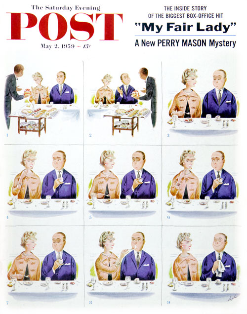
Constantin Alajalov
May 2, 1959
Mr. Noble, on Constantin Alajalov’s 1959 cover, doesn’t even make it through dessert. His pretty dinner companion is overjoyed at the thought of strawberry shortcake, but Mr. Noble (panel 2) nobly declines. Pretty lady jabbers away, enjoying her dessert, while Mr. N looks like…well, remember that dog you had who watched with pitiful, soulful eyes as you forked down your dinner? Like that. Finally taking pity by the eighth panel of this scenario, the lady gives the last bite of dessert to the man, making for a happy couple in the last segment.
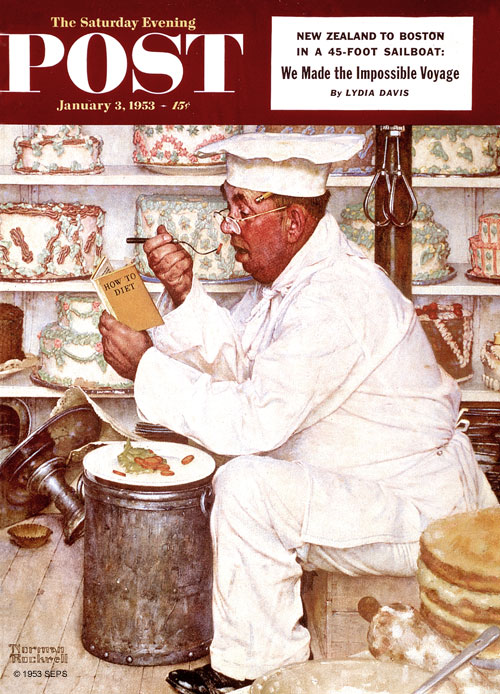
Norman Rockwell
January 3, 1953
If ever the battle of the bulge was a losing battle, it is Norman Rockwell’s pastry chef on the January 3, 1953 cover. Poor man. Eating rabbit food while surrounded by luscious cakes makes a New Year’s resolution doomed to failure. That book on dieting is only going to provide so much motivation.
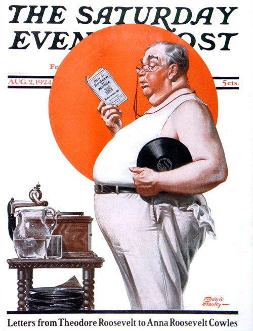
Frederic Stanley
August 2, 1924
Looking for motivation a few decades earlier (1924) is artist Frederic Stanley’s gentleman with a record player and a book all about reducing to music. Sorry, fella, but that gut is going to take some serious John Philip Sousa marches at the very least.
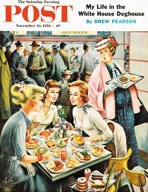
Constantin Alajalov
November 10, 1956
Artist Alajalov found cafeterias a dieting minefield. To work on this November 1956 cover, the artist lugged trays of food up to his New York studio. He couldn’t eat it all afterwards without getting fat himself, so the elevator boys were the happy recipients of his largesse. He is demonstrating just how unfair life could be. The rather large lady is valiantly sticking to a small salad and meager crackers while three charming (and thin) young ladies are tucking into enough food to feed an army. Ah, youth.
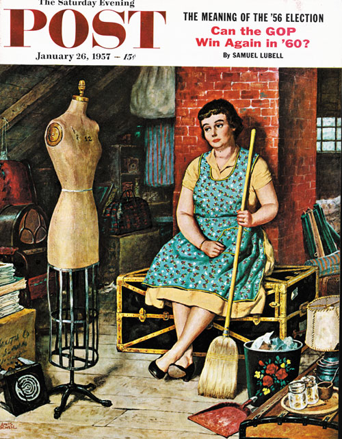
Amos Sewell
January 26, 1957
Yes, youth. That was when I had a figure, thinks the lady in Amos Sewell’s January 1957 cover. Wistfully looking at her former dress form, she wonders where the time (and bod) went. Okay, so we don’t use dress forms much these days, but who hasn’t looked at a former favorite pair of jeans with the same forlorn expression? The editors noted that the artist had “borrowed that dress form in Westport, Connecticut, walked to his car with it under his arm, and nobody gave him the raspberry. In artists’ colonies people evidently become shockproof.”
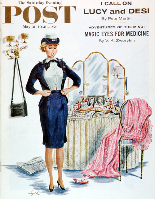
Constantin Alajalov
May 31, 1958
How the ounces add up if you don’t keep fending off the darned little things every day, month, year. It’s unfortunate for Mrs. Pounds, as she tries to make both sides meet. Well, artist Alajalov’s cover deserves a happy ending. Elsewhere in that room, Mister P. is futilely trying to encase himself in his old uniform too; and suddenly they go into each other’s arms—“ Oh, the heck with midriffs. After all, we love each other just as we are!’’ Does anything else really matter?
Cover Collection: The Art of the Common Cold
It’s that time of year again where half of us are sniffling, sneezing, and wanting nothing more than to crawl back into bed. If misery loves company, you’ll love our vintage Post covers of people suffering from the common cold.
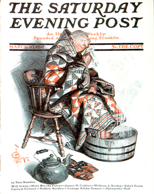
J. C. Leyendecker
March 10, 1917
In 1917 the way to take care of a cold was to curl up in a big quilt and soak your feet in a steaming tub. At least according to artist J.C. Leyendecker. Have a handkerchief handy for when the steam loosens up the nasal passages. Unfortunately, we haven’t improved this cold-treating technique much in the 101 years since this cover was published.
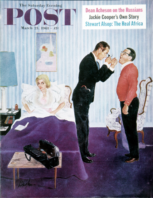
George Hughes
March 25, 1961
Remember when doctors made house calls? Well, okay, we don’t either, but some Post cover artists remembered. Artist George Hughes shows us a doctor calling on a woman taken ill. Sort of. Actually, the Mrs. is seething while her hubby is diverting the doctor’s attention. Who is the patient here, anyway? Perhaps the doctor is just good at multi-tasking.
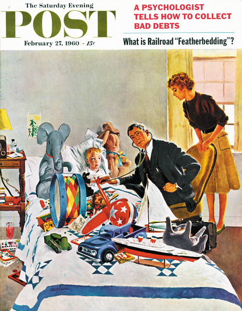
George Hughes
February 27, 1960
George Hughes shows a doctor who would be a good detective. Finding a sick little boy in a bed cluttered with this many toys was a good day’s work. Hey, when a guy isn’t feeling good, he needs his creature comforts around.
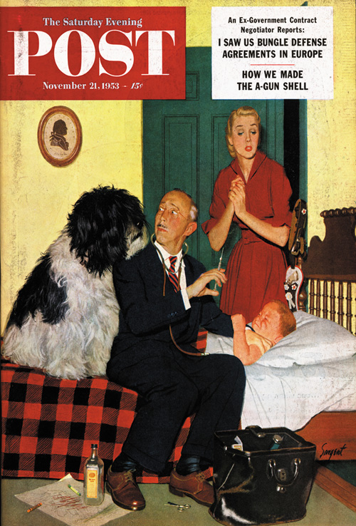
Dick Sargent
November 21, 1953
Keeping a close eye on the proceedings is the boy’s dog. A very large dog. Maybe this is why doctors don’t make house calls any more.
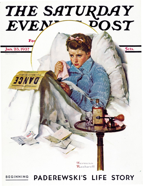
Norman Rockwell
January 23, 1937
What really stinks is when you’re sick during a big event. The young lady in Norman Rockwell’s 1937 cover is missing the big dance. Cough syrup, atomizer and hankies are poor substitutes for a pretty dress, corsage and dancing with a cute guy. This falls under the “Life is Unfair” category.
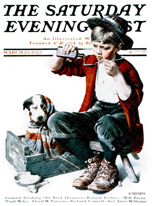
Norman Rockwell
March 10, 1923
Cover Collection: Bold Women
As Laurel Thatcher Ulrich once said, “Well-behaved women seldom make history.” This collection of Saturday Evening Post images is a paean to strong women making a difference.
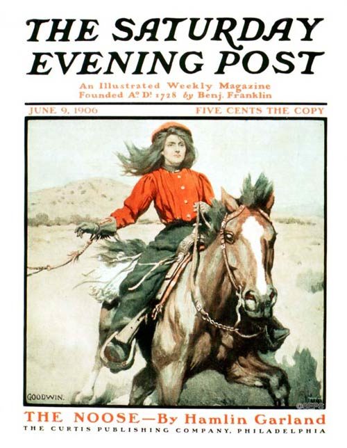
Philip R. Goodwin
June 9, 1906
Click to Enlarge
This cover illustrated a short story called “The Noose.” The cowgirl at the center of the story, Fan Blondell, “was already aware of her power, too, and walked among the rough men of her acquaintance with the step of an Amazonian queen, unafraid, unabashed.”

J.C. Leyendecker
March 18, 1905
Click to Enlarge
In the short story, “The Swastika” by Robert W. Chambers, stenographer Miss Grey turns out to have deeper knowledge and more intrigue than her employer expected. J.C. Leyendecker, one of the Post’s most highly regarded artists, created this Egyptian-themed cover to illustrate the story.

Joe De Mers
December 1, 1956
Click to Enlarge
Artist Joe De Mers illustrated “Her Big Moment” by Lee McGiffin. In it, four accomplished women return to their college reunion. De Mers captures the sleek glamour of the 1950s.

Gilbert Bundy
May 26, 1951
Click to Enlarge
This illustration accompanies a short story called “Petticoat Empire” by Edith Embury. In the story, Nathalie Wyman is a film producer: “She was the boss, the genius. No one ever disagreed with her — not if he wanted to keep his job.”

Coby Whitmore
January 5, 1952
Click to Enlarge
Artist Coby Whitmore was well known for his illustrations of confident women. This woman looks like she has already picked out her 1952 model, and will be shortly driving it off the showroom floor. It comes as no surprise that Whitmore had a fascination with cars. In the early 1950s, he designed the Fitch-Whitmore Le Mans Special with racecar driver John Fitch.
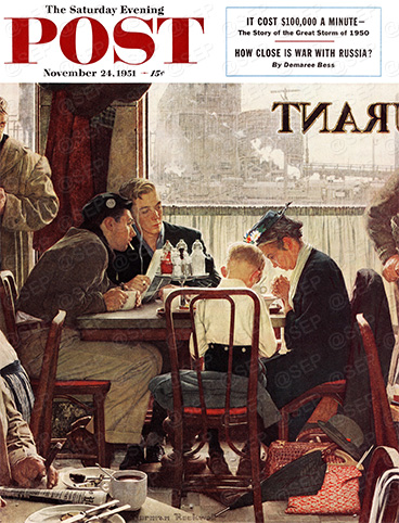
Norman Rockwell
November 24, 1951
Click to Enlarge
Boldness comes in all shapes and sizes; sometimes it means doing what you believe even when those around you don’t quite understand.

Norman Rockwell
May 29, 1943
Click to Enlarge
No gallery of bold women would be complete without Norman Rockwell’s beloved Rosie the Riveter. The model was Mary Doyle Keefe, a 19-year-old phone operator in Arlington, Vermont. During World War II, Rosie the Riveter toured the country raising money for the war bond drive. “I was very pleased that they could make all this money for the war.” Keefe said. “I am proud of this painting. It’s a symbol of what the women did for the war, to do their part.”

Ellen Pyle
October 8, 1927
Click to Enlarge
After her husband died, Ellen Pyle turned to painting to support her family. Her sister-in-law sent three of Ellen’s illustrations to The Saturday Evening Post in 1922, two of which were immediately selected by The Post’s famous editor, George Horace Lorimer. Over the course of the next decade-and-a-half, Pyle completed 40 covers for The Saturday Evening Post, including this archer.

J.C. Leyendecker
August 17, 1918
Click to Enlarge
The American Red Cross Motor Corps were a group of women who aided the U.S. military in transporting troops and supplies during World War I. These women did everything from running canteens and military hospitals to caring for patients of the 1918 flu pandemic.

Neysa McMein
August 11, 1917
Click to Enlarge
Artist Neysa McMein was involved in the war efforts during World War I, travelling through Europe with Dorothy Parker to entertain the troops. She painted a number of wartime covers, including this pilot.
Cover Collection: The Circus Is in Town!
Trapeze artists, clowns, elephants… the exotic magic of the circus has long been a part of the American tradition. These colorful Saturday Evening Post illustrations capture the spirit of the Big Top.
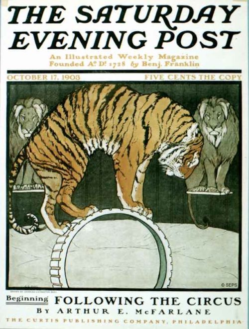
Charles Bull
October 17, 1903
Charles Bull painted dozens of covers featuring animals — cows and cats, owls and eagles, deer and dogs — for The Saturday Evening Post and its sister publication, Country Gentleman. This was his only cover showing animals at the circus.
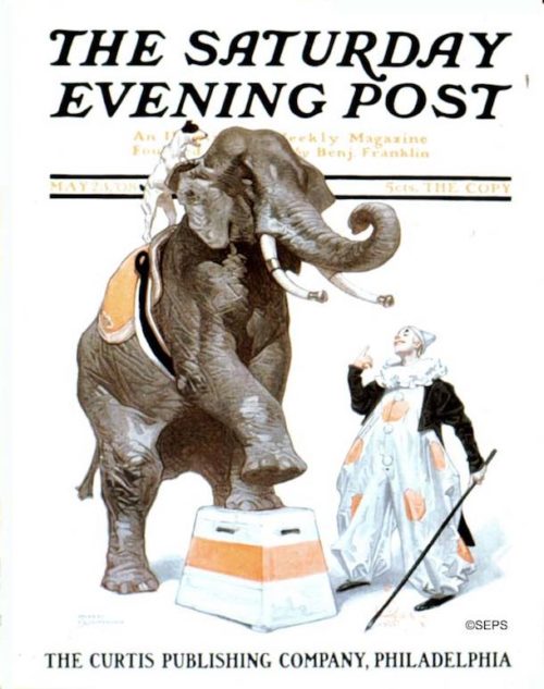
J.C. Leyendecker
May 23, 1908
Leyendecker painted six circus-themed covers for the Post, most of which featured the majestic elephant. That little black and white dog must have been Leyendecker’s muse, appearing on at least 16 of his Post covers.
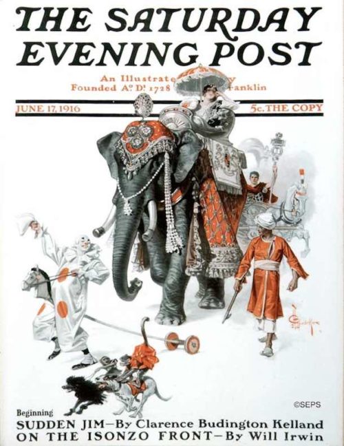
J.C. Leyendecker
June 17, 1916
Our art critic, David Apatoff, notes that the original paintings that were reproduced on the cover of the Post were far larger than the magazine — sometimes four or five times larger. And they were painted with oil paint on canvas, just like fine art in the greatest museums. Often, Post cover artists had been trained in a classical fine art tradition. Leyendecker, for example, trained in Paris at the Académie Julian. For more on this particular painting, read Apatoff’s article, The Hidden Talent of Post Cover Artists.
Norman Rockwell
May 26, 1923
A look behind the scenes at the big top reveals the house of disciplined practice that result in a show that delights the circus-goers in the ring. The pup learns his lesson under the stern eye of the older dog, who manages a degree of dignity despite the absurdity of the costume.
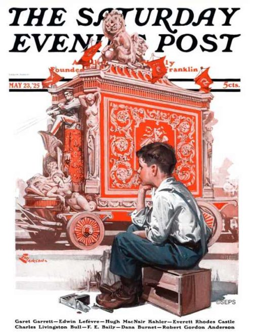
E.M. Jackson
May 23, 1925
These music-making “steam pianos” were often seen on riverboats and in circuses. Most had 32 whistles. The sound will be forever associated with the circus.
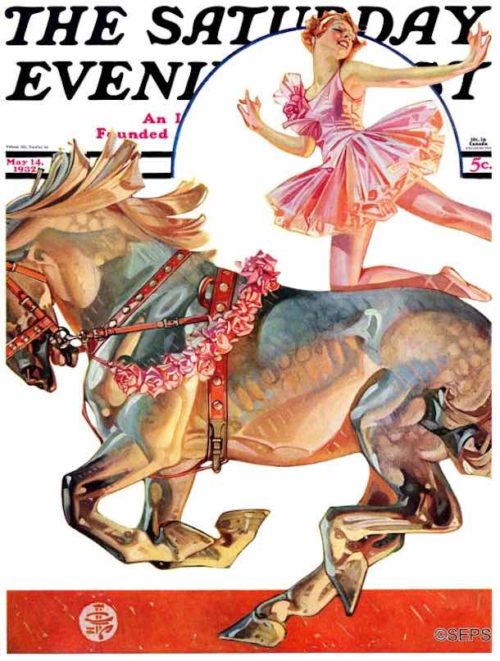
J.C. Leyendecker
May 14, 1932
Leyendecker masterfully captures the tension between the muscular strength of the horse and the delicate balancing act of the rider. The horse reflects the astonishing colors of the circus around him.
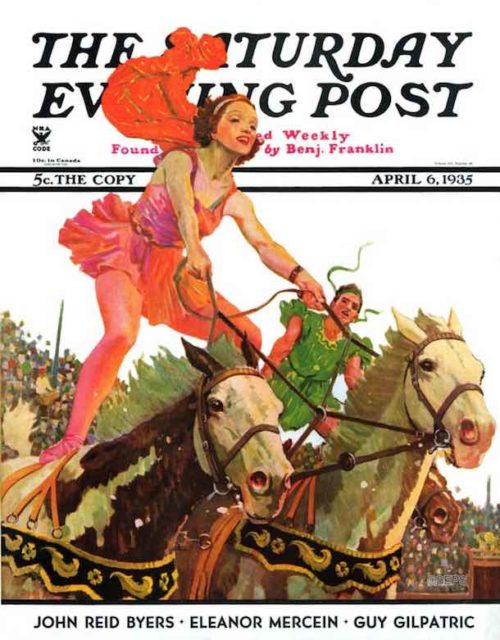
Maurice Bower
April 6, 1935
Maurice Bower offers another view of circus horses and riders. Horses were a favorite subject of Bower’s; he painted numerous covers featuring them pulling stagecoaches, sulkies, and firetrucks.
Stevan Dohanos
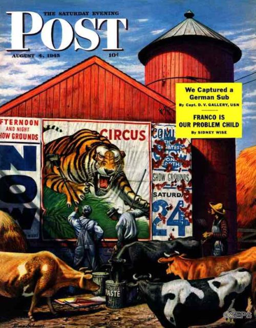
August 4, 1945
Stevan Dohanos showed that circuses meant palate-tickling excitement to cows too. Poster paste — a succulent mixture of flour and water, and copper sulphate to keep it from souring — seems to be the bovine equivalent of a dry martini. The two Ringling Brothers Barnum and Bailey bill posters, Bill Feigley and Bob Aikens, who consented to pose for Dohanos, kept a wary eye on horned kibitzers while covering previous circus posters with their own particular brand.
Stevan Dohanos
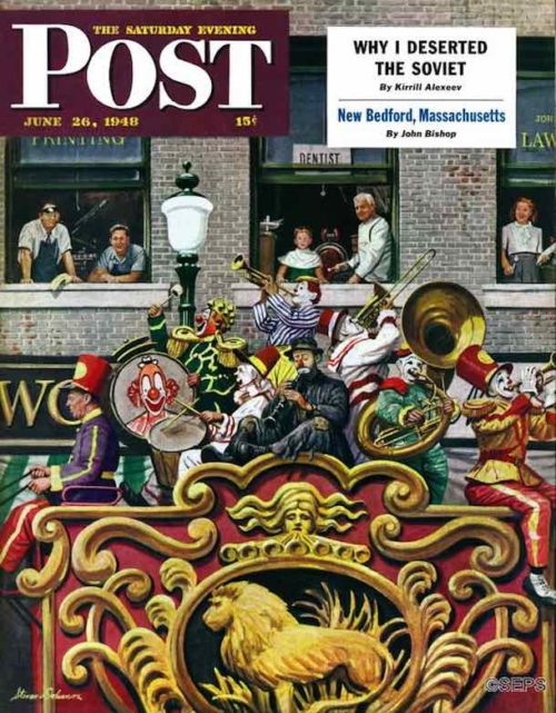
June 26, 1948
Stevan Dohanos painted the big parade down Main Street, once a standard feature of that great summer day, The Day the Circus Came to Town. “Circuses don’t parade much anymore,” said the artist in 1948, “but I think it’s a grand old custom and I wish I could help restore it.” The clowns were members of the famous Ringling Brothers-Barnum and Bailey team, with the sad-faced Emmett Kelly pretending to play the clarinet. The clowns posed for Dohanos in the back lot behind Madison Square Garden, between performances in New York.
Cover Collection: Holiday Fun and Silliness
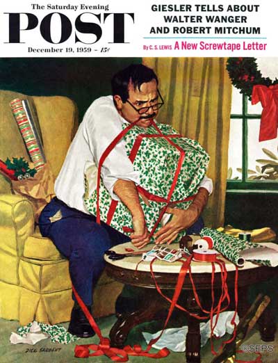
Humor is like a magic trick. To succeed, it needs to look effortless, and the devices used to make it must work invisibly. Comedy is often found in the unexpected, a contrast between the serious and the frivolous or the modern and the old-fashioned. Or it may be discovered in the all-too-familiar. Such is the case here with Richard Sargent’s portrayal of a dad who is about to be vanquished by his Christmas Eve wrapping project. Sargent, who referred to himself as “king of the pregnant pause,” tended to de-emphasize an illustration’s background, drawing full attention to his subject matter.
Richard Sargent
December 19, 1959
Whatever our age, we never lose our inner child, particularly at Christmas. Russian-born Constantin Alajalov specialized in illustrations gently pointing out human frailty. While a youth in St. Petersbug, his life was disrupted by the Russian Revolution. For years he survived by painting propaganda murals and posters, but he managed to defect, first to Turkey and finally to the United States. He quickly found success in America as a muralist. His magazine careerwas launched when a friend suggested he send some paintings to The New Yorker. To his surprise, they were accepted and used as covers. He would eventually complete 74 lighthearted covers for the Post.
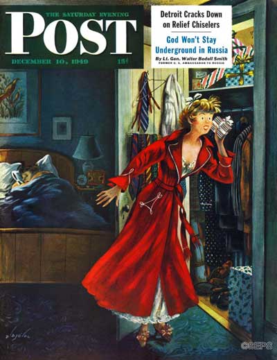
Constantin Alajalov
December 10, 1949
Rockwell went to extraordinary lengths to create verisimilitude. Here, instead of working in the studio, he set up his easel in Chicago’s Marshall Field’s department store even though all we see of it is the back of a sales counter. The store happily provided the setting and toys for the scene, but the artist felt the picture needed more dolls, so he went out and purchased a number of them. He reported the Post editors that he owned more dolls than any other 53-year-old-kid.
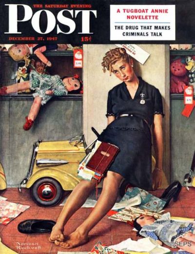
December 27, 1947
Norman Rockwell
As the camera became ubiquitous, the new tradition of the family Christmas card was taking hold. But it’s not always so easy getting everyone to cooperate. Sewell was widely known for his skill in capturing average Americans — and children in particular — with humor and affection.
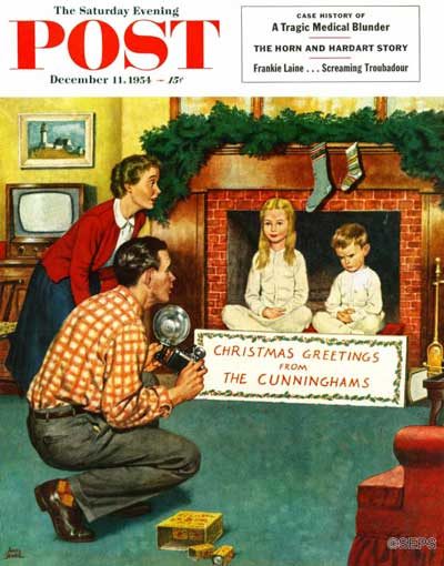
Amos Sewell
December 11, 1954
We were delighted a few years ago to receive an email from Betsy Norfleet with information about the creation of this iconic 1951 cover. Betsy told us that it was her mother, Betty, who portrays the housewife directing her harried real-life husband, George. As the story goes, George was not only brutally scratched by the needles but also threw his back out posing in the scrunched-up position for house on end.
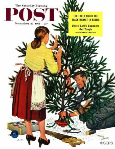
Stevan Dohanos
December 22, 1951
Dutch-born Prins turns this over into a vivid story that umps off the page like a movie sequence. Notice his clever evocation of the passage of time in the differing differing degrees of light shining (or not shining) through the kitchen window. This sweetly humorous illustration also has a wistful quality: All those weeks of preparation — the buying of gifts, the careful wrapping — then suddenly we’re left with a roomful of shredded paper.
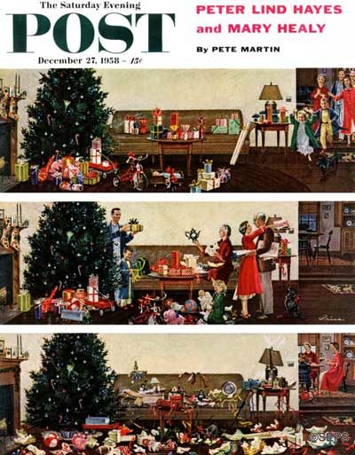
Ben Kimberly Prins
December 27, 1958
The outdoors beckons, and there beneath the tree are some keen skates that would be great to take to the pond. Unfortunately, this young man has some work to do. It may prove to be a long afternoon, with just two letters written and five more to go.
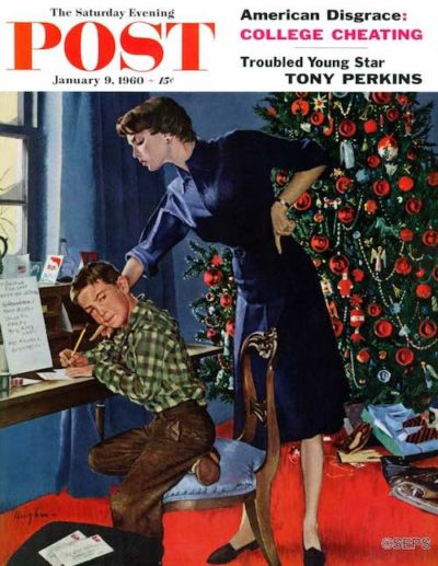
George Hughes
January 9, 1960
 These illustrations and many others are featured in the Post’s Special Collector’s Edition, Norman Rockwell: Christmas in America. This edition can be ordered here.
Vintage Ads: Remembering the 20th Century Limited
Once considered the greatest train in the world, The 20th Century Limited made its last run from New York to Chicago fifty years ago, on December 2, 1967.
When it departed from New York’s Grand Central Terminal at 6:00 PM that Saturday night, it was obvious why the train was ending 65-year run. The once prestigious train, which for decades had been the first choice for the rich and famous on their way to New York, was only half full.
Passengers who boarded the train would have noticed that memento hunters had been at work. The iconic red-and-gray curtain that hung over the Limited’s gate had already been stolen. Menus in the dining car were quickly disappearing. The police were guarding the train’s famous 100-yard red carpet, with its distinctive art nouveau logo, to ensure it didn’t disappear as well. It helped distinguish the Limited from every other train pulling out of Grand Central and it originated the term “red carpet treatment.”

By 1911, the New York Central Railroad could afford a full page ad in the Post, boasting that it could take passengers between New York and Chicago in 18 hours.

Passengers enjoyed luxurious décor and gourmet dining that featured lobster and filet mignon. Cocktails were served in three club cars, though employees claimed that half the drinks were consumed in private rooms or suites.

Like everyone else, the railroads saw revenues fall during the Depression. Where the Limited had once presented itself as the fastest and most luxurious route, in 1936 it advertised itself as the most practical. Its commercial passengers, they argued, were so well rested after 16 hours of travel, they were better prepared for business.

The Limited could also be the ultimate men’s club, a place for male business or bonding.

In 1938, the New York Central rolled out its ultra-modern streamliner.

The streamliner featured a new observation lounge and passenger compartments with individual air-conditioning and bathrooms.

The railroad assured passengers that, despite losing employees to the war, there was no drop in the quality of service on the Limited.

In 1948, the Limited got another new look from the same designer who created the streamliner. The new Limited switched to diesel power and its modernized furnishings now included phone service on board.

The Limited liked to emphasize its “Water Level Route” that followed the shore of Lake Erie and the Hudson River. It was a more restful ride, the railroad argued, than the route taken by its competitor, The Pennsylvania Railroad, which had to cross mountains.
Train travel declined after World War II, and air travel started becoming more affordable. When the New York Central decided to end the legendary rail service, many of its long-time passengers took one last ride. The last run of the Limited marked the end of an era.
Cover Collection: Yuletide Shopping Shenanigans
The commercialization of Christmas is not a modern phenomenon. Holiday shopping can be a joy, but it often veers toward comedy. In the hands of Post cover artists, the mundane experience of making lists, checking them twice, and finally scavenging neighborhood stores to gather up holiday bounty is presented as equal parts delight, misery, and just plain silliness.
Under the humorous guise of this painting’s subject matter, Norman Rockwell makes use of snow as white space to break the image of an overloaded grandfather into completely disjointed components. It’s not quite a human being we are looking at, but pieces of one—a subtle nod to cubism, perhaps?
Incidentally, “Pops” Fredericks, the model for this illustration, was an actor who never quite succeeded on the stage or the screen, but who achieved immortality on Rockwell covers as a cello player, a seasick cruise passenger, a hobo, Ben Franklin, Santa Claus, and a beloved doctor patiently examining a little girl’s doll.
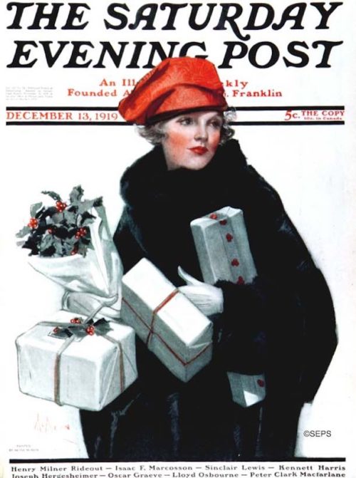
This stunning self-portrait by one of the Post’s more popular female artists makes use of winter’s white in an unexpected way. Not only is the background washed out—evoking a sense of snow—but the gifts are a stunning white against the stark black of the subject’s mink. The multi-talented McMein, a Midwestern girl from Quincy, Illinois, and star pupil of the Chicago Art Institute, moved to New York City with dreams of succeeding as an artist, poet, or musician. The year before painting this cover, she traveled to war-torn Europe as a correspondent for McClure’s Magazine. In the mid-1930s she would make an indelible stamp on the marketing world by creating the face of Betty Crocker.
December 13, 1919,
Neysa McMein
The rocking horse was not new in 1909. It had been popularized in England during the 1800s, then galloped from small workshops into factory production. By the early 20th century, it was a staple toy in America and made frequent appearances on The Saturday Evening Post’s covers, especially around Christmas. Notice the detail in the harried commuter’s overcoat and pants. Leyendecker, whose roots were in fashion advertising, always gave close attention to the clothing of his models. A mentor to Rockwell, Leyendecker was also a darling of the public. At one point his fan mail eclipsed that of legendary film actor Rudolph Valentino.
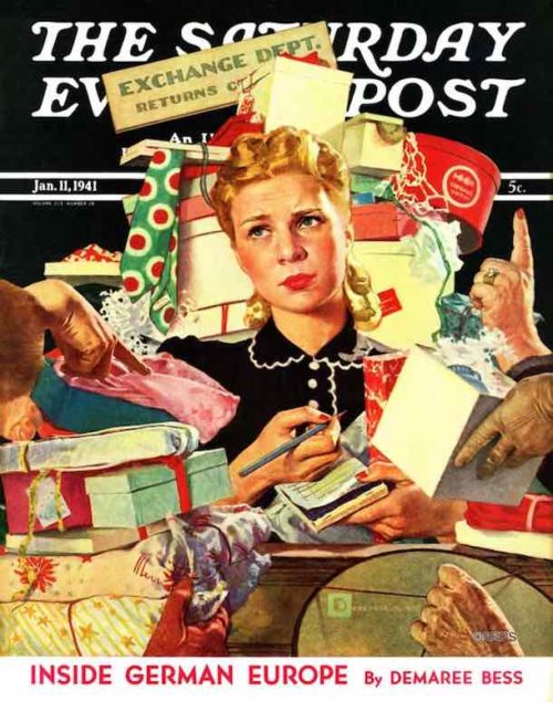
January 11, 1941,
Spencer Douglass Crockwell
The clerk’s face, almost floating in a sea of returned gifts, says all that needs to be said about the post-Christmas letdown. With its emphasis on the commonplace, the Post (and much of America) was willfully ignoring the global crisis brewing across the oceans. (The attack on Pearl Harbor that galvanized our engagement in World War II was still 11 months away.) Notice the signature, bottom right. Crockwell, who illustrated 18 covers for the Post, took to signing his illustrations “Douglass,” “DC,” or simply “D” to avoid being confused with another Post cover artist with a very similar last name.
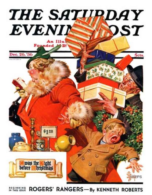
December 26, 1936, J.C. Leyendecker
Leyendecker was one of the longest running of the Post cover artists and certainly one of the most versatile. While best known for his stylish illustrations of fashionable people, he occasionally produced comic numbers, such as this colorful depiction of frantic, last-minute shopping. While many playful elements are at work, notice the visual pun of the bulky mom who bears an uncanny resemblance to St. Nick.
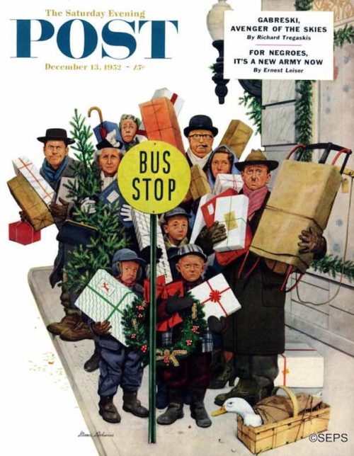
December 13, 1952, Stevan Dohanos
For this painting, Dohanos asked a man at a local nursery to
“saw me down a small Christmas tree to take out.” The little tree made this quirky cover in which all the players — duck included — seem remarkably complacent considering the circumstances. Post writer Rufus Jarman, a neighbor of Dohanos, makes a cameo appearance as the determined-looking man to the left of the tree.
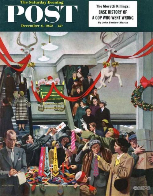
December 6, 1952, John Falter
Even 65 years ago, the ugly tie was universally recognized as the least desirable Christmas gift one could receive. But sometimes, well, that’s the best a person can do. For this hectic scene, Falter relied on his background working at his father’s clothing store in Falls City, Nebraska. By the late 1930s, Falter had moved to New York and was painting shirts and ties for Arrow Shirt ads before being discovered by the Post.
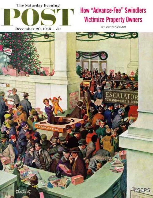
December 20, 1958, Thornton Utz
At the center of the image, a child at the Information booth will soon be reunited with misplaced parents. Meanwhile, countless other dramas are being played in Utz’s shopping pandemonium. Utz began drawing cartoons at 12 and knew he wanted to be an artist by the time he graduated from high school. But later he would say that he and a like-minded friend “could probably have been talked out of the whole idea if we’d been offered a good job driving a laundry truck.” With his knack for capturing humor in everyday situations, Utz became one of the most successful cover artists of the 1950s.
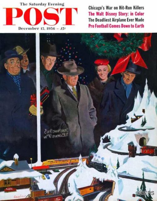
December 15, 1956, George Hughes
While drawing plans for a new home near Arlington, Vermont, Hughes decided to designate a room for his model trains. Months later, when breaking ground for his new home, his responsible side won out: He abandoned plans for the train room. But did he abandon his wish? One can almost feel the artist’s yearning for the magic of toy trains in this captivating holiday window display.
The Art of the Post: The Rockwell Cover that Led to a Marriage
Modern art critics have often looked down their noses at Norman Rockwell’s realistic style of painting, dismissing his painstaking details as unnecessary and old fashioned. But for at least one person, the details in Rockwell’s painting led to a life-altering experience.
In this 1944 Post cover, Rockwell painted a pretty young girl asleep in bed at midnight on New Year’s Eve. Rather than go out partying, she dreams about her soldier boy overseas.
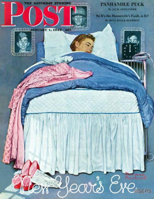
Rockwell literally selected the girl next door for his model. He asked his close friend and fellow illustrator, Mead Schaeffer, if Schaeffer’s sixteen-year-old daughter Lee would pose for the cover. Schaeffer lived just up the street from Rockwell in Vermont.
Ever the perfectionist, Rockwell also selected just the right details to tell his story. That clock on the bedside table shows us that it is midnight and the young girl is not out celebrating in those fancy party shoes. The photos of her boyfriend — none other than Rockwell’s favorite GI, Willie Gillis — on the wall tell us why. But do extra details such as the envelope on the floor really make any difference?
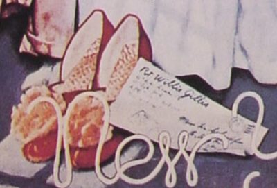
Rockwell was such a stickler for detail, when he painted that envelope he used Lee Schaeffer’s actual address. He assumed it would be too small and blurry to be legible when it was finally reproduced on the cover of the Post. The address was just one of the many details that Rockwell captured purely for his own satisfaction.
Unfortunately, Rockwell underestimated the resourcefulness of our young G.I.s. Soldiers were so smitten by the lovely Lee that they got out their magnifying glasses. Before long, letters started streaming in to Lee Schaeffer at home. Lee’s mother became quite upset with Rockwell for putting her daughter’s address on the cover of the Post. She made sure that all of Lee’s fan mail went unanswered.
But that’s not the end of the story. A few years later, a young veteran named Bob Goodfellow, recently back from serving in the U.S. Navy Reserve on Iwo Jima, saw the famous cover. Like others before him, he fell in love with the slumbering girl. But unlike other soldiers, Goodfellow had an advantage. His fraternity brother knew the Schaeffer family and happened to be dating Lee’s sister Patricia. Goodfellow kept pestering his fraternity brother to arrange an introduction, and finally his persistence paid off. The fraternity brother gave in and arranged a double date with Lee and Patricia in New York City. Goodfellow met Lee on a blind date on December 3, 1949. Goodfellow must have made a good first impression because he was able to wrangle an invitation to Mead Schaeffer’s New Year’s party. There, Lee introduced Goodfellow to her parents, he passed the test, and the courtship began.
Goodfellow and Lee Schaeffer were married on March 16, 1951, and they remain happily married in Vermont today. Next March will be their 67th anniversary. The famous Rockwell cover of the Post that started it all is framed and hanging on the wall above Goodfellow’s desk.

Many modern art critics have insisted that the tiny details in Rockwell’s paintings are pointless. They should keep their eyes and minds open. You can never tell where paying attention might lead.
Fall Video Gallery: John Falter’s Autumn Covers
Artist John Falter brought the fall season to life through his many covers for The Saturday Evening Post. Here are some of our favorites.
See more videos from The Saturday Evening Post at www.saturdayeveningpost.com/video.
Fall Video Gallery: Vintage Baseball Covers
From classic Cubs to the Bronx Bombers, our vintage baseball covers by Norman Rockwell, Stevan Dohanos, and other notable artists capture perfect moments in America’s game.
See more videos from The Saturday Evening Post at www.saturdayeveningpost.com/video.
The Rockwell Files: Sweet Memories
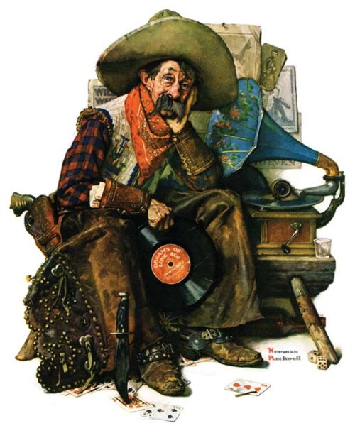
Norman Rockwell, © SEPS.
This cover idea came to Norman Rockwell when he paid a surprise visit to one of his favorite models, James Van Brunt.
The 80-year-old widower lived in a tiny but well-kept room in a run-down boarding house. Rockwell arrived to find the old man seated in a wicker chair, listening to an old gramophone and looking down at a few kernels of popping corn in his palm with “a sad, dreaming expression.”
Van Brunt welcomed him and extended his open palm. “You see this popping corn? It’s from a bag I bought my wife, Annabella, at the World’s Columbian Exposition in Chicago in 1893. When I look at it, I remember our trip and the Exposition and her.”
In this illustration, Rockwell recaptures that mood of bittersweet reminiscence by portraying Brunt as a cowboy tearfully listening to old records. He holds a recording of “Dreams of Long Ago,” a song written by Enrico Caruso. Its lyrics include the lines, “Summer’s gone and life grows cold / Still in dreams you’re mine
of old.”
This article is featured in the September/October 2017 issue of The Saturday Evening Post. Subscribe to the magazine for more art, inspiring stories, fiction, humor, and features from our archives.
Vintage Ads: Happy 100th Birthday to the Typewriter
100 years ago this month, E. Remington and Sons sold their first typewriter. This early model had several drawbacks. Typists could not see the words as they were being typed and the machine was only capable of typing capital letters. But it was a working model, and it featured the QWERTY keyboard layout that has been standard ever since.
It took years before the typewriter established itself as a business machine. But by 1874, Mark Twain was typing his manuscripts. In his autobiography, he wrote:
I will now claim — until dispossessed — that I was the first person in the world to apply the type-machine to literature… That early machine was full of caprices, full of defects — devilish ones… After a year or two I found that it was degrading my character, so I thought I would give it to [author William Dean] Howells. He was reluctant… But I persuaded him. He had great confidence in me, and I got him to believe things about the machine that I did not believe myself. He took it home to Boston, and my morals began to improve, but his have never recovered.
By 1899, the demand for typewriters was high enough to justify advertising in the Post.
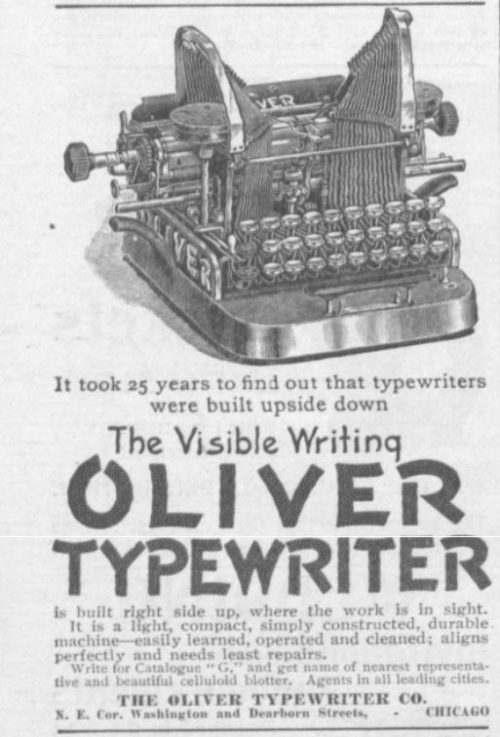
This is the first typewriter ad to appear in the Post. The design might look clumsy, but the Oliver typewriter offered one key improvement. Typists could actually see the letters they had just typed.
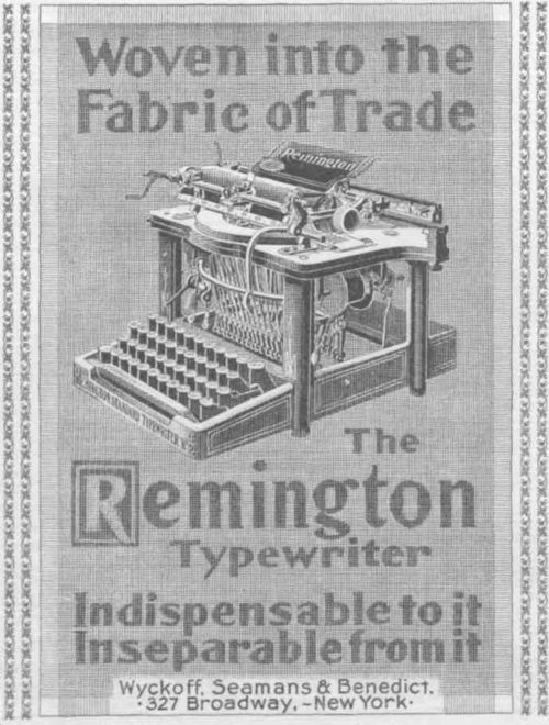
The first Remington typewriter ad appeared in 1899.
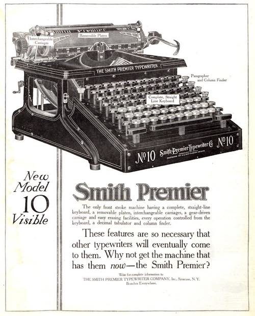
The Smith Premier Typewriter Co. was launched in 1886. This model had a larger-than-average keyboard — six rows of character keys instead of the usual four. The extra keys were needed for upper and lower cases.
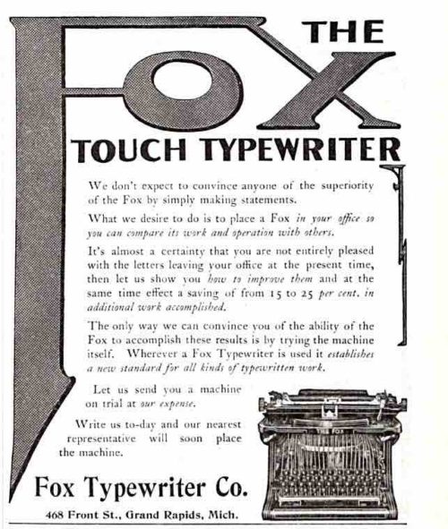
The Fox Typewriter Company of Grand Rapids made several models, including a portable version. The business folded after a lawsuit for patent infringement by the Corona typewriter company.
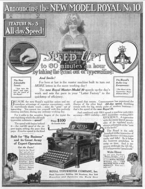
The Royal Typewriter Company’s ad talked of taking the exertion out of typing. If you ever had to use a manual, pre-electric typewriter, you know how you had to “punch” the keys, not at all like today’s keyboards. This model’s $100 price is the equivalent of $2,400 today.
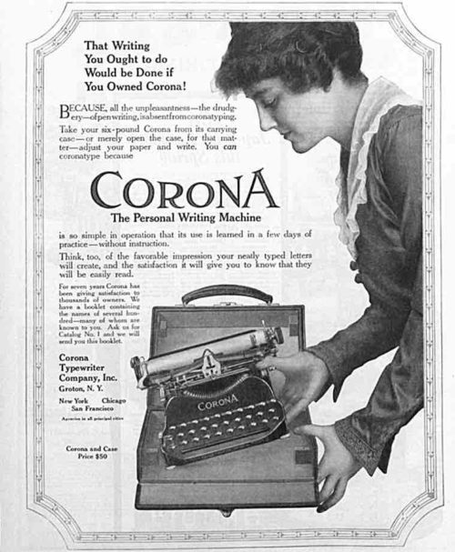
In Corona’s ad for its portable model, they show a woman with their typewriter. This might have been meant to emphasize how lightweight it was, but also acknowledged a new market that had opened up. Typewriters gave women wanting to earn their own income a chance to pick up a valuable skill that was in great demand in the business world.
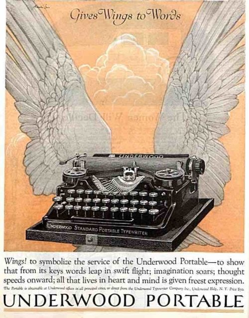
Underwood Typewriters were extremely popular; by the 1920s, they had sold two million machines. To keep up with demand, they modernized their factory until it was able to turn out one typewriter a minute.
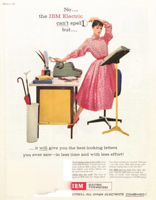
By 1955, there was a new name in the typewriter industry: International Business Machines. IBM was the only typewriter manufacturer to survive the migration from typewriters to computers.
Rockwell Video Minute: Shuffleton’s Barbershop
In a controversial move, the Berkshire Museum recently decided to auction several of its works of art, including Shuffleton’s Barbershop, one of Norman Rockwell’s most unusual paintings. Rockwell’s family has objected to the sale, as have numerous art and museum organizations. After painting the image for the Saturday Evening Post for their April 29, 1950, cover, Rockwell donated the original painting to the museum. Sotheby’s, who will be auctioning this other works from the museum in November, estimates that Shuffleton’s Barbershop will sell for between $20 million and $30 million.
See all of the videos in our Rockwell Video Minute series at www.saturdayeveningpost.com/rockwell-video.
Vintage Ads: The New Frigidaire
In 1919, General Motors bought a small company that was producing an alternative to the icebox. It was a compact refrigeration unit with a storage compartment above a compressor. GM called it the Frigidaire and used mass-production techniques to drive down the price from $775 per unit when it first bought the company to $180 in 1930. (Even that cost — the equivalent to $2,600 today — was prohibitive for most families, and GM offered financing for its refrigerators, just as it did for the family sedan.)
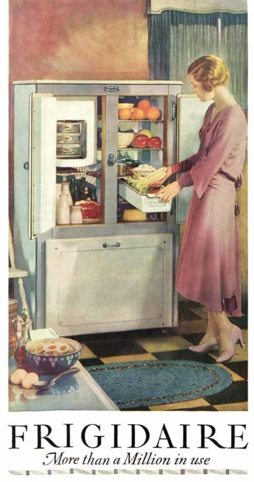
In this color ad from 1930, the company showed its refrigerator as a part of the stylish kitchen in a modern home. The kitchen is decorated with then-fashionable checkered linoleum and dark green curtains on the windows, plus a homemaker who finds cooking so easy she makes dinner wearing pearls and high heels. At the time of this ad’s appearance, over 90 percent of Americans still lived in the icebox era. But the allure of consistent refrigeration ultimately won Americans over. By 1940, nearly every home had a refrigerator.
This gallery of vintage Frigidaire hints not only at Frigidaire’s growth and the rapid acceptance of home refrigeration, but technological advances in magazine advertising as well.

Selling 100,000 refrigerators seems like a small milestone by today’s standards, but when this ad appeared in November 1925, the vast majority of Post readers were still using ice boxes. Ads like this hoped to convince readers not only of a Frigidaire’s usefulness, but of its growing popularity.

Less than seven months later, the number of “satisfied users” had increased by at least 50 percent. This ad’s appeal to pride is an early example of creating an emotional link between a product and a consumer — what we think of as branding today — in order to build brand loyalty.

The focus in this ad is on buying a Frigidaire, not using it, so it is directed at the family breadwinner. That is perhaps why this ad, unlike most others, depicts a man — presumably the woman’s husband — in the kitchen. This sort of casual sexism, though unremarkable when this ad appeared in July 1926, would get lambasted today.

This ad from July 1927 touts the luxuries of Frigidaire’s new model, including “ample food capacity” of “practically FIVE CUBIC FEET of food storage space.” By today’s standards, this would be a large mini-fridge; even the smallest upright refrigerators of today have nearly 10 cubic feet of storage space.

By April of 1928, when this ad appeared, Frigidaire had shifted from touting the convenience and popularity of its refrigerators to marketing them as a “vital safeguard to health.” The preference for checkered linoleum in the kitchen is still going strong here, too.

In February of 1929, Frigidaire models offered six “freezing speeds” that let owners create ice cubes and chilled desserts even faster. Notice how the advertisers subtly reinforce how cold the freezer can get by having the guest wearing a hat and fur-lined coat.

By mid-1935, Frigidaire was touting cutting edge refrigerator technology, including that “Super Freezer,” an all-porcelain interior, and — a fairly new innovation — a light bulb the turns on when you open the door.

A lot changed after World War II — for the United States and for Frigidaire, as you can see in this ad from September 1948. Gone are the checkered linoleum floor and bare walls, replaced by a solid floor and hand-painted cabinet doors and wall trim. Frigidaire offered nine different models, and these were the first to have completely separated refrigerator and freezer sections.
An abridged version of this article is featured in the September/October 2017 issue of The Saturday Evening Post. Subscribe to the magazine for more art, inspiring stories, fiction, humor, and features from our archives.