Rockwell Files: Freshening Up Our Logo
To reflect its new, modern style in 1961, the Post underwent a major redesign. The magazine changed its editor, layout, typography, and, especially, its logo. Norman Rockwell celebrated the change on the September 16 cover by painting Herbert Lubalin, who created the new Post logo, at his drafting table. The cover was a humorous allusion to a cover Rockwell had painted in 1938 in which the artist portrayed himself surrounded by discarded sketches, staring at a blank canvas and scratching his head in search of a fresh idea.
To emphasize the Post’s long history on this cover, he tucked copies of 11 previous Post cover illustrations around the work table. He even included a copy of the Pennsylvania Gazette, founded by Benjamin Franklin in 1728, from which the Post was born.
A cover recalling the Post’s long history is appropriate, we feel, as we approach 2021 — a very special year for the magazine. On August 4, 2021, we will be 200 years old. We think Norman would be proud. We certainly are.
This article is featured in the November/December 2020 issue of The Saturday Evening Post. Subscribe to the magazine for more art, inspiring stories, fiction, humor, and features from our archives.
Featured image: Norman Rockwell / © SEPS
Rockwell Video Minute: Elect Casey
See all of the videos in our Rockwell Video Minute series.
Featured image: (Norman Rockwell / © SEPS)
Post Artists: Sarah Stilwell Weber
See all Post Artists Videos.
Featured Image: Detail, Saturday Evening Post cover from November 2, 1918 (©SEPS)
The Art of the Post: The Artist Who Drew on Toilet Paper
Read all of art critic David Apatoff’s columns here.
There’s no stopping a born artist.
Artist Sarah Goodridge grew up in a small colonial village where she had no pencil or paper but learned to draw by scratching pictures with a pin on birch bark. Polish artist Edward Galinski, held prisoner in a Nazi concentration camp, continued to draw by scratching images on the plaster walls of his cell. The young artist Austin Briggs lacked art supplies but improvised by drawing on window shades he removed from condemned buildings.
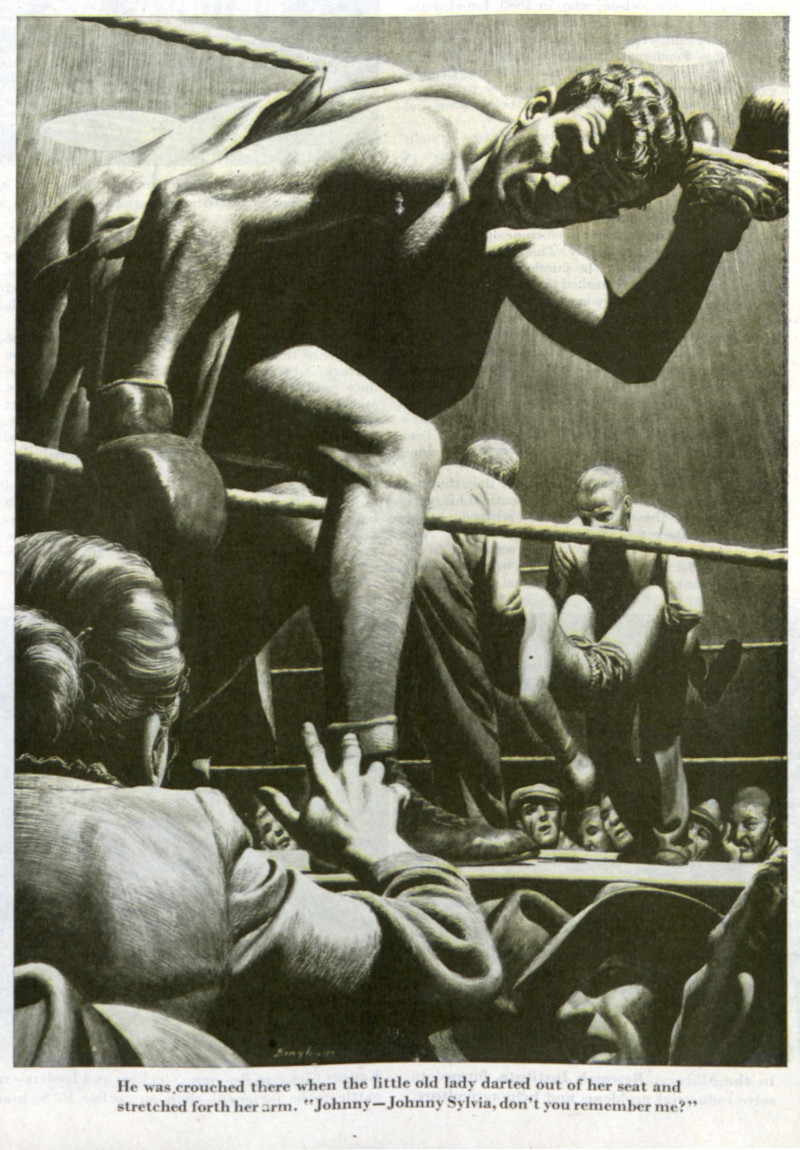
But few artists could match the story of illustrator James Bingham (1917-1971) who, as a young boy, drew on his family’s toilet paper. Bingham’s son recalled the family legend: “When Dad’s family got together they all used to complain about having black bottoms… Dad used to go to the bathroom and draw on the toilet paper then roll it back up!”
It’s true that Bingham lived to make pictures.
He grew up in Pennsylvania, the son of an architect. Starting at the age of three, he spent all his spare time drawing and painting. He did the artwork for his school yearbook all four years of high school.
When he graduated, he was already and experienced artist. Bingham spent two short semesters at art school before the school offered him a job as an instructor. Instead, Bingham moved to New York to start a career as an illustrator.
He had just begun when World War II interrupted. Not one to let a little thing like a world war get in the way of his drawing, Bingham joined the Navy where he worked on propaganda pictures for the war effort, including caricatures of Hitler and Hirohito.
After the war, Bingham made up for lost time, reportedly taking only 11 days of vacation in nine years. When friends suggested that he take some time off to develop a hobby, he said that if he had a hobby it would be to “paint.”
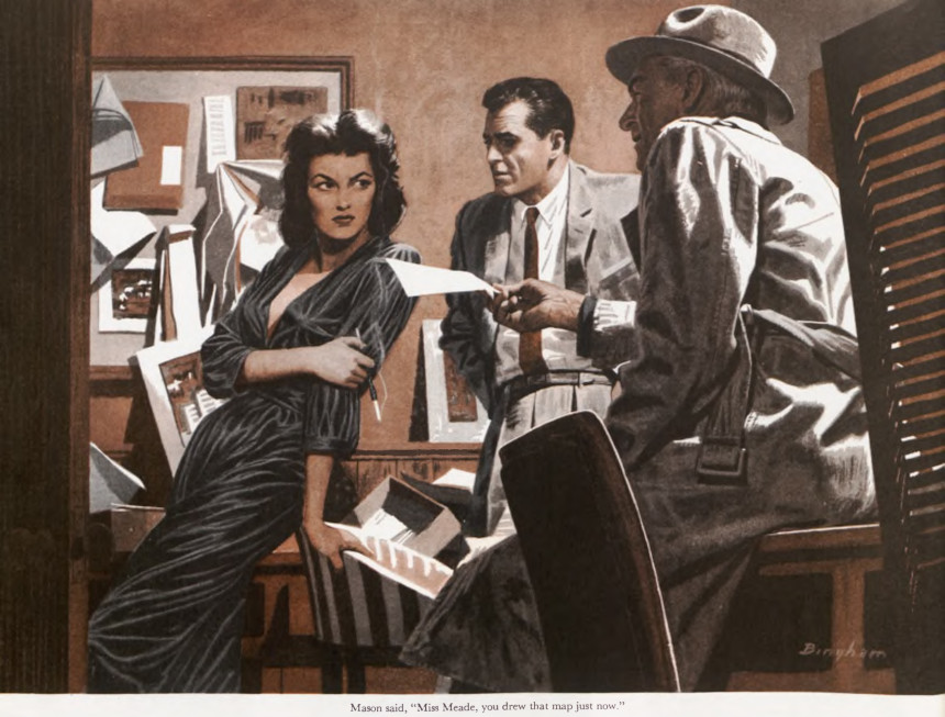
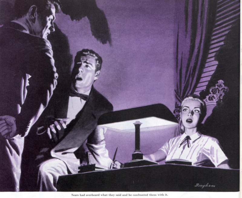
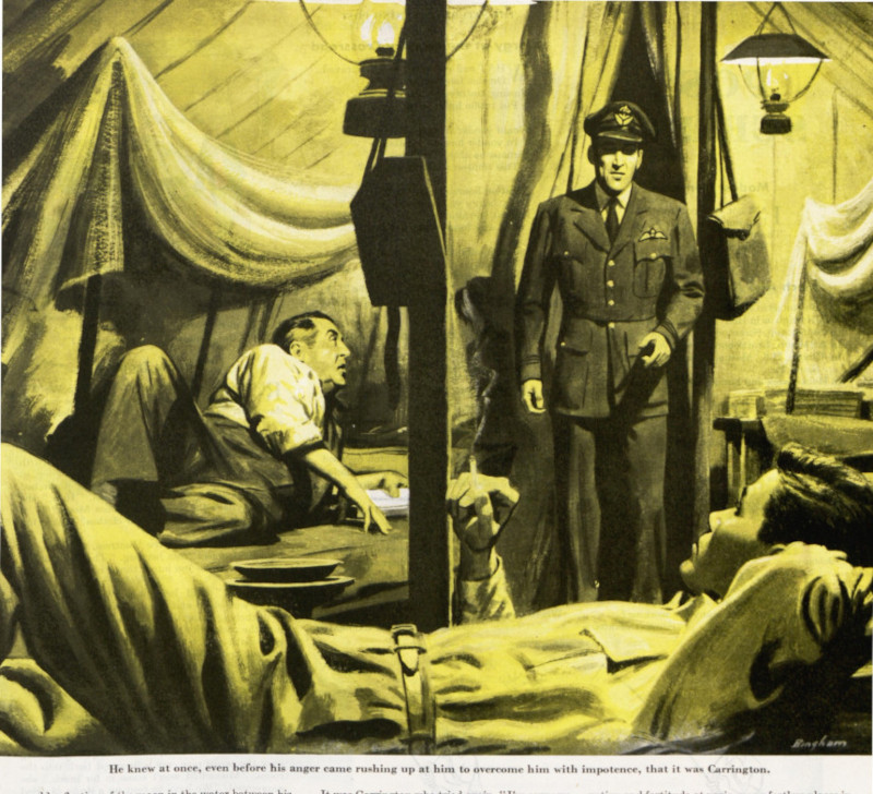
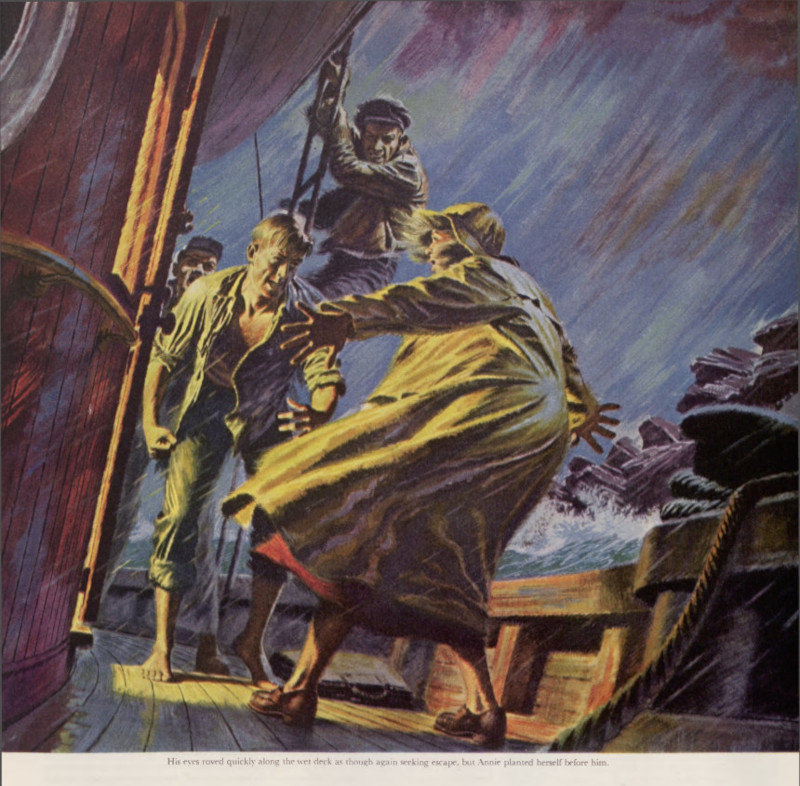
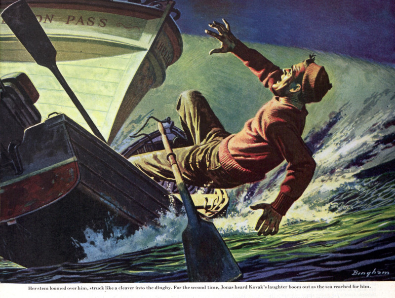
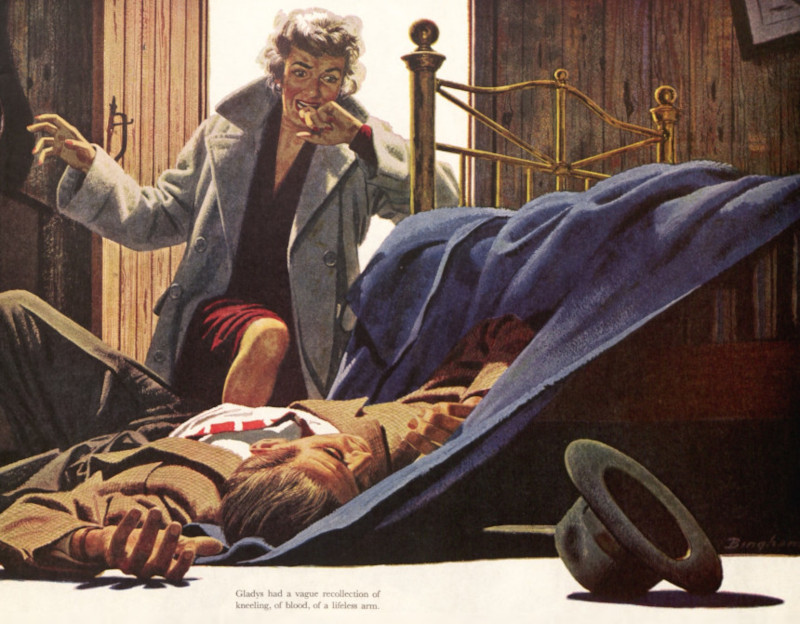
With this work ethic, Bingham became one of the most prolific illustrators of the 1940s and ’50s. For The Saturday Evening Post he illustrated the highly popular Perry Mason and Tugboat Annie series as well as many other story illustrations.
He also worked for other magazines such as Argosy, Good Housekeeping, and Esquire. He illustrated Pearl Buck’s novel, Pavilion of Women.
At the same time he was illustrating fiction, he was a hugely popular commercial illustrator for many of America’s largest commercial accounts. U.S. Steel, Nieman Marcus, Maxwell House Coffee, Gulf Oil, Cannon Towels, Caterpillar Tractor, Philadelphia Whiskey, Alcoa Steamship Company, and Champion Spark Plugs were among the many corporations that called upon his talents.
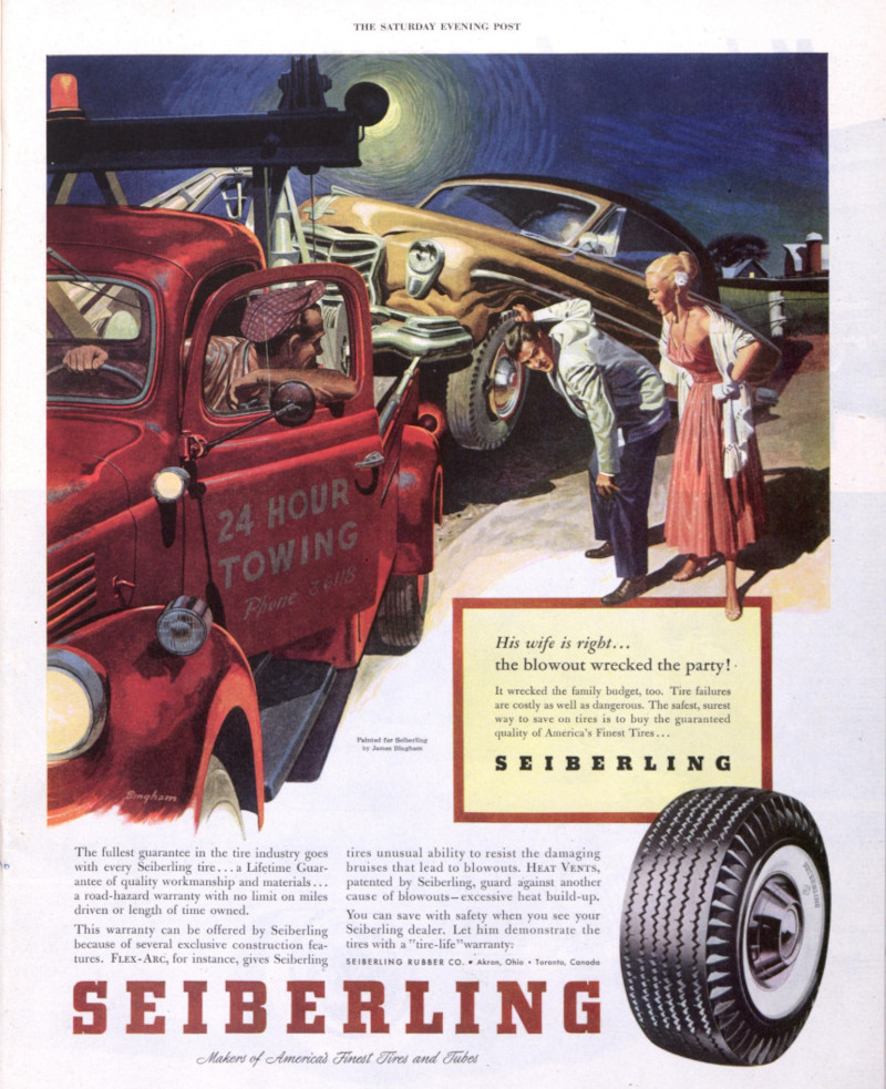
One of the advantages of working nonstop was that Bingham developed the skills necessary to portray any subject from any angle, in any lighting, using any perspective. He became a “utility infielder” of illustration. Art directors knew he could be relied upon to do a good job on a tight deadline, whether the subject was a shadowy noir detective scene or aerospace machinery.
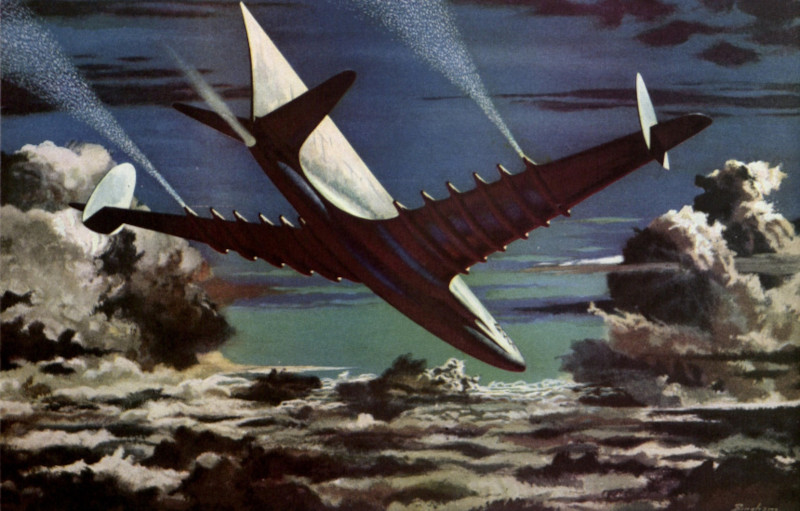
Bingham could be trusted to make the picture work, whether the budget allowed for only two colors or permitted full color.
In the 1950s, Bingham moved to Florida where he continued to draw and paint nonstop. He worked on illustration assignments he obtained through his agent in New York, but he also branched out into a second career doing architectural drawings. His son recalled, “For a while I think Dad did just about every high rise ever envisioned for south Florida.”
When we study Bingham’s pictures, it’s easy to see what made him so attractive to such a diverse group of clients. He was not a flashy stylist who inserted his opinions into each picture or showed off his technique. Readers never had to struggle with his interpretations. Instead, he had a very clean approach, depicting his subjects with a simplified realism that proved very appealing to readers. There were no warts or moles in the world that Bingham painted.
I’ve written in this column about other illustrators for the Post whose style was readily recognizable, such as J.C. Leyendecker or Norman Rockwell. But there is also a role in art for an objective visual reporter like Bingham who could simplify a picture to its essence.
Like a dedicated artist, Bingham died in the middle of a painting. He was working in his studio on an illustration for Chris Craft when he had a stroke, and passed away shortly thereafter. In hindsight, we’d have to say he succeeded in doing what he cared about most: using his time to make as many pictures as he possibly could.
Featured image: James Bingham / ©SEPS
Rockwell Files: Commuters
Norman Rockwell’s 1946 cover Commuters was a tribute to fellow artist and friend Anna “Grandma” Moses, who painted in a folk-art style, rarely using perspective to convey distance. Hence, her landscapes appeared flattened and tilted forward so everything in the panorama could be seen. Commuters uses a similar style to portray Tuckahoe, New York, a very flat town that rises here like an Alpine village in the background. But the improbable landscape allowed Rockwell to make all the houses and cars of the neighborhood visible.
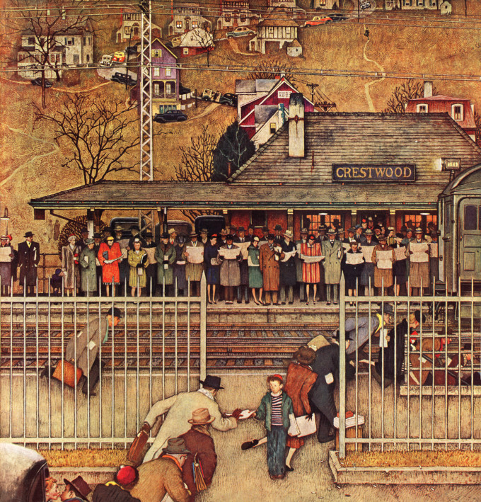
Grandma Moses, who only took up painting in her 70s, said she wanted her works to capture “how we used to live.” Similarly, Rockwell’s cover evokes a morning rush hour from 74 years ago that takes us back in time. Reflecting the rising postwar flight to the suburbs, Crestwood Station, a stop on the Harlem Line into New York, is crowded with well-dressed commuters. Notice how, in those days, hats were de rigueur out of doors — one exception being the housewife in curlers kissing her husband goodbye (bottom left). For a parallel to the modern commuter, notice the rapt attention each one has to their own newspaper — no socializing, no chatter. Today, of course, all that attention would be devoted to a phone.
Featured image: Norman Rockwell / SEPS
This article is featured in the September/October 2020 issue of The Saturday Evening Post. Subscribe to the magazine for more art, inspiring stories, fiction, humor, and features from our archives.
Rockwell Video Minute: Cousin Reginald
See all of the videos in our Rockwell Video Minute series.
Featured image: Norman Rockwell / SEPS
Post Artists: Stevan Dohanos
See all Post Artists Videos.
Featured image: Stevan Dohanos / SEPS
Post Artists: John Falter Captures American Moments
See all Post Artists Videos.
Featured image: “Lunch Counter” by John Falter (SEPS)
Rockwell Video Minute: The Tattoo Artist
See all of the videos in our Rockwell Video Minute series.
Featured image: Norman Rockwell / SEPS
Post Artists: George Hughes, Norman Rockwell’s Anti-Muse
See all Post Artists Videos.
Featured image: George Hughes / SEPS
The Art of the Post: The Artist Who Kissed a Painting by Botticelli in the Dark
Read all of art critic David Apatoff’s columns here.
Many of the great artists who worked for The Saturday Evening Post led colorful, interesting lives. One such artist was Stanley Meltzoff, a classically trained artist who worked for the Post between 1956 and 1960.
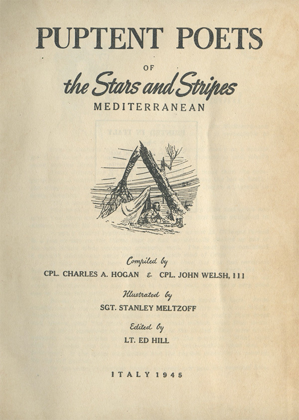
Before World War II, Meltzoff was an art student who traveled in Italy to study the Renaissance painters. When war broke out, it was only natural that the army put Meltzoff’s knowledge of Italy to use in an intelligence unit assisting with the invasion of Italy. Meltzoff was sent to the landing at Anzio, and when the front lines broke open he entered Rome with the first G.I.s. His role included drawing battle maps and Italian locations and translating key Italian phrases for the G.I.s in the army newspaper, Stars and Stripes. Even in the midst of war, Meltzoff was eager to find a way to draw, so he volunteered to illustrate poems that soldiers sent in to Stars and Stripes. These were published in a book entitled Puptent Poets.
Meltzoff spent three years in Italy as the war raged. The greatest art of the Italian Renaissance was in danger of being destroyed in the fighting, so paintings were evacuated from museums and hidden in the countryside. The entire contents of the famed Ufizzi Gallery in Florence were hastily moved to a remote country villa to protect it from bombing.
As Meltzoff recounted in an interview in the forthcoming book, Stanley Meltzoff: Picture Maker, he was driving a jeep along the Arno River in an area being shelled by German and Canadian artillery when he came across an abandoned villa. Later he wrote about what he discovered there:
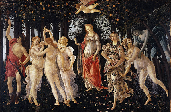
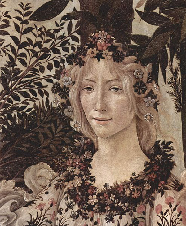
…I saw close up the masterworks I had only known from books. The whole inventory of paintings in the Ufizzi was leaning against the walls of the Sitwell’s villa south of the Arno where they had been tucked away in the countryside in case there might be a battle for Florence… The villa was empty, the room I entered was empty. A rooster was perched on a stack of panels in front of which was the Primavera of Botticelli.
The legendary painting Primavera, about the birth of spring, was created around 1480. It has been described by art historians as “one of the most written about… paintings in the world.” It shows the cold gray wind of March coming in from the right, kidnapping and possessing the beautiful nymph Chloris. The wind marries Chloris and she transforms into the deity Flora, the goddess of spring, the eternal bearer of life. We see Flora here scattering the rose petals of spring on the ground.
Meltzoff stood transfixed in the dim light, staring at the painting.
Flora, life size, was scattering her flowers. As in my dreams I stepped up and kissed my ideal of beauty full on the lips…
Meltzoff survived the war. Like the goddess of spring he experienced a rebirth, a career he called his “happy period” painting beautiful oil painting illustrations for The Saturday Evening Post, Life, and other top magazines.
He went on to a distinguished career as a gallery painter, enjoying a long, lucrative career as a painter and an author before he finally passed away in 2006.
But it’s clear that his youthful kiss in the dark with his ideal of beauty remained fixed in his mind. Just as Botticelli painted the Birth of Spring later in life, Meltzoff painted his own Birth of Autumn.
Like many of the illustrators who once worked for the Post, Meltzoff’s work has been rediscovered by a new generation of art lovers. A new book about his art and career, Stanley Meltzoff: Picture Maker, is available from Illustrated Press.
Featured image: Primavera by Sandro Botticelli (Uffizi Museum, Wikimedia Commons)