Rockwell Files: Freshening Up Our Logo
To reflect its new, modern style in 1961, the Post underwent a major redesign. The magazine changed its editor, layout, typography, and, especially, its logo. Norman Rockwell celebrated the change on the September 16 cover by painting Herbert Lubalin, who created the new Post logo, at his drafting table. The cover was a humorous allusion to a cover Rockwell had painted in 1938 in which the artist portrayed himself surrounded by discarded sketches, staring at a blank canvas and scratching his head in search of a fresh idea.
To emphasize the Post’s long history on this cover, he tucked copies of 11 previous Post cover illustrations around the work table. He even included a copy of the Pennsylvania Gazette, founded by Benjamin Franklin in 1728, from which the Post was born.
A cover recalling the Post’s long history is appropriate, we feel, as we approach 2021 — a very special year for the magazine. On August 4, 2021, we will be 200 years old. We think Norman would be proud. We certainly are.
This article is featured in the November/December 2020 issue of The Saturday Evening Post. Subscribe to the magazine for more art, inspiring stories, fiction, humor, and features from our archives.
Featured image: Norman Rockwell / © SEPS
Rockwell Video Minute: Elect Casey
See all of the videos in our Rockwell Video Minute series.
Featured image: (Norman Rockwell / © SEPS)
Rockwell Video Minute: Arguing Politics Over Breakfast
See all of the videos in our Rockwell Video Minute series.
Featured image: Norman Rockwell / SEPS
Rockwell Files: Commuters
Norman Rockwell’s 1946 cover Commuters was a tribute to fellow artist and friend Anna “Grandma” Moses, who painted in a folk-art style, rarely using perspective to convey distance. Hence, her landscapes appeared flattened and tilted forward so everything in the panorama could be seen. Commuters uses a similar style to portray Tuckahoe, New York, a very flat town that rises here like an Alpine village in the background. But the improbable landscape allowed Rockwell to make all the houses and cars of the neighborhood visible.
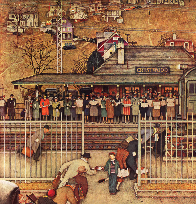
Grandma Moses, who only took up painting in her 70s, said she wanted her works to capture “how we used to live.” Similarly, Rockwell’s cover evokes a morning rush hour from 74 years ago that takes us back in time. Reflecting the rising postwar flight to the suburbs, Crestwood Station, a stop on the Harlem Line into New York, is crowded with well-dressed commuters. Notice how, in those days, hats were de rigueur out of doors — one exception being the housewife in curlers kissing her husband goodbye (bottom left). For a parallel to the modern commuter, notice the rapt attention each one has to their own newspaper — no socializing, no chatter. Today, of course, all that attention would be devoted to a phone.
Featured image: Norman Rockwell / SEPS
This article is featured in the September/October 2020 issue of The Saturday Evening Post. Subscribe to the magazine for more art, inspiring stories, fiction, humor, and features from our archives.
Rockwell Video Minute: Cousin Reginald
See all of the videos in our Rockwell Video Minute series.
Featured image: Norman Rockwell / SEPS
Post Artists: Stevan Dohanos
See all Post Artists Videos.
Featured image: Stevan Dohanos / SEPS
Rockwell Video Minute: April Fool’s Day
To study the covers in more detail and see all of the answers, visit saturdayeveningpost.com/fool.
See all of the videos in our Rockwell Video Minute series.
Featured image: © SEPS; Image of the sculpture “Coming to the Parson (patented 1870)” by John Rogers, painted plaster in the Delaware Art Museum Wilmington, Delaware, Photo Ad Meskens of a sculpture by John Rogers via the Creative Commons Attribution-Share Alike 3.0 Unported license.
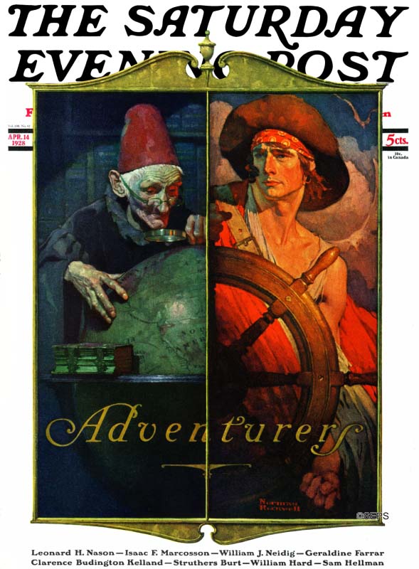
Rockwell Files: Gary Cooper Puts On a Good Face
In 1930, Norman Rockwell traveled to California on the advice of his lawyer, who wanted the artist out of his home state of Vermont while he, the lawyer, settled a contract lawsuit with another magazine.
Rockwell stayed with friends who lived near Hollywood. He was fascinated by the extras and out-of-work actors he saw on the streets. Back home, he relied on neighbors for his models. Here, if he needed any type of face or character, he only had to walk around town to find what he wanted.
But when he got the idea for this cover, he asked the friend he was visiting to help him find a cowboy actor. Rockwell was stunned when Paramount Studios offered the services of their mega-star Gary Cooper.
When Cooper showed up for the modeling session, Rockwell later wrote, he filled the doorway, making Rockwell keenly aware of his own “narrow shoulders and puny arms.” But during three days of modeling, Cooper proved to be easy-going, very cooperative, and a practical joker who brought along exploding matches and ash trays that jumped when they were touched.
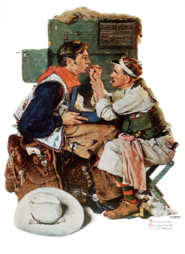
Probably in gratitude to Paramount, Rockwell put the name of Cooper’s latest movie, The Texan, on the slate in the background. The movie premiered shortly before this issue appeared on the newsstands.
Movie stars weren’t the only people who impressed Rockwell in California. He also met a school teacher there, Mary Barstow, who later returned east with him as his new wife.
Featured image: Norman Rockwell / SEPS
This article is featured in the March/April 2020 issue of The Saturday Evening Post. Subscribe to the magazine for more art, inspiring stories, fiction, humor, and features from our archives.
Rockwell Video Minute: The Tattoo Artist
See all of the videos in our Rockwell Video Minute series.
Featured image: Norman Rockwell / SEPS
Rockwell Files: After the Prom
Rockwell freely admitted he painted “life as I would like it to be.” But in the case of this cover painting from May 25, 1957, it was no simple matter. It took a masterful sense of staging, lighting, and careful execution to share with viewers his sense of an idealized world.
He starts with the happiness of two young people as they enjoy a night of feeling “grown up.” He emphasizes the magic of the evening by contrasting them against the mundane world of a dingy truck stop.
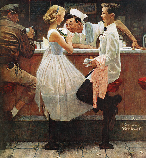
He draws attention to their youth and innocence by dressing both in gleaming white. And he sets them beneath a beam of light from above that illuminates them and the appreciative cook. They are undisturbed by other customers, and even though Rockwell puts a dirty floor beneath them, they seem set apart from the dark interior in this perfect moment. Rockwell even echoes the viewer’s reaction by adding a bemused truck-driving spectator. Like him, we might observe this unforgettable moment with a smile of recognition, and perhaps recollections of our own.
This article is featured in the January/February 2020 issue of The Saturday Evening Post. Subscribe to the magazine for more art, inspiring stories, fiction, humor, and features from our archives.
Featured image: Norman Rockwell / SEPS
Post Artists: George Hughes, Norman Rockwell’s Anti-Muse
See all Post Artists Videos.
Featured image: George Hughes / SEPS
Rockwell Video Minute: Rockwell and Charles Dickens
See all of the videos in our Rockwell Video Minute series.
Featured image: Norman Rockwell / SEPS
Rockwell Files: Bridge Night
Nearly half of all households in the 1940s contained at least one bridge player. So when Rockwell featured this game on the Post’s cover in 1948, lots of readers would have understood what was going on.
Rockwell had been kicking around ideas for a bridge-themed cover before he took this unique angle on the game, which enabled him to show all the players’ cards.
The woman scratching her head is “South,” and since she’s won the bid for this hand, her partner “North” has laid down his cards to become the dummy player. South played her jack of spades, West has followed suit with the four. Now comes South’s dilemma. If East has the king, she can force it out with her ace. But if it’s in West’s hand, she’ll probably lose a trick.
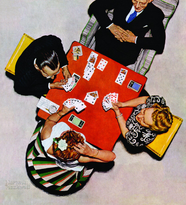
Meanwhile, her partner simply sits back and enjoys her quandary.
This article is featured in the September/October 2019 issue of The Saturday Evening Post. Subscribe to the magazine for more art, inspiring stories, fiction, humor, and features. Subscribers get access to digital archives of the magazine dating back to 1821.
Featured image: Norman Rockwell / SEPS.
An Interview with Our September/October 2019 Cover Artist Robin Moline
Saturday Evening Post: Can you tell us more about what inspired you to paint the image that appears on the September/October 2019 cover of The Saturday Evening Post?
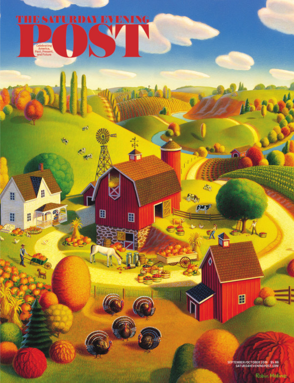
Moline: This painting was originally commissioned for tapestry art, but I decided to go ahead and create an image that I could also sell for prints and as a stock image. So I basically went to town, put myself into the scene and tried to imagine what the look and the feel of that kind of day would be. The painting had to tell the story and transport the viewer there too.
Post: You describe your style as “a surreal look with an often folksy twist.” Many of your illustrations pay homage to or are reminiscent of Grant Wood. I would describe them as “Grant Wood on acid.” What attracts you to that style of illustration?
Moline: I have heard my artwork described like that before. I’d like to think that I take Regionalism imagery and that folksy style and amplify the colors to make my artwork have a more contemporary feel. What attracted to me to this style is hard to say. I suppose first I always enjoyed painting landscapes from an early age and often they were of rural subject matter of places I’d been and farms I visited. When I first saw Grant Wood’s work I felt a connection maybe because they felt familiar and maybe because I always wanted to be in his paintings. I eventually bought a Grant Wood art book, studied it a lot, and decided I wanted to try to paint like that myself. So I did and eventually it has become what you see today.
Post: Who else are you inspired by?
Moline: There are other Regionalist artists’ work I also really love. Marvin Cone’s sensual landscapes of that same area in Iowa are spectacular. The color and movement in John Steuart Curry and Thomas Hart Benton’s work I always find inspirational. Other non-Regionalist artists that stand out are the whimsy, detail, and subject matter of Charles Wysocki paintings. Some of my early favorites were the surrealist Artists Henri Rousseau, René Magritte and Salvador Dalí and the romantic look and thermal colors palette of Maxfield Parrish. I of course enjoy a wide range of artists going back to other centuries as well. While on my honeymoon back in 1980 I saw Botticelli’s large scale paintings and was in total awe. Recently while in Italy I saw again the work of Pinturicchio and his mythological scenes and detail in Sienna’s Duomo; I could have looked at that artwork all day long. Of course there are plenty of other artists to draw inspiration from including many peers but the above stand out in the top tier.
Post: What media do you typically work in?
Moline: My traditional style is I paint on illustration board. I generally do an acrylic airbrushed underpainting then go in with fine tiny acrylic brushes to finesse the art and add detail and texture.

Post: How did you get started in your illustration career?
Moline: I pretty much decided to freelance right out of my college years at The Minneapolis College of Art & Design. I was lucky to start out when I did. There was a lot of local work and I was able to get a representative early on. In the ’90’s after I had established a more consistent style and fine-tuned my skills, I then looked for a national representative and broadened my field.
Post: How is painting for yourself different from painting for a client?
Moline: I do enjoy both. I love the challenge of working with a client and the problem solving involved, whether it be a book or magazine cover, an editorial, a poster, map, or product design. I always love seeing the end result when a client is involved because I am working with other creatives and my work gets to be woven into a bigger picture. I also don’t mind a deadline; of course the longer ones are more welcome. When I work on a painting for myself it’s hard to know when to stop, and that can be a problem. Also when I have a set client there is incentive to get the artwork done because I get paid sooner. So that’s a big motivation as trite as that might sound. Of course painting for myself I only have myself to please and I can experiment and not have a client expecting that specific look they are after based on seeing previous work.
Post: What is your favorite thing about being an artist?
Moline: Honestly being my own boss and working out of my home and not dealing with a commute is the best. Working with so many wonderful creative people I’ve met along the way and that there is always a challenge and rarely a dull moment. Being an artist has made me grateful that I have a way to express myself and that it has allowed me to expand my imagination. Hopefully through my work I can move others emotionally and intellectually and to be able to share some of my inner world and imagination.
Post: What’s the most fun thing you’ve painted?
Moline: That’s a hard one to pick over the 40 years of painting. So I’ll give you a few that achieved a few levels of satisfaction. The Farmer’s Market Stamp project stands out…I loved the art director and I had a luxurious long deadline. It was first thought that I’d be doing some of my signature landscapes, but in the end I was painting every kind of fruit, vegetable, food, and plant you might find at a neighborhood farmer’s market. It was definitely a job that evolved over time, but I enjoyed the whole process and it also included a trip for the unveiling ceremony in Washington, D.C.
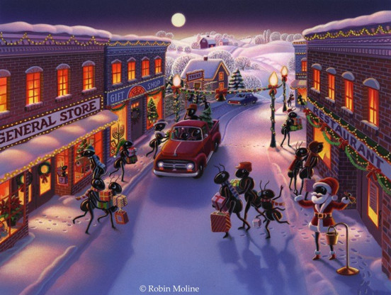
As far as landscape art goes I was lucky to work with HOK architects/engineering in the early ’90’s and did some big projects with them. The second was mural art for the new John Deere Pavilion in Moline, Illinois. The actual painting is a bit of a blur — the deadline was pretty fast considering the amount of painting involved, but the end results still please me to this day. I also fondly look back at an ongoing series I did for a high profile marketing group out in Hollywood called the Ant Farm. I created a group of ant characters for them that were pretty busy and active doing fun things mostly taking place out in L.A. Again, the clients were great to work with, too.
Post: What advice would you give to aspiring artists?
Moline: Patience and practice above all. You are not going to know your full potential, hidden talents, or fine tune your artwork right away. That takes time. Your artwork, as life itself, is an evolving process…and a gradual unveiling of yourself and your story. Don’t be afraid to experiment with different mediums and subject matter. You will make mistakes and you might disappoint those you work with now and then but you will learn from that. Don’t fear those periods of time when you don’t feel an ounce of creativity surfacing. When that happens, it will take time to observe and reflect and do whatever else you are being pulled toward…travel, read, relax and pick it up again when you are reenergized and the creative tap starts flowing again. Whatever you do don’t compare your work to others… if you are enjoying what it is you do and are growing as an artist, that is number one. Also accept that not everyone is going to like your art. Some will be critical, but if you love your work and you find a niche and even a few people love what you do as well, then you’ve made it. At that point smile and pat yourself on the back!
Post: Is there anything else you’d like Saturday Evening Post readers to know about your work?
Moline: Looking back on my career, a day that tickled me the most was when I was Googling some of Grant Wood’s work, my image came up and someone had mistaken it as his. Just last year I was asked to do a show down at the American Gothic House in Eldon, Iowa. That was another highlight of my career — to be standing in front of that house that had been parodied endlessly, and that my work that was on display inside was inspired by my favorite muse. I’ve told numerous people before that in fun I like to call myself Robin Wood. I think it has a nice ring.
To find out more about Robin and her work, visit robin-moline.pixels.com/.
Featured image: Robin Moline / SEPS.
How to Look at a Norman Rockwell Picture: Part 5 — Light and Color
Read all of art critic David Apatoff’s columns here.
This is the fifth in a series of columns on how to appreciate the artistic side of Norman Rockwell’s paintings. See Part 1 on Rockwell’s use of hands, Part 2 on his use of black and white, Part 3 on how he leads your eye, and Part 4 on his interaction with the great artists in history.
You couldn’t be blamed for thinking that this painting, entitled “A Day in the Life of a Girl” is about a day in the life of a girl.
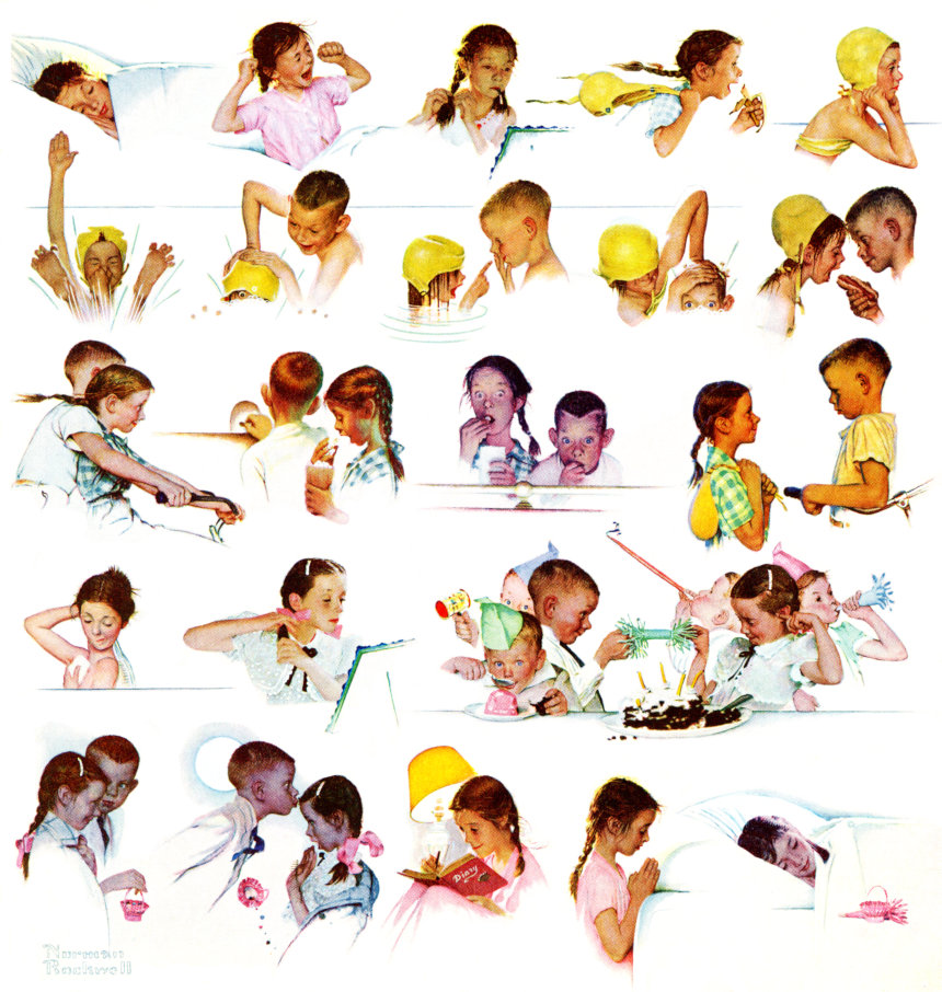
But if you look closely there’s a second subject staring you right in the face: that subject is “light.”
Rockwell could easily have painted each event in the same consistent light. Instead, he spent a great deal of effort capturing light’s subtle changes throughout the day. Light is a separate character in this painting, as important as the girl.
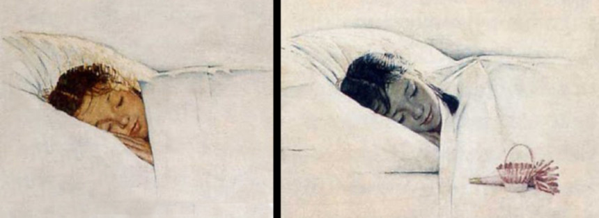
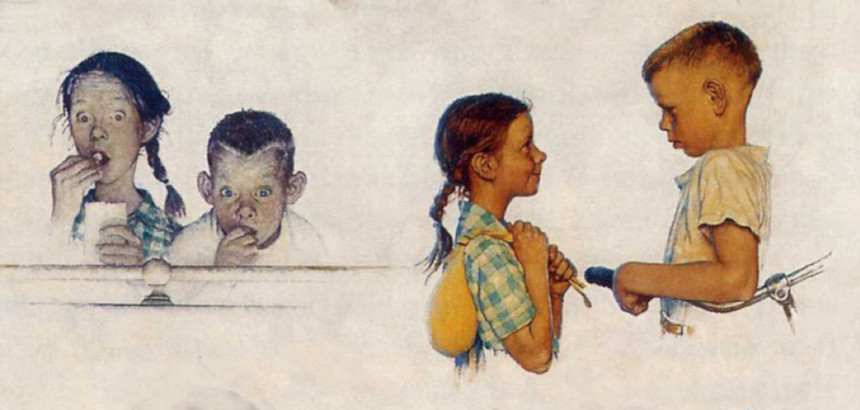
For example, compare the girl at the beginning and end of the day. Rockwell saw that the morning sun illuminates the full range of color in her skin and hair, with emphasis on warm colors such as red, orange and yellow. Moonlight, on the other hand, diminishes the color spectrum and creates cool colors such as blue and gray.
Next, notice how Rockwell captures the way artificial light from a bedside lamp looks different from natural light:
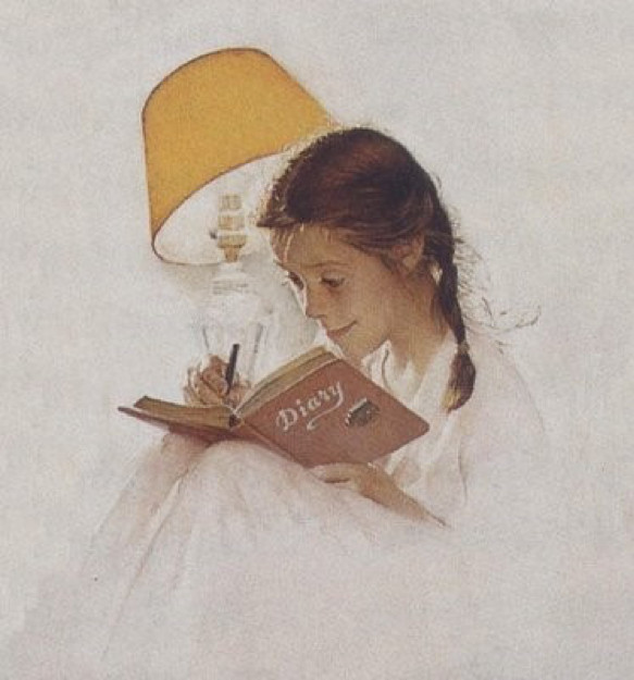
And electric light from the bedside lamp looks very different from the electric light of a movie theater marquee (below):
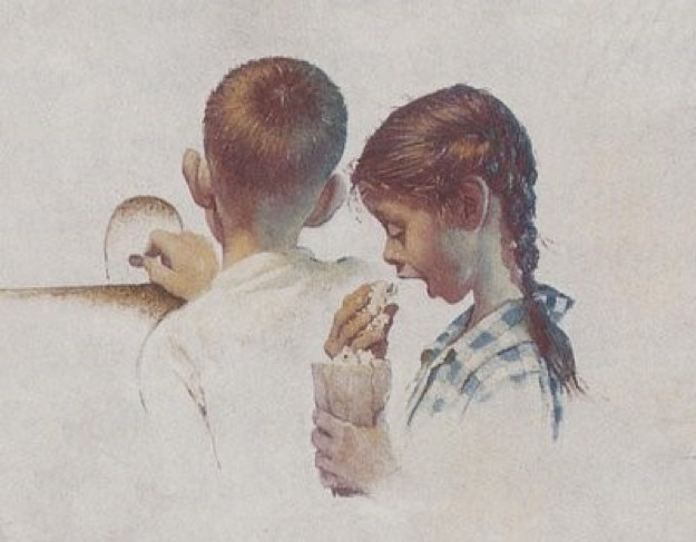
The sharp-eyed Rockwell can even distinguish between two different kinds of theater lighting: he paints the light from the marquee (above) differently from the way he paints the light from the silver screen (below). Then, after the movie ends and the children step out into the golden glow of the late afternoon sun, the light transforms their color completely:
Painting the effects of light required as much artistic skill and observation as painting the girl. This brilliant painting could just as well be called, “A day in the life of light.”
Artists have always been inspired by light; it is the magic ingredient, the source of what we perceive as color. Rockwell may have been a commercial illustrator who painted entertaining magazine covers for a corporate employer, but he was simultaneously a gifted artist, solidly within the artistic tradition that regards light as a source of wonder. (In a previous column I compared Rockwell to the famous impressionist Monet, who painted the same haystack several times to show that color looks different at different hours of the day.)
If you want to appreciate the artistic side of Rockwell’s work, look for the ways in which his paintings celebrate the qualities of light.
For example, why does the lighting of this fellow in the doorway look so warm and welcoming?
The source of light is from the ground up, rather than from the normal top down. Also, the light has an unusual warm glow. This is because the light is coming from a crackling fire in a fireplace. Rockwell doesn’t need to paint the fireplace for us, he can imply a fireplace using light.
In the next example, Rockwell uses color to contrast an ancient scholar at night in his study with a bold young explorer sailing into the dawn.
Rockwell didn’t have to clutter up his painting by showing additional objects, such as a black sky with stars and a moon, in order to set the scene. He was able to explain to viewers that it is night because he understood the palette of moonlight.
Finally, it’s important to emphasize that the artistic role of light goes beyond having the keen eye and technical skill to reproduce shades of light accurately. Light can also play a major emotional and psychological role in art. For example, look at Rockwell’s Post cover of a group of amateur musicians playing together after hours in the back of a barbershop:
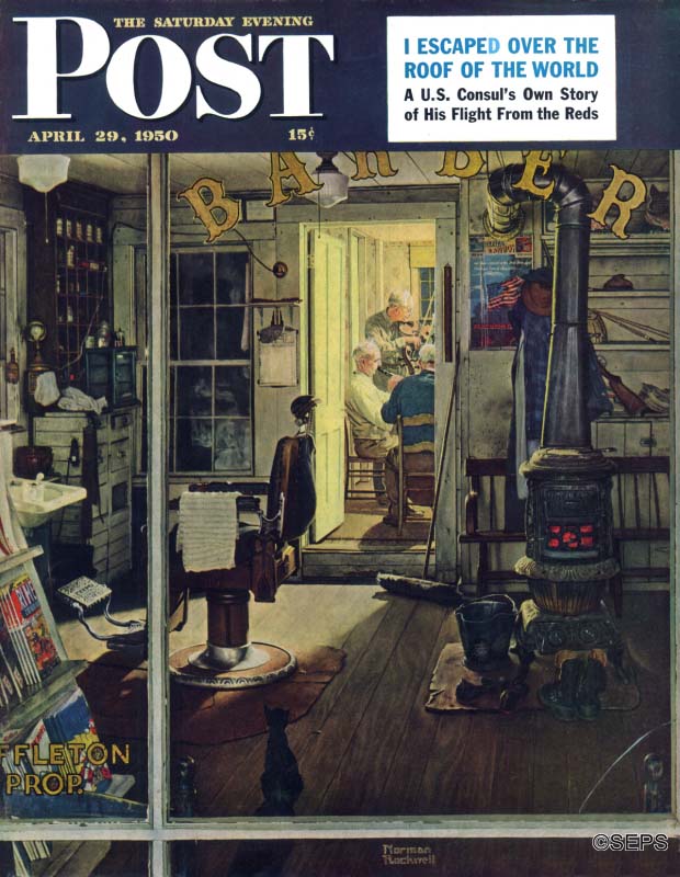
Why didn’t Rockwell paint the entire scene in a well-lit room so he would have more space to show all those warm, folksy details and facial expressions for which he was famous?
The answer is that it was psychologically more effective to use a narrow sliver of light to reveal a partial glimpse of the beating heart of the picture. The joy of this picture is that these musicians are playing for their own private pleasure, not performing publicly. Their shining time together is surrounded on all sides by the darkened place of business, which makes this a more powerful, emotionally moving painting.
All this was achieved with color — one more example of how the mastery of light made Rockwell an excellent artist.
Featured image: Norman Rockwell/SEPS.
Rockwell Video Minute: Coming and Going
It’s summer, and time for that family road trip! Norman Rockwell captures the before and after of a day at the lake.
See all of the videos in our Rockwell Video Minute series.
Featured image: Norman Rockwell; SEPS.